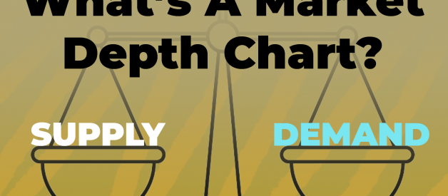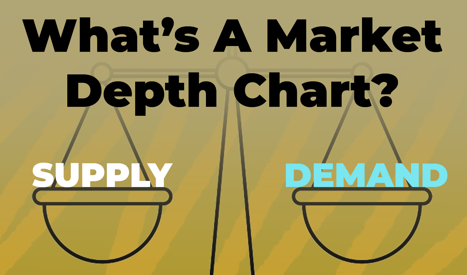
Supply and demand is at the heart of business itself, without both commerce would cease to exist. If only there was a way to see both supply and demand for a particular asset. Well, a depth chart provides just that info!
A depth chart is a visual representation of buy and sell orders for a particular asset at varied prices. This kind of chart illustrates both sides of supply and demand to show exactly how much of an asset you can sell at a particular price point.
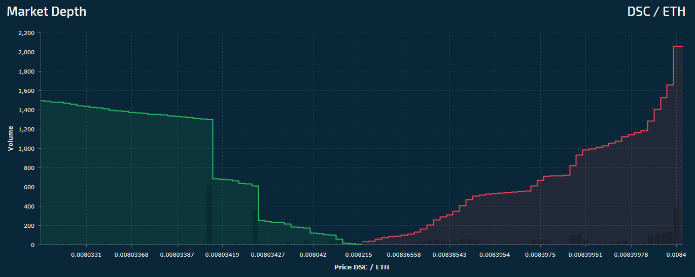 DSC Market Depth
On the left side in green we have bids/buy orders which are displayed between a range of prices located on the x-axis. On the right side we have ask/sell orders which are displayed in red with their respective values on the x-axis.
In an ideal case, you would want the x-axis values to be as close together as possible.
When there is a set supply and varied demand the value of any particular asset will fluctuate. These fluctuations are reflected in the overall mid market price, which averages out both sides of the graph.
Each line on the depth chart is created by plotting dots which indicate the quantity of an asset at a particular price. Individuals sell the same asset for different prices which creates the step like visual representation we see on the graph itself.
For example, if I am looking to buy 10 apples at $1 each my buy order would be plotted on the graph at the $10 mark along the x-axis with an order for 10 apples reflected on the y-axis. As a supplier an individual may put a sell order for 10 apples at $1.10 each which would be plotted as a dot on the right side.
A liquid asset will have a depth graph where both green and red sides nearly mirror one another, reflecting almost perfect amounts of supply and demand on their respective sides. An illiquid asset will display a depth chart where supply and demand are not represented equally such as the one below.
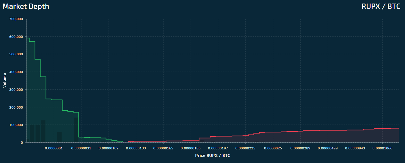 RUPX Market Depth
By looking at this depth chart, we can see a couple of issues:
- The x-axis values are too wide.This indicates very little interest at one price.
- Demand is uneven.Buying or selling this token will result in price volatility and inability to obtain the asset at a fixed rate.
Be sure to check liquidity depth before buying any tokens or else you could be stuck with something you can never get rid of.

