
He steps out into the night air, his suit tailored to be trim. His Bruno Magli shoes strike the cobbled streets, punctuating his walk and announcing his arrival. Bodoni is accompanied by a crowd of stilettos and coats stumbling, swinging their Gucci bags. Together, they own the night in Milan.
There is something about Italy that exudes luxury. It?s in the air, in the wave of a diamond encrusted wrist, in the punctuation point of a stiletto, the careful angling of sleek cheeks and the perfect swirl of carbonara.
The Bodoni type is no exception.
The Bodoni font family dates back over two centuries to its founder, Giambattista Bodoni (1740?1813), who ruled the world of print publishing in the late 1700?s. Giambattista was hailed as the King of Printers when he took over the family printing business. He was famed for moving away from the traditional calligraphy style that dominated the print press business to create a rather modern font, now called Bodoni.
Giambattista was saluted as the father of modern type by many. His original Bodoni font has sired many children over the past two centuries. Even in his time, the Bodoni type was not limited to one font, but included many variants that he adapted over his forty years working in the publishing industry.
This modern font is characterised by its elegance and flexibility, and it remained the most popular type until the mid 19th Century. Since its inception, it has undergone many modifications and changes, but is still reminiscent of the original serif font created by Bodoni.
Massimo Vignelli, a famed Italian designer, praised the type as being one of the six necessary fonts to be used. ?Bodoni is one of the most elegant typefaces ever designed?.
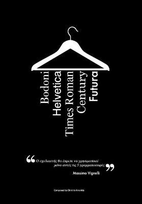 The only typefaces you need ? Massimo Vignelli
Hallmarks of the Bodoni Typeface
Bodoni falls in the serif category. The serif superfamily usually dominates the world of print, as it has been labelled easy to read. Bodoni was widely applied in the fashion industry and print media, therefore using the serif font was a mark of its time.
The Bodoni font has also been classified in a variety of ways according to its style. Originally, it was labelled a ?Transitional? font due to its Baskerville inspiration and the contrast between its thick and thin line strokes. However, then it was classified as a ?Didone? type, which is a ?modern? type, due to broad strokes reducing to thin hairlines, along with unbracketed serifs that abruptly change from thick to thin without a transitional curve (Spoon Graphics).
It is possible to see how Bodoni has small changes to its original design. Many modern Bodoni fonts boast certain flairs and finishes that are resurrected Bodoni?s earlier days. Bodoni also presents an interesting study as it shifted from being a predominantly print font to having a place on the screen. This translation from one technology to another made a mark on the font, and minor changes have been made to ensure that the font remains functional across the various technologies, while maintaining Bodoni?s original characteristics.
Bodoni in Use
The Bodoni typeface has been largely used for display and for headings due to its timeless style. It has been a favourite of many fashion brands and upmarket magazines, for example Vogue, Calvin Klein, Gucci and Elizabeth Arden. It can also be seen on movie titles, such as ?Mamma Mia?.
 Bodoni in use in the Calvin Klein logo.
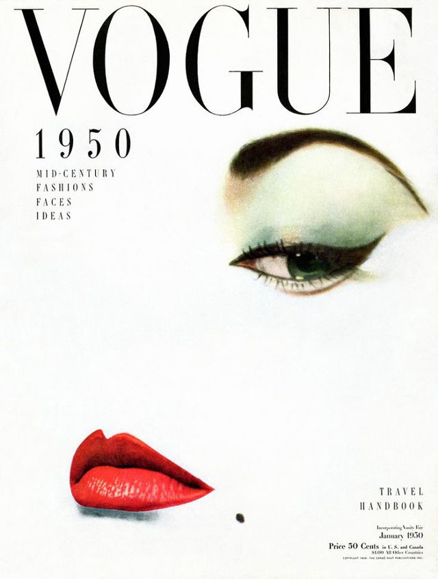
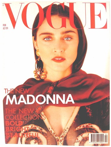 Bodoni?s timeless style has served Vogue for over 100 years.
Despite the popular use of this brand in logo design, it is not often favoured as body text. This is due to the ?dazzle? effect that the Bodoni font letters have in a small point size. The ?dazzle?, or legibility degradation, is caused by the alternating thick and thin lines that make up an individual letter (Shaping Texts).
It is also important to acknowledge that Bodoni is a classic typeface that has been around before the digital era. It was originally designed for print at Bodoni?s print publishing business. The fact that it has been successfully translated and refined for screen use speaks to its timeless and modern characteristics. Due to the change in technology, minor changes in the font needed to be made to account for the transition from print to digital.
The Anatomy of a Classic Bodoni Type
There are three key characteristics that differentiate Bodoni from other typefaces. The first, is the high contrast between its thick and thin strokes (or hairline strokes). The second, is the abrupt or unbracketed serifs used across all the Bodoni fonts. Lastly, the characteristics of the vertical axis and the horizontal stress creates overall geometry and balance to the Bodoni font.
Personally, I like Bodoni. It?s contrasted strokes and flat serifs has given it a timeless look. I also like the flexibility that this type offers throughout the entire type family. Although all Bodoni fonts share similar characteristics, there are still minor differences. But the devil is in the details, and even the slightest change to a serif or tail creates a whole different persona.
Leaning into Libre Bodoni
For this exercise I have chosen to zoom in on the Libre Bodoni font. Libre Bodoni is a modern adaptation of the traditional Bodoni font, created by two designers: Pablo Impallari and Rodrigo Fuenzalida. They worked together and published this modern version of Bodoni in 2014. Bodoni Libre is reminiscent and based on the original design of Bodoni ATF but has been adapted for the web.
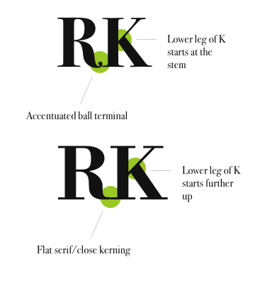
Bodoni is a proud font, and Libre Bodoni is no exception. It shows elegance in its simplicity. The letters are carefully poised and dignified. The careful contrast between the thick and thin strokes show emotion and variation. The indulgent O?s are countered by the stoic stems. The rounded beak at the ?r? is perfectly balanced by the straight, angular serifs. The Libre Bodoni fonts play with all the shapes to create a balanced font.
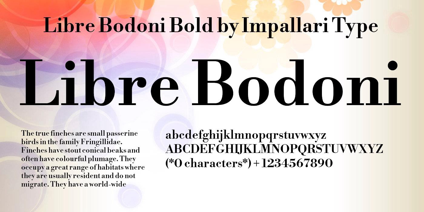 Libre Bodoni, the latest addition to the font family. Credit: Smart Fonts.
This Bodoni font is versatile to suit its new platform and is available in 104 different languages. Yet it still remains true to its core as a type associated with ?elegance, style, luxury and fashion?.
Deciphering the Libre Bodoni font
To indicate that all Bodoni?s aren?t the same, I will compare and contrast two of the font family. Libre Bodoni is fairly new on the scene and is an open font created for the web, which I will compare to Bodoni 72, an older font that was designed as a display and headline font.
As seen in the image below, there are slight but key differences in the two Bodoni fonts. Although both are serif fonts with the traditional high modulation in the strokes, the differences show themselves in the serif styles. The Bodoni 72 font presents a natural, rounded serif, whereas the Libre Bodoni font boasts a completely flat serif that is angled, making it feel cleaner, and almost robotic in a sense. Bodoni 72 has a more stylised and emphasised curvature throughout all characters, whereas Libre Bodoni sticks to flat, angular finish to the serifs.
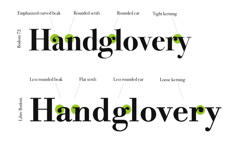
 Comparing the Bodoni 72 to the newer Libre Bodoni fonts.
Another key difference that separates these two siblings is the size of the characters. Libre Bodoni shows a larger caps and x-height at the same 60pt size, than Bodoni 72. It?s also interesting to note that Libre Bodoni characters are quite a bit wider too. Yet, this width does not come from wider stems, or the weight. Instead, it comes from increased white- and counter-space within the characters such as the ?H? and the ?O?.
This adds more breathing space to the Libre Bodoni, which is ironic as the Bodoni 72 is supposed to serve as a display and heading font, whereas Libre Bodoni is intended for the web.
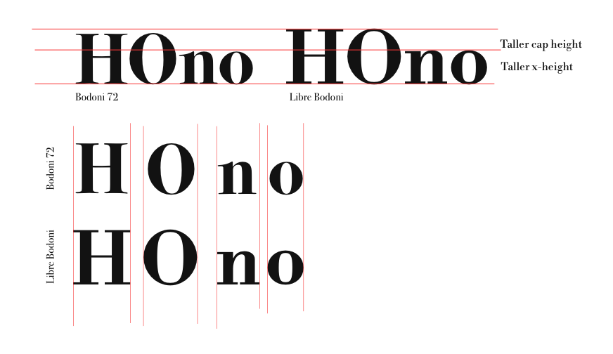
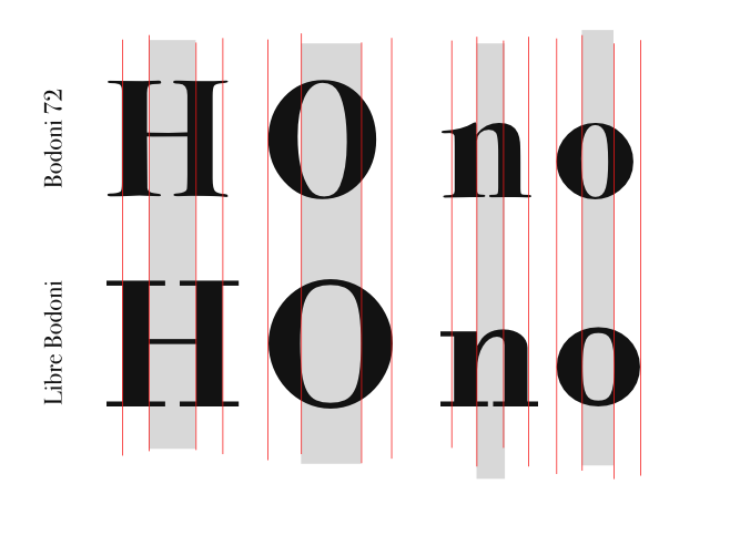 Comparing height and width between the Bodoni 72 to the newer Libre Bodoni fonts.
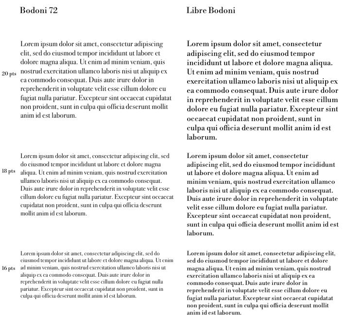
And finally, playing to none of the Bodoni?s strengths, I will examine them as body text. To recap, Bodoni is not famously used as body text as the highly modulated thick and thin strokes ?dazzle? the reader, making the letters jump.
Below you will see a staggering of the two respective Bodoni?s at various font sizes. Libre Bodoni seems to be more legible, but only just at 20 pts, which is fairly large. At the same time, Bodoni 72 is difficult to decipher. But these fonts were never intended for body text, so it is not surprising.
The fact that Libre Bodoni works at 20 pts and is sort of legible, is due to additional space between the letters and within the characters, as well as the slightly heightened caps height. Somehow, although the width of the actual strokes is remarkably similar (see above), Libre Bodoni almost looks like it has been presented in a heavier weight or in bold, alongside a Roman Bodoni 72. However, this is not the case.
In Closing
Despite these differences, the trademark characteristics of Bodoni continue to shine through. This proud and fashionable typeface can be identified across the variations of the family.
Bodoni continues to play a significant role in the world of fashion and headlines, although it is clearly not suited for body text. There are many variants of Bodoni that exist today, each with a different strength and a different feel.
I believe that the functional design of something often lends itself to the technology of that time. The Bodoni font was functional (and popular) in print publishing, but moving into the digital world you can feel the tension. Typographers would love to translate this timeless, Didone typeface onto the World Wide Web, but certain functional features that are the hallmark of Bodoni makes it a challenging experience.
Although Libre Bodoni has been designed for the web, there are startling few examples of this font being used on websites for anything other than referring to Bodoni in print. Maybe Bodoni should be left where it started: as a classically modern and elegant display and heading font used predominantly in the publishing industry.
