I?ve been reading some articles here and there about flags, so now I?ve gotten in the mood to write a fun post ranking all 50 American state flags in order from worst to best. I?m going to loosely follow Ted Kaye?s five principles for good flag design, which are:
- Keep it simple, so simple a child could draw it from memory.
- Use meaningful symbolism.
- Use two or three basic colors.
- No lettering or seals of any kind.
- Be distinctive or be related.
I?m also going to include my own highly subjective musings about what I find personally entertaining.
(In case you?re wondering, yes, I am a fan of The Big Bang Theory. No, Sheldon is not my favorite character. Yes, I wish Fun With Flags was a real channel on YouTube.)

A few American state flags are decidedly cool and iconic, others seem to have been borne of utter laziness. So, without further ado?
50. WASHINGTON
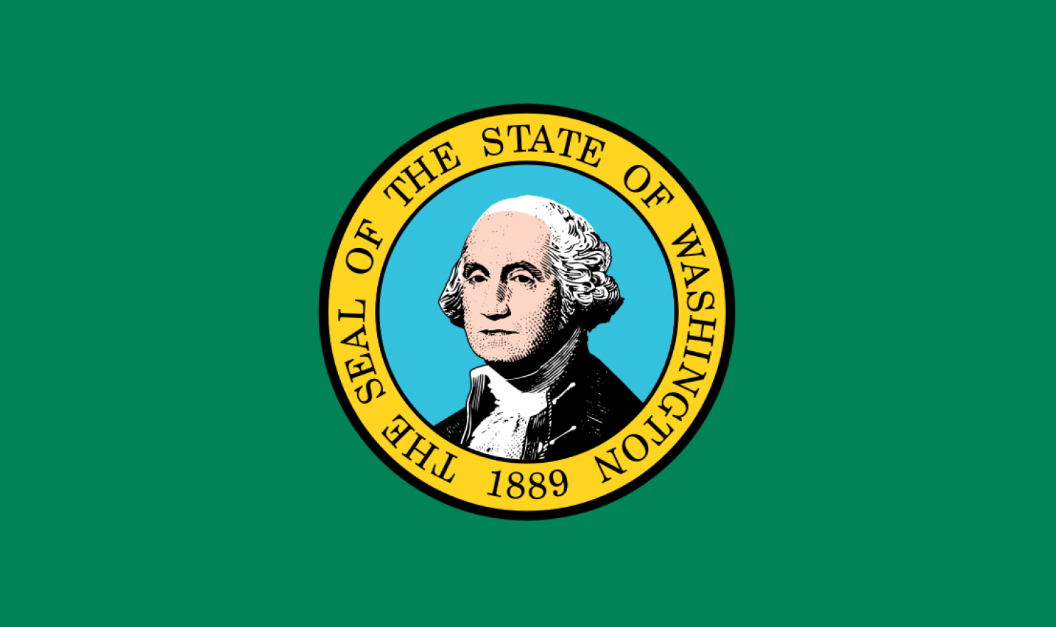
The worst flags are all just lazy! It?s really hard to objectively rank them. The logic is always: Choose a color, slap on the seal and maybe write something on there. For Washington, the green looks ugly. And you think you can just slap on a picture of ol? George and get a way with it? Show some effort!
49. DELAWARE
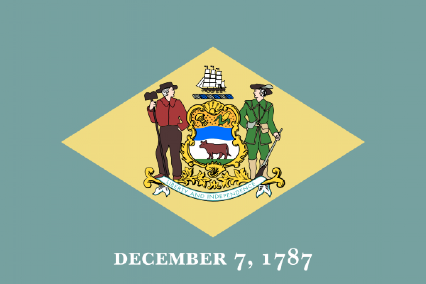
The colors are just ugly. And it looks like someone went in and typed the date in MS Word. Not to mention there?s a seal and words.
48. CONNECTICUT
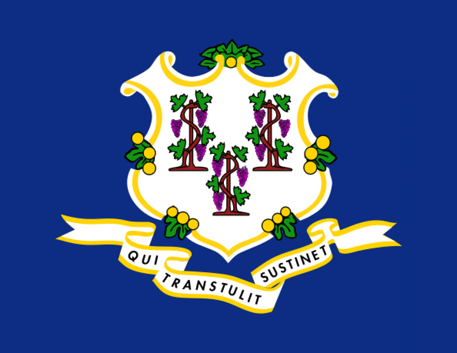
What is this? Honestly, Connecticut, get with it.
47. NEVADA
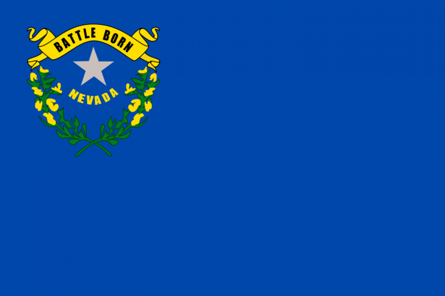
I?m stealing this comment from someone else, but this really does look like someone got the wrong size image file and scaled it down so it wouldn?t get too pixelated. Nevada, you have too much empty space.
46. LOUISIANA
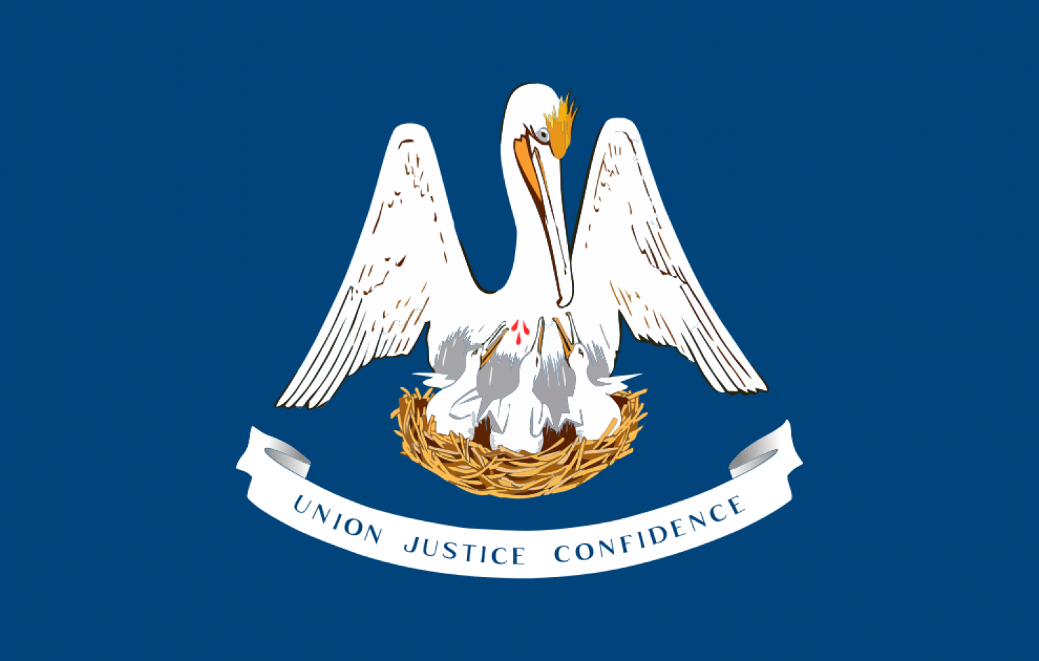
Pelicans? I?m confused?
45. Idaho
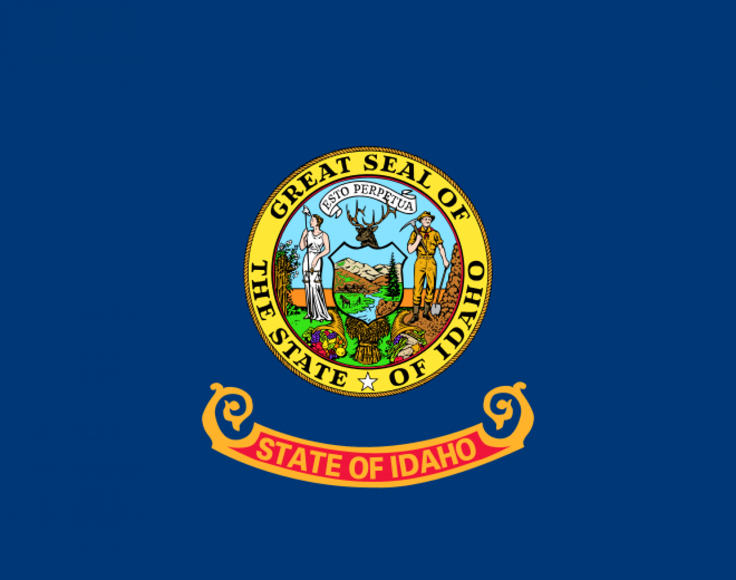
I can?t ignore the fact that ?State of Idaho? is written twice. It makes this flag moronic.
44. MASSACHUSETTS
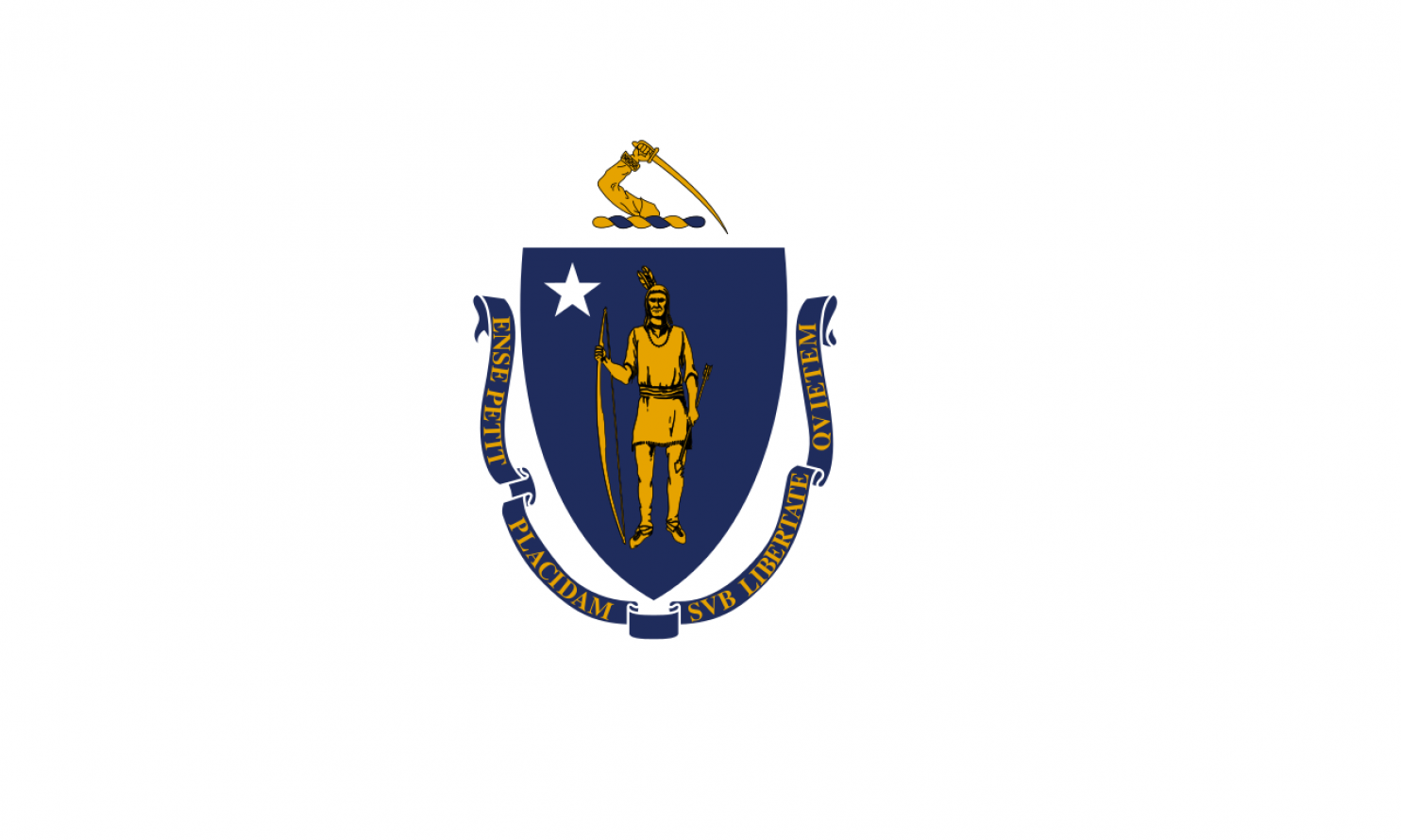
This flag totally makes you squint to figure out what?s going on. Also, I think I saw this movie when I was a kid. That colonist totally stabs the native in the back. On top of that, even if I could read Latin, that text is tiny!
43. KENTUCKY
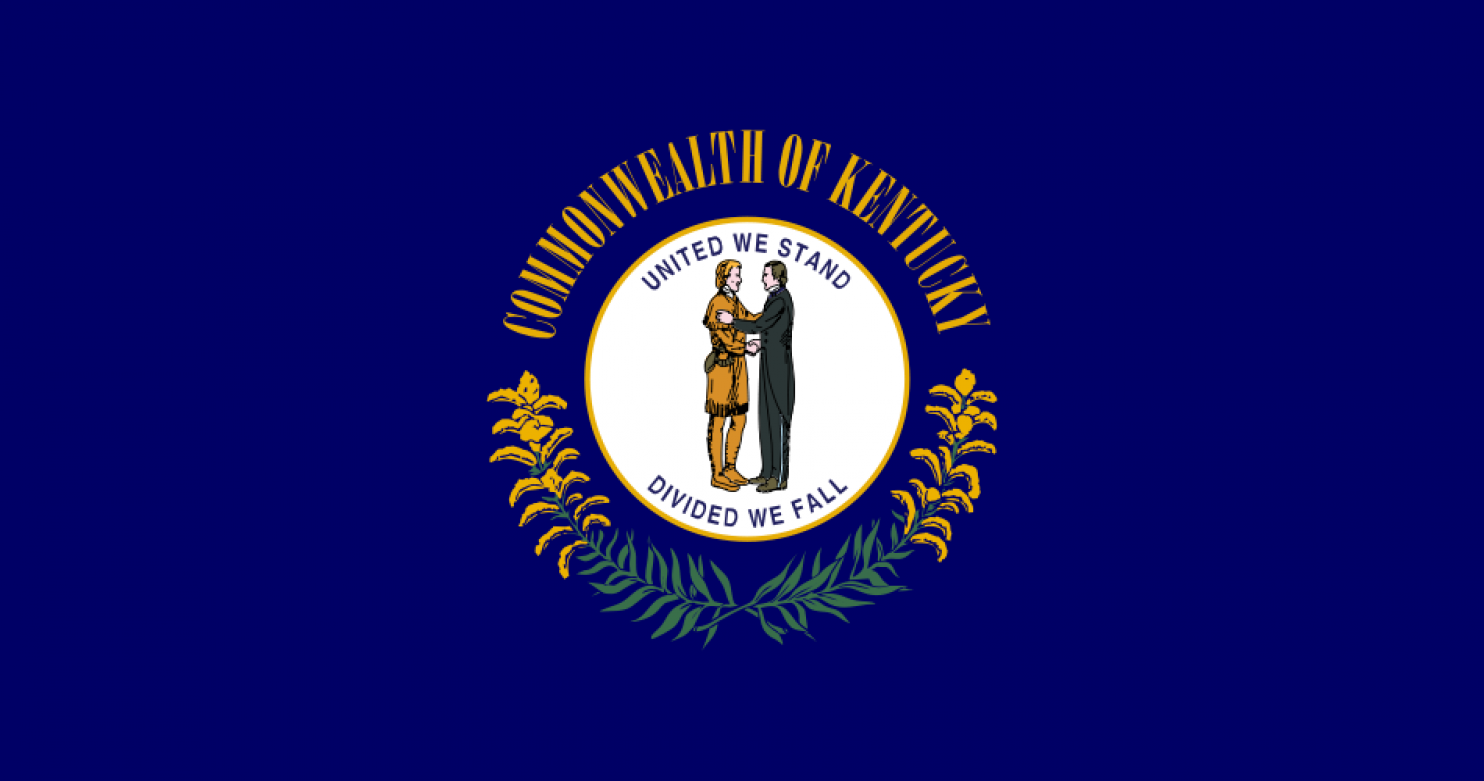
I could barely even read the letters across?
42. NEW JERSEY
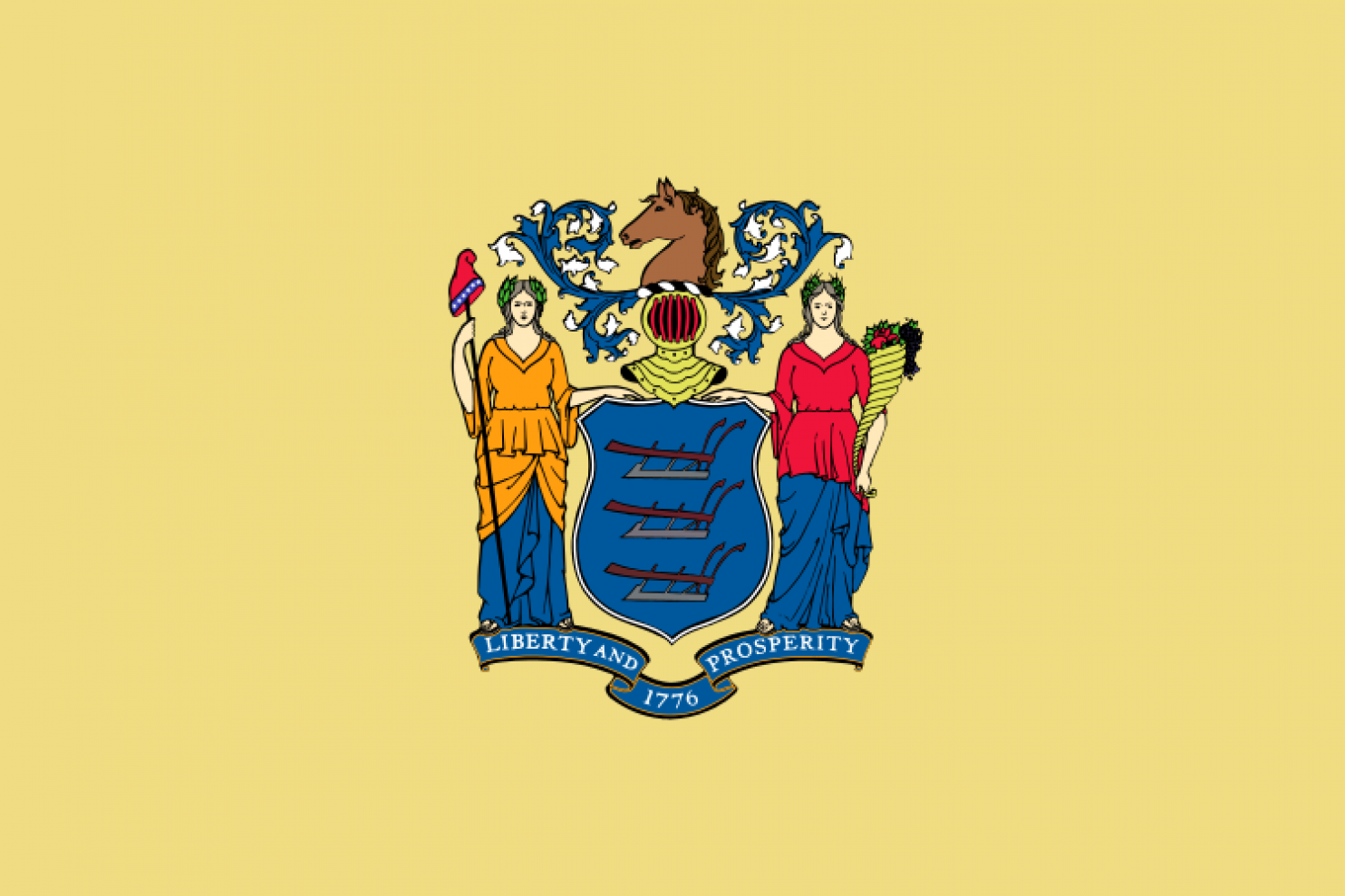
That hat is just throwing me off. Did she kill one of Santa?s elves? Sorry, I just can?t?
41. PENNSYLVANIA
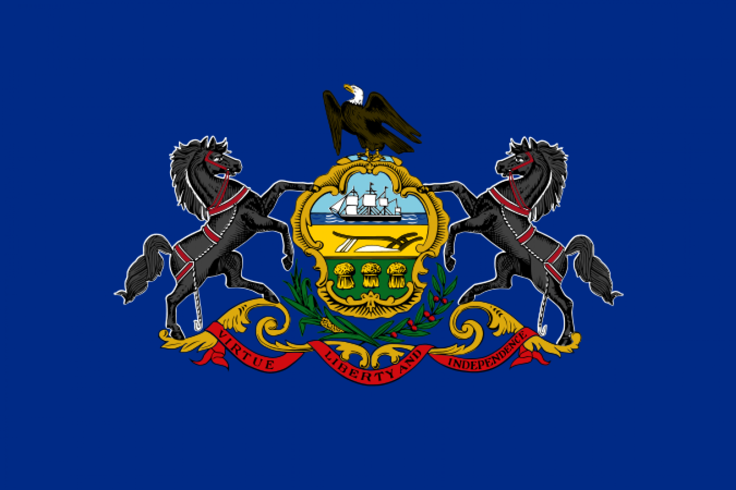
Are you trying to be evil?
40. NORTH DAKOTA
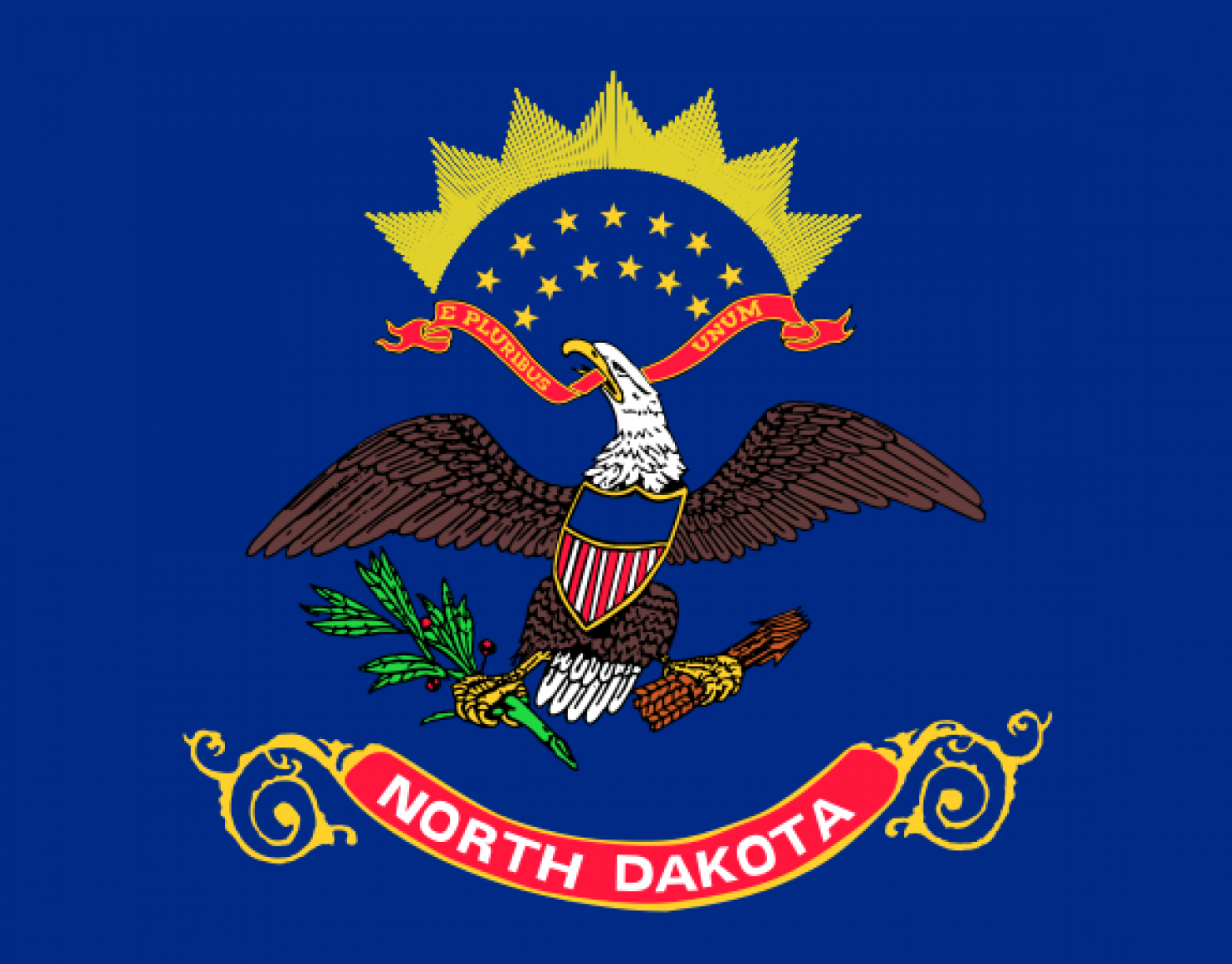
Painfully unoriginal.
39. ILLINOIS
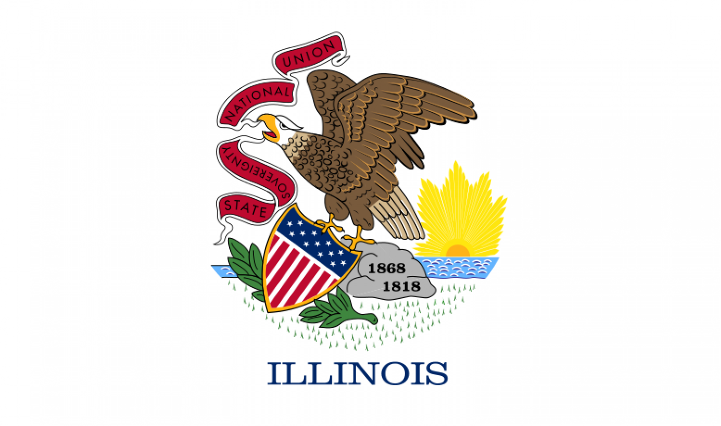
A little bit less painfully unoriginal. Why is ?Sovereignty? upside-down?
38. UTAH

Still painfully unoriginal. Ooo! Bee hive!
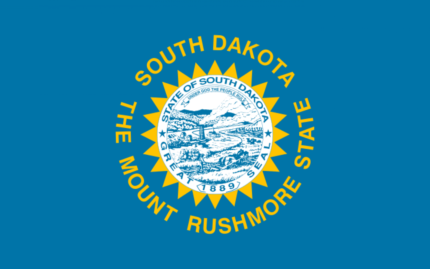
37. SOUTH DAKOTA
36. MINNESOTA
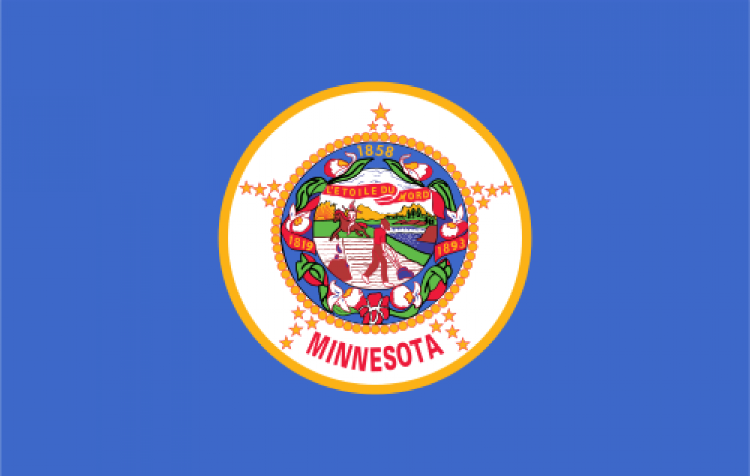
Too busy.
35. NEW HAMPSHIRE
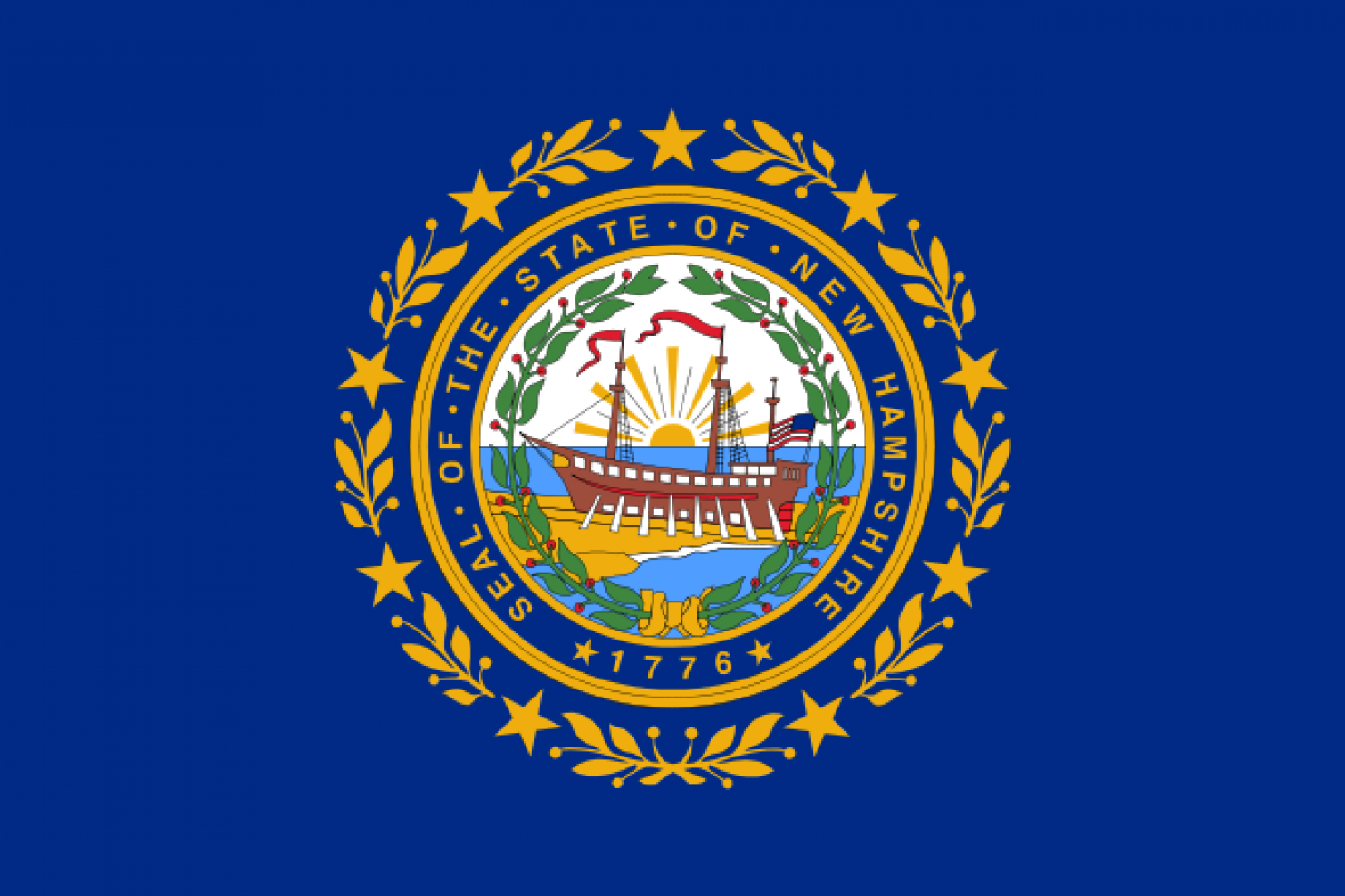
Aren?t ships supposed to go in the water? Idiots.
34. NEBRASKA
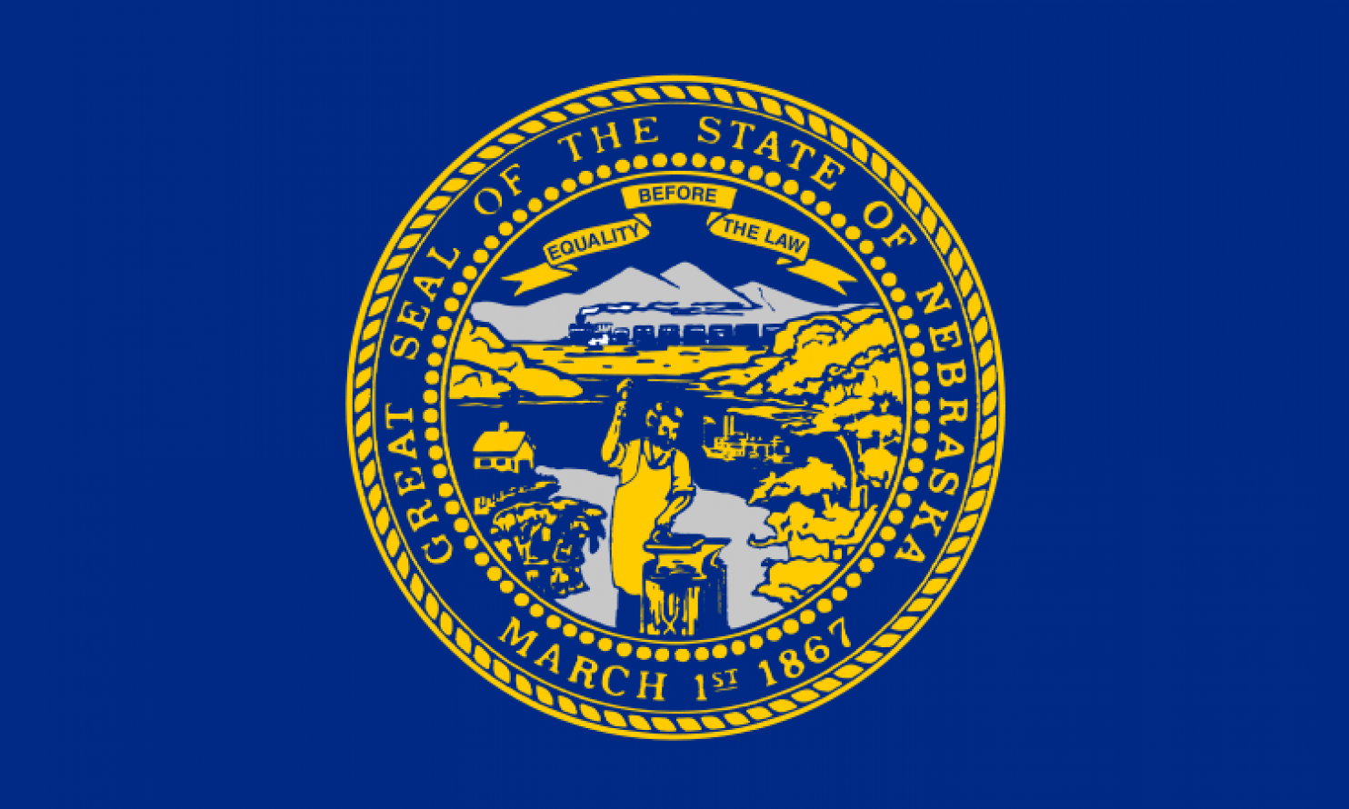
Somehow I really like that guy. I?d like to have a beer with him. Who knows, maybe even elect him President? He?d probably be better than Trump.
33. WEST VIRGINIA
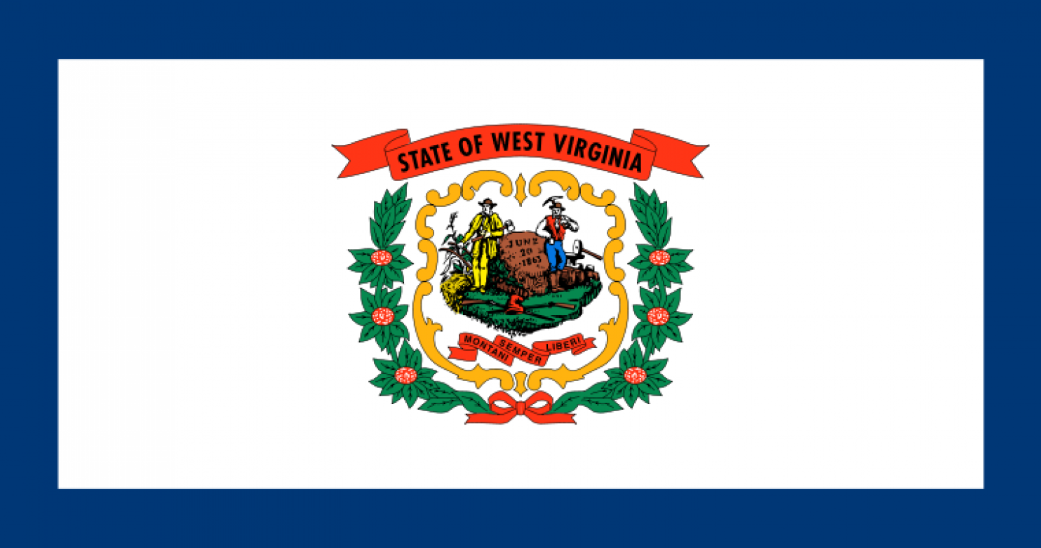
Moving on from seals to coats of arms. I?m still disinterested.
32. VERMONT
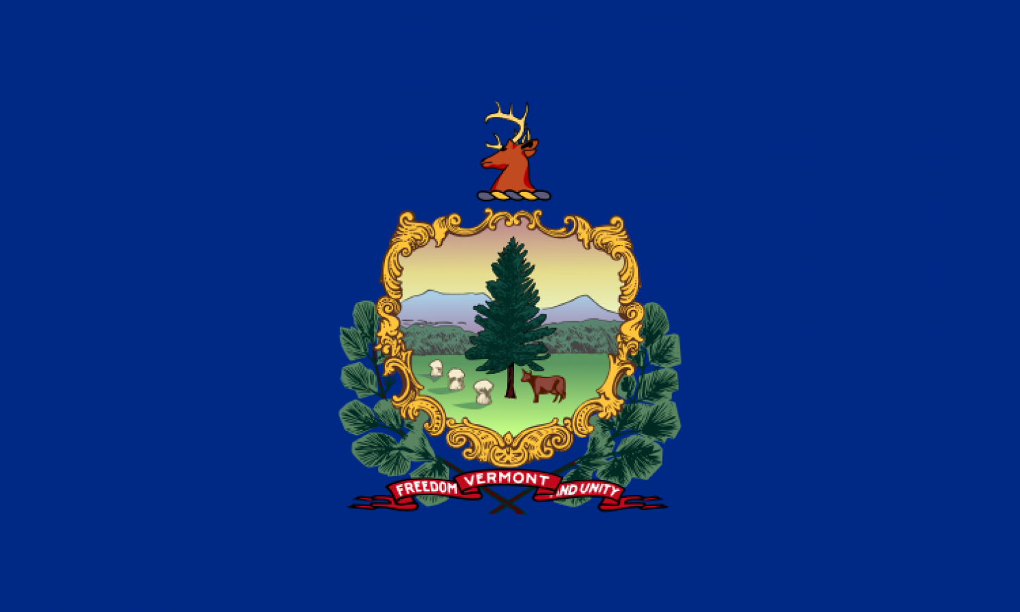
I?m bored. Entertain me with cheese and syrup.
31. MAINE
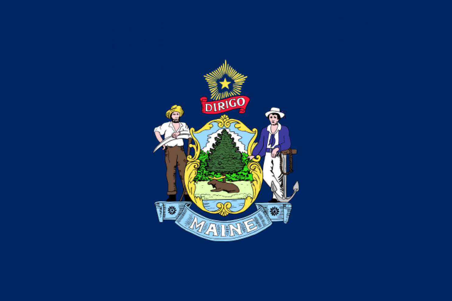
Pluses: Honestly depicts white trash. Has a moose. Minuses: No lobsters. The star on top looks like it?s for MSSR (Maine Soviet Socialist Republic).
30. MICHIGAN
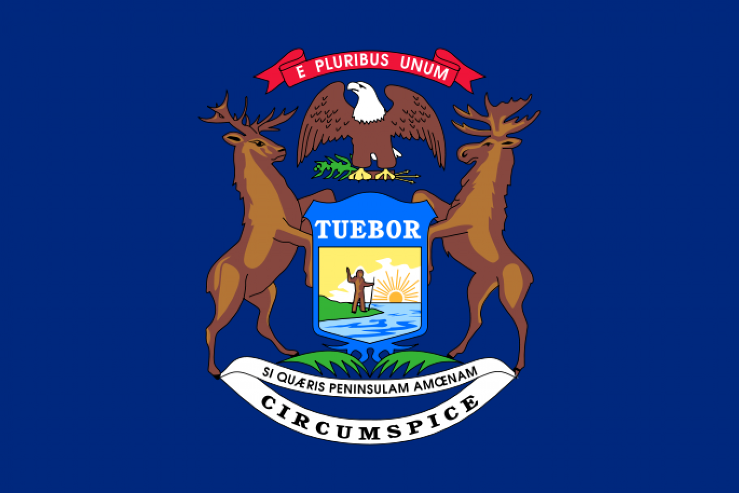
There?s something about that guy that?s welcoming? Ahhh! It?s Bigfoot!
29. NEW YORK
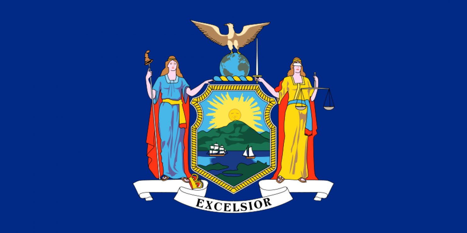
There?s so much in here, so it ranks the highest among the others with just a coat of arms. Plus, the ?Excelsior? thing is cool and kinda Knights-of-the-Round-Tabley. Correct me if I?m wrong, but has she speared herself half a croissant?
28. RHODE ISLAND
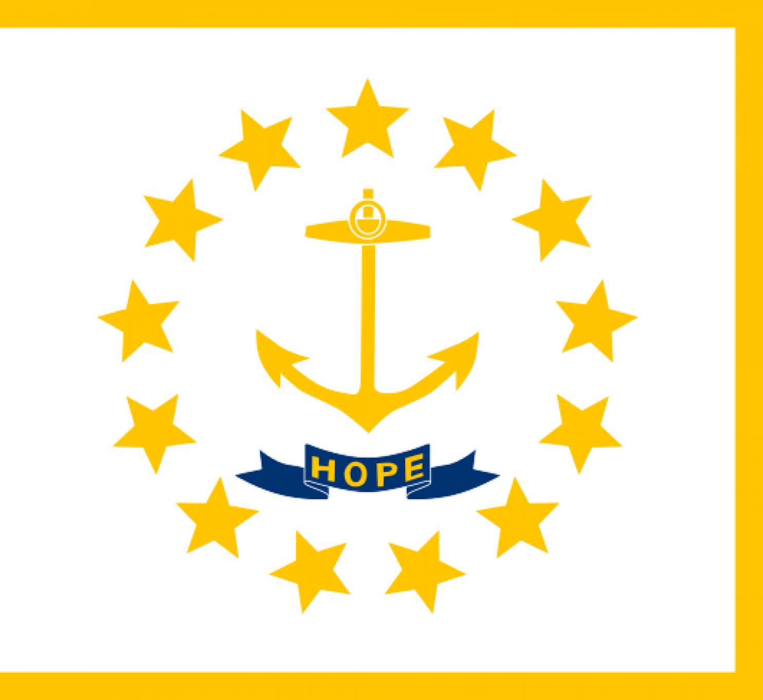
Unique but weird.
27. OREGON
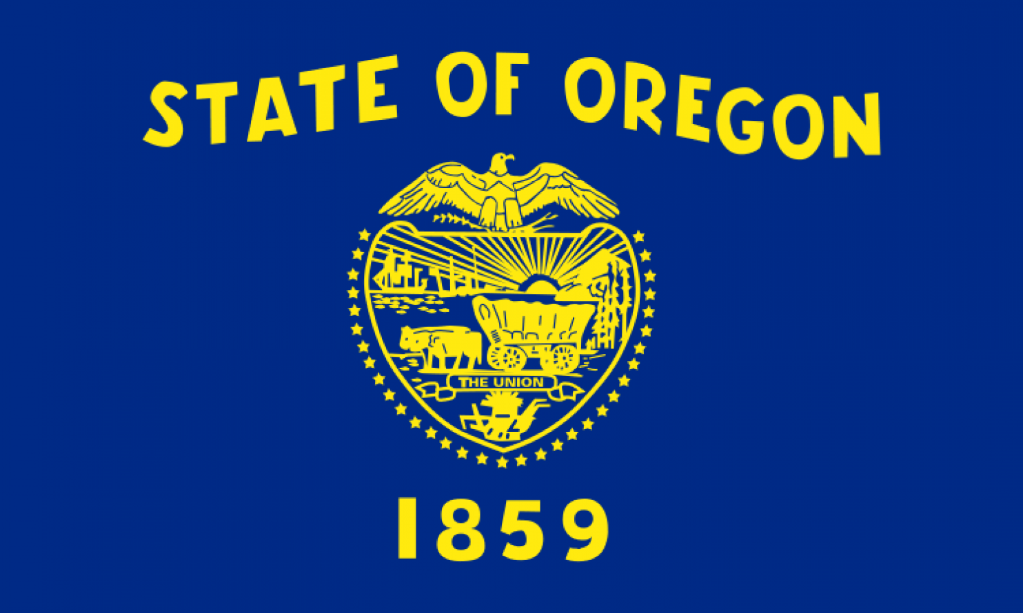
There?s something I like about the state flags that write the state?s name in bold font. This one looks like it was made by people with disentery.
26. WISCONSIN
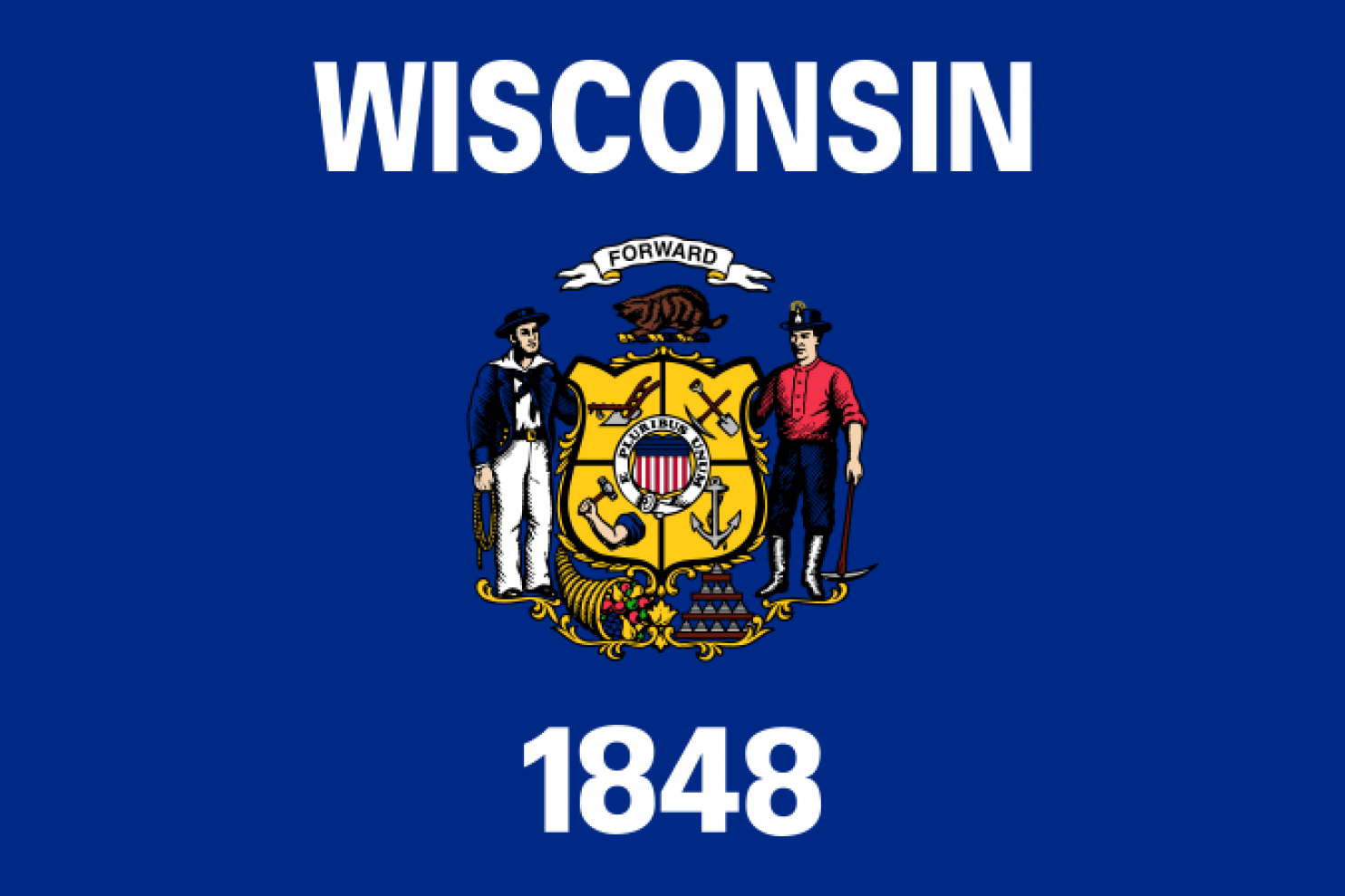
A little better?
25. KANSAS
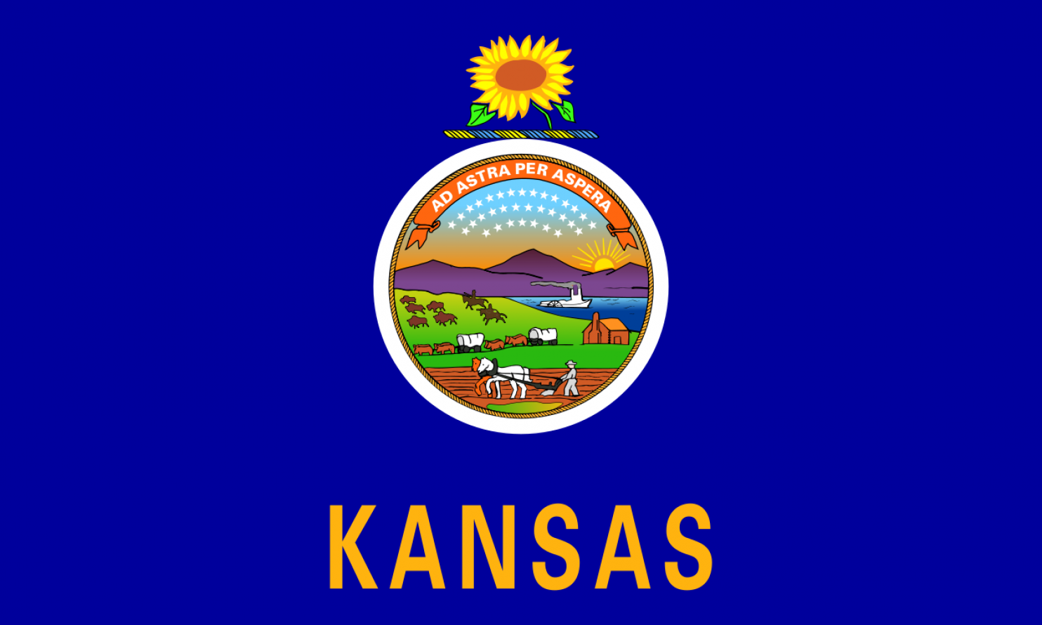
Mountains in Kansas? HAHAHAHA?
24. MONTANA
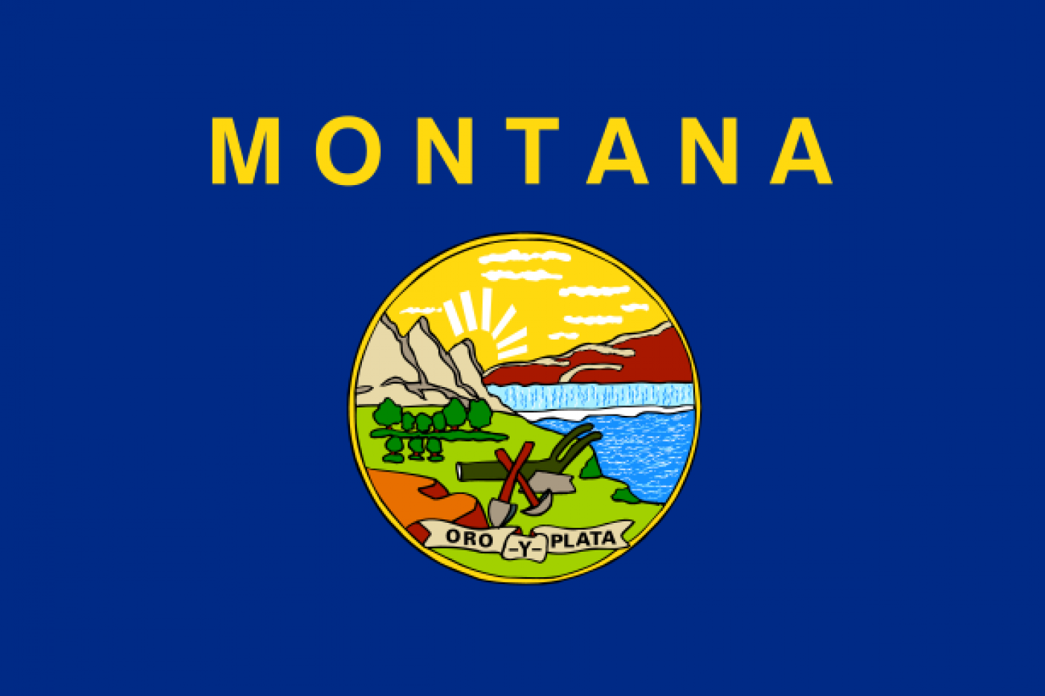
I like the proportions of this one.
23. OKLAHOMA
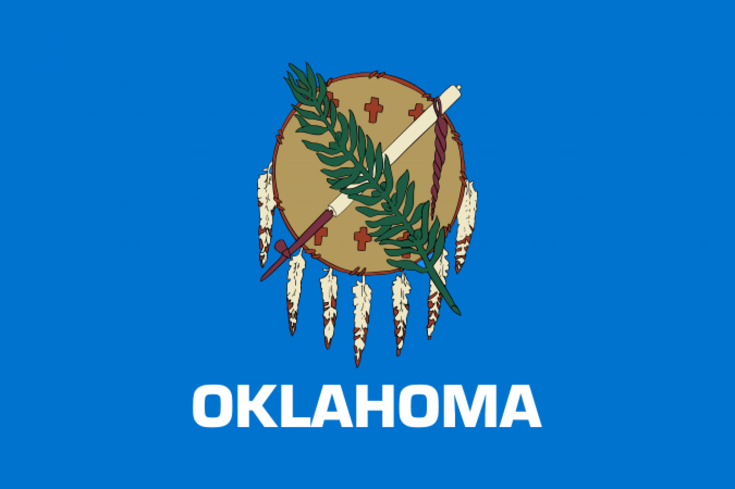
By far the best among these. I wish there was a ?!? at the end though.
22. VIRGINIA
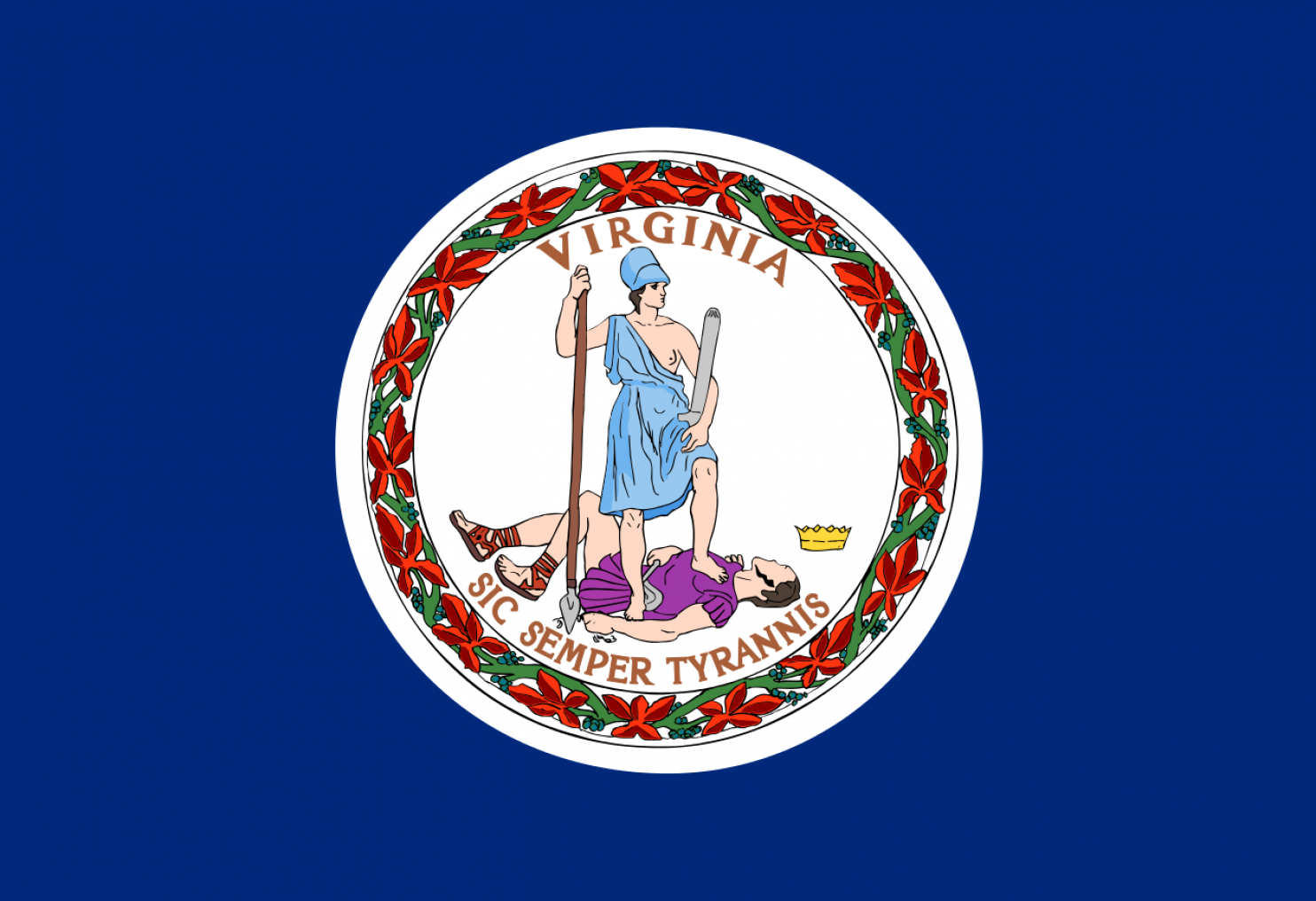
Although this is just another shameless seal, I really love how Lady Liberty has conquered tyranny. Sadly, she is being very un-PC by showing a tit! Doesn?t she know that that?s a thing these days? Geez.
21. FLORIDA
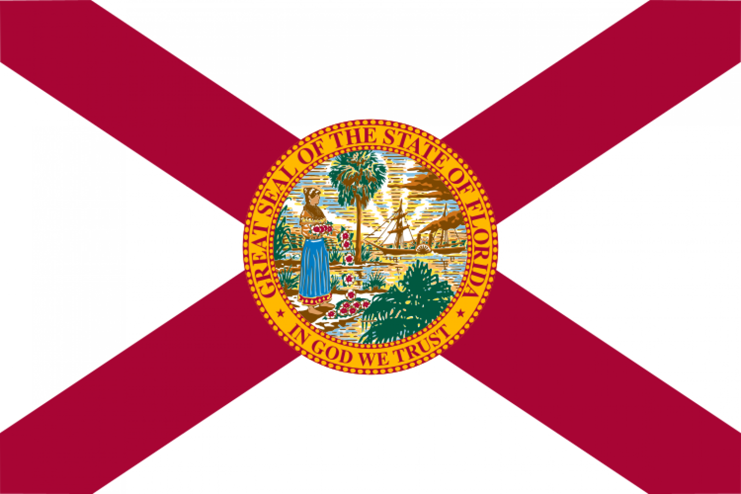
This one has a seal slapped on it, but it looks better because of the design.
20. MISSOURI
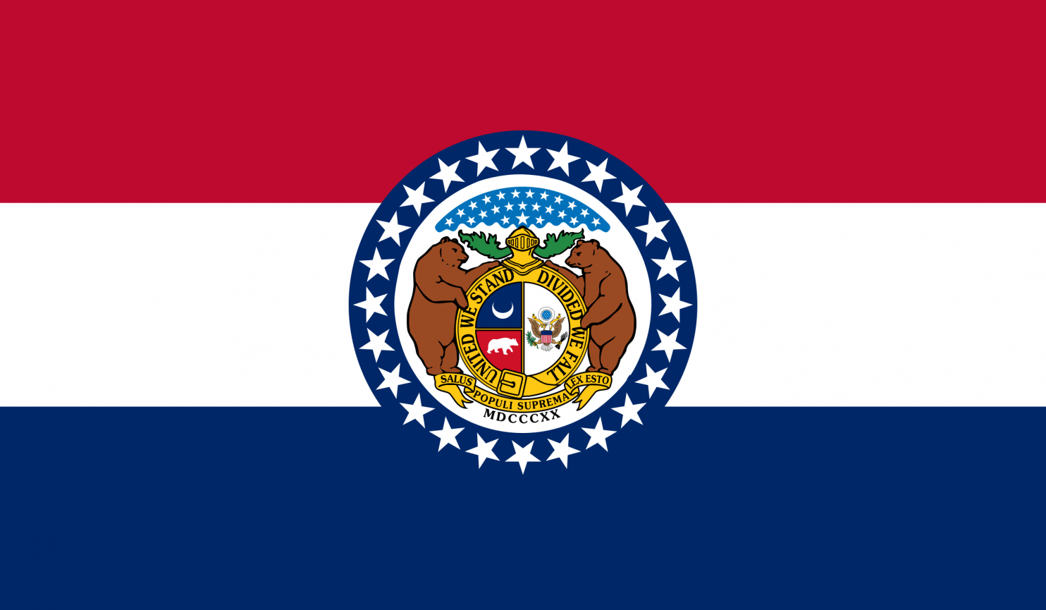
Same deal with the seal again?
19. WYOMING
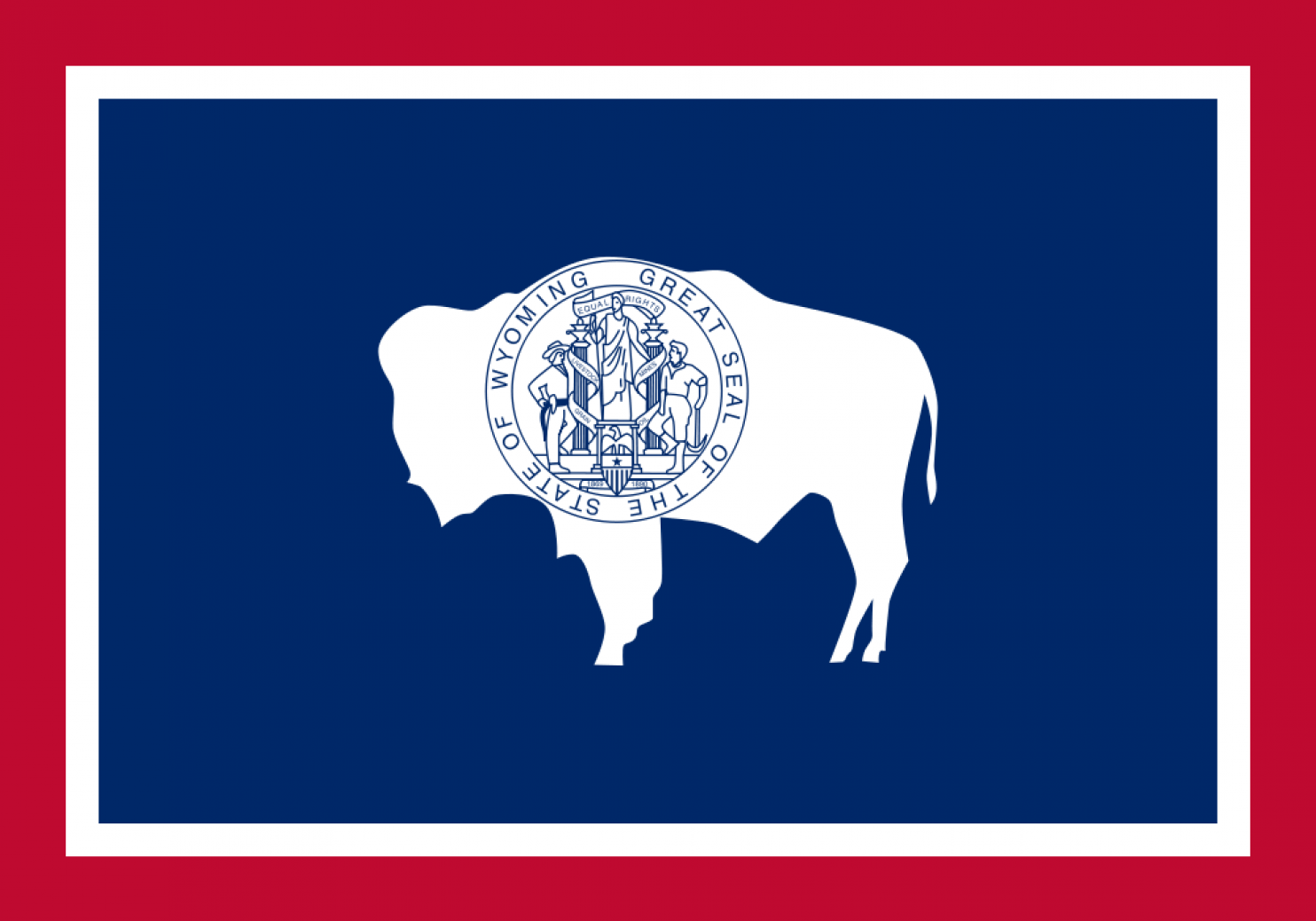
Never was a fan of the colored border design. The buffalo wins you points, but the seal?
18. GEORGIA
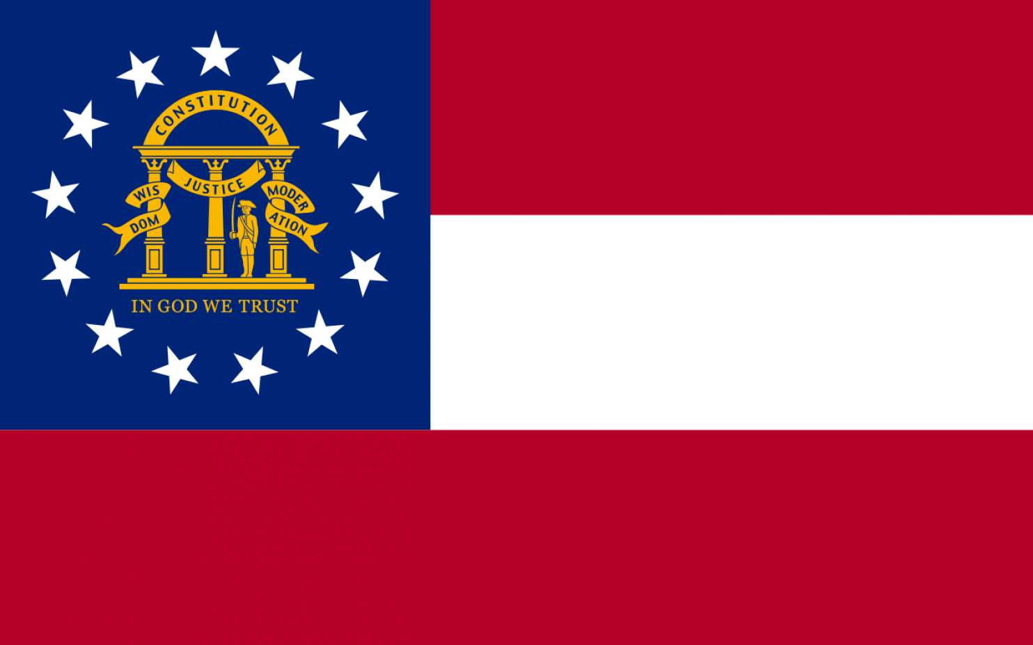
Would have been much better without the seal. Or maybe just three pillars holding up the arch with no text.
17. INDIANA
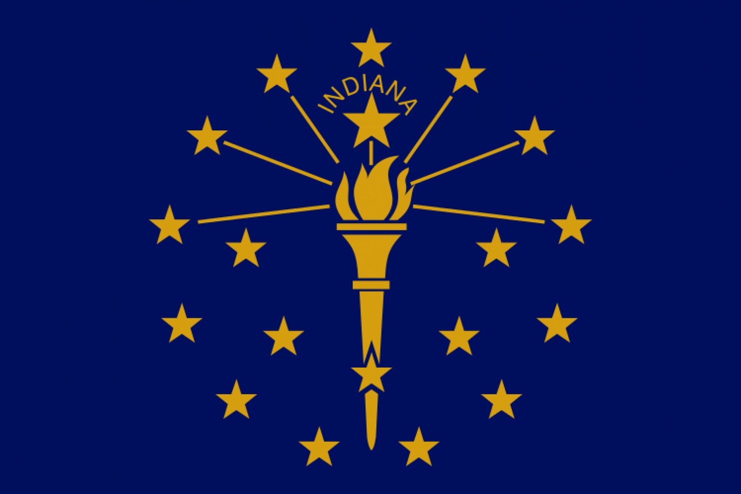
Original design, but somehow not cool enough to warrant a higher ranking.
16. ARKANSAS
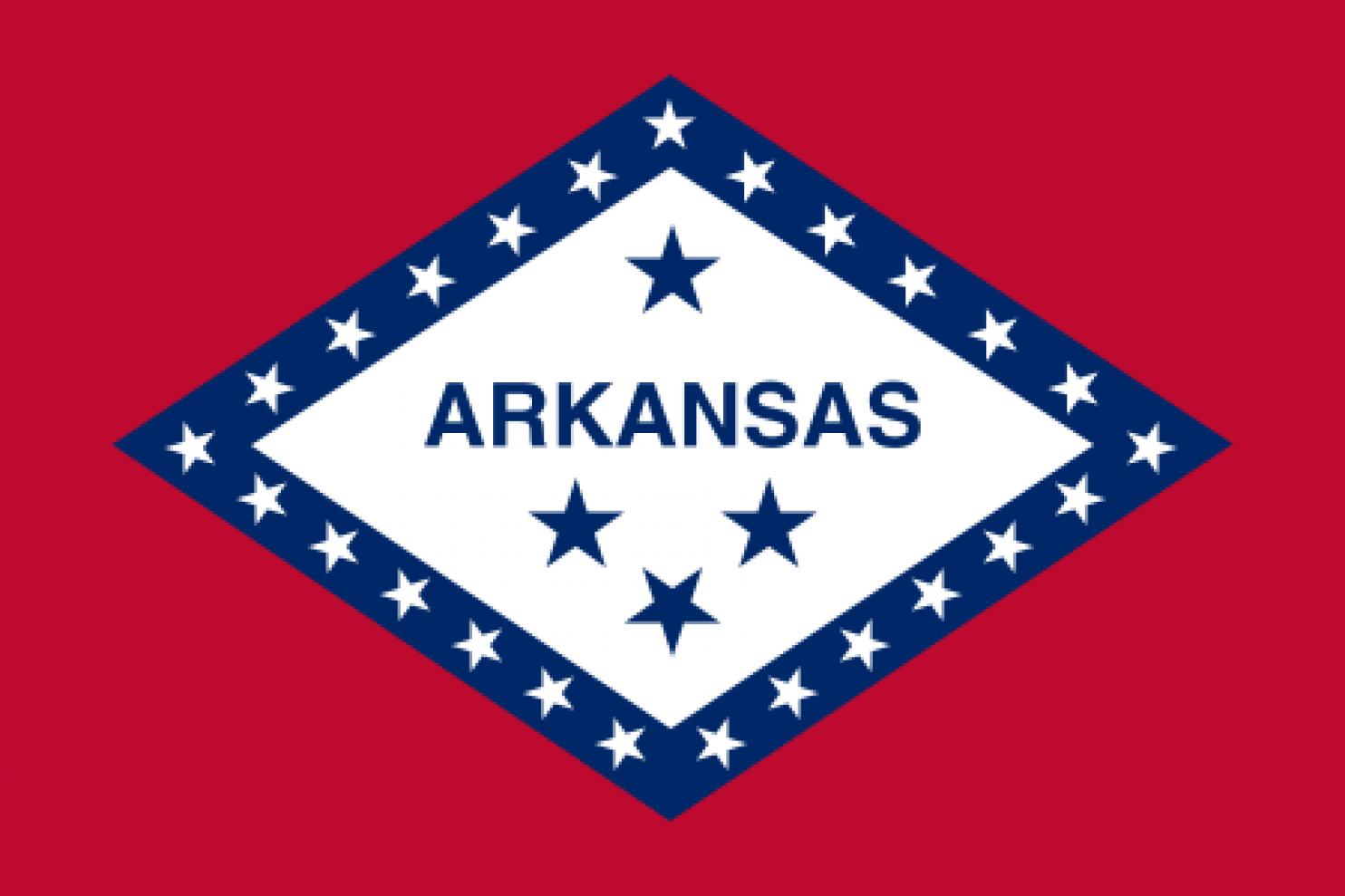
The only reason it?s higher than Indiana is because it has three colors.
15. NORTH CAROLINA
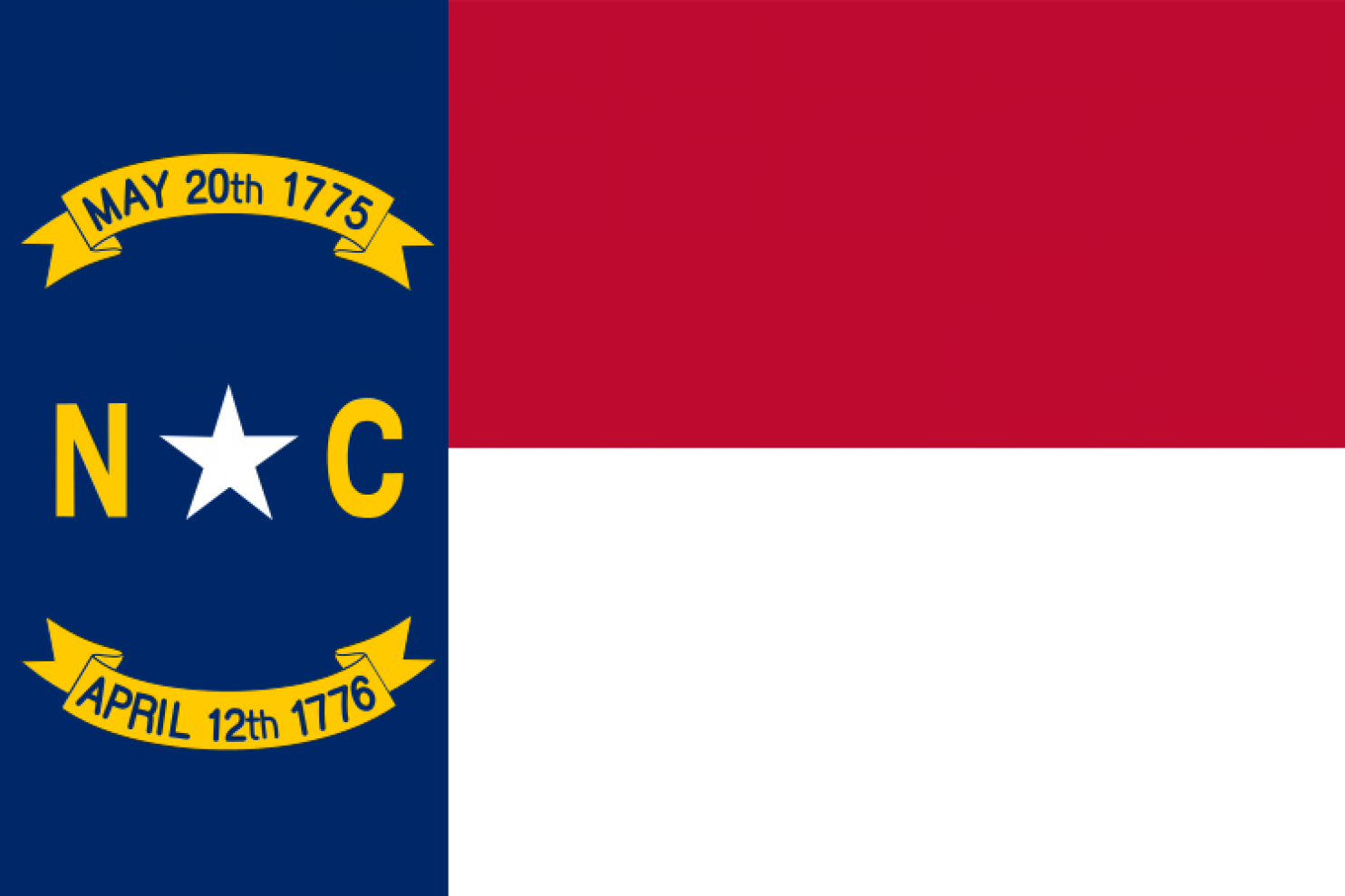
RIP North Carolina? Lived and died within 11 months? I don?t get it.
14. IOWA
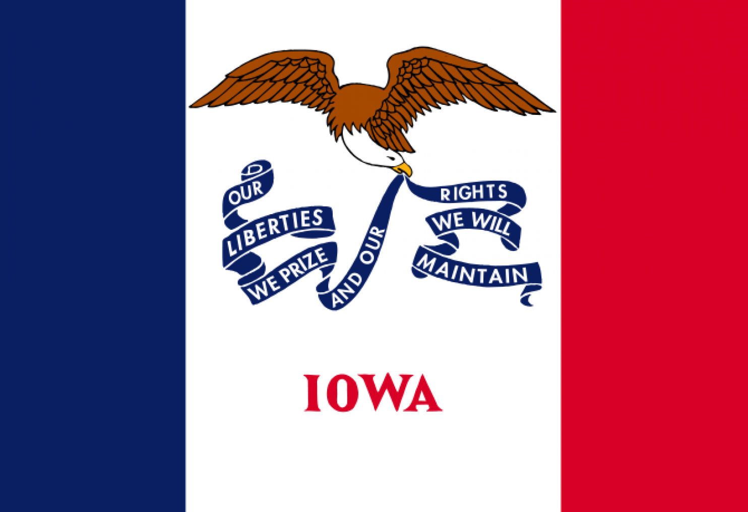
I do like this one, but the words make it go down in the ranks.
13. SOUTH CAROLINA
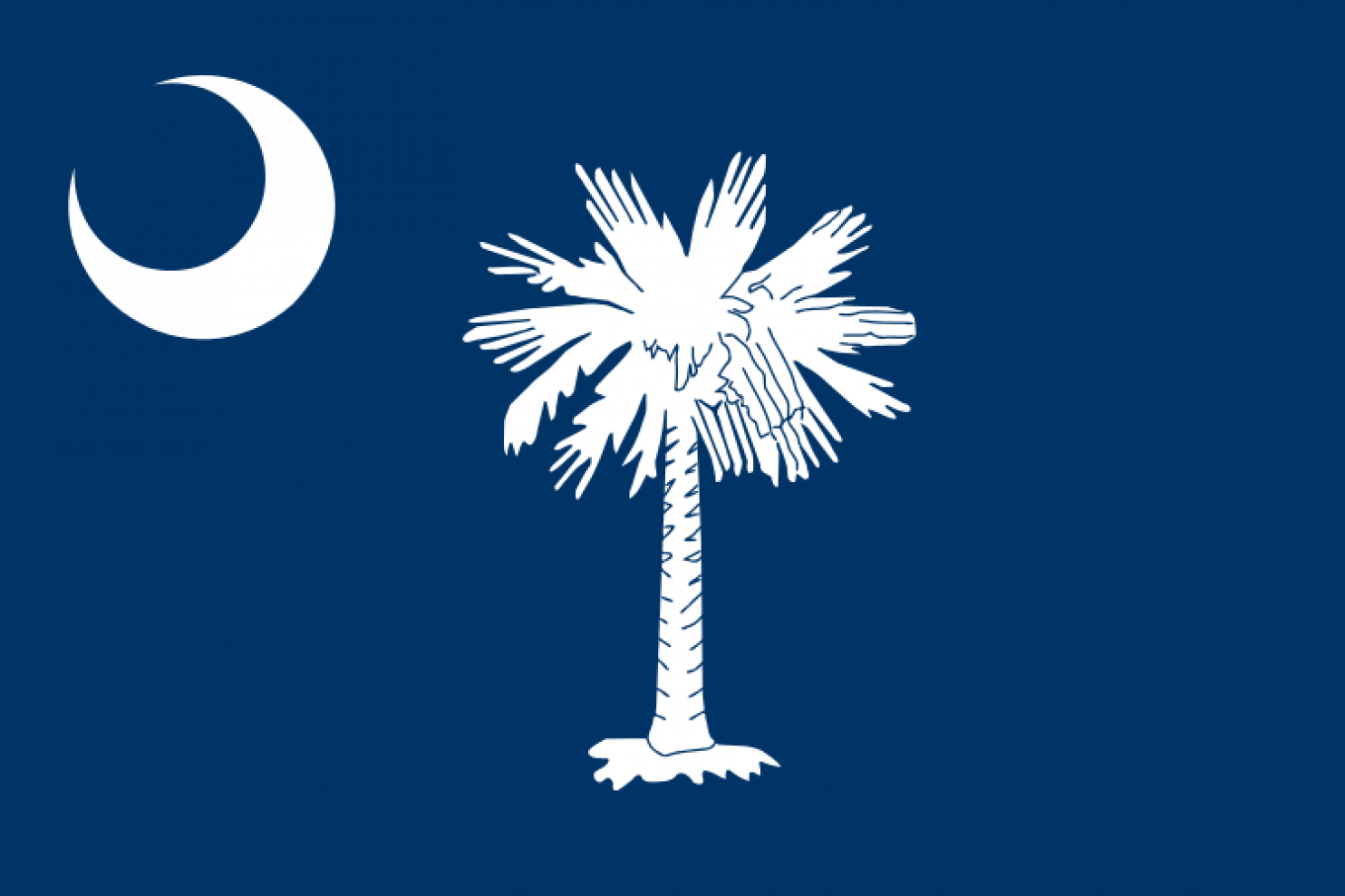
The meaning of this still baffles me. But it is somehow still memorable and easily distinguishable from a distance. I feel like if you made it green, it would just become the flag of Agrabah.
12. MARYLAND
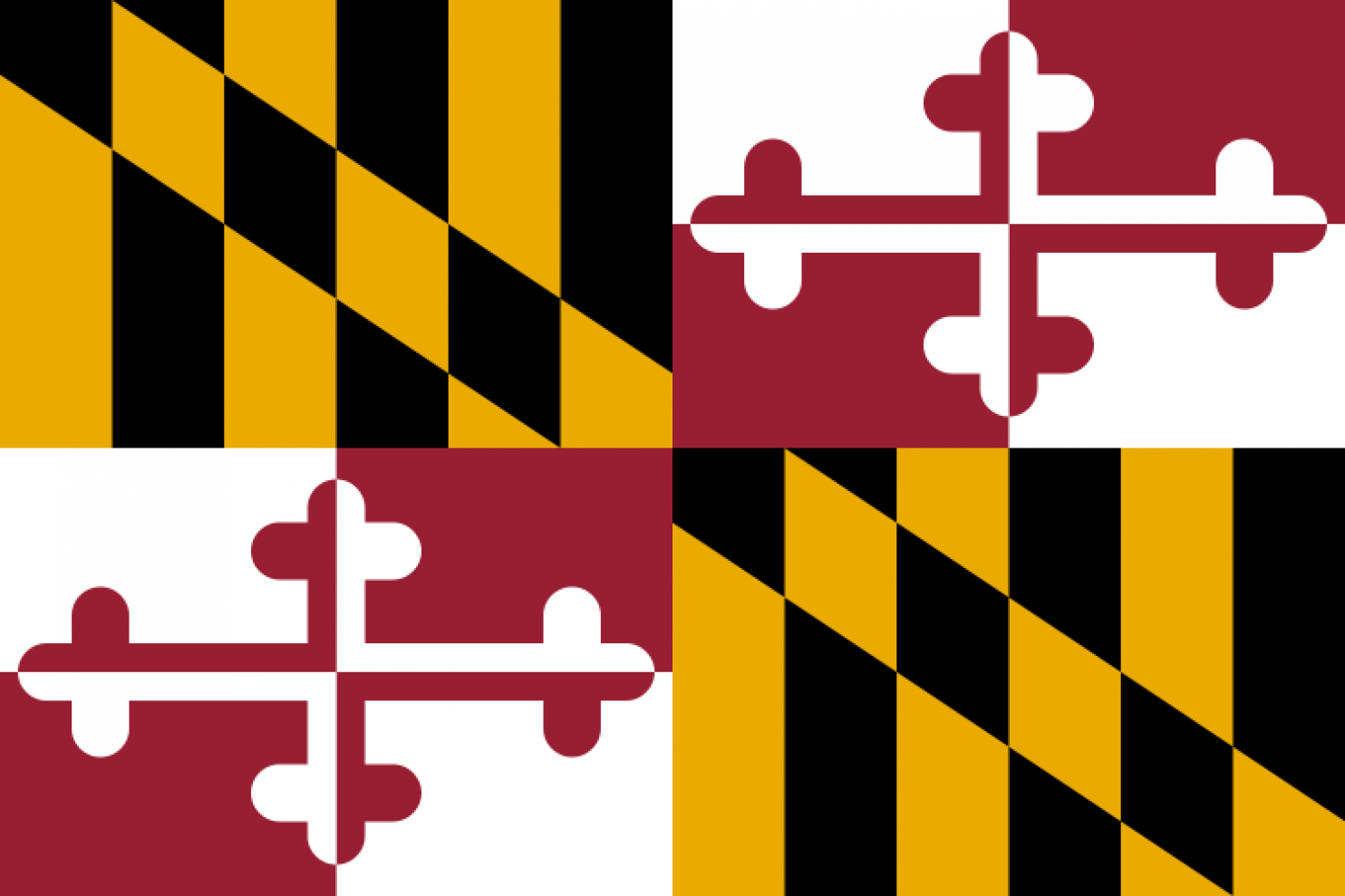
Ok, you actually put some effort and came up with a design, but this is just too much. Calm down, Ok?
11. HAWAI?I
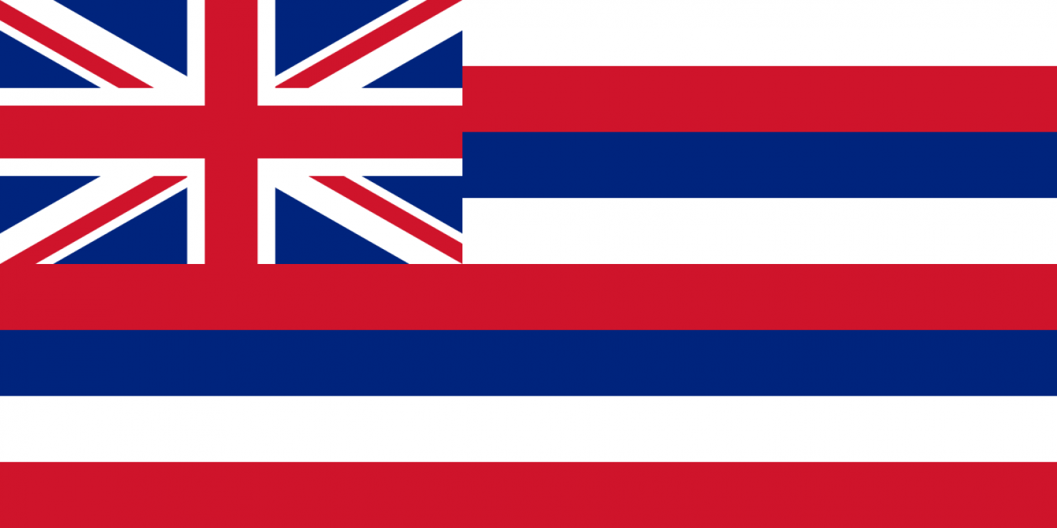
Did you really love the English that much? Plus the colors are kinda busy.
10. OHIO
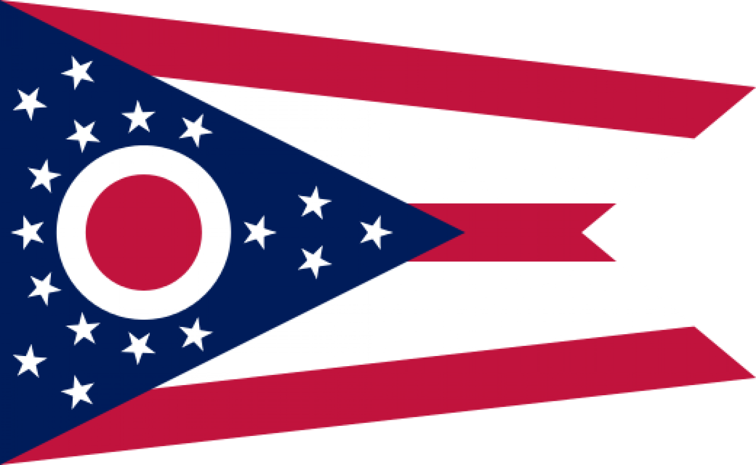
?O?, how you make my eyes crooked, Ohio. ?E? for effort.
9. ALASKA

It has a unique design, but still kinda feels awkward. I still think it would be better to just write, ?I can see Russia.?
8. ALABAMA
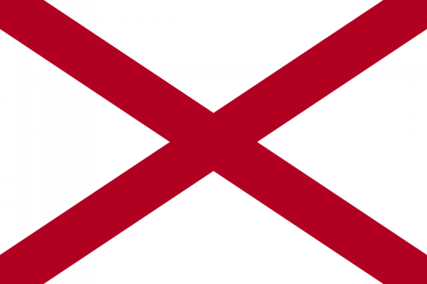
The design is easy to recognize, but I find this one lazy and easily confused with Ireland.
7. COLORADO
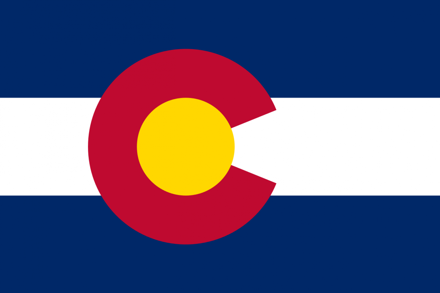
Colorado follows all the rules, but I can?t help myself from thinking it was made by a committee hired by Hillary Clinton.
6. MISSISSIPPI
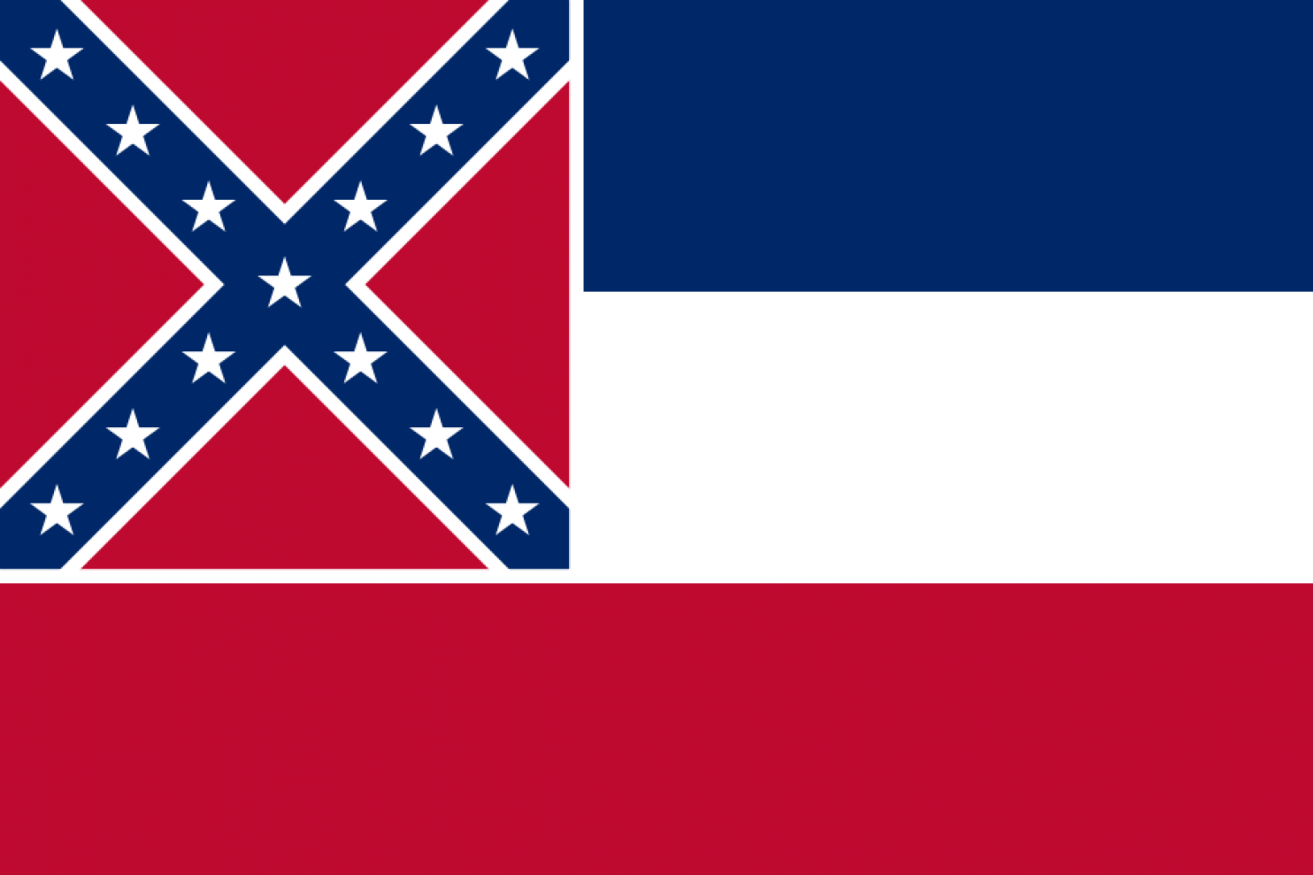
This one screams ?heritage,? whatever that means? Three colors, recognizable designs, sure why not?
5. TENNESSEE
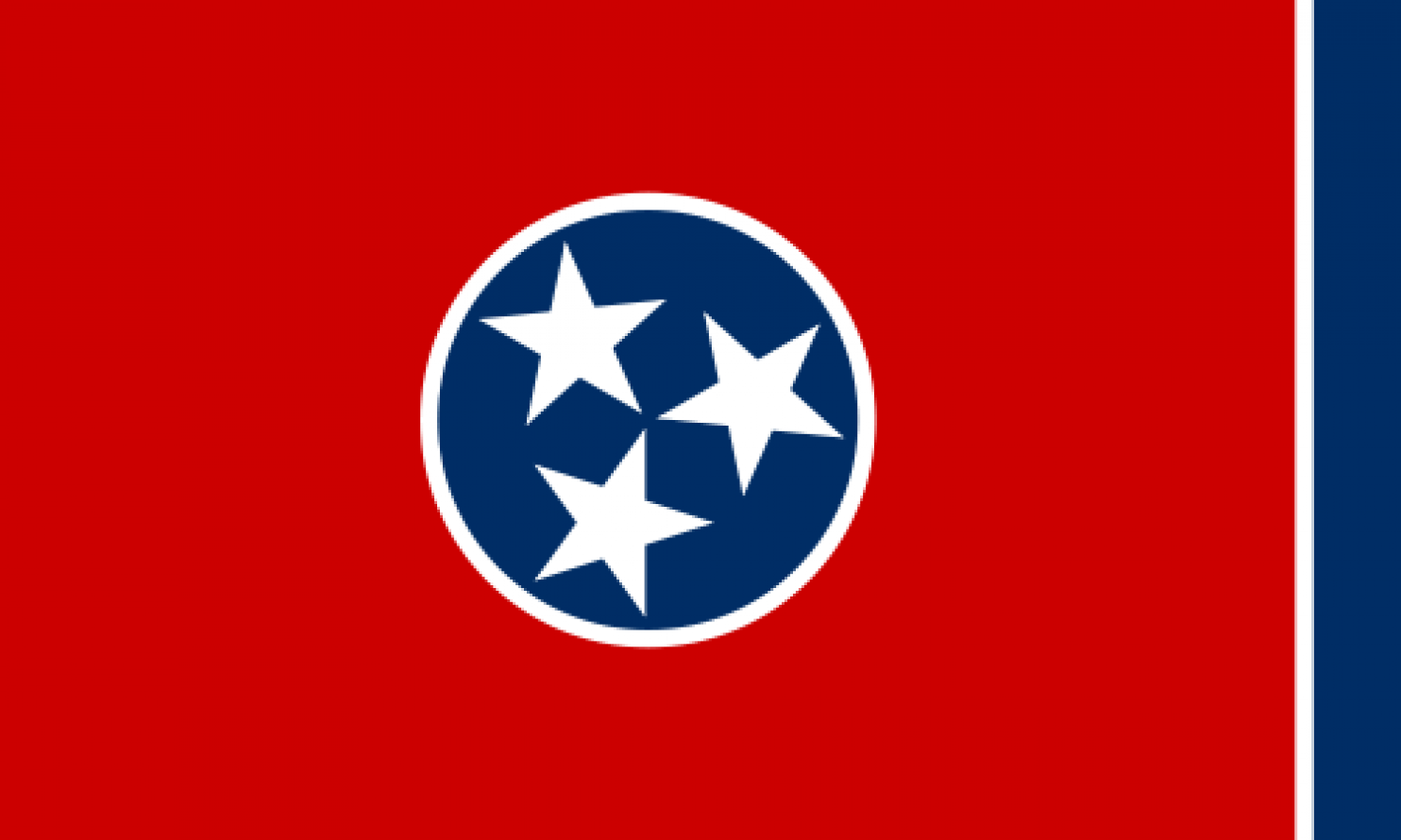
This looks like it should be flown by fascists in the next blockbuster dystopian film. It is kinda cool.
4. CALIFORNIA
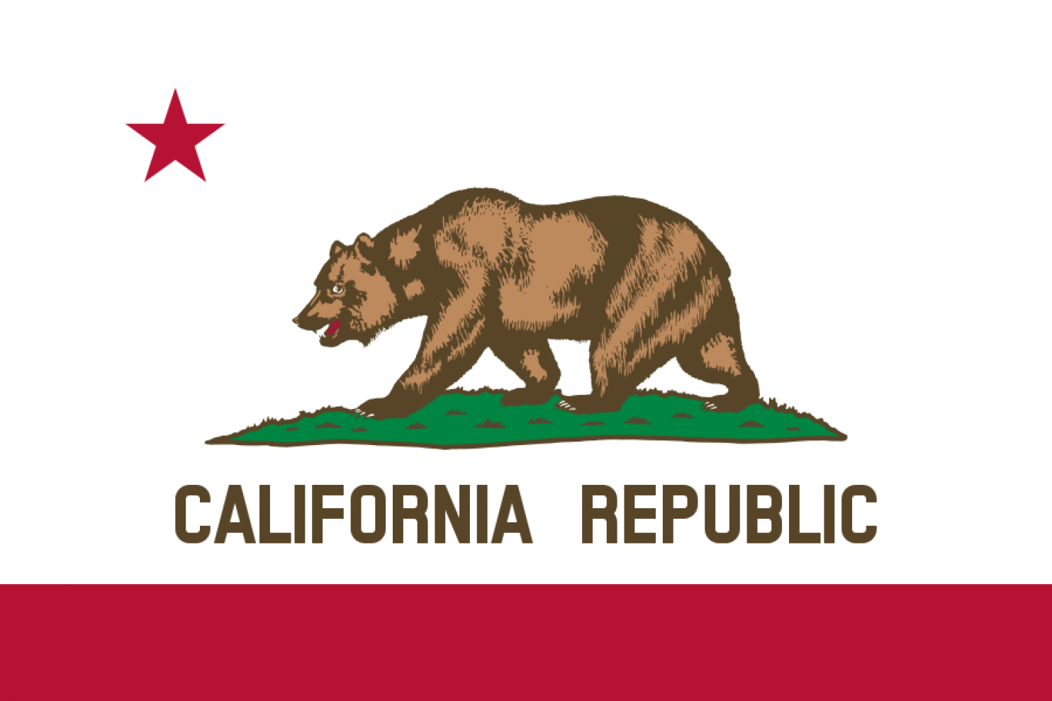
This one breaks the rules of ?no letters?, but the bear is so awesome I had to give it some respect. Honestly, it doesn?t need to say ?California Republic,? the bear speaks for itself.
3. ARIZONA
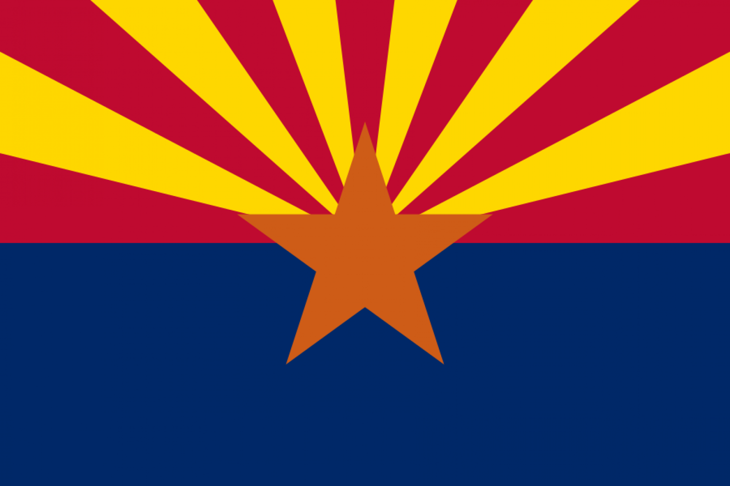
This flag easily makes it into the top three. Some might argue that it?s a little busy because it has four colors, but it all comes together nicely.
2. NEW MEXICO
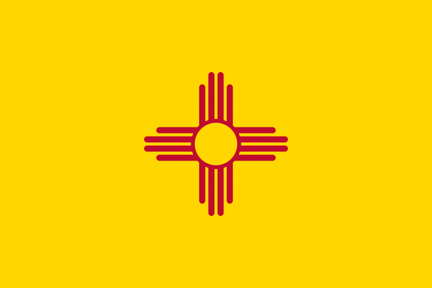
This design is so perfect. Incidentally, this flag was voted best US state flag by NAVA (North American Vexillological Association).
HONORABLE MENTION: PUERTO RICO
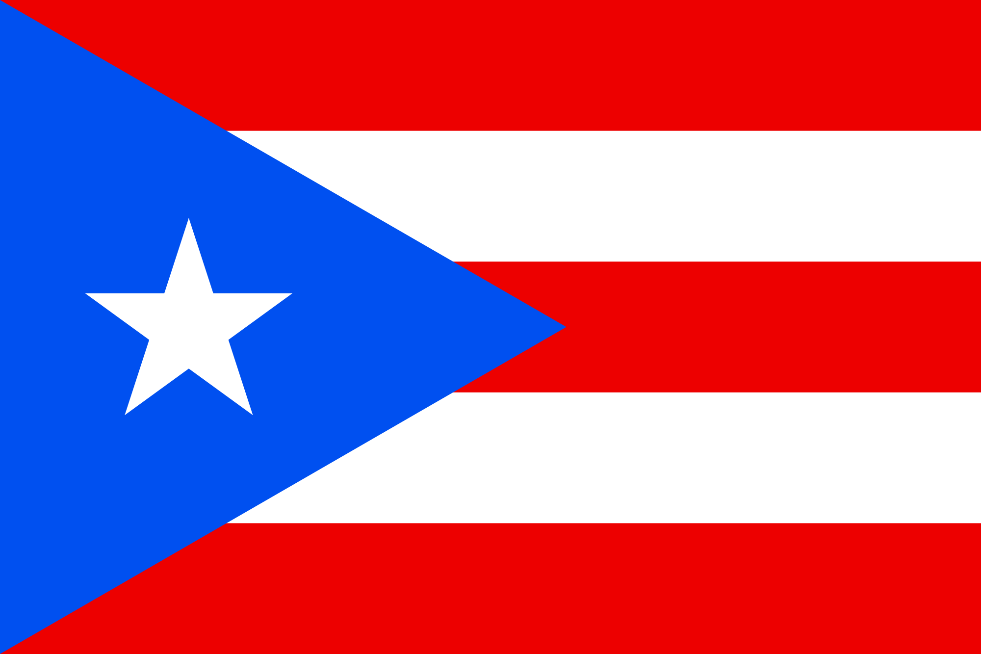
This is where Puero Rico would rank. It does everything right! The flag is kind of a Cuba-wannabe, but who can blame them? Good food, good music, good beaches, great rum, friendly people that make you want to dance ? That?s the good life.
1. TEXAS

Sorry if I disappoint, but let?s face it ? This flag is iconic! Everyone recognizes it. You can even travel overseas and people recognize it. There are no letters or seals and it follows all the rules ? The epitome of symbolic representation.
?
BONUS SECTION
If you?ve made it this far, you?re a trooper. You deserve some treats 😉
Amsterdam, Netherlands

If there ever was a flag for the Red Light District, this would be it! ?XXX?
Zheleznogorsk, Russia

This flag has got hardcore written all over it. Zheleznogorsk was a ?secret? town founded in 1950 where the Soviets produced weapons-grade plutonium. So it makes sense that there would be a bad-ass Russian bear splitting an atom on a blood red field.
?
Karl Hideyo Schroeder is a globally-experienced manager in international companies, having worked in banking, finance and start-ups. You can follow him on Twitter @KarlHideyoSchro.
