15 Creative Envelope Design Ideas & Examples for Inspiration
When it comes to reaching out to a business?s potential clients, direct mail might seem like a thing of the past, but it boasts several advantages that more modern marketing methods lack.
Like a personal letter or holiday card from a loved one, direct mail makes a more personal connection with the recipient ? especially when a good deal of care and attention has been paid to the envelope that packages it.
That said, envelope design for direct mail marketing is often a little more complicated than creating other types of marketing collateral because it requires you to focus on so many different things at once.
You have to catch the audience?s eye, but you also have to ensure that they recognise your branding ? not to mention, compel them to look inside the envelope itself.
The hardest part of any new design is getting started ? figuring out the initial idea from which the rest of the artwork springs forth.
Sometimes all you need to break through ?artist?s block? is a little inspiration.
Take a look at this collection creative envelope design ideas (and accompanying design tips) to discover the perfect jumping off point for your next envelope.
It?s always tempting to try to squeeze as many exciting images as possible into a design, but often the most important parts are what you don?t include.
Too many design elements, and you?ll overwhelm viewers with a busy layout.
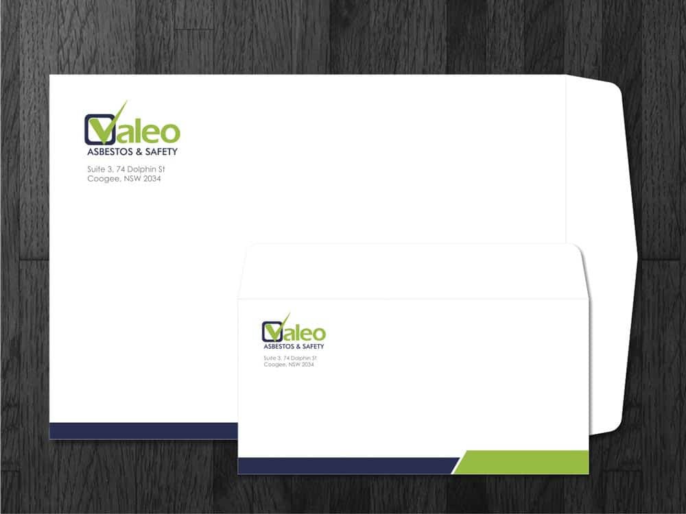
Take note of how this envelope for Valeo focuses only on the most critical elements ? the company logo design, contact info, and brand colours.
For most designs, you?ll want no more than 2?3 colours and fonts.
Source: https://www.designcrowd.com/design/1871963
2 ? Stay consistent
Before you get too far into the design process, make sure your envelope artwork in is in line with the rest of the company?s visual branding.
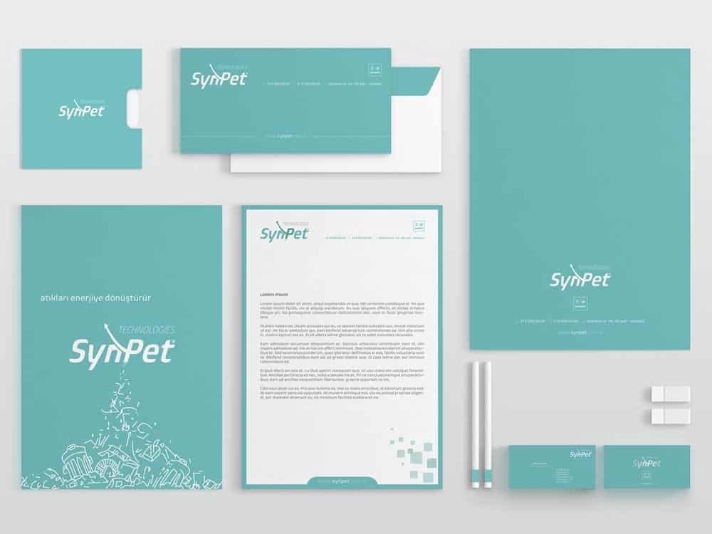
Notice how each of these envelopes for SynPet is distinct, but also uses the business?s signature logo and typography.
Your envelopes should complement not only one another, but also the company?s website, signage, and other marketing materials.
Source: https://www.behance.net/gallery/33743874/SynPet-Corporate-Identity-Work
3 ? Convey the business?s values
Always keep the client?s personality, values and philosophy at the forefront of your mind.
Try to add symbols, photos, or other elements that help to express those concepts.
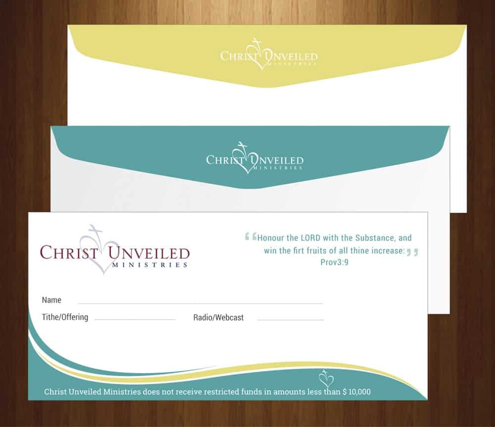
For instance, Christ Unveiled Ministries logo incorporates religious and spiritual symbols.
Note that this technique doesn?t always need to be right out in the open; you can use negative space or optical illusions to suggest the concept you?re going for.
Source: https://www.designcrowd.com/design/8439893
4 ? Use colour to set the tone
People tend to associate specific colours with specific concepts and emotions.
You can use colour psychology to trigger the desired response in your target audience.
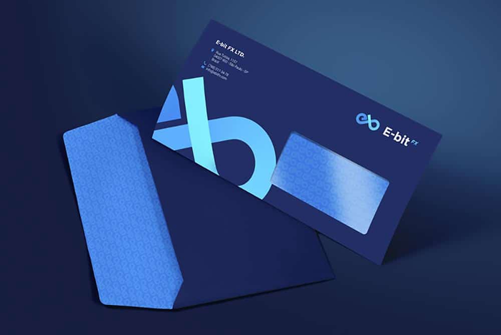
For instance, E-bit uses blue elements to create an association with sincerity, calmness and relaxation.
You can also use red to signify passion or love, yellow for happiness and cleanliness, or green for health and renewal.
Source: https://dribbble.com/shots/4786548-E-BitFX-Brandbook-design-Envelope
5 ? Use eye-catching imagery
No design exists in a vacuum, and that?s especially true for envelopes.
Your envelope design will need to compete with every other piece of mail the audience receives ? so it?s important to do something to catch their eye.
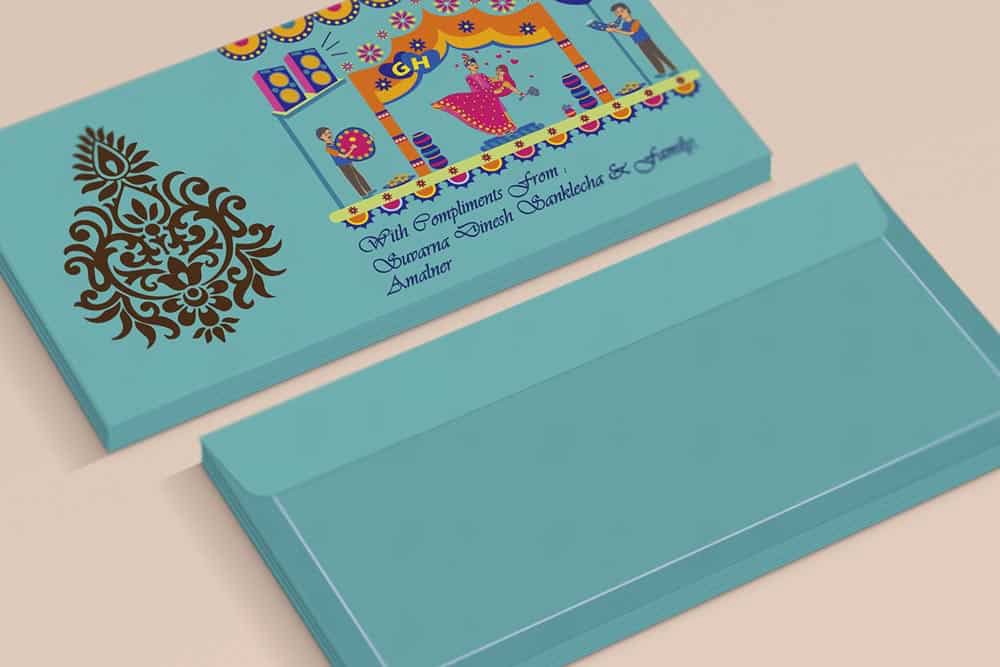
This Indian wedding envelope design makes use of illustrated characters and bright colours to draw attention.
You can also use contrasting patterns, compelling calls to action, or striking photographs to grab ahold of your audience?s focus.
Source: https://www.behance.net/gallery/65472673/Envelope-Design
6 ? Incorporate a human face
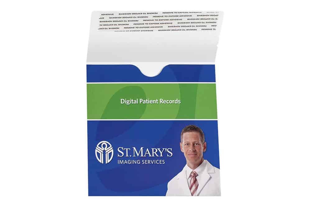
Photographs of human faces tend to be more engaging, creating a deeply personal connection with your audience that helps them feel more of an emotional attachment to the brand.
It?s a similar principle to the one guiding clicks on YouTube; people are more likely to engage with media that features a real-life person.
St. Mary?s Imaging Services? envelope features a photo of one of their friendly medical professionals.
Source: https://www.companyfolders.com/adhesive-strip-single-cd-dvd-mailer-envelope?popup=PG-000-722
7 ? Get creative with illustrations
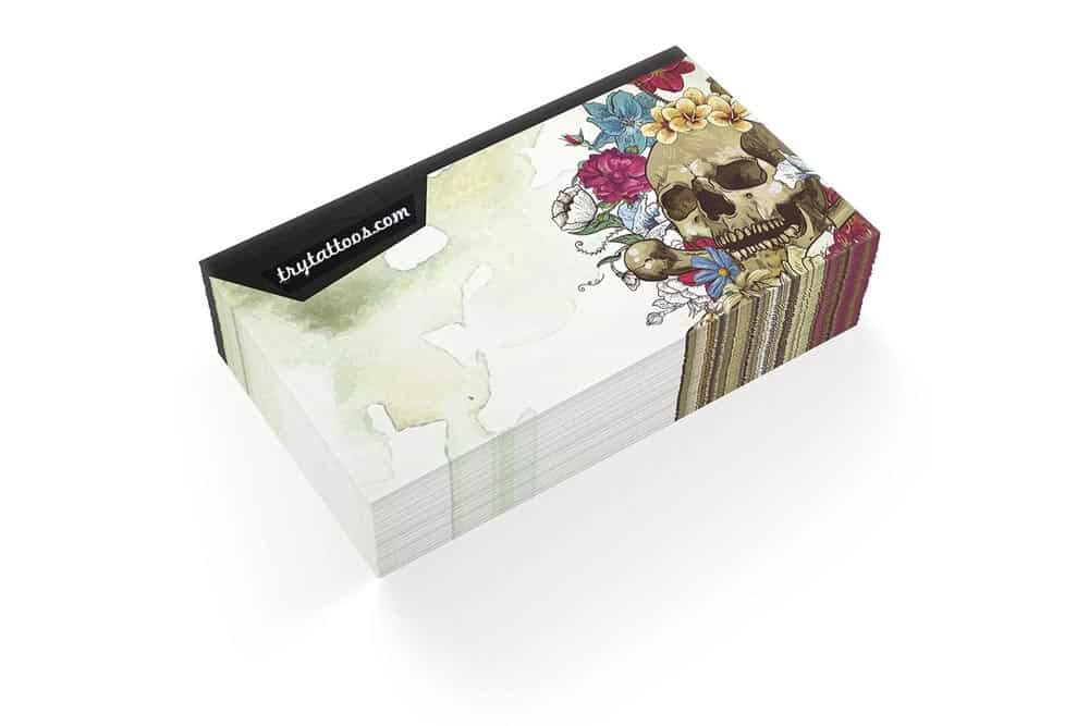
An original illustration is an excellent way to show off your company?s creative spirit.
It?s also helpful when you want to include an image that can?t be easily recreated with a photograph.
This illustration for TryTattoos shows off a sample of their edgy, artistic talent.
If you lack drawing talent yourself, consider hiring a freelance illustrator to add a splash of style to your design.
Source: https://www.designcrowd.com/design/4642154
8 ? Place your logo in a prominent position
A business?s logo design is often the first impression that audiences receive of the brand, so it?s vital to consider its placement on the envelope carefully.
Make sure it?s somewhere audiences will take notice of it.
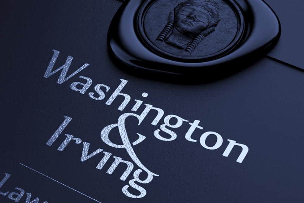
This envelope design for Washington & Irving includes two instances of the company?s logo ? one printed and the other stamped with wax.
The more times recipients are exposed to a logo, the more memorable it will be for them; be sure not to go overboard.
Source: https://dribbble.com/shots/1580906-Washington-Irving
9 ? Expand the elements of your logo
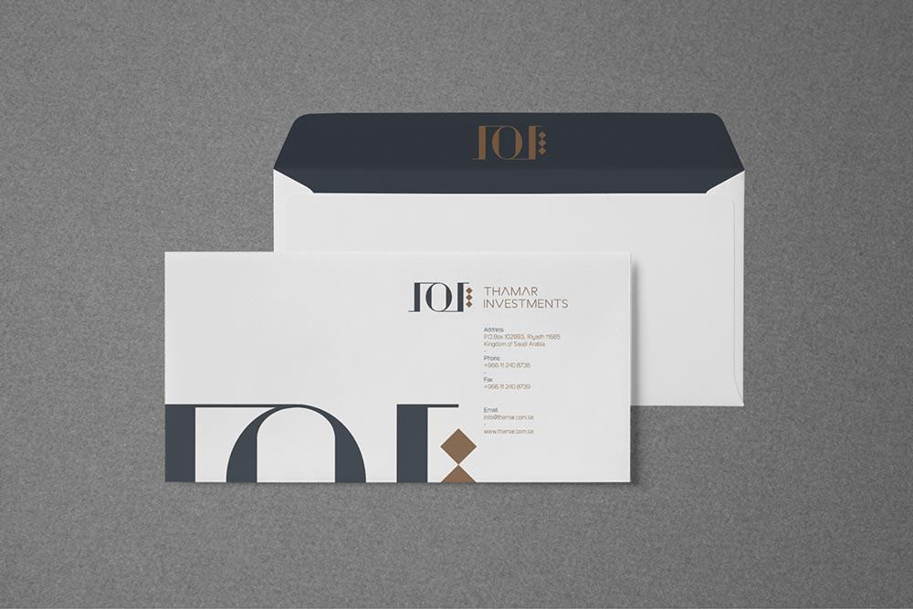
When you?re not sure how to layout your envelope design, one favourite technique is to add a much larger version of your logo, so that it acts less as a recognisable brand and more as an abstract design element.
Parts of the logo may even extend off of the page, as seen in this piece designed for Thamar Investments.
Source: http://www.millimbrands.com/millimeter_brands/thamar/
10 ? Give audiences a look at your product or service
Giving recipients a chance to see your product or services in action can be a great way to compel them to look inside.
Natividad Medical Center?s business envelope design includes a photograph of their diagnostic imaging equipment and staff to give new patients a better idea of what to expect.

Source: https://www.companyfolders.com/single-cd-dvd-wrap-around-disc-mailer-envelope-pocket?popup=PG-001-461
11 ? Play with unusual backgrounds
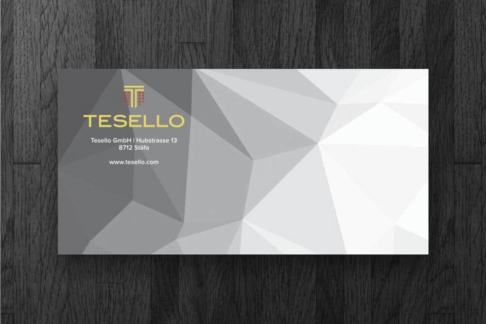
An intelligent, original background can help add interest to your envelope design when a specific photo or illustration isn?t a viable option.
This design for Tesello GmbH employs an abstract geometric pattern that resembles a gemstone or topographical map, giving the envelope design a unique look.
Source: https://www.designcrowd.com/design/10513606
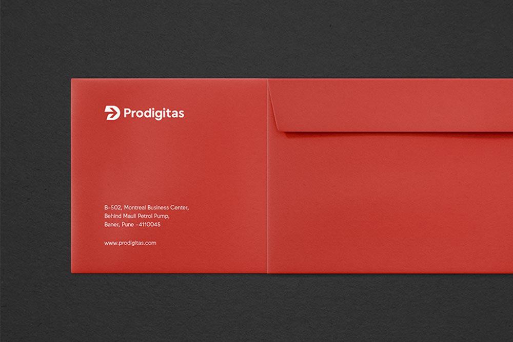
12 ? Use solid backgrounds to create impact
A solid colour background is a simple, minimalist way to make the text in your design pop out.
This design for Prodigitas Marketing Agency uses a bright, eye-catching red background to help the company?s logo and contact information stand out.
Source: https://dribbble.com/shots/4916763-Prodigitas-Envelope-Print-Identity
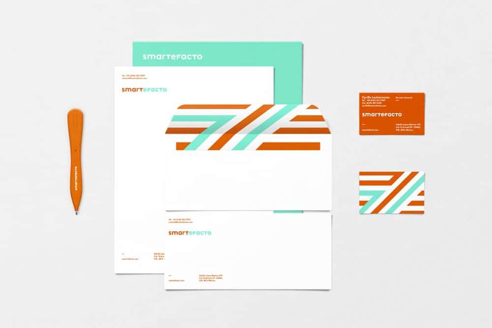
13 ? Use lines to add interest
Sometimes all a design needs is a subtle extra touch.
Diagonal lines, for instance, are a simple way to add a sense of motion and dynamic energy ? as seen in this envelope for Smartefacto.
The vibrant teal and orange colours also help to give the design an energetic and vivacious feel.
Source: https://www.behance.net/gallery/30159599/Smartefacto
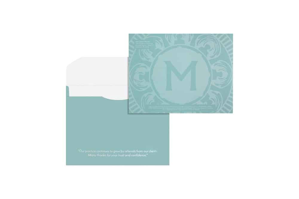
14 ? Include a personal message
Try speaking directly to your audience to engage with them on a deeper level.
This might involve printing the business?s slogan or tagline, or it could be a seasonal greeting appropriate for the time of year.
It could also just be a simple ?thank you? for their business.
The reverse side of this envelope for Mint Capital Advisors, LLC includes a personal thank-you message directed at the business?s clients.
Source: https://www.companyfolders.com/1013-deluxe-portfolio-w-flap?popup=PG-000-754
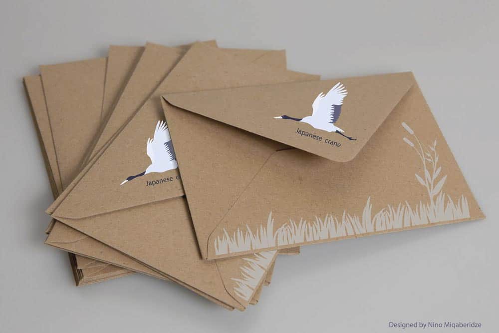
15 ? Add a ?handcrafted? touch
Making dozens of envelopes by hand probably isn?t an option for you ? but that doesn?t mean you can?t design something that looks like it was created with personal, individualised consideration.
These conceptual envelope designs (created by designer Niniko Miqaberidze) use brown kraft paper and illustrations reminiscent of paper cutouts, creating a look that feels like it was made especially for the recipient.
Source: https://www.behance.net/gallery/46662299/Envelope
More Creative Envelope Design Tips
As your envelope design begins to come together, keep these additional tips in mind:
Your envelope should be approximately 1/4? larger in height and weight than the materials inside.
To save money on shipping, keep your envelope design within the size required for letter rate ? between 3.5?6.125 inches high, 5?11.5 inches long, and 0.007?0.25 inches thick.
Try using contrasting colours on the front and back of your envelope to add interest.
Choose typefaces that are clear, legible, and match the overall tone of your design.
If your envelope includes a call to action (such as ?Special Offer Inside?), make sure it is noticeable.
The company?s return address should, in most cases, be placed in the top left corner of the envelope, 1/4? away from the edge.
In some cases, you can also place the address on the envelope?s flap; this is a popular technique for wedding invitations.
Remember to leave one square inch of space in the upper right-hand corner of the envelope for postage.
Final Thoughts
An excellent envelope design does more than provide the recipient with your contact information; it makes them feel as though they?ve received something genuinely unique.
If you?re still not sure where to start with your envelope design, try looking at example designs from the business?s competitors.
You shouldn?t rip off their concepts, but seeing what others in the industry are doing also shows you what they?re not doing ? and that puts you in a much better position to stand out.
Need more guidance while creating your envelope design?
Let us know in the comments below.
If you wish to discuss how we can develop your brand or provide graphic design for your product or business, email us: [email protected]
Inkbot Design is a Creative Branding Agency that is passionate about effective Graphic Design, Brand Identity, Logos and Web Design.
T: @inkbotdesign F: /inkbotdesign
Originally published at https://inkbotdesign.com/creative-envelope-design-ideas/ on August 13, 2018.
