Benjamin Ehinger
December 28, 2018
Creating a room within your home to represent your love of the mid-century modern design style requires the right colors. Of course, for those looking to buy an actual mid-century modern home, finding one with the right color palette may be important. Here?s a quick look at some of the most popular mid-century modern colors.
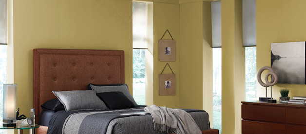
Behr Bitter Lemon
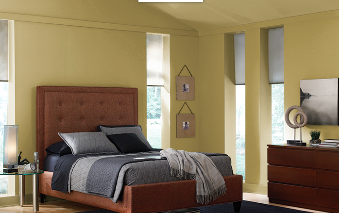 Courtesy of Behr
If you want to nail the mid-century modern color palette, you really cannot skip Behr bitter lemon. This color is one of the most popular as it?s a muted green with a touch of gold. This specific mid-century modern color goes well with avocado, gold, warm red and wheat.
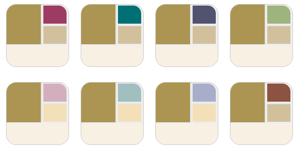 Bitter Lemon Color Pallet Recommendations, Courtesy of Behr
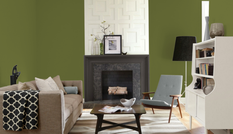
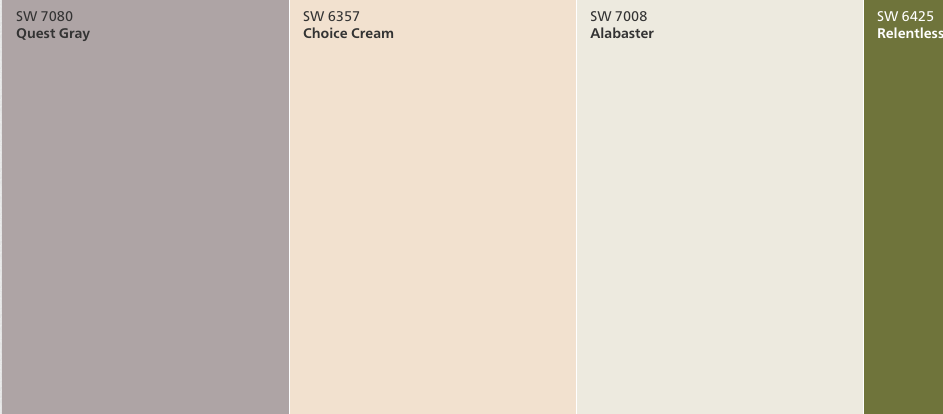
Restless Olive SW 6425 from Sherwin-Williams
Another very popular color to bring your home back into the mid-century modern era is this olive color from Sherwin-Williams. It?s just like a green olive and works great with many colors. It can even be used as a neutral color and works well as an accent wall.
 Restless Olive, Courtesy of Sherwin Williams
Other mid-century modern colors pair well with restless olive, such as dark brown, burnt orange and gold. Use it to create the perfect foyer or for an entire olive-green room.
 Restless Olive Pallet Recommendation, Courtesy of Sherwin Williams
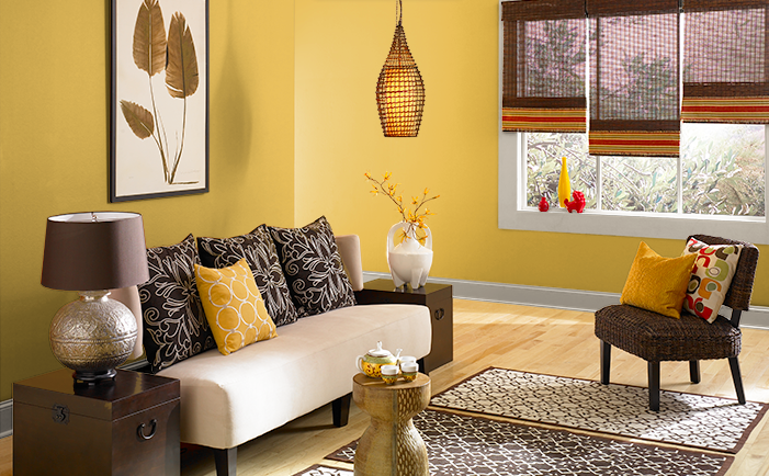
Yellow Gold 360D-6 from Behr
 Yellow Gold, Courtesy of Behr
Offering a warm gold color, yet a bit more complex than the Harvest Gold many used in the 1960s, Behr?s Yellow Gold pairs well with many other mid-century modern colors. It?s perfect for those looking to create a color palette with warm tones.
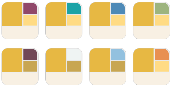 Yellow Gold Pallet Recommendations, Courtesy of Behr
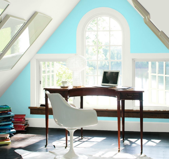
Blue Seafoam 2056?60 from Benjamin Moore
 Blue Seafoam, Courtesy of Benjamin Moore
You cannot create a list of mid-century modern colors without adding a touch of turquoise or aqua. This blue seafoam color offers a true ode to the 1950s, yet allows you to feel like you live in the 21st century. It pairs well with many neutral colors and offers a way to brighten up any room.
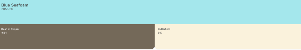
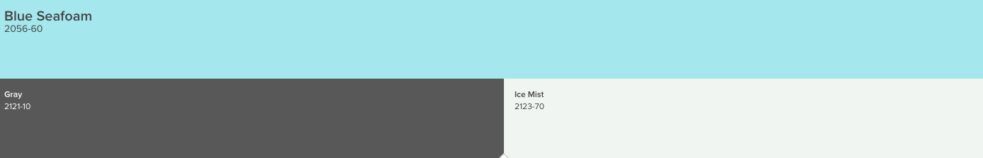 Blue Seafoam Pallet Recommendations, Courtesy of Benjamin Moore
Fundamentals of Mid-Century Modern Color
While the colors listed above all fit within the mid-century modern design palette, they are very specific. Let?s look at a few more general colors to choose if you want to create a mid-century modern look within your home.
Red
Using bright reds will pay homage to the 1950s and 1960s well, but you only want to use pops of red. If you dare to use a shade of red called ?Cherokee Red? you will be using the favorite red shade of Frank Lloyd Wright.
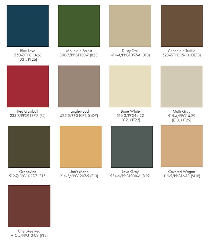 Frank Lloyd Wright Fallingwater Pallet, Courtesy of PPG Paints
Golden Yellow
Several shades of golden yellow offer a great compliment for any contemporary mid-century modern design. Bright closet doors were very popular and often painted in a golden yellow color.
Earthy Browns
With the right shade of brown, bringing back the mid-century modern design becomes much easier. When using wood veneers and furniture, adding earthy brown colors may be the perfect compliment.
Several colors, such as aqua, wasabi, pewter grey, orange, ochre, tangerine, and pink all fit within the mid-century modern color palette. Choosing your favorites may not be easy, but once you do, you?ll be able to create the perfect mid-century modern look within your home.
Remember, today?s digital age brings us access to view limitless color options online. But it also means that the settings on our screens will.
