
Chapter 2 from the book; Vumbula React ? Co-authored by Edmond Atto
 Cover Image by Edmond Atto
 Vumbula.io
What are components?
Components are the building blocks of any React app and a typical React app will have many of these. Simply put, a component is a JavaScript class or function that optionally accepts inputs i.e. properties(props) and returns a React element that describes how a section of the UI (User Interface) should appear.
Your first component
const Greeting = () => <h2>Hello World today!</h2>;
This is a functional component (called Greeting) written using ES6?s arrow function syntax that takes no props and returns an H1 tag with the text ?Hello World today!?
In Chapter 1, you learnt how to set up a React App using the create-react-app tool. We?ll take a step back momentarily and use a basic setup to learn the basics of components. You can find the starter app here and clone it to your computer.
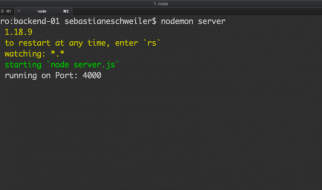
In order to run the code examples in this chapter on your machine, you first have to install a server globally using nodeJs. Below is the command to install the http-server on your machine. Open your terminal and run:-
npm install http-server -g
Open the index.html file within the Chapter 2/starter-code folder in your text editor and add the Greeting component where you see the instructions to do so. Below is a code snippet of how your index.html file should look like after this change.
Within the starter-code folder run the command below to start the server:-
http-server .
Open the url within the terminal in your browser and you should see the text ?Hello World Today!?.
In case you make changes to the code and they are not shown in the browser even after refresh. Try hard refreshing that tab or page.
You did it! You created and rendered your first component. Let?s take a closer look to help us understand what just happened.
Your index.html should look like this at this point
=> The React script allows us to write React components
=> The ReactDOM script allows us to place our components and work with them in the context of the DOM
=> The Babel script allows us to transpile ES6 to ES5. Some browsers have limited support for ES6 features; transpiling our ES6 to ES5 allows us to use the modern features of ES6 in our design without having to worry about compatibility. Notice that the React code is wrapped in a script tag with a type of text/babel.
ReactDOM.render(<Greeting />, document.getElementById(‘root’));
Translating the line of code above to English would sound something like this;
Use ReactDOM?s render method to render the Greeting element into the DOM in a container with the id of root.
When naming a React component, it is convention to capitalize the first letter. This is important because it enables React to differentiate between the native HTML tags such as div, h2, span etc and custom components like Greeting.
A different way to write components
So far, you?ve written a functional component, a fitting name since it really was just a function. Components can also be written using ES6 classes instead of functions. Such components are called class components. Go ahead and convert the functional Greeting component to a class component like so:
class Greeting extends React.Component { render(){ return <h2>Hello World Today!</h2>; }}
Replacing the the functional component in index.html with your new class component and refreshing your browser should also render ?Hello World Today!? which means everything is working well.
Functional (Stateless) Vs Class (Stateful) components
By now, you?ve created both a functional and class component. In this section, we?ll take a closer look at the differences as well as situations in which you might prefer to use one type over another.
Functional components
These components are purely presentational and are simply represented by a function that optionally takes props and returns a React element to be rendered to the page.
Generally, it is preferred to use functional components whenever possible because of their predictability and conciseness. Since, they are purely presentational, their output is always the same given the same props.
You may find functional components referred to as stateless, dumb or presentational in other literature. All these names are derived from the simple nature that functional components take on.
=> Functional because they are basically functions
=> Stateless because they do not hold and/or manage state
=> Presentational because all they do is output UI elements
A functional component in it?s simplest form looks something like this:
const Greeting = () => <h2>Hi, I?m a dumb component!</h2>;
Class Components
These components are created using ES6?s class syntax. They have some additional features such as the ability to contain logic (for example methods that handle onClick events), local state (more on this in the next chapter) and other capabilities to be explored in later sections of the book.
As you explore other resources, you might find class components referred to as smart, container or stateful components.
=> Class because they are basically classes
=> Smart because they can contain logic
=> Stateful because they can hold and/or manage local state
=> Container because they usually hold/contain numerous other (mostly functional) components
Class components have a considerably larger amount of markup. Using them excessively and unnecessarily can negatively affect performance as well as code readability, maintainability and testability.
A class component in its simplest form:
class Greeting extends React.Component { render(){ return <h2>Hi, I?m a smart component!</h2>; }}
How do I choose which component type to use?
Use a class component if you:
=> need to manage local state
=> need to add lifecycle methods to your component
=> need to add logic for event handlers
Otherwise, always use a functional component.
As you start out, you will not always know whether to use class or functional components. Many times, you will realise after a while that you chose the wrong type. Do not be discouraged, making this choice gets easier as you create more components. Until then, one helpful tip is, class components that only have markup within the render body can safely be converted to functional components.
Props
In the previous chapter, having reusable components was listed as a benefit of using React, this is true because components can accept props and return a customised React element based on the props received.
Looking at the Greeting component you created earlier, it is clear that it?s not a very useful component to have. In real world situations, you will often need to render components dynamically depending on the situation. You, for example might want the Greeting component to append your application?s current user?s name to the end of the greeting to have output like ?Hello Steve? as opposed to having it render ?Hello World Today!? every time. Perhaps, you?re always saying hello world, and the world never says hello back.
Props are React?s way of making components easily and dynamically customisable. They provide a way of passing properties/data down from one component to another, typically from a parent to a child component (unidirectional dataflow).
It?s important to note that props are read-only and that a component must never modify the props passed to it. As such, when a component is passed props as input, it should always return the same result for the same input.
All React components should act as pure functions with respect to their props.
Now that you know about props, make use of them in the Greeting component to render a greeting with a custom name appended to it.
Make changes to the code between the script tags in your index.html document to make it look like this:
const Greeting = props => <h2>Hello {props.name}</h2>; ReactDOM.render( <Greeting name={?Edmond?}/>, document.getElementById(‘root’) );
This renders the text ?Hello Edmond? to the screen. Go ahead and play around with this by switching out the name for yours.
Using props added some new syntax to your app. Let?s take a closer look and understand what is going on here.
=> An argument (props) is passed to the functional component. Recall that since a single argument is being passed to the arrow function, the parentheses are unnecessary. Passing this argument lets the component know to expect some data to be passed to it (in this case, the name of our app?s user)
=> Within ReactDOM.render, the name you want rendered to the screen is passed in by specifying propName={propValue} within the component?s tag.
=> In the h2 tag, {} are used to print the name that is added to the props object when it?s passed in via the component?s tag. Notice that the name attribute is accessed using the dot syntax.
There is no limit to how many props can be supplied to a component.
Using Props with Class Components
Adding props to class components is a very similar process to the one used in the functional component above. There are two notable changes:
=> Props is not passed as an argument to the class
=> The name attribute is accessed using this.props.name instead of props.name
class Greeting extends React.Component { render(){ return <h2>Hello {this.props.name}</h2>; } }ReactDOM.render( <Greeting name={?Edmond?}/>, document.getElementById(‘root’) );
Challenge: Make changes that make it possible for the Greeting component to take name, age and gender props and render this information to the page.
HINT: Pass 3 attributes (name, gender and age) to your component within ReactDOM.render() and alter your h2 text to accommodate your new data. Remember to access the attributes using the right syntax e.g. props.gender for functional components and this.props.gender for class components
Default props
These offer another way to pass props to your component and as the name suggests, default props are used by a component as default attributes in case no props are explicitly passed to the component.
As a fallback, default props are helpful in enabling you offer a better user experience through your app , for example, considering the Greeting component from previous examples, using default props ensures that a complete greeting is always rendered even if the name attribute has not been explicitly passed to the component.
By altering the Greeting component as shown above, you now have ?Hello User? being rendered in your browser if you do not pass the name attribute to the component.
Passing a name attribute as a prop to the Greeting component overwrites the default props.
Composing Components
Up until now, you?ve only created a single component, however, when building real products, you will often have to build multiple components.
React allows you to reference components within other components, allowing you to add a level(s) of abstraction to your application.
Take for example a user profile component on a social network. We could write this component?s structure like so:
UserProfile |-> Avatar |-> UserName |-> Bio
In this case, UserProfile, Avatar, UserName and Bio are all components. The UserProfile component is composed of the Avatar, UserName and Bio components. This concept of component composition is quite powerful as it enables you to write highly modular and reusable components. For example, the UserName component can be used in many parts of the web application and in case it ever needed to be updated, changes would only be made to the UserName component and the changes would reflect everywhere with the application where it is used.
In the code snippet above, the Avatar, UserName and Bio components are defined within the UserProfile component. Try and do this on your own using the index.html file from previous examples.
Functional components can be referenced within class components and vice versa. However, it is not often that you will reference a class component within a functional component; class components typically serve as container components.
Project One
At this point, you have learned enough of the basics. Get your hands dirty by following up with this first project and in case you get blocked, get out the Github repository for this chapter for the solution or leave a comment below in the response area.
Let?s get started
Clone the repository and cd into the chapter 2 folder that contains the code for this chapter. Then fire up a text editor or IDE of your choice, though VSCode or Webstorm are recommended and follow the steps below.
- Create a project folder to hold the project files.
- Create an index.html page
- Create a src folder to hold the JavaScript files.
- Create an index.js file within the src folder
- Add a div with an id of root to the body of the index.html.
- Add the react, react-dom and babel scripts
- Link to the index.js script below the babel script at the bottom of the html page.
- Within index.js create a presentational component called Application.
- Copy all the html within the body of the html template in the starter-code folder within the chapter 2 folder apart from the script tags.
- Paste this html within the <> </> tags (fragments). We use tags because a React component only accepts one element and all the rest/siblings must be nested within the one parent element.
- We need to clean up the html code and turn it into JSX that React can understand.
- Let us start by removing all the html comments like this one <!-? Navbar -?
- Rename all class instances to className, then close all img tags like so <img className=?card-img-top? src=?img/8.png?/> and also close the horizontal rule <hr/>
class is a reserved name in React, hence, the requirement to change all class instances to className.
- Copy the img folder and paste it at the root of the project folder.
- Head back to the index.html file and add the Bootstrap 4 CSS link tag in the head section.
- Whoop?Whoop?You can now open the html page in the browser and see your new React application.
Here is the code up to this point.
Great work so far, you are moving on well but you are not yet done. You need to break the main component down further into smaller components so that your code is clean and easy to maintain. Let us get back to work.
Into components
Start by creating the Nav component. You can try it on your own and then cross-check your work by reading through the steps below.
- Below the Application component, create a new functional component with a name Nav.
- Copy the <nav> </nav> JSX into the Nav component as shown below.
- Delete the nav code from the Application component JSX and replace it with <Nav/> element as shown here.
- Open up the application again in the browser and everything should still be the same.
- Let?s move on to the second presentational component, the Jumbotron.
- Create an arrow function with a name Jumbotron.
- Copy the jumbotron code and paste it into the Jumbotron function.
- Delete the jumbotron code from the Application component?s JSX and replace it with the <Jumbotron/> element.
It is now your turn, go on and create the Toys and Footer functional components and then reference them within the Application component. Be sure to follow similar steps as before.
Nothing about the page in the browser should change after you are done. When you are done cross-check your solution with this.
We have done a good job up to this point, you may have realized that our JSX is not DRY. Meaning there is a lot of repetition specifically in the <Toys/> component, the toy cards are repeated for every toy. We can leverage the power of reusability that React components possess to clean this up.
- First, create an array called toys to hold objects containing the toy name, description and image number as shown below.
- Create a functional component that accepts props as an argument and name it Card. Copy and paste one card?s JSX code into it from the Toys component as shown below.
- We need to make a few changes to the card so that it is reusable by adding placeholders which will be replaced by the actual data to be rendered.
- The toy name is replaced by {props.toy.name} where toy is a prop object passed into the component from the toys array.
- The description is replaced by {props.toy.description}.
- The image src is replaced by a string template literal which accepts {props.toy.image} to make up the image path.
- Let us make use of our new Card component by refactoring our Toys component. First delete all the cards within a div with a class of row in the Toys component. Then change the function signature to accept props as its only argument.
- In order to display all the cards again in the Toys component, we make use of the map function to loop through the toys array passed into it as props. This map function accepts a callback function that accepts two arguments, the item in the array and its index. This callback returns a Card component which accepts a toy has its props. React also requires us to add a key to elements that are being looped over so that it can easily keep track of them and the changes applied to them making it easy for it to know what elements to re-render when the underlying data changes. Therefore the index of the toy object within the array acts as the key in this case as shown below.
- Before you can test out the changes there is one more thing to do, otherwise the toys wont show on the page.
We need to pass in the toys array as props to the application component so that the Toys component can get access to them. This is shown in the snippet below.
ReactDOM.render(<Application toys={toys}/>,document.getElementById(‘root’));
Finally, within the Application component we also need to pass the toys array as props down to the Toys component as shown below. Recall from chapter one that data flow in React is unidirectional.
<Toys toys={this.props.toys}/>
Now open the page again in the browser to view the changes we have made. You will realize that nothing changes in the browser, we still get to see our page design as it was, but now it is fully optimized with React.
At this point you know how components work and how you can make use of them to develop modular React code that represents different sections of your user interface. Here is the final code for this project. The next chapter explains the aspect of state in a React application, do not miss it.
If you have found this article useful, reach over to the ? button and hit it as many times as you have enjoyed reading this post. Your responses are also highly appreciated. You can also find me on twitter.
