One of Massimo Vignelli?s legacies is his NYC Subway System signage. The comprehensive visual design system includes Helvetica typeface and an iconic color scheme for the subway?s various lines.
In my recent article on the impact Vignelli had on the NYC Subway System, I explained how he was instrumental in consolidating the signage and visual design across the city?s mass transit system. His design for the 1972 NYC Subway diagram was loved by design fans for its clean, non-geographical presentation. His end goal was to help passengers navigate the subway without confusion by having a minimal amount of information needed at each step of their journey. He called this concept going from ?dot to dot.?
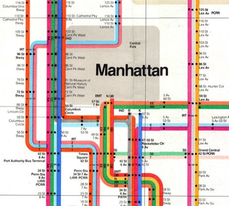
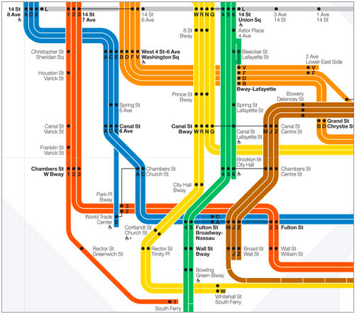
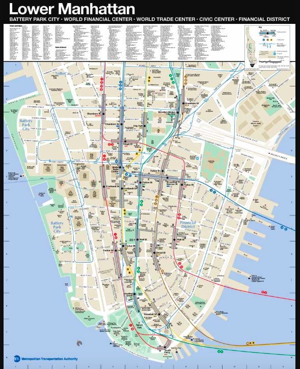 These neighborhood maps like the one of Lower Manhattan were originally a part of Vignelli?s unified system design. Hertz Associates was able to implement them in the 1980?s. Map courtesy: MTA
Here?s what he has said when asked about the received criticism in a 1990 interview:
?One of the problems they had in New York is that the people, they couldn?t relate the geography with the station, with the lines, and they were confused by that. But it?s just because they shouldn?t. There were neighborhood maps in the subway stations, so really there?s no reason why this map had to be literal ? it could be completely abstract.?
Despite the many debates over the effectiveness of the Vignelli design, one thing has remained consistent: it always makes a comeback!
Simplicity coupled with colorful design makes for easy navigation of a complex system. The colors are not randomly assigned to the subway lines but based on the avenue or street (aka ?trunk line?) they traverse in Midtown Manhattan excluding a few lines that do not run through this borough. New Yorkers know the A-Train is part of the ?8th avenue line? when they see the blue line on the map and tourists often call it the ?blue line? as they head to landmarks like Madison Square Garden. I believe most people won?t argue the effectiveness of the design; it?s the perceived function that hasn?t always been executed smoothly and agreed upon. There are two examples where the Vignelli design and function was received favorably by subway riders.
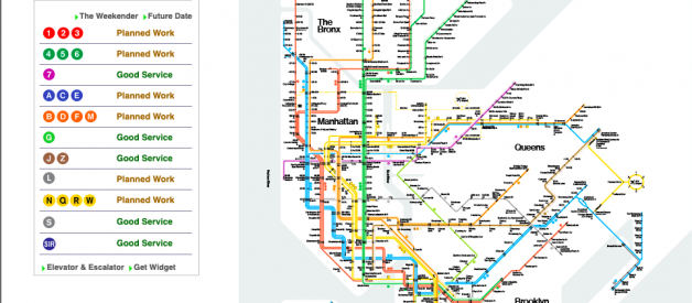
 The Weekender gives information on the service status as well as any planned work along a given route. This guide is also a supplement to the subway map. In the above snapshot, a customer can get a real time status of the subway route they plan to take. Map Courtesy MTA
In 2011, the MTA introduced an interactive map designed to inform customers about service changes that would impact the weekend schedule. A reinterpretation of the 1972 design, called ?The Weekender? was well-received for its simplistic presentation on a complicated topic of weekend subway service changes. It functions as a supplement to the subway map and focuses on letting subway riders know how their planned trip will be impacted by scheduled construction works or unplanned delays.
?The Weekender has transformed the way riders navigate the subway system on weekends by making it easy for subway riders to visualize exactly how weekend work will affect their subway service,? ? Paul Fleuranges, the MTA?s Senior Director of Corporate and Internal Communications (2011).
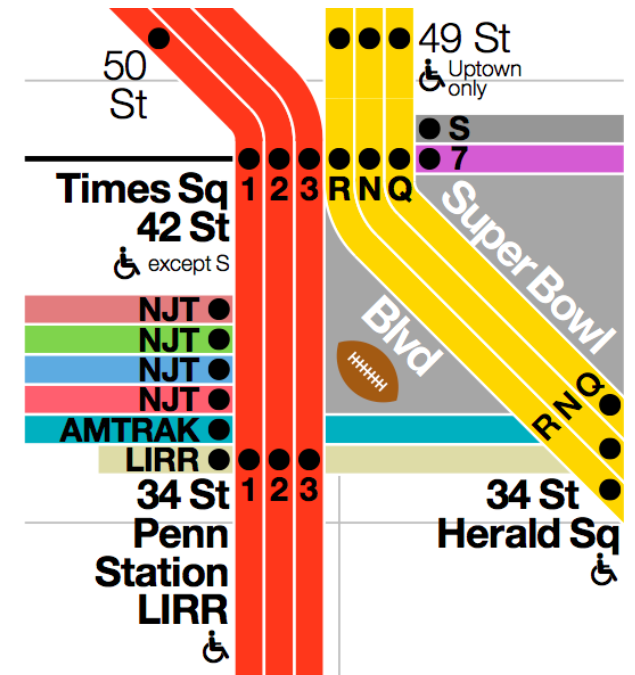
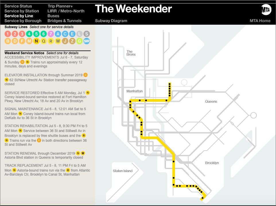 Snapshot of The Weekender showing planned work along the N Line. Leveraging the Vignelli concept of traveling from ?dot to dot?, a customer can focus on their line to get more detailed information like accessibility improvements, station rehabilitation and track replacements along their subway route. Map Courtesy MTA
The editor of the now-defunct Men?s Vogue, Mark Rozzo is to thank for the resurgence of the 1972 iconic map! According to an article in DesignBoom, Rozzo reached out to Vignelli for the May 2008 Men?s Vogue. He was looking to salute Vignelli and thought having his map would be a great asset to the publication?s design issue. ?This would be an opportunity to not only cover design as a subject but to be actually involved in creating a great design with an acknowledged master.? said Rozzo.
Vignelli Subway Diagram ? 1972 vs 2008
 Original Vignelli 1972 map on the left and updated 2008 map on the right by Vignelli Associates. When asked about the key differences in the two maps, Rozzo stated what was appealing to him about the project was to see how all of the changes that have altered the subway system over the past 30 years would be reflected in a new Vignelli map. In addition, Vignelli abstracted the geography even further and the color schemes have been simplified. Rozzo mentioned that VIgnelli missed ?all the crazy colors of the old one!?
When Rozzo reached out to Vignelli he was amazed to hear back from him right away. Their collaboration led to 500 limited-edition art prints of an updated 2008 Vignelli map with the proceeds going to a NY based charity encouraging sustainable design. The prints quickly sold out but magazine readers were still presented with a tear out centerfold of the beloved map. Rozzo commented that it brought a surprising design element to their design issue. It?s amazing to take this iconic design and fast forward the clock 30 years to see how the subway system has evolved. It?s a great testament to the impact this design has had on Vignelli?s colleagues, fans, subway enthusiasts, and subway riders alike.
?It?s rich nostalgia for people who either lived or visited New York in the 1970s (a very heady time for the city, of course) or who (like me) moved here long afterwards and always wondered about what it would have been like to live here at that time.?? Mark Rozzo on what he thinks readers appreciate about Vignelli?s map.
Regional Transit Diagram 2014
When New York and New Jersey made history by being the first two US states to co-host the 2014 NFL Super Bowl, they worked with transit agencies who commissioned Vignelli Associates to create a regional map. Designed by Yoshiki Waterhouse, the map brings together transit systems on both sides of the Hudson River. Map Courtesy NJ Transit
Perhaps one of the best examples of the effectiveness of Vignelli design was the visual unification of the transportation systems between NY and NJ for the 2014 Super Bowl. This was the first time that two US states, New York and New Jersey, hosted the event simultaneously. The combination of sports facilities in NJ and hotel facilities in NY had been a major deciding factor for the National Football League (NFL) choosing this location. There would be events located in both states leading up to the Super Bowl. To promote the use of public transportation during Super Bowl Week, public and private transportation agencies got together to plan for what was called the ?Mass Transit Super Bowl?. The agencies and companies included: New Jersey Transit (NJT), the Port Authority of New York and New Jersey (PANYNJ), the Metropolitan Transportation Authority (MTA), New York City Transit Authority (NYCTA), Amtrak, and New York Waterway. These agencies make up the vast transit network in the Tri-State area of New York, New Jersey and Connecticut.
 Snapshot of Vignelli Regional Map Showing Times Square and Penn Station transfer points. The regional map places both New York and New Jersey transit lines in the same place. It shows major transfer points as well as what super bowl activities are in the area! Since these agencies operate independently, it was a great feat to bring these routes together to answer, ?How do I get to the Super Bowl??. Map Courtesy NJ Transit
Although there is some joint operations and transfer points, the agencies operate independent of each other and there was no map that showed all of the transit services in one place. The Super Bowl host committee commissioned Vignelli Associates to create a Regional Transit Diagram produced specifically for the Super Bowl. According to the MTA the diagram ?shows all inter-connections between the regional transit services, and highlights with a football icon those areas where Super Bowl related events will occur on both sides of the Hudson River.?
Like the Weekender, this regional diagram is not trying to be all things to all kinds of riders. It?s answering the question, ?How do I get to the Super Bowl games by transit?. The audience of this map will be riders local to the Tri-State as well as fans from out of town looking to enjoy the festivities. I believe the map did a good job on giving riders a ?20K Ft View? of how to get around. Looking at customer feedback, there were riders who wanted to know fare information, schedules, and service advisories. This is valid information needed but not on this diagram. One design criticism I read was on the color scheme. The critique was that the Jersey transit lines used muted colors compared to the NYC transit routes thereby offsetting the Vignelli design scheme. I do notice the difference in color but do not feel it takes away from the function of the map. Yes, there are colors that NJ Transit lines use that are familiar to their riders but those colors overlap with some of the NYC subway lines. In order to stay true to the Vignelli design, I believe these compromises were made to focus more on orienting riders where they were and where they needed to go. It was estimated that 10K ? 12K fans would take the train to the event and roughly 28K ended up using the system on game day! I?m sure marketing and logistics played a part on the ridership but I believe passengers had a clear diagram to guide them!

There?s no doubt that Vignelli?s design principles unified the NYC Subway system back in the 1970?s. He knew that unifying the information being conveyed cut down the processing time that passengers used trying to figure out where they were and where they needed to go. He accomplished this by using his signature colorful angled lines to represent the subway routes and minimal geography. He sped up consumption and comprehension of signage and diagrams by providing the minimal amount of information needed at each step of the journey. While the infrastructure has changed over the years the design remains constant. When it came to conveying complex transit information like weekend service or an inaugural event like ?Super Bowl Week?, the MTA leaned on these design principles to get passengers from ?dot to dot?.
Here are some additional readings that discuss Vignelli?s legacy and give homage to his effective visual design:
Poetry in Motion
Whether you?re an urban dweller passing through the turnstiles on a daily basis or a first time visitor using it to?
medium.com
Making the NYC Subway User-Friendly Through Effective Visuals
When the New York City Subway system consolidated under a single operator in 1940 it was clear that integrating the?
medium.com
2014 Regional Transit Diagram used for Super Bowl Week. Map Courtesy NJ Transit
