Someone asked What font does Trump use for ?Make America Great Again?? The typeface Trump uses in ?Make America Great Again? is called The Best Serif. I kid, I kid.
Trump typography
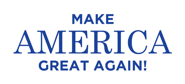
It depends on which typography you are talking about. I take the typography below to be the official Trump typography.
 Image source: Brown Political Review
The serif typeface (?America?) is Century Schoolbook. A bit ironic.
The sans typeface (?Make _ Great Again!?) is? no clue. I think I?ve seen it before but I don?t recall its name. Montserrat is a fair approximation, though it features a higher weight contrast, and most notably the ?M? and ?!? are different.
Also, I also want you to pay attention to the horrible lack of kerning in both ?America?(I_C and C_A) and in particular ?Great? (A_T); it almost says ?MAKE AMERI C A GREA T AGAIN!?.
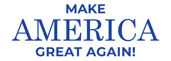
Below I have recreated the image above. At first glance, Montserrat for ?MAKE? seems to be a good match. But upon closer inspection, Trump?s sans serif typeface features a more condensed M with a wider top and a sharper middle, a more condensed A, the weight contrast is lower, and the spacing is slightly more generous. Anyway, Century Schoolbook for ?America? is a perfect match, including the spacing and the lack of kerning.
Here is the same image with kerning (M_E, R_I, I_C, and C_A are spaced more tightly):
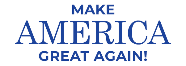
A subtle difference, but it makes the spacing, texture, and rhythm a lot more consistent. In typographic terms, it has better color (the distribution of black on white space).
Extended brand
Who cares about consistent branding? Certainly not Donald Trump. Throughout his brand and merchandise, he uses a wide variety of typefaces. When he places the slogan ?Make America Great Again? under his name (which is set in Akzidenz-Grotesk Bold Extended), FF Meta Bold is used.
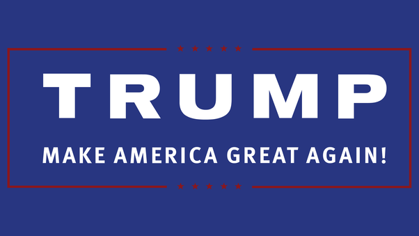 Image source: Imgur
The great cap
And below Trump can be seen sporting an official ?Make America Great Again? cap, in a different typeface yet again, and without an exclamation mark. My hypothesis is that with Trump wearing the cap, the exclamation mark is very much implied, thus making it a redundant typographic element.
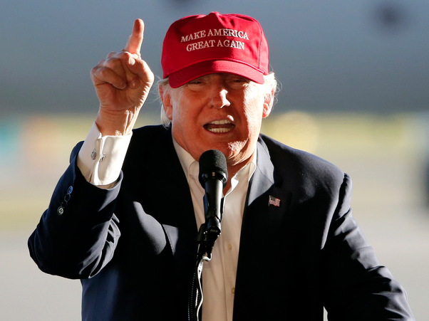 Image source: Business Insider
Here is a close-up of the typography:
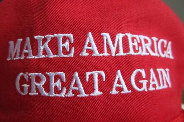 Image source: Wikimedia
I have no clue what typeface was used here, but it is certainly not Century Schoolbook. The fact that the second ?G? features a spur (the vertical stroke at the bottom) whereas the first does not suggests the typeface has been modified, in any case. I think the different Gs are awkward, but I suppose the spur was taken off the first ?G? to make it fit tighter to ?R?. Why the same was not done with the second ?G? and kern it tighter with ?A? ? or why A_G was not kerned in the first place ? I do not know.
The cap below (signed!) which can be bought from the White House Giftshop features a different typeface yet again.
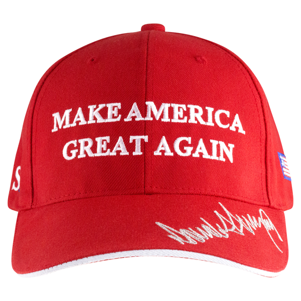 Image source: White House Giftshop
Again, I don?t know the typeface. If you do, let me know. Make typography great again!

 typeface of Trump’s ‘Make America Great Again’ campaign slogan)
 typeface of Trump’s ‘Make America Great Again’ campaign slogan)