According to this Illinois ad agency
Y?all probably know me exclusively from Medium, but in real life I?m a copywriter at Ivor Andrew, a B2B agency in Chicago?s west suburbs.
Doug, our creative director, is not a fan of the design of the new Illinois license plate. So that got us thinking: What states are the best, and is Illinois actually the worst?
My colleagues and I each made lists, then we debated. Below is our consensus and some back and forth.
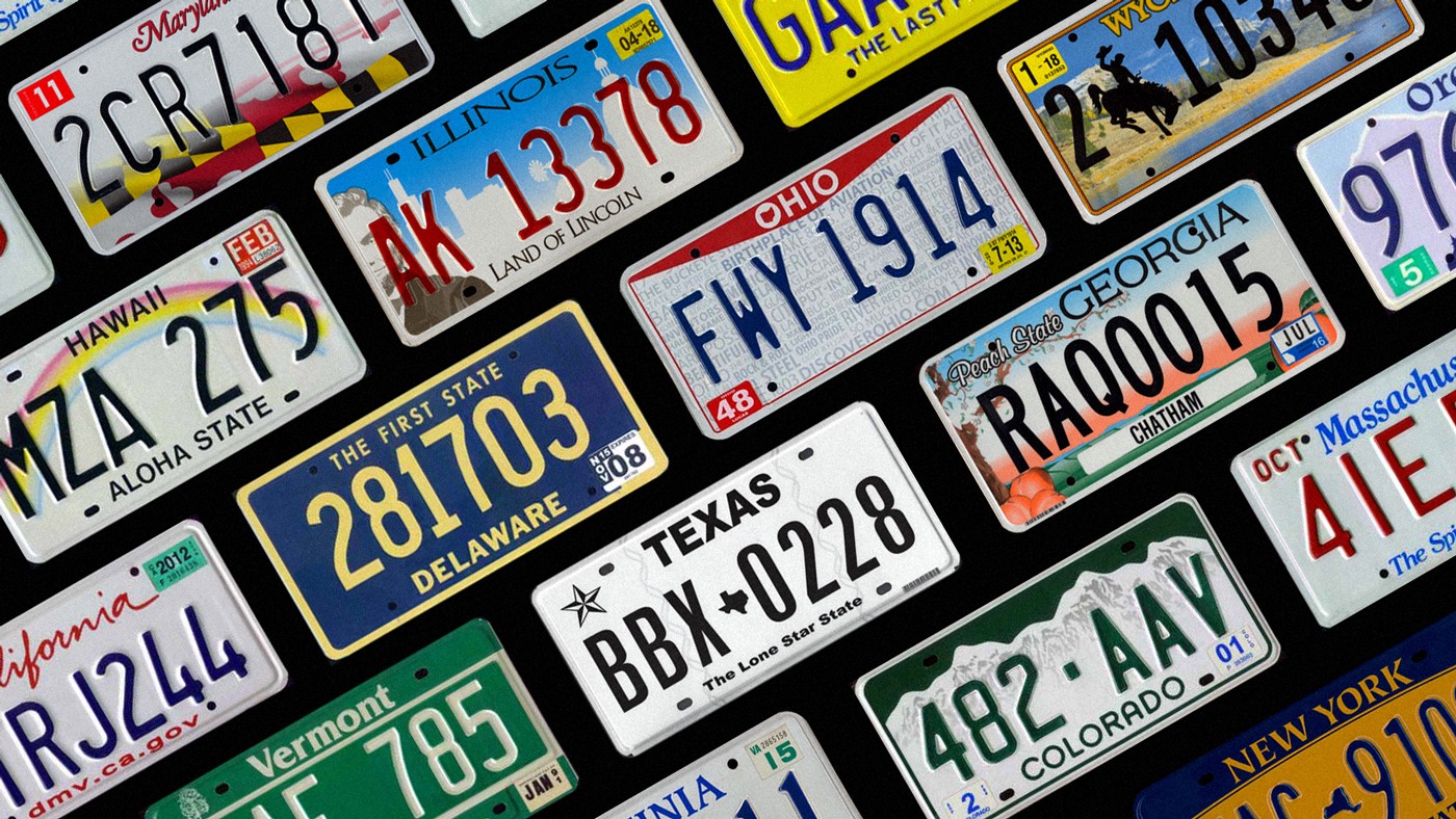
Top 5 United States license plates
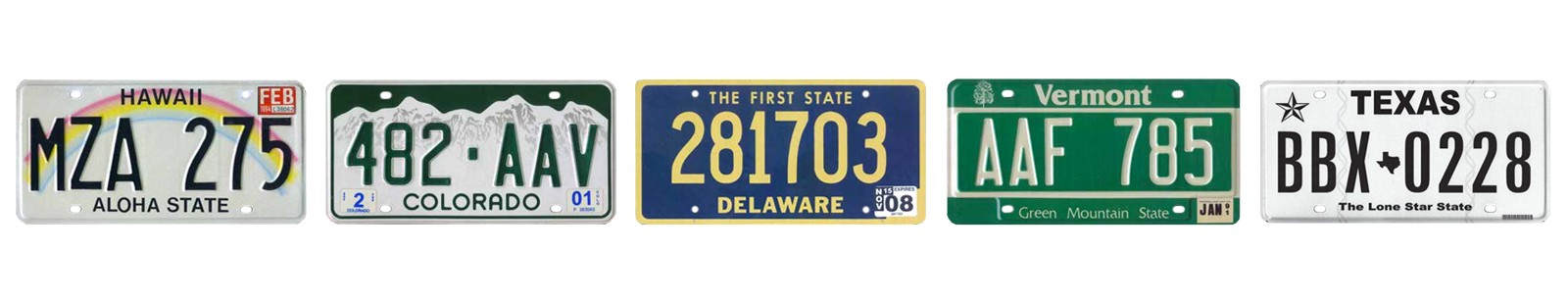
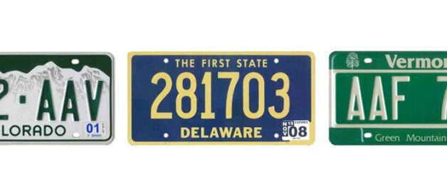
5. Texas
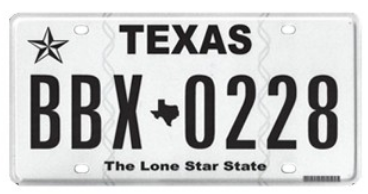
Steph: Don?t ask. I don?t even know. I just like it, okay?
Well actually, I do know. It?s simple and perfect.
Liz: Yawn. BORING. Which is funny because I like the simple plates in general, but black and white? C?mon!
Rafal: But that?s the idea, the lone star. It wouldn?t be a lone star if it were colorful and full of other icons.
Luke: Totally boring? Yes. Perfect license plate? Also yes.
I adore the Texas plate. The goal for any plate should be legibility. Whether you?re a cop or a citizen, chances are you?ll have to quickly memorize a license plate at some point in your life.
Texas is beautifully legible. And The Lone Star State is just a great nickname.
Doug: I?d be totally fine if Texas seceded from the Union, just FYI.
4. Vermont
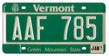
Ken: Simple and easy to read.
Susan: One word: Bernie. And my favorite color is green.
Liz: I like this a lot. It feels retro, like they haven?t changed their design. Ever. I dig that.
Steph: Y?all cray. I do not stand behind Vermont. Ugh ugh ugh.
Luke: Agreed. Looks like a dadgum street sign.
Susan: Feel the Bern! This is clean and simple, and green is a great color. This is really not that different from Colorado, which you all LOVE, btw.
Luke: SPOILERS.
Rafal: Google image search Vermont and take in the beauty of nature found there. This license plate is beautiful and blends in with the beautiful nature that surrounds it.
Doug: What exactly is in that tea of yours?
3. Delaware
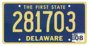
Doug: Speaking of stalwart style, Delaware has been using this classic since I was born (1970). Damn fine year, I must say. Good color, easy to read, simple, effective.
Keith: In production for 47 years! Far longer than any other plate. Why waste taxpayer money on unnecessary redesigns? This is clean and legible. It just works.
Liz: My eyes are drawn to it. Really stands out (in a good way) when viewed with the other plates.
Luke: Love the blue and yellow. Love the big, fat numbers. I?m also a huge fan of firsts on license plates, and The First State is arguably the best one there is. DELAWARE WAS A STATE BEFORE IT WAS COOL.
2. Colorado
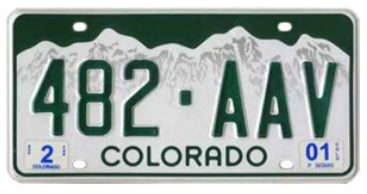
Alex: My #1 plate. Simple and timeless. The dark green would complement my red Jeep perfectly.
Doug: I like this plate a lot, but I absolutely adored the white on green mountain range plates Colorado had used since forever. My favorite license plate of all time, so this new version gets knocked down a couple pegs because they inverted the colors for some unknown reason. I do love the typography of the word COLORADO in this new plate, though.
Susan: It?s just nice to look at. Like Oregon?s.
Ken: I?m a fan that they flipped the color of the mountains and sky. Now the mountains are snowcapped.
Steph: Yep. I?m feeling the contrast of white and green giving focus to the elevation and geographical beauty of the state. But it?s not too loud. Nice and subtle.
Rafal: Wow, you sound like a designer!
Steph: NAILED IT.
1. Hawaii
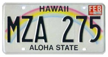
Steph: I?m digging this hard. That is all.
Doug: I couldn?t decide if I loved this plate or hated it. I still can?t decide.
Luke: If a license plate is easy to read AND it makes you want to visit? Winner winner chicken dinner.
Steph: YAS.
Keith: Out of all of the natural beauty in Hawaii, they chose to represent it with a symbolic rainbow rather than something more literal. Love it. Me and the North Dakota Bison are heading there to check it out.
Susan: But are they trying to ?own? rainbows? Like they don?t appear anywhere else in the world? I don?t know ? this didn?t make my top 5 because it seemed like an easy out.
Hawaii license plate committee: So, what?s something everyone loves and brings a happy image to people?
Someone on the committee: Rainbows?
Hawaii license plate committee: Perfect! Done!
Liz: But it works, doesn?t it, Susan? I am on team Luke alllll the way here. Book my ticket!
Bottom 5 United States license plates
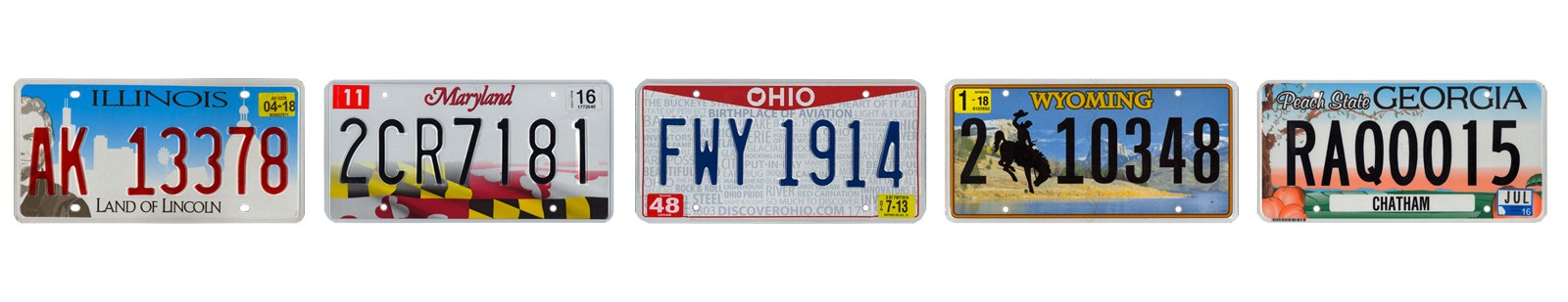
5. Georgia
Luke: y tho
Steph: Peaches have been ruined forever. Yes I know that?s dramatic of me to say. Not taking it back.
Liz: Why did they ditch the old peachy plate? It was great. This new one looks like something I?d find in my daughter?s books.
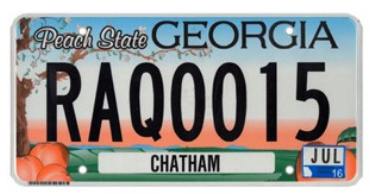
4. Wyoming
Liz: YEEHAW.
Doug: It looks like they made this plate so you could print your own on your inkjet printer.
Luke: Can someone tell me what that number is between the 2 and the 1? I thought I knew all the numbers.
Steph: HOW BOUT WE GIDDY-NOOOOO.
See what I did there, you guys? Get it?
Keith: I do not see what you did there.
Doug: Nor do I. That was as bad as the plate itself.
Alex: Wait, I actually like the Wyoming plate. Its tacky, but that?s why it?s great. It?s what you imagine the American West is like when you?re a little kid. I want to go there. Plus, the rope border is a great finishing touch. 🙂
Oh, and I?ve always wanted to be a cowboy. Here?s proof.
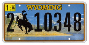
3. Ohio
Luke: Ban all word clouds.
Susan: TLDR.
Liz: I had to ask Steph what that meant. I feel old.
Keith: Ohio is the only plate built by a WordPress plugin, so there?s that.
Doug: THE worst use of typography in license plates, and that?s saying something. WTF is in the background of that mess? Couldn?t decide on a theme, so we?ll just throw everything in there and make everyone happy? Yeah, this is complete trash.
Steph: Do not try to read this plate while driving. You will rear end the car in front of you while making a really ugly scrunched up ?what the hell is going on here? face.
Susan: The North Carolina plate says ?FIRST IN FLIGHT? but the Ohio plate says ?BIRTHPLACE OF AVIATION.? So, who?s lying?
Luke: I know this! The Wright brothers were born in Ohio but flew in North Carolina. So both states are technically correct, but North Carolina is more badass.
2. Maryland
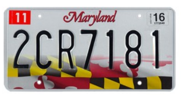
Susan: Looks like a crime scene at first glance. The yellow and black being police tape and the red being blood spilled all over pavement. Don?t know what it?s really supposed to be!
Doug: Damn, I love Maryland?s state flag so much ? IMO, it?s one of the best state flags in the country. So much history and iconic art to be used on these plates, and they just kinda did the worst of all options, including running black numerals over the black and yellow faded flag. So much potential, and so much underachieving.
Luke: I liked how they used the state flag at first glance. Then I kept looking and realized I couldn?t read the plate. Not ideal.
Liz: Took me WAY too long to realize this was their state flag. I kept seeing a checkered flag and wondering why Maryland was so into racing. To Steph?s earlier comment on the Ohio plate, by the time I figured this out I would have rear ended the car in front of me.
1. Illinois
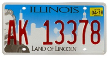
Keith: When you try to make everyone happy, mediocre design results.
Rafal: I just can?t get over Lincoln?s eye. And why is he peeking from the side? And where is his hat?!
Luke: I love living here. What a great state across the board.
Steph: I love that we all live here and without hesitation are all ?ahhh booo this blows.? Way to go, Illinois.
Doug: OMG, where in the hell do I even begin with this dumpster fire? These are the plates that instigated this whole license plate project, as we have to now look at these every day when we drive. The old ones weren?t awful, but they weren?t very good, either. These move bad plate design to a whole new level.
First, we have a half-cropped face of Lincoln, because you know he moved here when he was 21 and he freed the slaves, so we claim him as ours (suck it, Kentucky). Then again, we did only take half of him. Kentucky can have the other half.
Next, the typography gets a failing grade in every respect. Bad typeface is stretched not only horizontally on the state title, but vertically on the ?Land of Lincoln.? And if it wasn?t bad enough type already, they used it as small caps which distorts it even further. This is first-class flunky high school shit design. And can you read it from more than 3-feet away? Nope.
Now, throw in a silhouette of the state capital building and the Chicago skyline (because all of Chicago thinks that anything south of I-80 is ?the south?), then make the stamped numbers a strange transparent red over a blue gradient, and you have this eyesore that we now must live with in Illinois.
Hot garbage.
Disclaimer: It was a bit difficult to tell which plate is every state?s current primary offering. This page seemed to be the most up to date, so that?s what we used to make our lists.
How to design a good license plate: Make it legible and feel free to add color, but don?t go crazy. If you add a graphic, keep it simple.
How to design a bad license plate: Make sure you get a massive committee of people (who know nothing about design) to comment on how the plate should look. Make it as complicated and hard to read as possible. A few tips:
- Add more color!
- Where?s our nickname? Add it in!
- Is there a way we can get our flag onto the plate?
- Hey, there?s no URL on this plate! We need a call to action.
- When in doubt, add a blue-to-white gradient like Connecticut, Kentucky and Missouri.


 License Plates in the United States)
 License Plates in the United States)