Residual plots help you evaluate and improve your regression model.
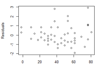
A residual is the difference between the observed value of the dependent variable (y) and the predicted value (?). There are a few common residual plots. The first one we?ll cover is the residuals vs. fitted plot. This plot tests the assumptions of whether the relationship between your variables is linear (i.e. linearity) and the whether there is equal variance along the regression line (i.e. homoscedasticity).
A ?good? residuals vs. fitted plot should be relatively shapeless without clear patterns in the data, no obvious outliers, and be generally symmetrically distributed around the 0 line without particularly large residuals.
Let?s generate a simple example in R to demonstrate:
# load package for residual plots. I?m using the boot package, but these can be # constructed manually, as well
library(boot)
# linear model ? distance as a function of speed from base R ?cars? dataset
model <- glm(dist ~ speed, data = cars, family = gaussian)
# diagnostic plot of model
glm.diag.plots(model)
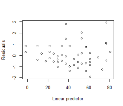
Our plot is OK. It?s relatively shapeless. The residuals get larger as we move left to right and there are a few potential outliers, so there may be a few issues with our model. However, it?s probably not worthwhile to try to over-interpret this plot.
We?ll tackle QQ plots next?
Additional resources if you?d like to explore further
https://onlinecourses.science.psu.edu/stat501/node/36 ? more detailed overview
http://docs.statwing.com/interpreting-residual-plots-to-improve-your-regression/#x-unbalanced-header ? a lot of good examples of poor residual vs. fitted plots and how to correct your model.

