Learn how Google reimagined over 2,000 emoji characters ? all in the interest of expression.
Since the days of Android KitKat, our emoji have grown to over 2,000 characters with only subtle changes in style. With the proliferation of high density screens and new messaging use cases, we decided it was time to give our emoji an overhaul.
At Google I/O 2017, we announced a full redesign of the Android emoji font, which includes a unification of our visual style and a brand new design that fosters cultural awareness through diverse and inclusive emoji.
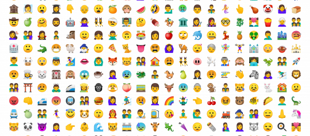
 Examples of the redesigned people emoji
Transitioning to new emoji
Our original emoji style was simple and flat with bold pops of color. The flat design became Android?s signature style, differentiating us from other platforms.
Over the years, as additional emoji were added across all of the categories, the set became stylistically divergent. Our design system wasn?t equipped to to provide standards that unified the look and feel of all the illustrations across the many emoji categories. As a result, our emoji became inconsistent between old and new designs, making it difficult to quickly scan the keyboard to find the right emoji.
It was time for a change.
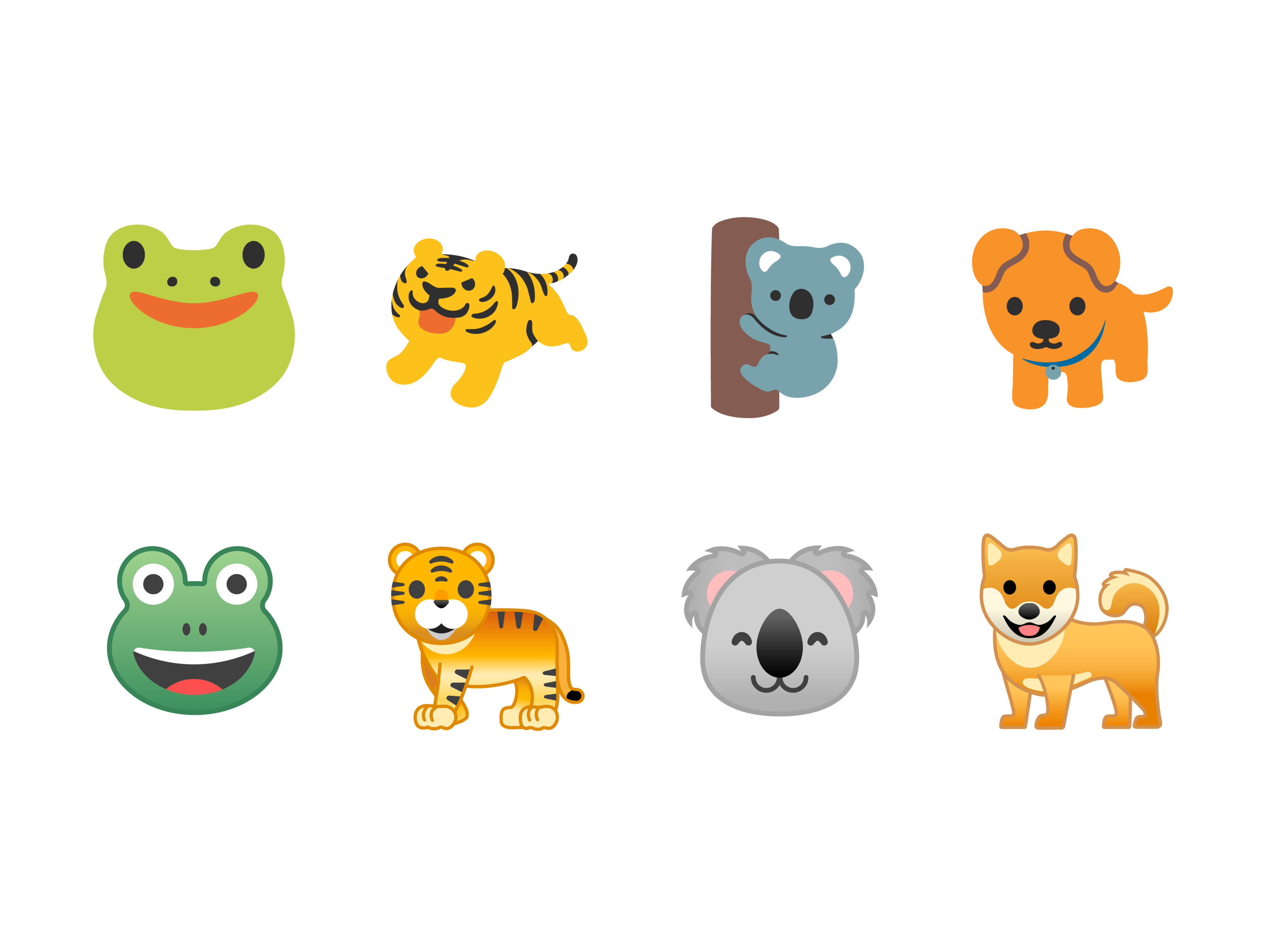
 We changed the animal set from a variety of styles to a single unified look for heads and bodies alike.
Creating a new design system
Learning from past experience, a central theme of our redesign had to be a strong design system that made it easy to create an easily identifiable emoji style. In addition to a unified style, the system had to help us stay consistent and vibrant as new emoji were introduced in the future.
By formalizing the shape, grid, representation, and color, we were able to unify the set while retaining expressiveness and character. By creating a strong design system we also addressed a major shortcoming in our old style, and we enabled the emoji to be created by more than one illustrator while remaining consistent, legible, understandable, and representative in any context.
Shape system
 Bye bye blobs! Hello emotive squishy circles.
Yep, we did it. We said goodbye to the blobs. We moved away from the asymmetric and slightly dimensional shape of the container to an easily scannable squishy circle, relying on bold color, purposeful asymmetry ? such as the new mind-blown emoji or the prop-wearing cowboy emoji ? and loud facial features to convey emotion.
We also spent a long, long time making sure that we addressed cross-platform emotional consistency. Because one of our main goals with the redesign was to avoid confusion or miscommunication across platforms, we wanted to assure the user that when they sent an emoji to a friend, the message was clearly communicated regardless of whether they are on iOS, Windows, Samsung, or any other platform.
Grid system
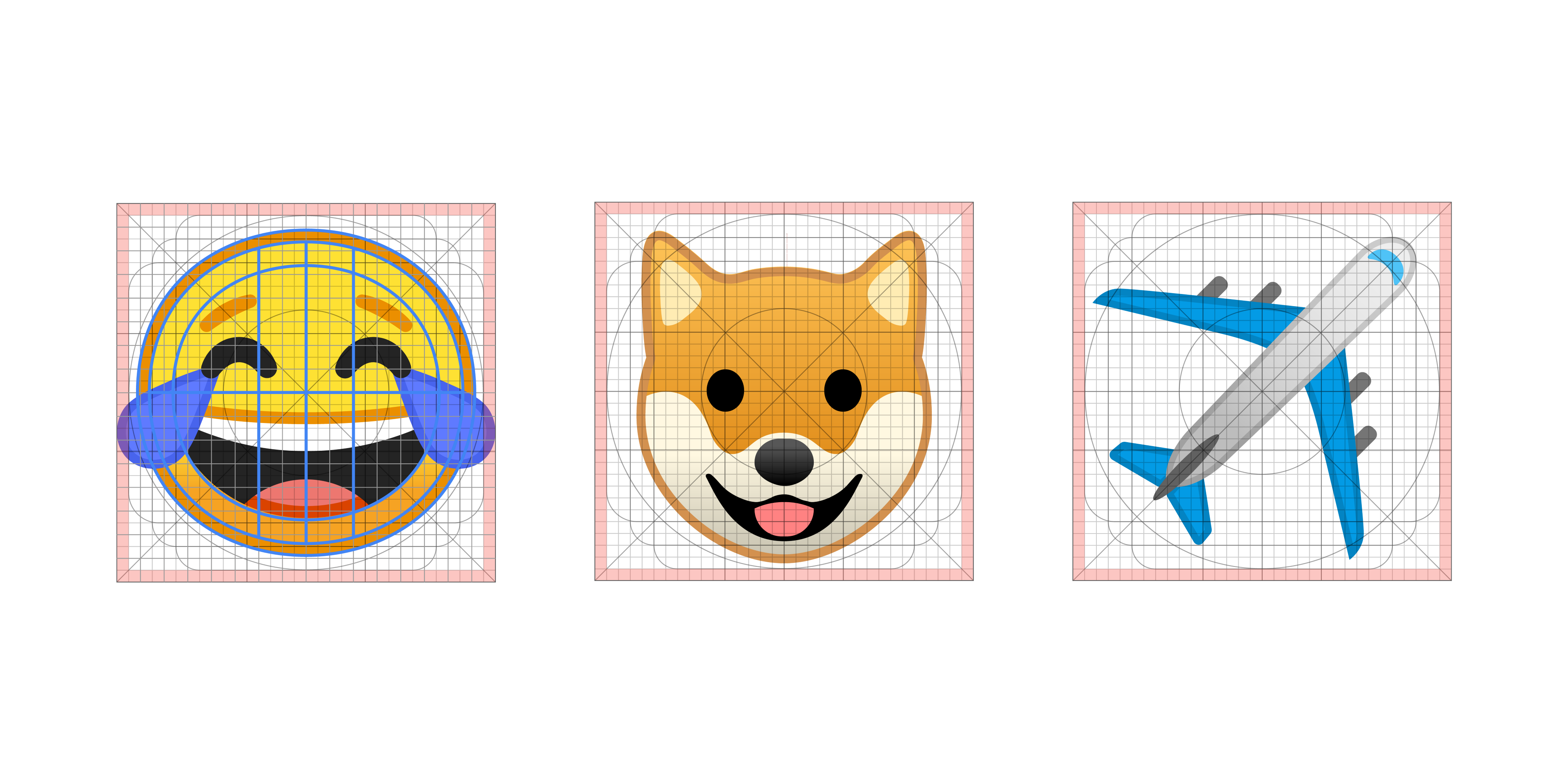 Emoji are designed on a single grid to maximize readability and consistency.
In the spirit of readability and consistency, we built emoji on a single grid. The grid we used was a modified version of the Material Design product icon grid. For illustrations, we did not adhere as strictly to the rules as we do for iconography, but we capitalized on the grid in three particular ways:
- Unifying scale and size consistency across illustrations.
- Building a consistent set of shapes across the set.
- Facilitating designers aligning various parts of emoji in the correct places (think specific areas for eyes and mouths).
We also unified dimensionality and angles across sets, opting for simple angles as much as possible ? emphasizing two-dimensional views over three-dimensional views to simplify and work with our grid. And we introduced three-dimensional points of view in the few cases where the readability of the emoji was unclear.
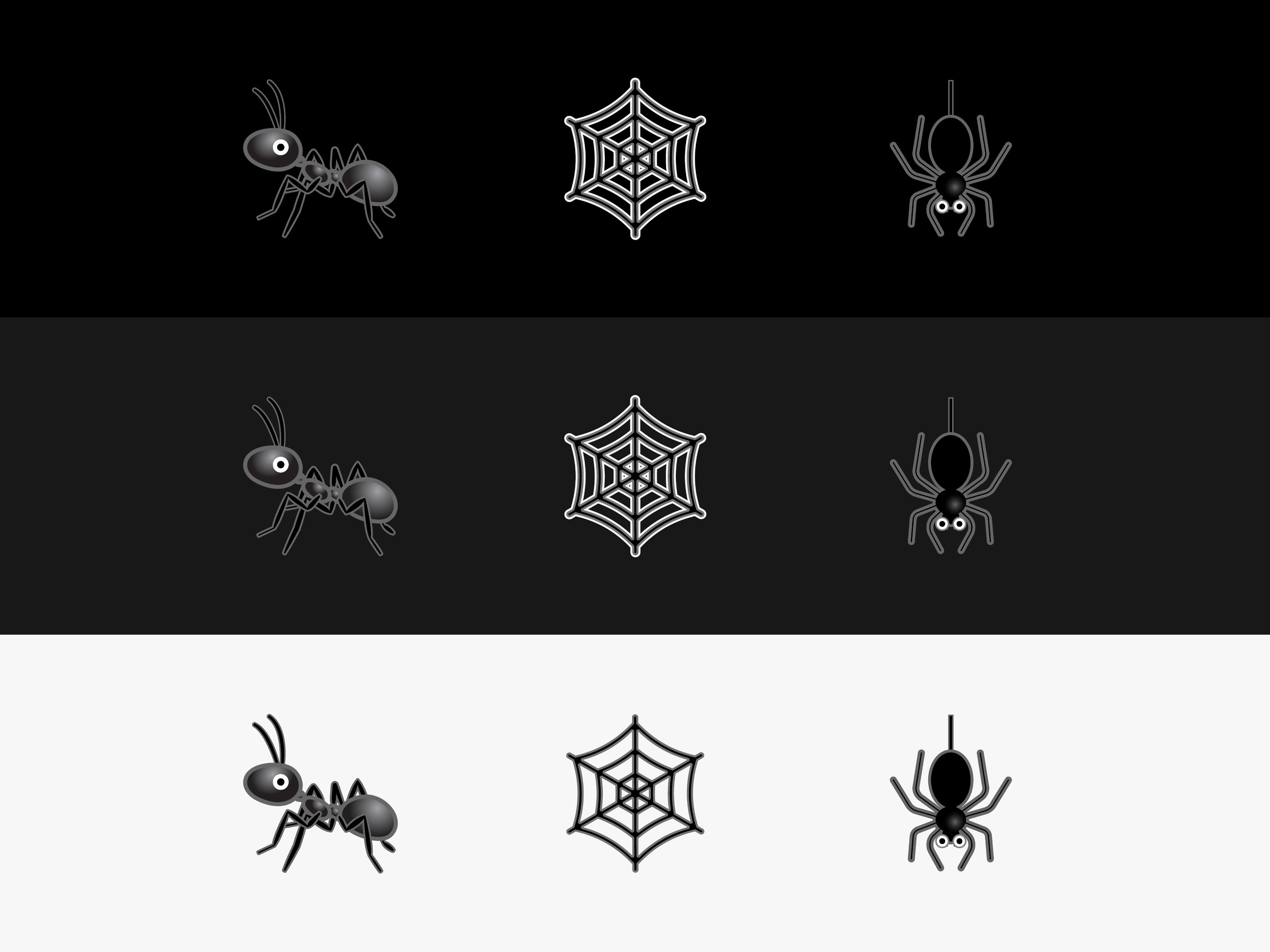
 We used the grid to create angle and scale standards. In Android N (top row), the animals? postures, angles, and styles were inconsistent.
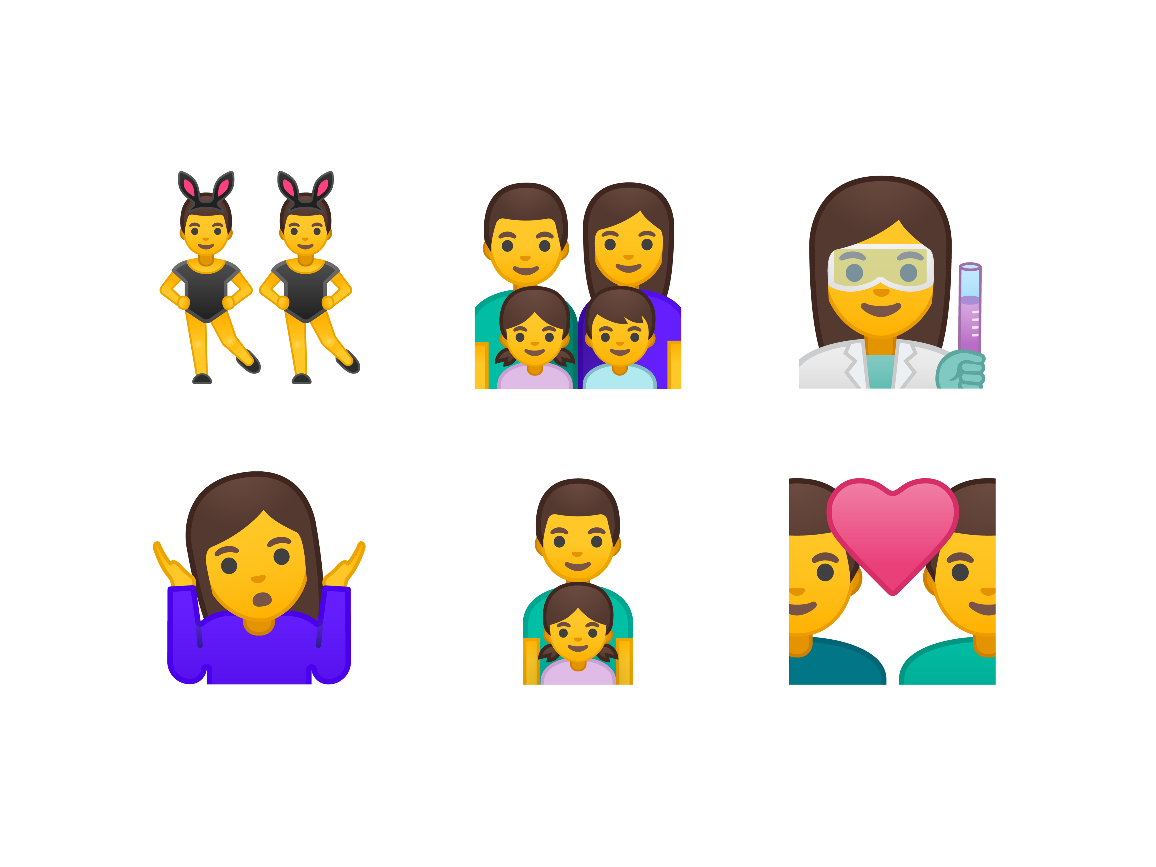
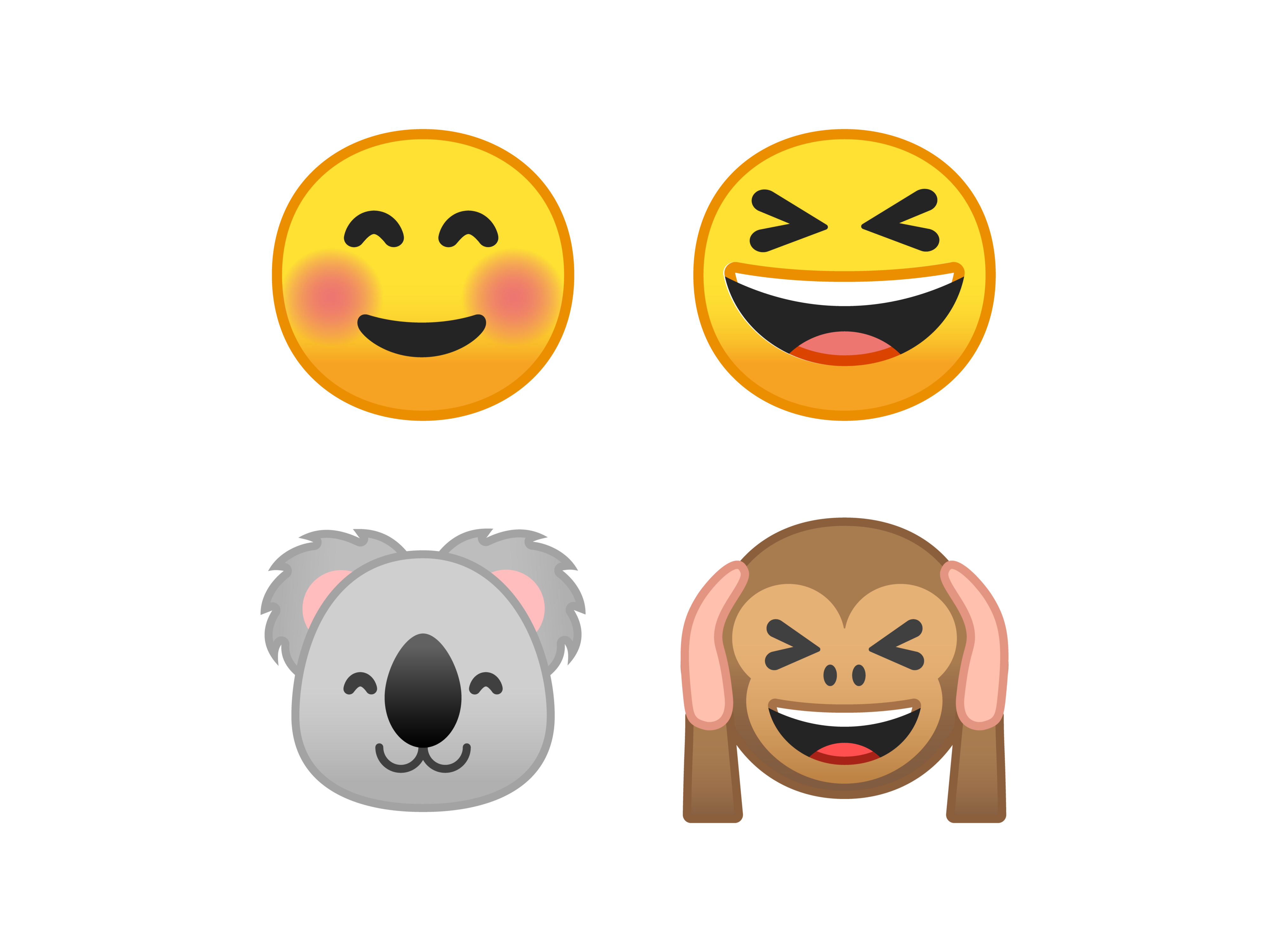
Reusable components
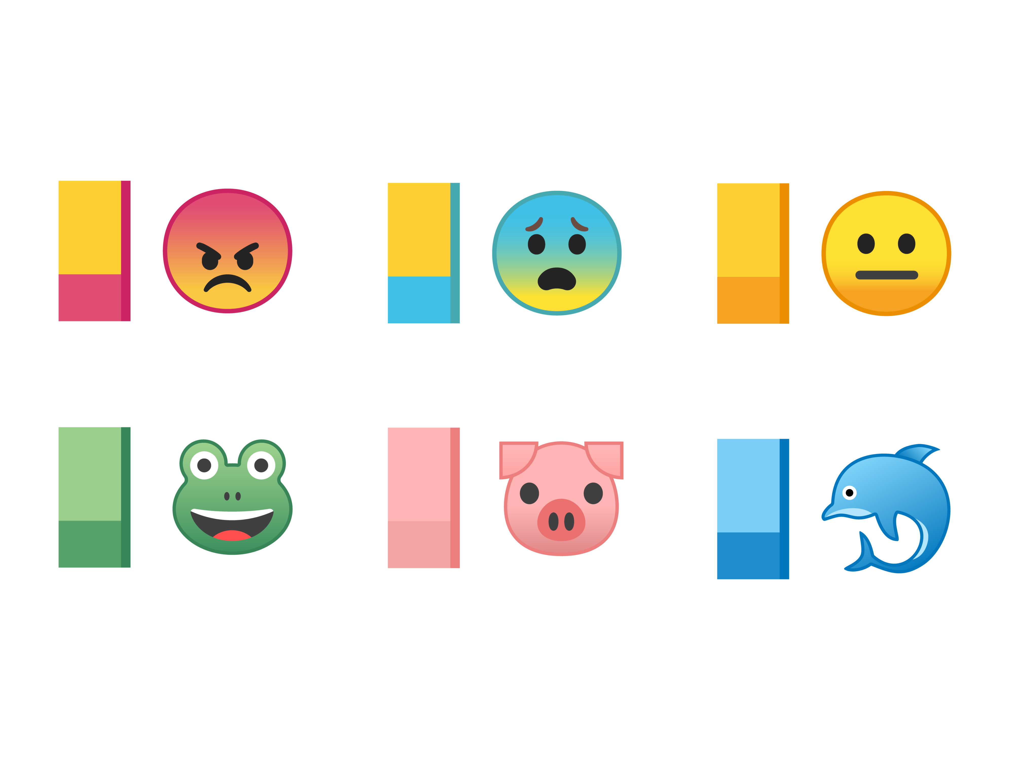
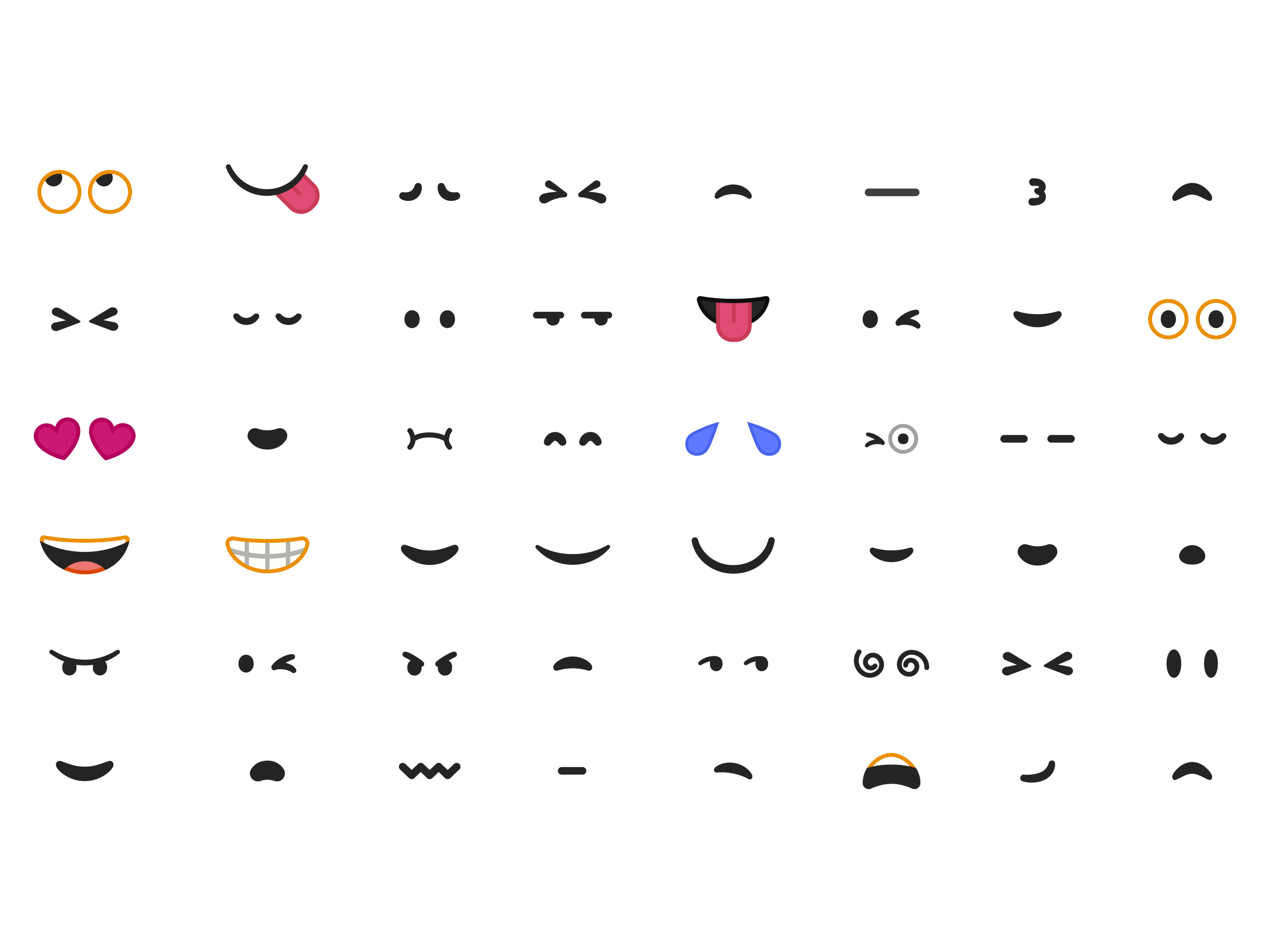 Reusable emoji expression components cover a wide range of emotions.
In addition to a grid, we built a new collection of reusable components for certain categories of emoji. Not only do these reusable parts maintain consistency and readability across the emoji, they help define the unique aspects of our illustration style while making future emoji much easier to build. It was also fun to mix and match components between categories, which resulted in some nicely expressive animals.
 We shared many of the eye and mouth components between the expression and animal emoji.
Color
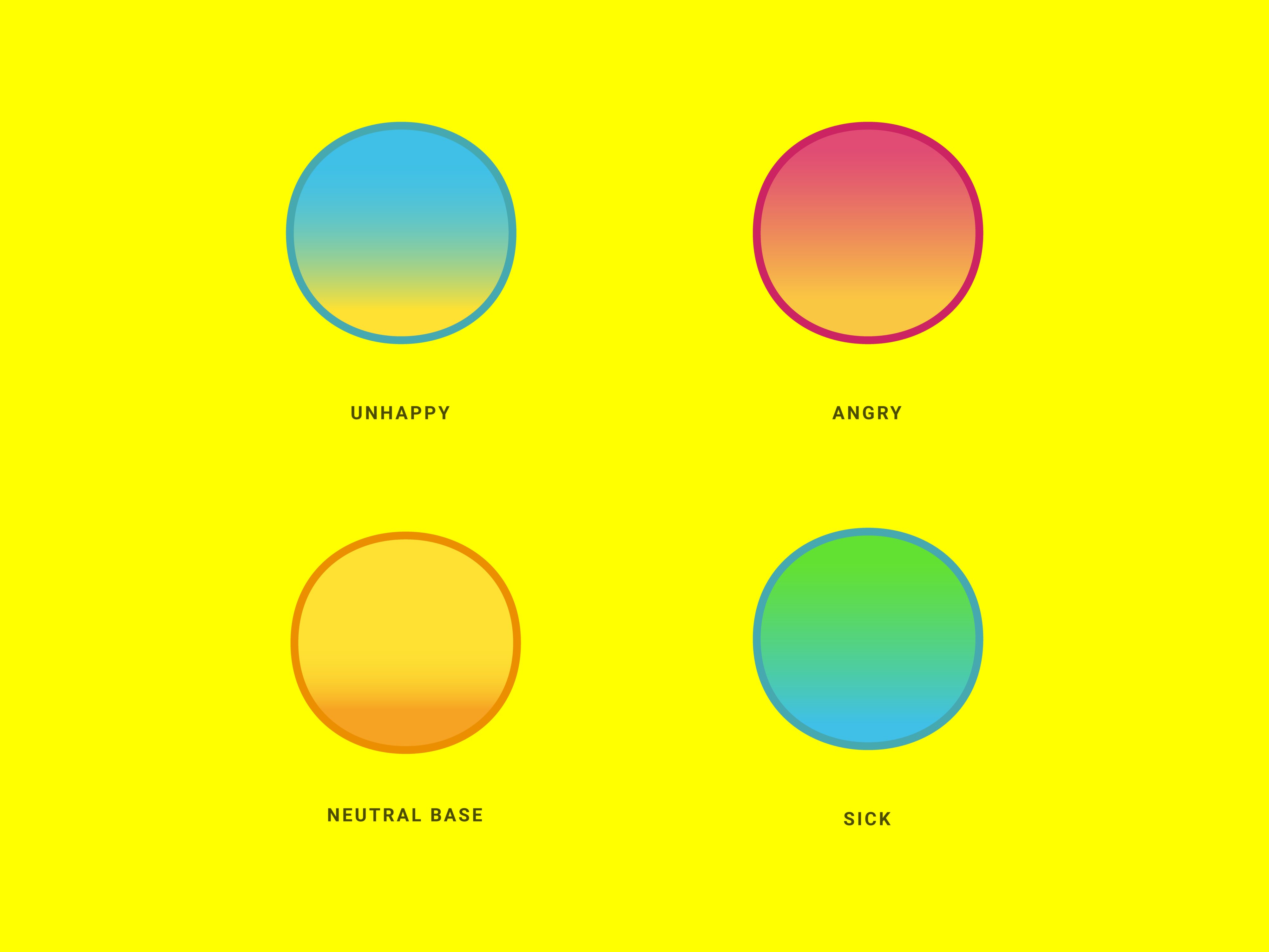 Colors reinforce emotion
Our color update introduced a fresh and consistent palette of bright colors. We created sets for certain categories?most noticeably the expression emoji, where reds, blues, yellows, and greens are now associated with specific emotions.
Taking another cue from the Material Design product iconography work, we introduced a lighting style that makes the emoji more tactile while giving us the opportunity to play with color. Gradients also made the emoji more legible across a variety of solid backgrounds.
 Gradients and tonal strokes ensure emoji are legible across any background color.
Another method for ensuring the legibility was adding a tonal stroke, or outline, to the emoji. We determined the color of the line based on the palette of the emoji and the category. Categories that contained emoji using many different colors used a dark, semi-transparent stroke. Simpler categories such as animals, people, or expression emoji used two main colors and a stroke based on the secondary emoji color.
 The new color system unifies the emoji set.
Beyond looking awesome and pushing our color system further, the tonal strokes ensure that regardless of the background color they appear upon, the emoji are always legible, on any keyboard or within any messaging app.
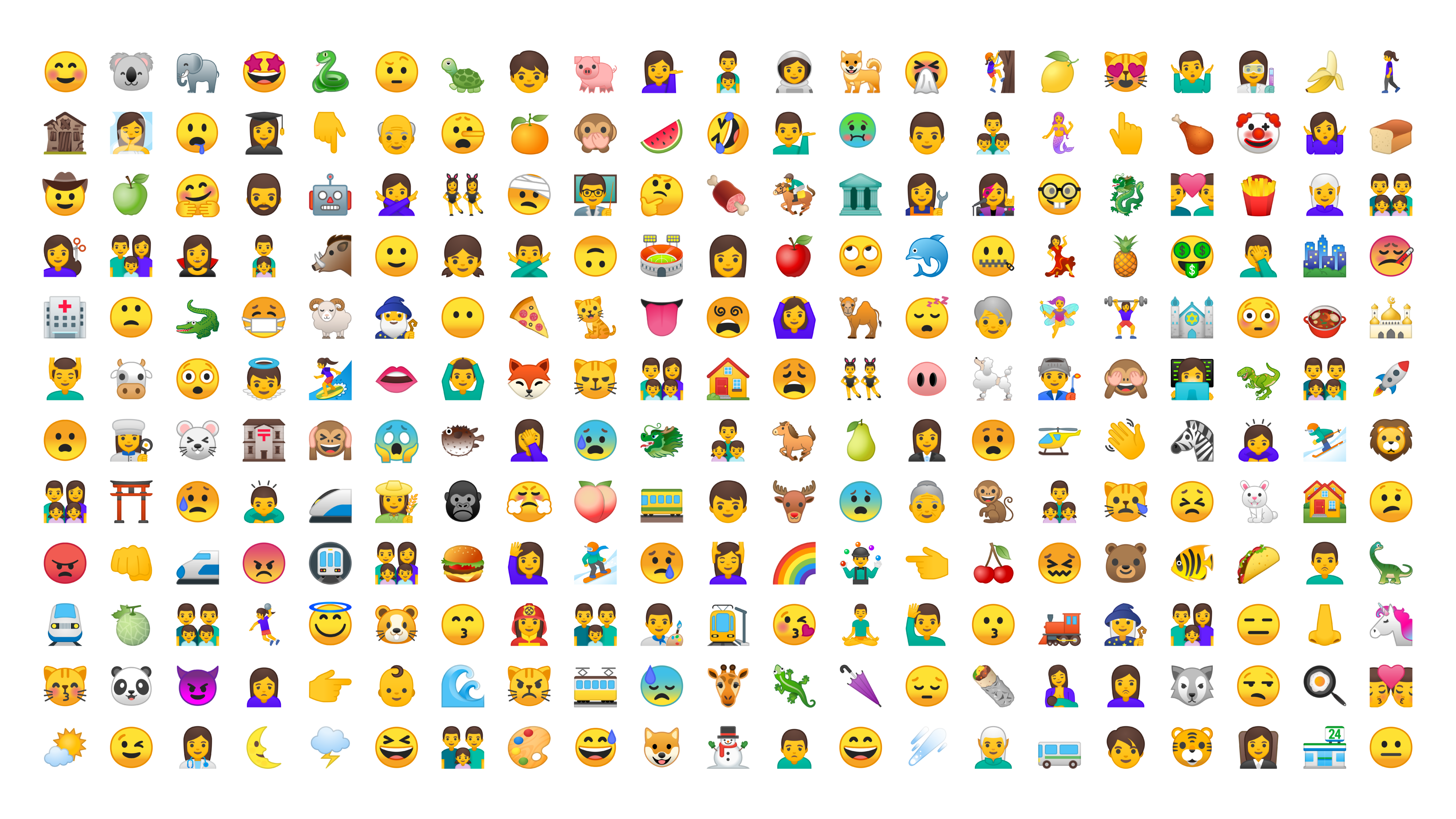
69 New Emoji
As part of the redesign for Android O, we?re also introducing 69 new emoji which are part of Unicode 10. This new set strives to make emoji more representative by providing gender-neutral representations of people, a woman wearing a hijab, and a woman breastfeeding.
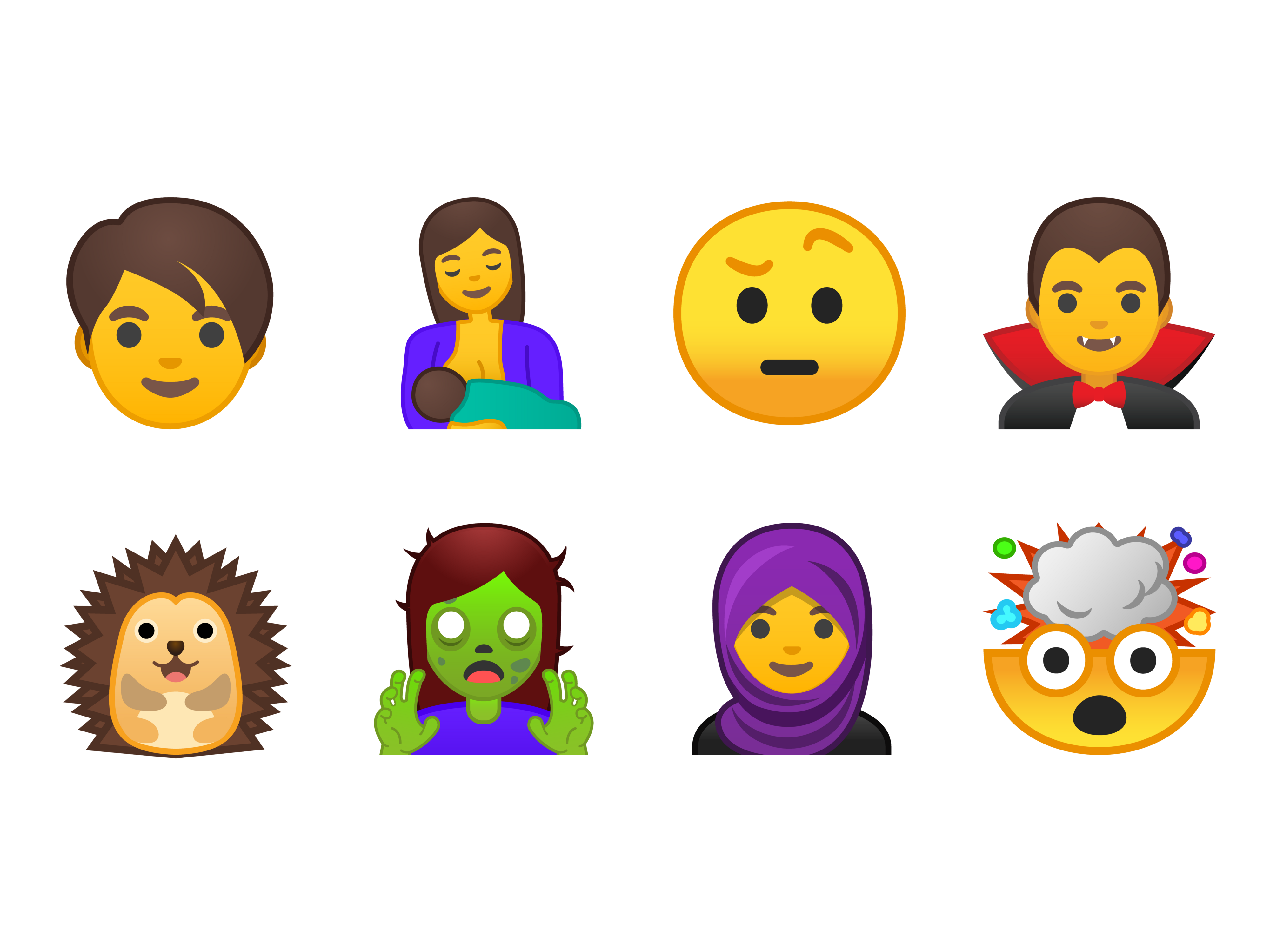 A sampling of the 69 new emoji.
There are also nine new smileys to help users expand the range of emotions they can convey. Fantasy fans, animal lovers, and foodies will find some great new emoji too ? from ghoulish green zombies to a fierce T. rex and delicious dumplings.
The fully redesigned emoji set as well as the new Unicode 10 emoji will be available to Android O beta users starting May 17.
It?s been a long journey since Android started supporting color emoji and today we?re taking the biggest leap yet with a full redesign! We hope you?ll enjoy using our newly revamped emoji as much as we enjoyed making them.
