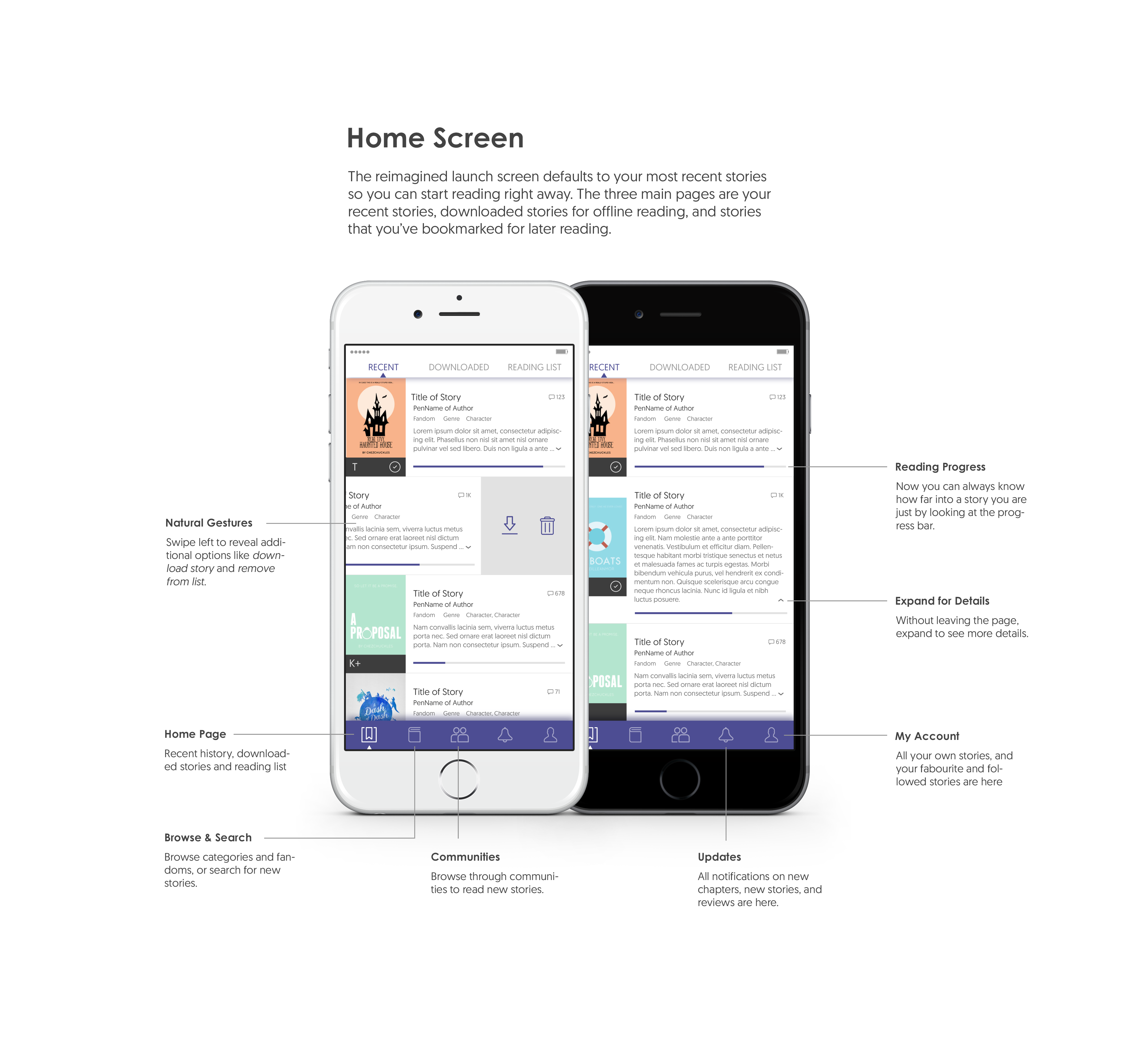
A Personal UX Reflection
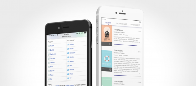
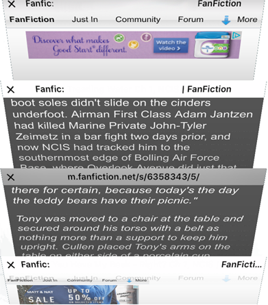
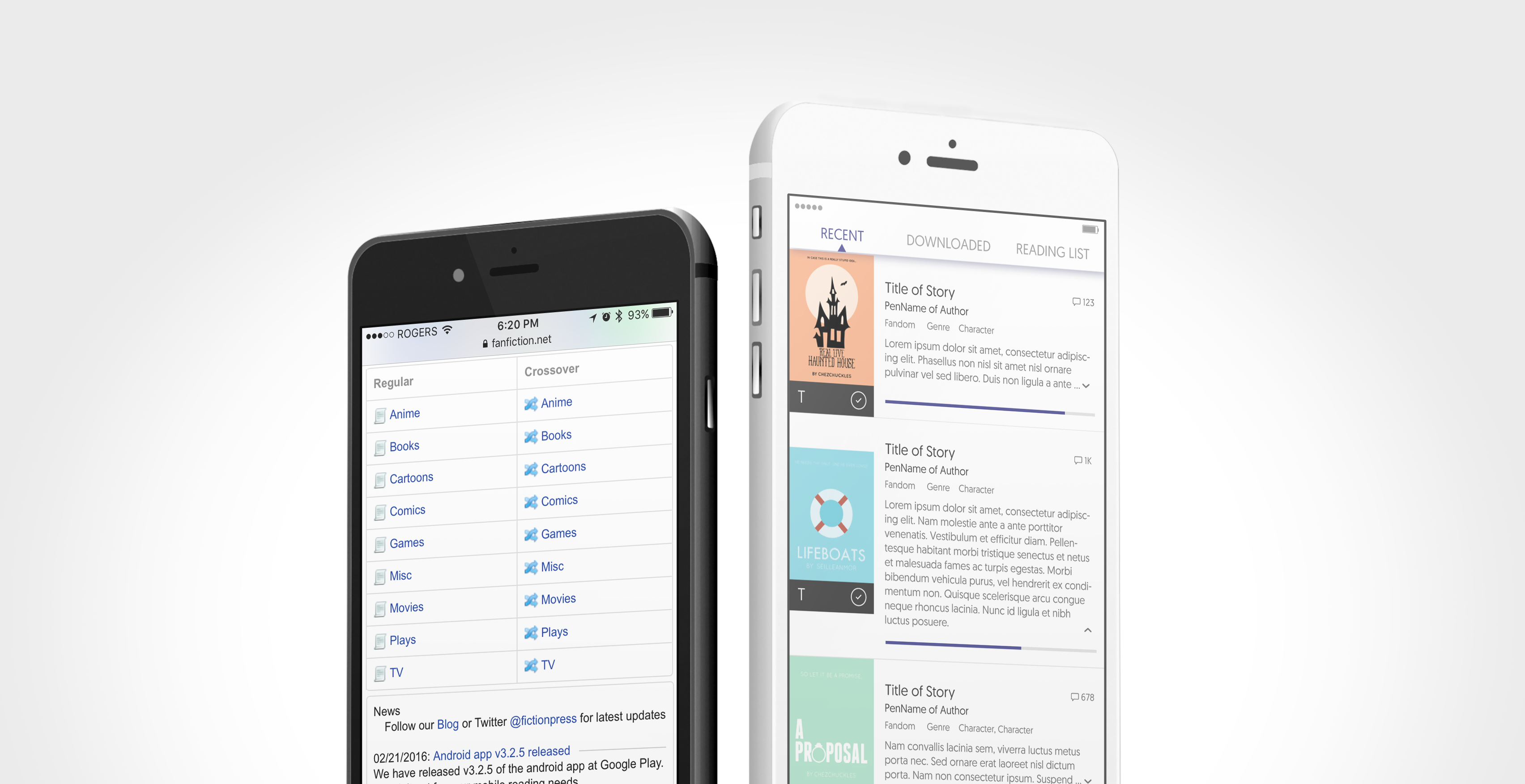 Current m.fanfiction.net launch screen (left). My proposed app launch screen (right).
Growing up, I hated reading. I only ever picked up a book for my Novel Studies class and even then, it was forced. One day in grade 7 after I had finished reading the first Harry Potter novel (assigned reading, of course), my best friend suggested that I read a fanfiction titled Obsessive Lily Disorder by an author by the pen name Procrastinator-starting2moro. If you don?t know what fanfictions are, fanfictions are stories written by fans about characters or settings from original works of fiction. Stories are based on novels, TV shows, movies, cartoons and even real life celebrities. This particular story was based on Harry Potter books, specifically the Marauder era. Upon reflection the story is ridiculous and is not exactly publisher material but my twelve-year-old self thought it was absolutely hilarious. For a person who never read for pleasure before that point, I sped through 144,021 words in no time. From then on, my best friend kept feeding me new stories. Later on that school year, she handed me a real book. That is when I started really reading. I remember counting all the books I read in grade 8 and it totaled over 50 books. That may not seem like much but for me, it was more books than I had read in my entire life up until then.
While I started to read more published novels, I was still an avid reader of fanfictions. The largest repository of these stories is hosted on fanfiction.net (aka FFN). This website is a social reading site that allows people to write stories and post them, filter and read stories, and to review (leave comments) and share stories. People can ?follow? or ?favourite? stories and authors to get notifications on updates and new stories.
I made my account on fanfiction.net back in late 2005 and mainly read stories on my old Dell 14 inch monitor. Now in 2016, I almost exclusively read on my mobile devices: my iPhone 6s and iPad Mini 2. When I am on-the-go, I primarily read on my phone since it is with me all the time. Whenever I have a spare moment, like when I?m waiting for an appointment or I?m riding the bus, I take a moment to read a chapter or two. For over a decade now, reading online stories has been a regular part of my week.
The following is a table of some basic statistics of the site to indicate that I am not alone but one of millions. Most people still use the web/tablet version of the site. Regardless of the platform, people spend approximately the same amount of time on the site, likely reading. Users also seem to be less patient and tolerant on the mobile site than the web site.
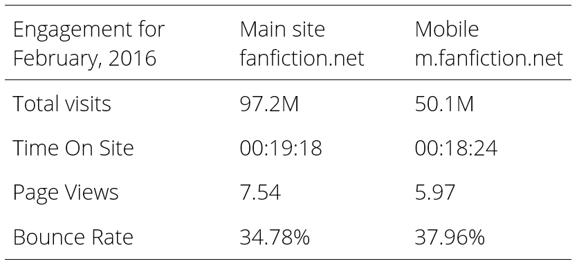 Statistics provided by www.similarweb.com
How do I use FFN?
The reading experience on my tablet/desktop is very different than on the phone. While fanfiction.net has a dedicated mobile web version of the site, it is not nearly as pleasant to read as the tablet version. But I still mainly read on the phone for convenience sake. For that reason, I will be limiting the scope of this reflection on the mobile reading experience of the site.
On the phone, I mainly just read. Sometimes I favourite or follow a story or author. Even more rarely do I leave a review. I never write or upload stories of my own to publish on anything other than my desktop. There are also a number of features that I never use regardless of the platform: forums, communities, and features specific to beta readers (informal editors). An analysis of these features will also be out of scope.
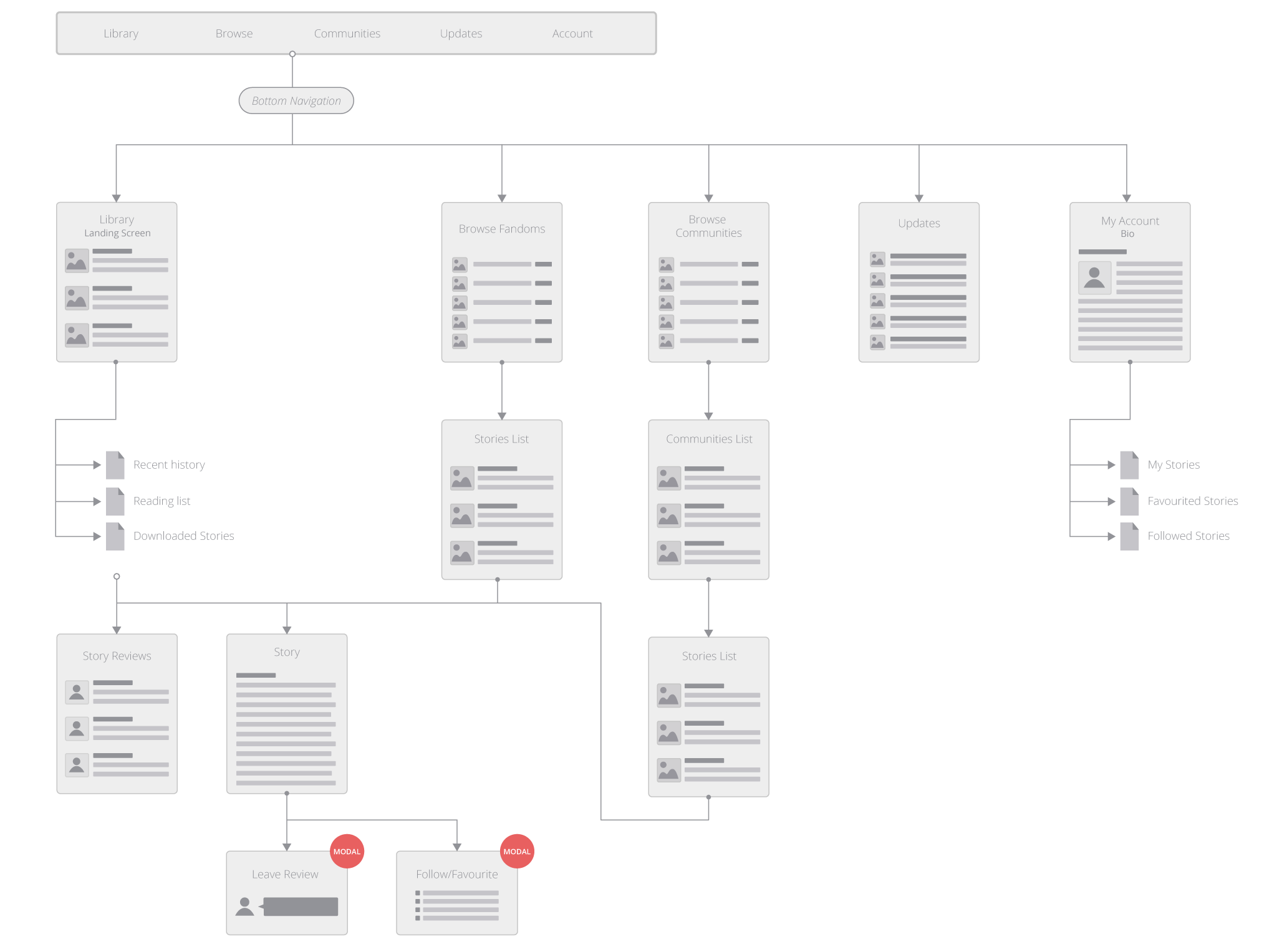
The following diagram shows my personal usage pattern on the phone. The green lines and blue phones show the screens and pathway that I use the most often. The red lines and white phones outline other pathways that I use from time to time.
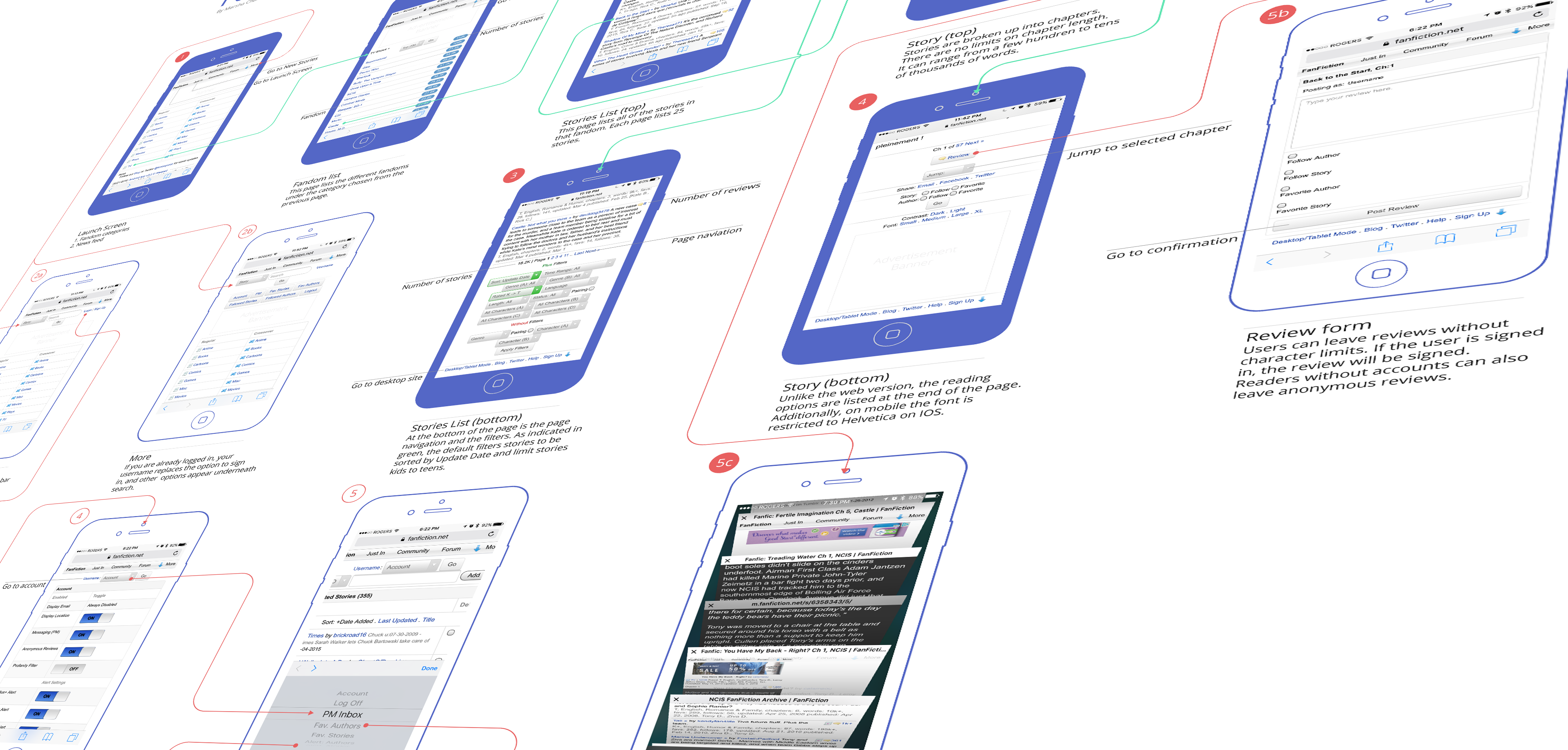 Just because it?s too huge to paste, click here to browse the entire map!
Understanding Me
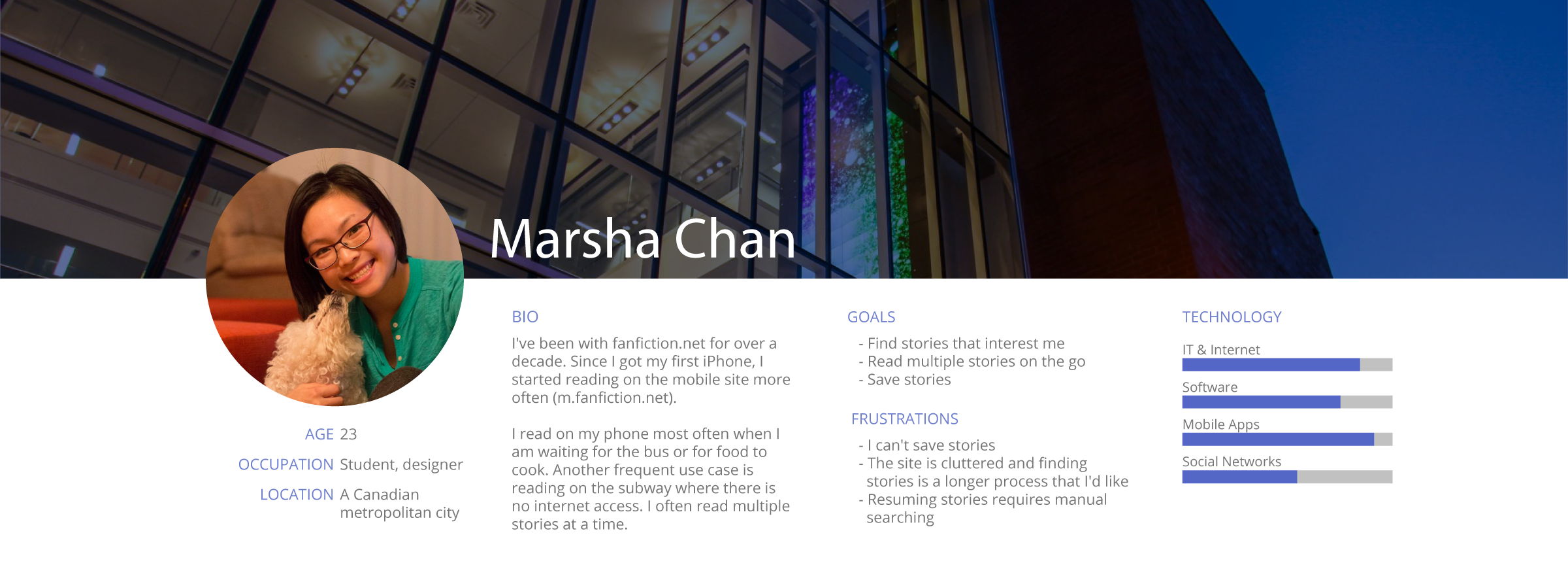
Since this is a personal reflection, the only persona that I will be concerned with is me. While personas are typically used as a tool to build empathy, in this scenario I am the only user of importance (said with the utmost modesty).
Introducing me!
User Scenario
Here is a common user scenario:
I work downtown and live in the suburbs of Toronto. To get to work, it takes a 25 minute bus ride and a 25 minute subway ride.
- Get on the bus.
- Pull out my phone and go to m.fanfiction.net.
- Find a story.
- Read until I see the subway terminal.
- Rush to save some chapters in my reading list.
- Walk down to the subway platform and get on the train.
- Continue reading on the subway until the chapters run out or I arrive at my station, usually the former rather than the latter.
I?ve been reading on this site for ages now and I am fairly used to the idiosyncrasies of its personality. For the purpose of this assignment though, I spent some time scrutinizing the experience of my typical user journey. While it is functional, there is significant room for improvement.
So with that, let?s go over some pain points:
1. It takes me 4 screens and 3 clicks to actually start reading anything.
- Whether I?m finding a new story or continuing one that I?ve been following, I have to click 3 time at minimum to actually start reading anything. FFN needs to apply the principle of ?one less click?.
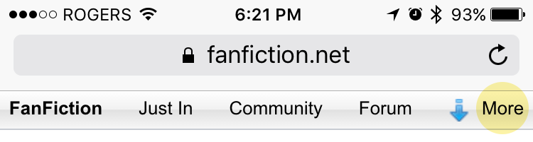
- If I want to search for a story that I already have in mind, the search option is hidden under more. Once your click search, it takes you to every possible story on the site and does not let you filter between languages or fandom.
- Additionally, the clickable links are all the same size as on the website. The website is designed mainly for mouse-and-keyboard input. However, on the phone, the main input is my thumb and my thumb is not nearly as precise as a mouse. The touch target area is too small.
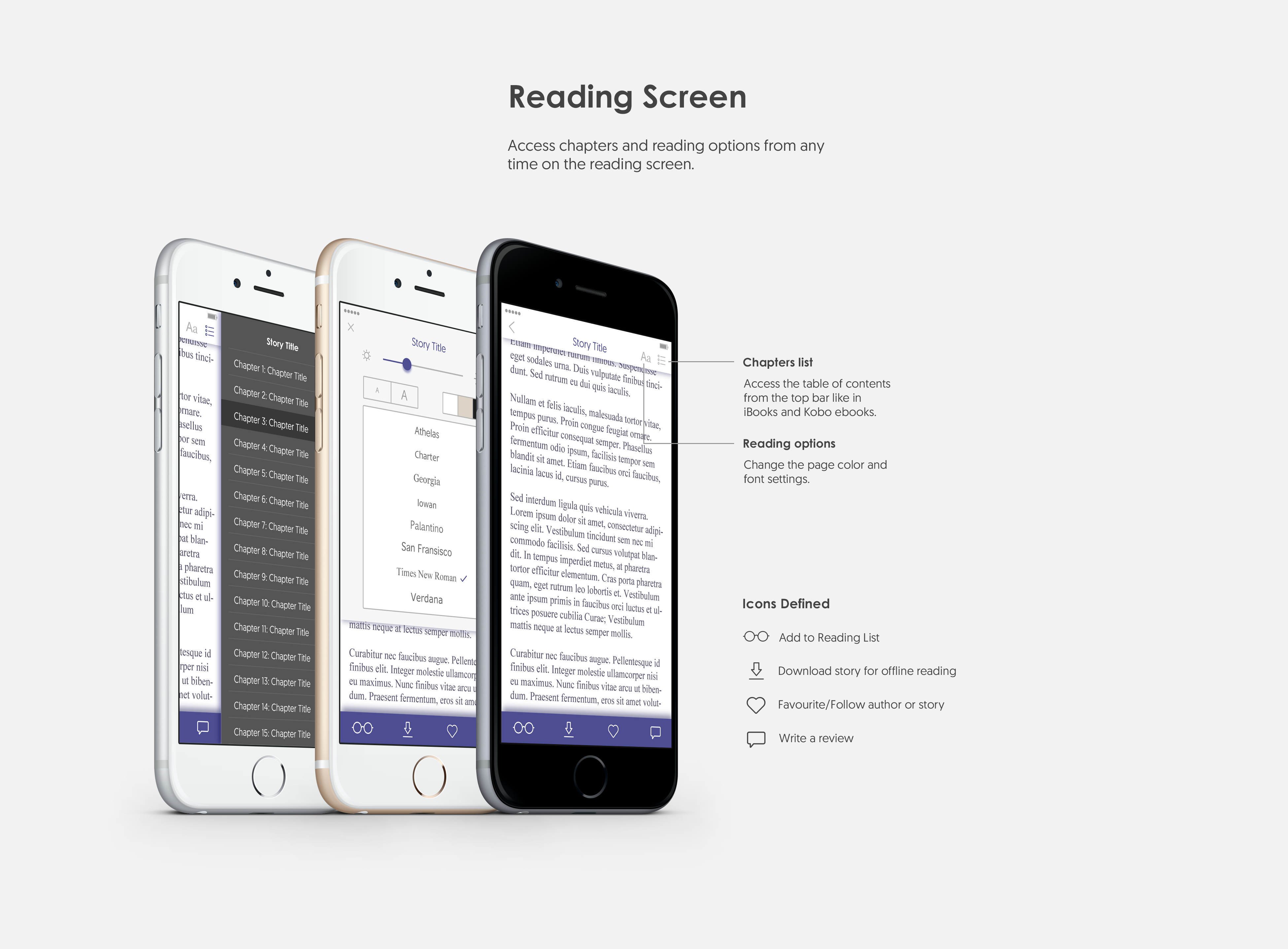
2. There are minimal reading options compared to the website.
- Fanfiction.net is not the only app I read from on my phone. I also read ebooks on iBooks and Kobo. Both of these apps provide the option to change my reading experience. This includes the ability to change the font and font size as I read. The website/tablet version of FFN provides the option of choosing font style, font size, margins, line spacing and background colour/texture. Coming from reading on the web version, the loss of these options is a monumental failure. While I understand that it is more comfortable for most people to read sans-serif typefaces on digital devices, I have a strong personal preference for Georgia on any device when I have to read large blocks of text as is the case on FFN. I want to be able to choose.

- The settings are at the end of the chapters or the bottom of the page. So when I start reading and the default is not as I like it, I have to navigate to the end of the story or chapter, change the settings and then scroll all the way back up.
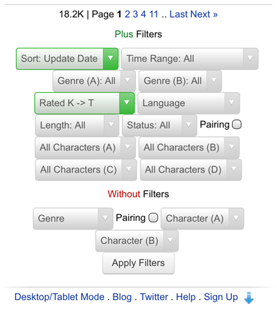
- The story filters have the same problem. The list of filters are located at the end of the web page. Also, it is wrong to assume that all people are interested in all stories and sorted the exact same way. Similarly, not all people want to read with the default settings.
3. Bookmarking
- Ever since I started, I would often find multiple stories I wanted to read at a time. Just as frequently, I would read multiple stories simultaneously, sometimes over different devices. When I return to a story I have been reading, it won?t show me which chapter I was on or where on the page I was. Currently, my ?hack? for this is opening all my stories on different tabs. I assure you that it is less than ideal.
4. Offline reading isn?t really possible
- Because of the way stories are broken in to chapters, each chapter in the story has its own URL. As soon as I am disconnected from the internet, the chapter that I am on is the only one I can read. When there are 34 other chapters and I am only on chapter 8, I have to stop reading until I?m back above ground (in the case of being on the subway). I want to be able to save the entire story to read! Currently, what I can do is to navigate to each chapter and save the page on to my reading list, one by one. Its tedious and annoying. When I only have a few moments before I reach my final stop, I can usually only add about 4?7 chapters before I have to get off the bus. That only gets me maybe 10 minutes of reading time before I?m through all the chapters I saved. When I don?t anticipate the disconnection, it?s even worse. When you pick up a book, do you ever expect to not access the following chapter? It?s a jarring and unpleasant experience.
Solution?
A mobile app!
There is currently no native app by FFN for IOS. All the ones on the App Store are all by third-party developers and are missing some core functionality or stories provided by FFN. As a frequent user, I would be happy to download a dedicated app to read stories. It would solve the problem of offline reading, and design decisions would no longer constrained to the limitations of the browser.
Goals:
- Optimize mobile reading experience.
- Maintain a unified experience across all platforms (web, tablet and mobile).
Process:
I looked at a variety of reading and book review applications including iBooks, Google News, BuzzFeed, Wall Street Journal, New York Times, Pocket, Wattpad, KoBo eBooks, and Kindle. I looked for standards across all these applications to find trends, patterns and typical user flows and UI elements.
Based on the typical user flow (my personal user flow) and pain points I mentioned above, I came up with a number of user stories to inform potential features:
- As a user, I want to start reading a story with minimal navigation so I can maximize my reading time.
- As a user, I want to be able to resume my story from where I left off so I don?t always have to manually search for it.
- As a user, I want to search for stories using filters so I can personalize my search results.
- As a user, I want to download stories for offline reading so I can continue reading without interruptions when I am not connected to the internet.
- As a user, I want to remove stories from offline storage so that I can save space on my device(s).
- As a user, I want an optimized and customizable mobile reading experience so that I?m delighted, rather than frustrated, as I read.
Additionally, there are a few extra user stories that aren?t priority 0, but would turn the app from satisfactory (includes only the necessary features to not be disappointed) to delightful.
- As a user, I would like to see a list of recommended stories based on my reading history and other readers who have read similar stories (like Amazon or Netflix) so that I don?t always have to search from scratch.
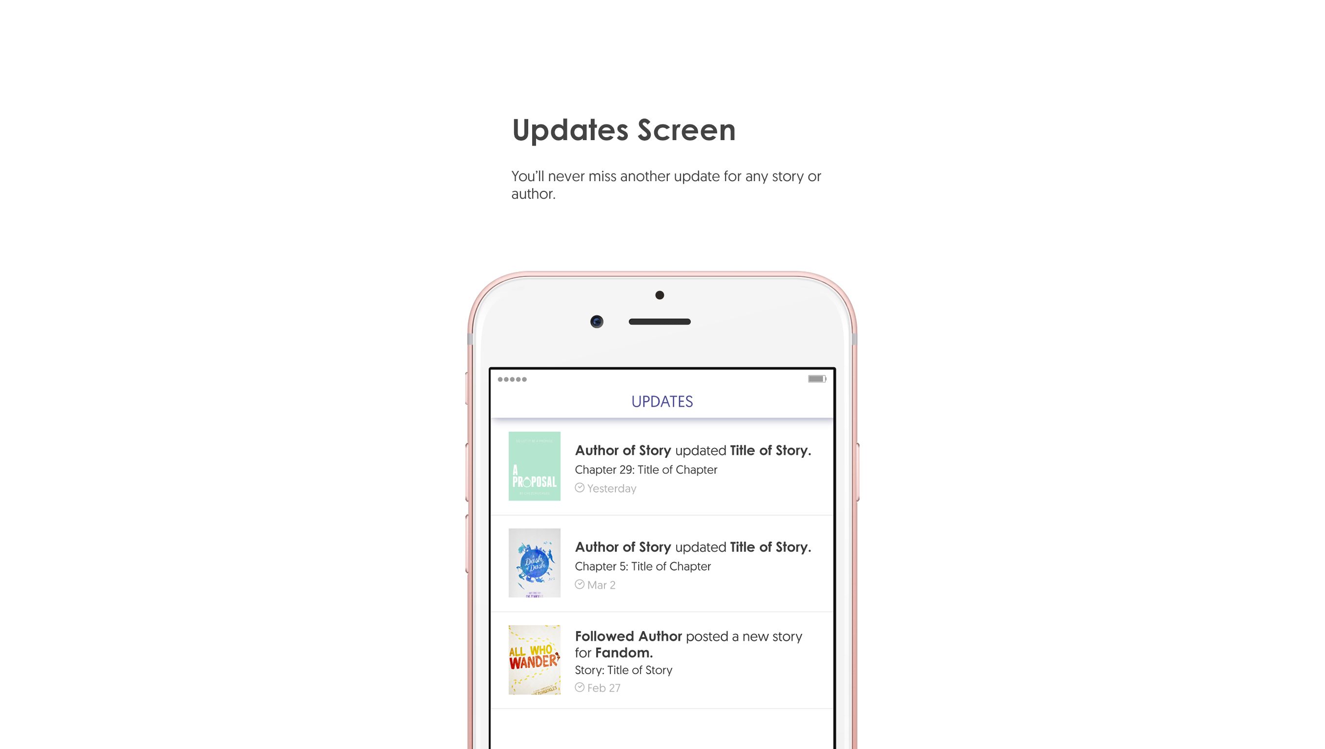
- As a user, I would like to know when there is new activity for my followed stories or favourite authors so that I don?t always have to check my email to know when I get new alerts.
Time to Design
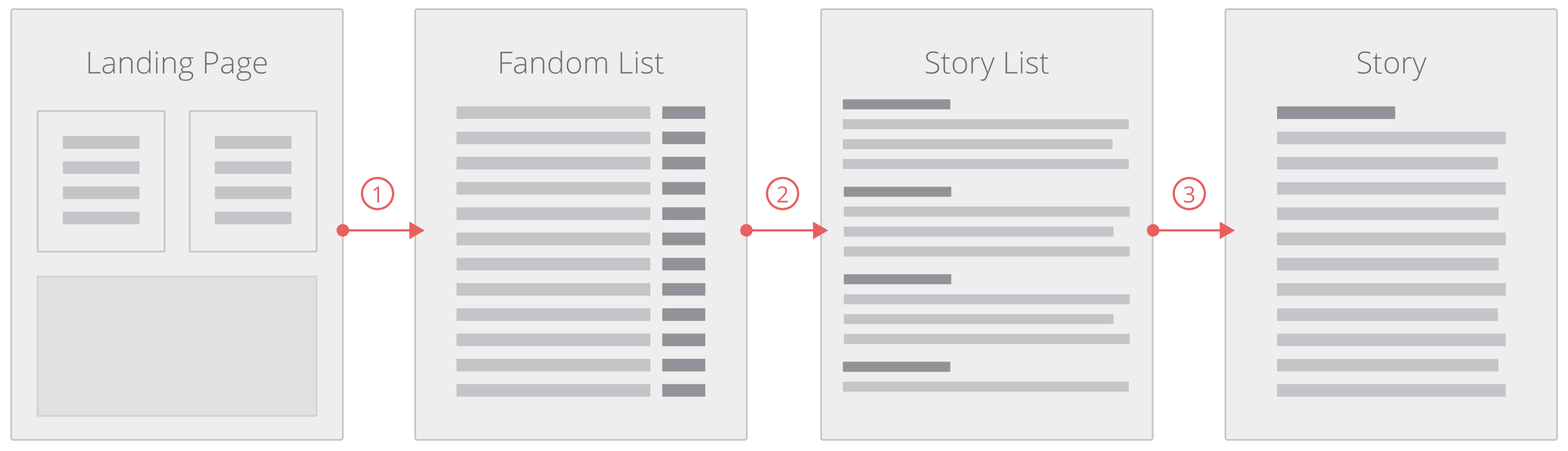
The following diagram is the proposed site map, or in this case, app flow map and architecture.
 Wireframes inspired by the Website Flowchart & Sitemap by Eric Miller
Following the map I opened Indigo Studio, my wireframing program of choice from a few years ago (I might have just not updated since?), and made a number of wireframes to explore how to structure the information and layout content.
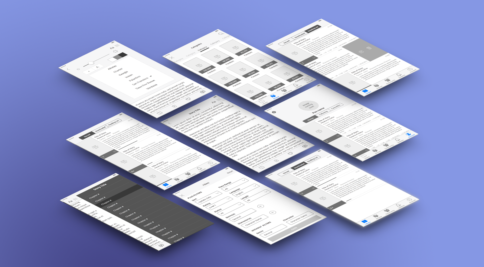
For how I wanted to present the final product of this assignment, I have always admired the work designers display on their behance portfolios when they redesign applications. I?ve seen a handful of fantastic redesigns of Twitter, Instagram, Spotify and a few others. I wanted to try to make one of my own.
Here it is:
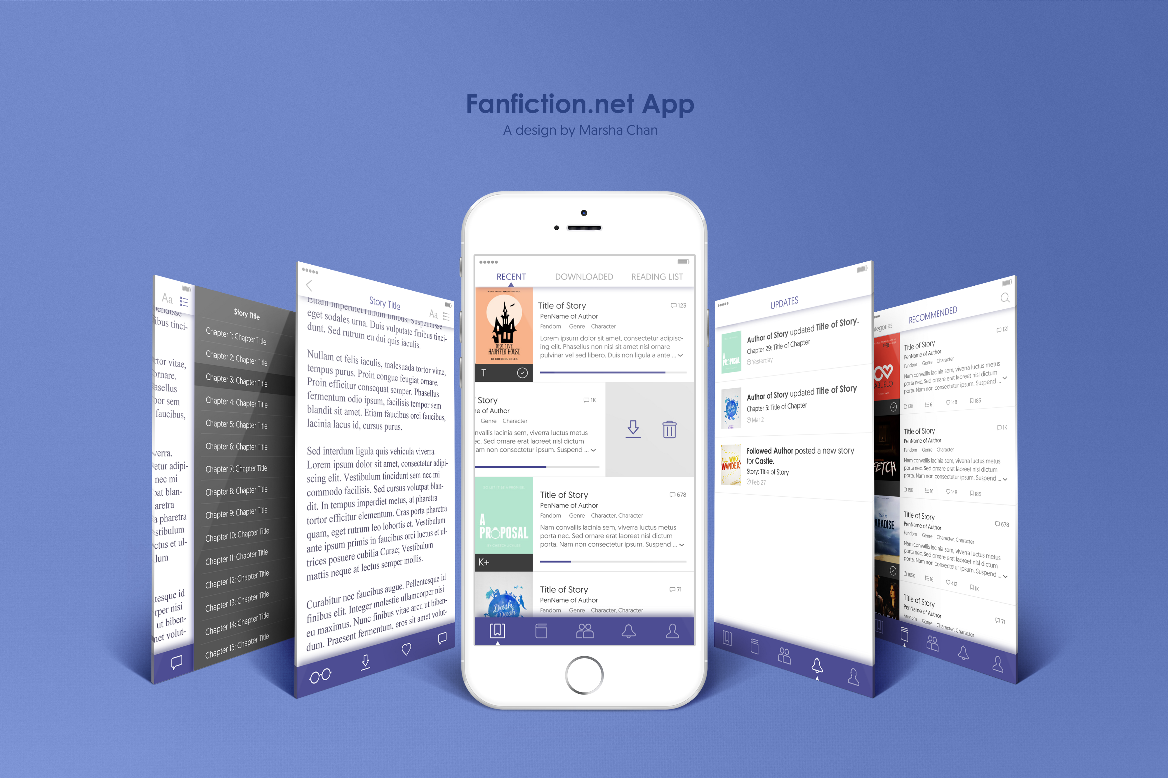
Impact
Ideally, these changes successfully address all of the pain points presented above.
- Users can start resume reading a story in just one or two clicks from their recent, downloads, or reading lists.
- Story options and filters match the array of options presented on the website version, and the UI follows IOS conventions.
- The progress bar visually displays the user?s position in the story and automatically bookmarks where the user last left off.
- Entire stories can be saved offline for uninterrupted reading when the user is not connected to the internet.
So what now?
I struggled with some of the information architecture because most reading and news apps have a lot of emphasis on images for aesthetic allure. Fanfiction.net only started allowing users to upload cover images in the last few years and many authors don?t bother making one. I wanted to maintain the spirit of basing readership on the summaries provided by the authors rather than the quality of their cover photo and perpetuating the problem of ?judging a book by its cover?.
But I?ll work on that more for V2.
This design isn?t perfect. I didn?t follow many of the rules of a true usability review (since it was a reflection) and these recommendations and designs would be greatly improved with a true review. For example, users who are not me would test the original design. Personas would be created based on users that are not me, and would give insight to consumer constraints. Usability tests would provide more feedback than my personal grievances with the mobile site, and would dictate realistic features and requirements for the design solution. My personal designs would also have to be vetted by other users to assess its usability and functionality.
As I mentioned before, there were a number of things that I considered out of scope. Forums, which I have never used before, were not included in my design. Cross-over stories (stories that take components from separate fandoms) were not included either since I don?t read them and don?t know how the site organizes them. Writing or publishing stories were not included since I only ever publish while on a desktop. I did include communities because they are a pathway to searching for and reading stories were included but minimally considered. In true practice, every piece of the design should be thoroughly thought out.
Thanks for reading!
This was my personal reflection for my DEI 626: UX Design course.

