This article is going to cover plotting basic equations in python! We are going to look at a few different examples, and then I will provide the code to do create the plots through Google Colab!
Goals:
- Learn to Create a vector array
- Manipulate vector to match an equation
- Create beautiful plots with a title, axis labels, and grid
y = x
Let’s go ahead and start by working on one of the simplest and most common equations! y = x. To do this, we are going to be doing a few things but first of all, we need to cover a few concepts.
- A module allows you to logically organize your Python code. We will be using 2 Modules: Matplotlib.pyplot and Numpy.
NumPy
Numpy is the fundamental package for scientific computing in Python. It is a Python library that provides a multidimensional array object, various derived objects (such as masked arrays and matrices), and an assortment of routines for fast operations on arrays, including mathematical, logical, shape manipulation, sorting, selecting, I/O, discrete Fourier transforms, basic linear algebra, basic statistical operations, random simulation and much more.
Matplotlib.pyplot
Matplotlib.pyplot is a collection of command style functions that make matplotlib work like MATLAB. Each pyplot function makes some change to a figure: e.g., creates a figure, creates a plotting area in a figure, plots some lines in a plotting area, decorates the plot with labels, etc.
Creating an x and a y vector
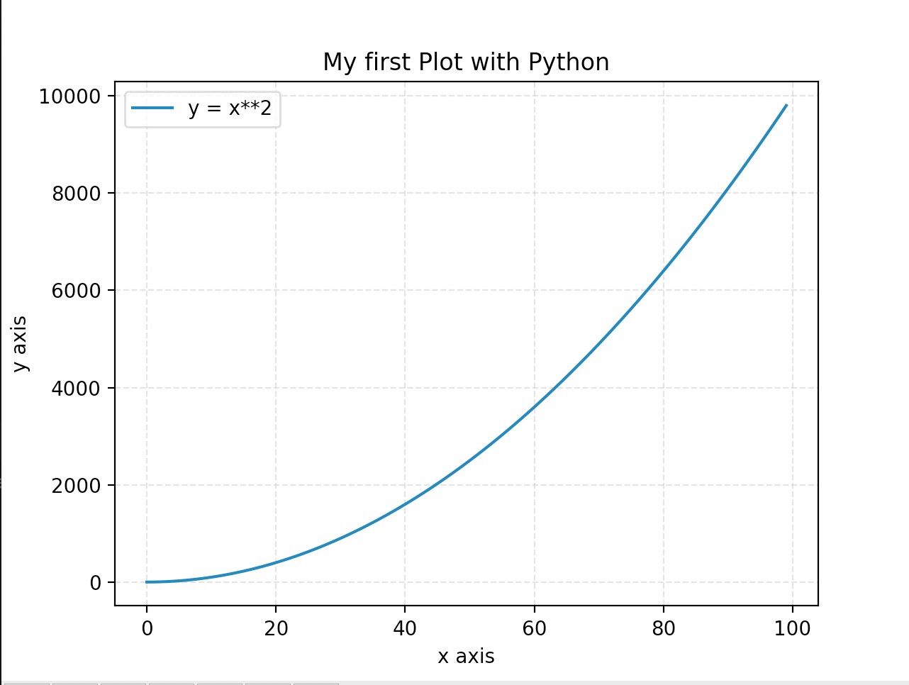
We want to plot from 0?100 on the x-axis, but let’s think about what each value would be:
x = [1,2,3,4,…,99,100]
y = [1,4,9,16,…,9801,10000]
In this case, every value in y is just the x value at the same index squared. Now that we have all of these values, we can just put them into a python variable and plot!
This is pretty much all that we need for our plot! Below, I put all of the pieces together, and then you can see the resulting image.
Below is the plot that this created! But as you can see, there is a lot more that we can add to make this more understandable. Below I will go into a few options that we can add to make our plots look better!
 Plot from the python code
- Adding a title: plt.title(?My first Plot with Python?)
- Adding x axis label: plt.xlabel(?x axis?)
- Adding y axis label: plt.ylabel(?y axis?)
- Add a grid with opacity of .4 and linestyle of ?-?: plt.grid(alpha=.4,linestyle=’–‘)
- When plotting add a label for the legend:plt.plot(x,y,label=’y = x**2′)
- Show the Legend: plt.legend()
Below is another gist where I implemented all of this!
And here is the plot that this created!
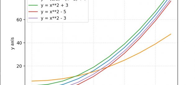
 Looks so much better
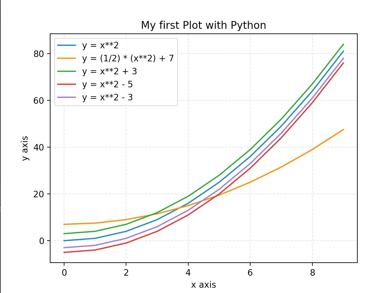
Finally, you can add multiple plots to the same figure and gist for this is below along with the resulting image!

