Model decisions that flow through a UI component catalog
As described in Color in Design Systems, systems codify color decisions and palettes for brand identity, interactive affordances, neutrals, feedback, and theming. However, having a deep library of harmonious colors doesn?t mean that you?ve sufficiently modeled how to color each component on a white, various grays, or a near black canvas.
With systems, you can encode predictable background, text, border, interactive state, and layered color property combinations so that your components display well diverse background colors. This article tours lessons you can apply to prepare, codify, and implement accessible color choices across light and dark interface settings.
Prepping for a Light & Dark System
Inventory Neutrals Use Across Components
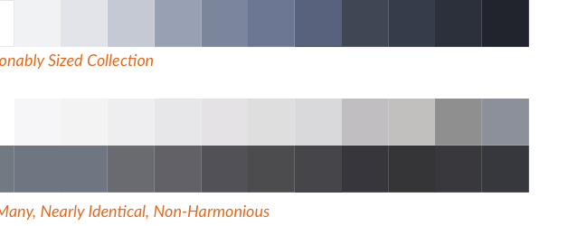
Before selecting new colors, inventory the neutrals you already use. Some libraries already limit a small set of tints (8? 10? 12?). In other cases, I?ve seen teams with over 40 often barely distinct grays!
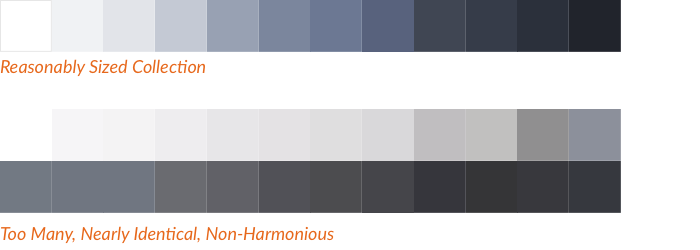
Catalog the distinct HEX values, order them from light to dark, and prepare to prune to a reasonably-sized, non-duplicative, harmonious set.
Next, analyze color use across components to understand how neutrals are applied as text, background, and border colors. Look for patterns as well as inconsistencies. Are the neutrals harmonious? Is the primary text using 3, 4, or even 5 different neutrals? Does the benefit of all this variety outweigh the cost of complexity and variability?
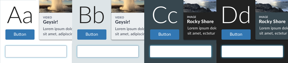
Arrange Component Designs Across Backgrounds
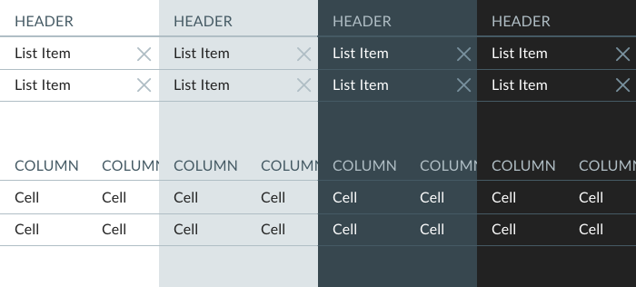
Whether on a Sketch canvas or lengthy kitchen sink HTML page, stacked your library?s more basic components densely on a white canvas. Then duplicate the stacked column for each background color your system endorses.
 Sketch artboards exploring Discovery Education Comet System components, used with permission
With this setup, you can experiment with and demonstrate effectively designed components across backgrounds while describing the models.
Light & Dark Properties
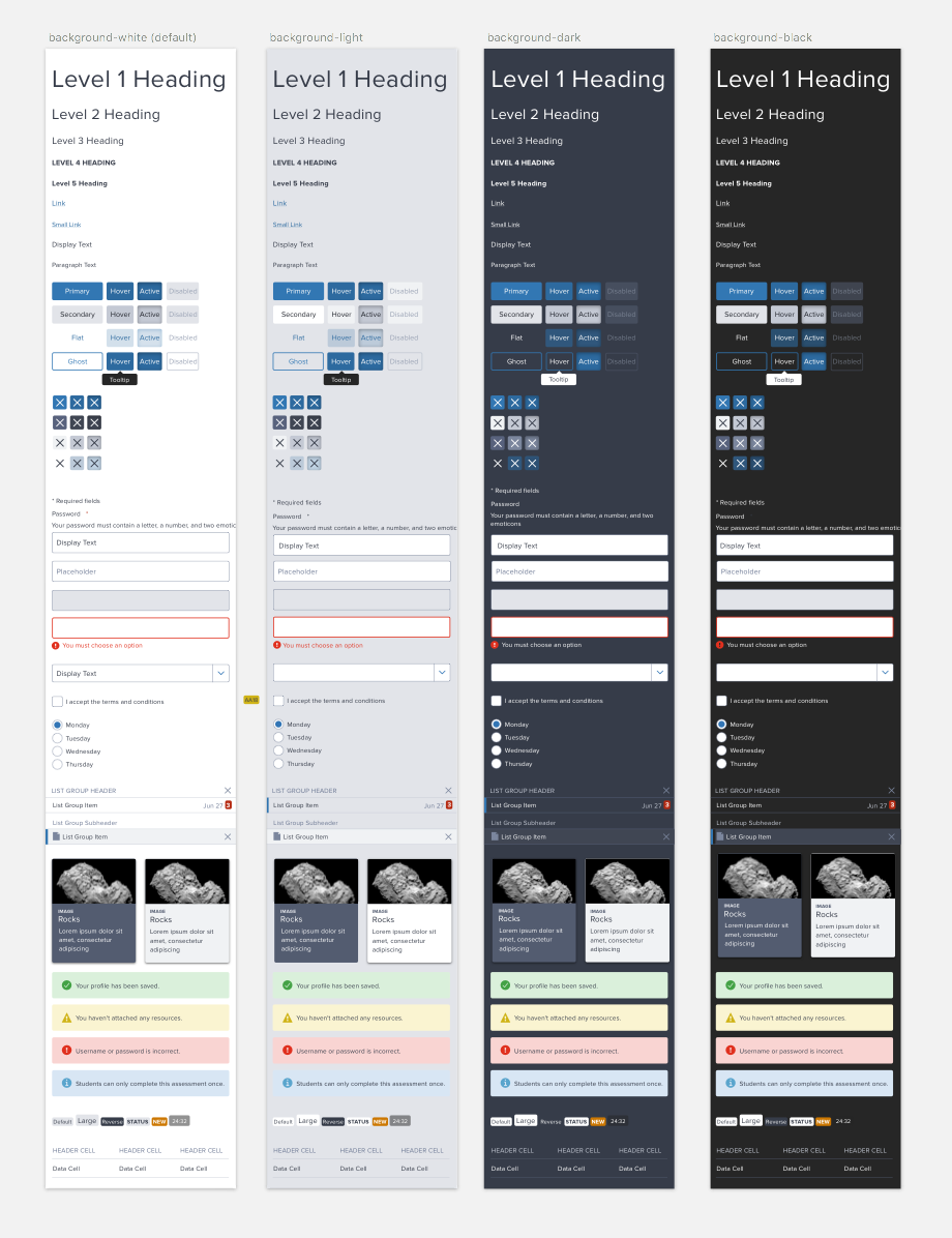
To create a system for light & dark, you must model the range of CSS properties you?ll control, from backgrounds and text to borders, layers, and more.
Background Color: Just Light and Dark Settings, or More Options?
How many different light & dark settings do you need? Most teams opt for a simple toggle: a ?light?, often pure white #FFFFFF canvas and ?dark?, near black canvas such as#222222.

Other teams endorse a wider range of neutral backgrounds. For example, a system may overlay light gray modules on a white canvas (or vice versa, or both). In a dark setting, there may be a ?pure black? alternative for a video player and photo gallery distinct from the default charcoal dark background. Therefore, having a pair of colors for each of light and dark is helpful.
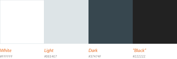
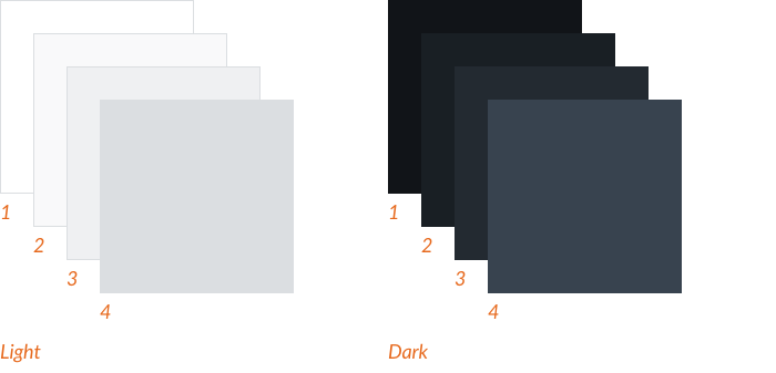
A very sophisticated collection of layered backgrounds could start with white and near black and add successive layers of darkening light grays and lightening charcoals, respectively.
So much choice to optimize and maintain! I prefer things a bit simpler. That?s why at this point I?ll avoid solving for other thematic background colors (orange, blue, green and purple!) and photography, preferring to solve the core light & dark first.
Takeaway: Even if you target just two settings (?light? and ?dark?), expect to solve for a background color shift in each setting. Finally, avoid ballooning the complexity of colorful and photography backdrops, at least early on.
Text Color: Type Your Types
In a library, you may find there was no simple model of text colors. Instead, card titles, labels in pills and forms, and other component text may be arbitrarily colored.
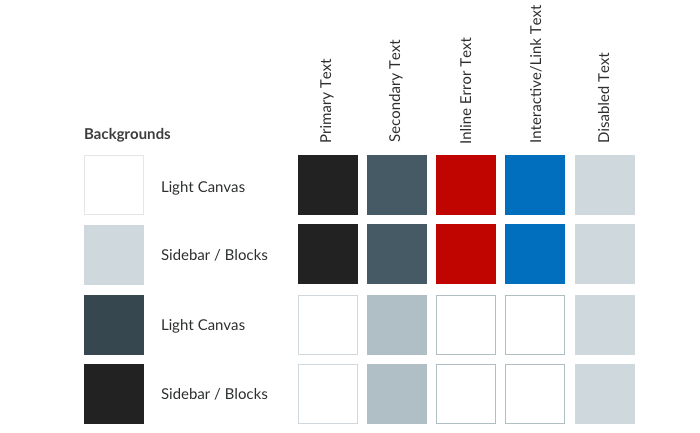
Text color can be more systematic, starting with basic types:
- primary text color for paragraphs, labels and other essentials
- secondary text color like form microcopy, captions, and table headings
- interactive text (mostly, links)
- inlineerror text color shown adjacent to controls
- disabled text, usually in form controls and buttons
Maybe there?s room for a tertiary text color, although it can tend towards inaccessible contrast and lack sufficient distinction from secondary. An icon fill/text color could be included too, or you can color icons using the same primary, secondary, and interactive types already in play.
With established types, choosing and applying text color per background becomes fill in the blank.
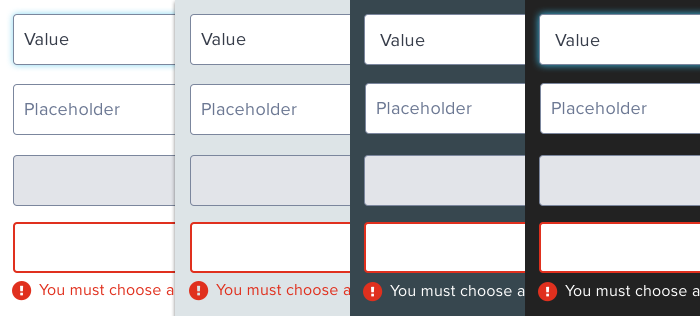
 Modeling text color decisions across backgrounds making applying to components far easier
One things for sure: finding link and error text color in dark settings that?s both accessible and harmonious is difficult. Efforts of my teams sometimes yields ?use white? for those types on dark.
 Using blue and red on dark backgrounds results in accessibility failures.
Takeaway: Identify a simple classification of type color that includes at least primary, secondary, interactive, and error text. More cautiously consider additional types such as tertiary and distinct icon fill colors.
Borders of Controls: Keep Strokes Strong Enough
Input controls ? textbox, textarea, radio-button ? require strong contrast for visibility and usability. The control?s border color can play a big role, and may or may not shift across backgrounds. Other features ? a :focus halo, a red border for field in error, and more ? may also need attention.
Takeaway: Consider the borders and focused states of UI controls, and see if a moderate neutral and identical halo is usable across all settings.
Borders as Separators: Need Heavy & Light Hairlines?
Designers can scaffold a UI using thin rules ? or hairlines ? to delineate sections, rows in a data table, or items in a list group.
Adjusting hairlines ? even light and heavy variants ? can benefit from a similar structure of simple property definitions across backgrounds.
Takeaway: Catalog a hairline or two (heavy vs light) across each background. Be wary of more. Choices beyond heavy get obese.
States: Adjust by Shifting Opacity
Don?t forget interactive states like the hover, active, and selected states of buttons, tabs, list groups and links.
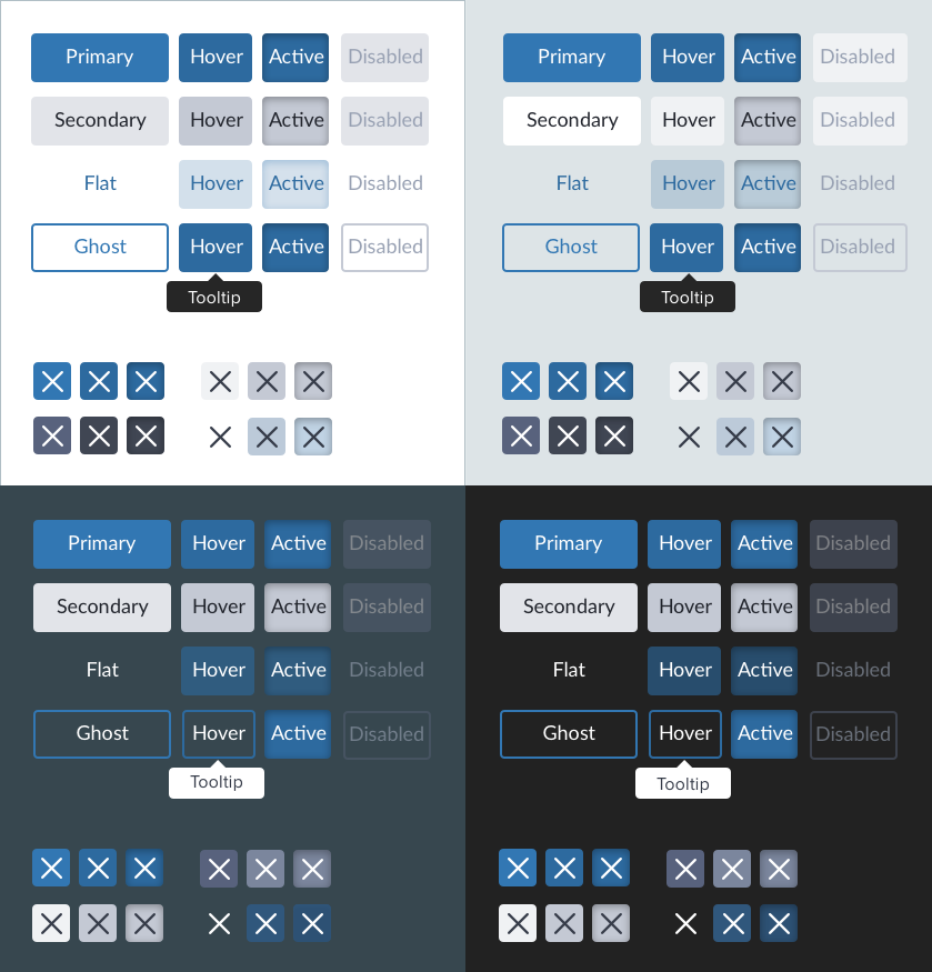
As with color in general, states are a place where functional transformations (think: darken(5%)) or adjusted opacity (think: background-color: rgba(x,x,x,80%)) can work well. Other teams handpick even these colors, optimizing appearances per background.
I?m less concerned which approach is used, so long as it?s modeled soundly and assessed for accessibility across backgrounds.
Takeaway: Fine tune colors for each state using a consistent method, whether functional transform, opacity shift, or handpicked option.
Backgrounds on Backgrounds: Prevent Undesirable Layering
Things get more interesting when a component block ? like a card ? has a neutral background that itself rests on a different neutral. Suddenly, you are solving for text on a background ? on a background. System users will be curious about what background-on-background combinations work well and are consistently used.
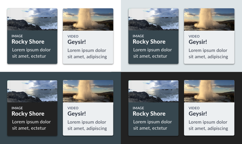
I?ve never seen such combinatorial madness woven into a system via variables or functions. Nevertheless, some explorations and a few Do?s and Don?ts in documentation can help and suggest when a bit more ornamentation ? like a box-shadow ? can help when contrast is a bit too subtle.
Takeaway: Explore how chunkier components of various backgrounds rest on broad fields of other neutrals.
Further Considerations When Implementing Light & Dark Color in a Library
Accessibility: Stay Tuned in Real Time
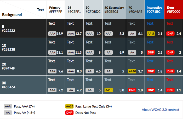
As you select color combinations, keep an eye on accessibility. You?ll tune this neutral. You?ll adjust that neutral. All the while, stay in bounds with accessible contrast that passes muster. At EightShapes, we built a Contrast Grid tool to quickly visualize and score many text and background color combos at once.
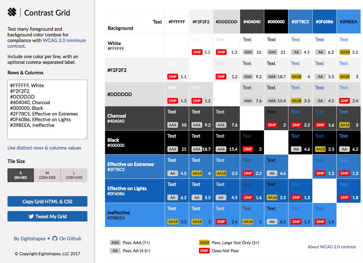 contrast-grid.eightshapes.com
The tool visualizes each combination in a grid, enabling us to experiment with, discard, adjust, and converge on the right neutrals. We?ll also screenshot and paste the grid into a Slack convo, or copy and embed the HTML/CSS for it into web-based doc to educate collaborators.
To use the tool, visit contrast-grid.eightshapes.com.
Refine the Neutral Palette
To optimize a color system, expect change. Some teams can?t avoid revisiting the entire palette altogether, cooling a blander grayscale towards blueish gray ?slates? or ?charcoals.?
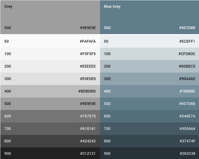 Google?s Material Design palettes of Neutral Grays vs Blue Grays
Other times, you need add just one more neutral or to replace a moderate choice to pass a barely failing accessibility test.
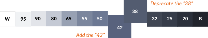
Takeaway: Add, adjust, and deprecate neutrals to ensure just enough options fulfill your pursuit of reversible color system.
Tokenize Choices
With all that structure, tooling should ease implementation. Design tokens are a great way to catalog decisions and establish hooks for others ? designers and developers alike ? to align to.
Takeaway: Create a taxonomy of tokenized variables used by system adopters and your library?s components. The more predictably your model is catalogued, the easier it is to apply, maintain, and endure.
Weave Lights & Darks Thru Components
Don?t forget. Getting to the right colors is half the solution. You still have components to re-style, too.
Some low-hanging fruit like button states should be easy to change. However, the vast component catalog might feel like a dizzily daunting task to adjust for each setting. So get the job done, incrementally.
For an existing system, this can mean a bevy of small adjustments, tracked via a litany of spreadsheet rows or JIRA subtasks. If that?s your reality, spread responsibility across a team to share the load and have ?em all learn by doing. This may motivate you to setup mixins, tokens, and other tooling more robustly.
Takeaway: Finish what you?ve started by ensuring each library part supports toggling color. by divvying tickets across teammates to fill the gaps of availability over a coming release or two.
Both Light & Dark Regions on the Same Page: What?s Your CSS Methodology?
Once UIs combine dark and light areas together on the same page, risky CSS conflicts arise. One larger ?light? container could contain another ?dark? container itself with ?light? components. Overly lengthy CSS selectors could get tedious, and applying a controlling class on the top-most container causes problems.
So, should a system provide a <body> CSS class for toggling a page to light or dark? Definitely, if the entire page?s interface can be exclusively one or the other. But if mixing on the same page, it?s unclear how to contain CSS effects on components, and count on each component sensing it?s context to color correctly, without targeting each and every component. That?s a pain.
Takeaway: We haven?t figured out a clean solution. Got advice? 😉
About to embark on a design system, or need to dive deeper to discuss products and players? EightShapes conducts systems planning workshops and coaches clients on design systems. Let?s talk!

