Why are exaggerated maps still a thing?
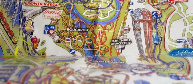
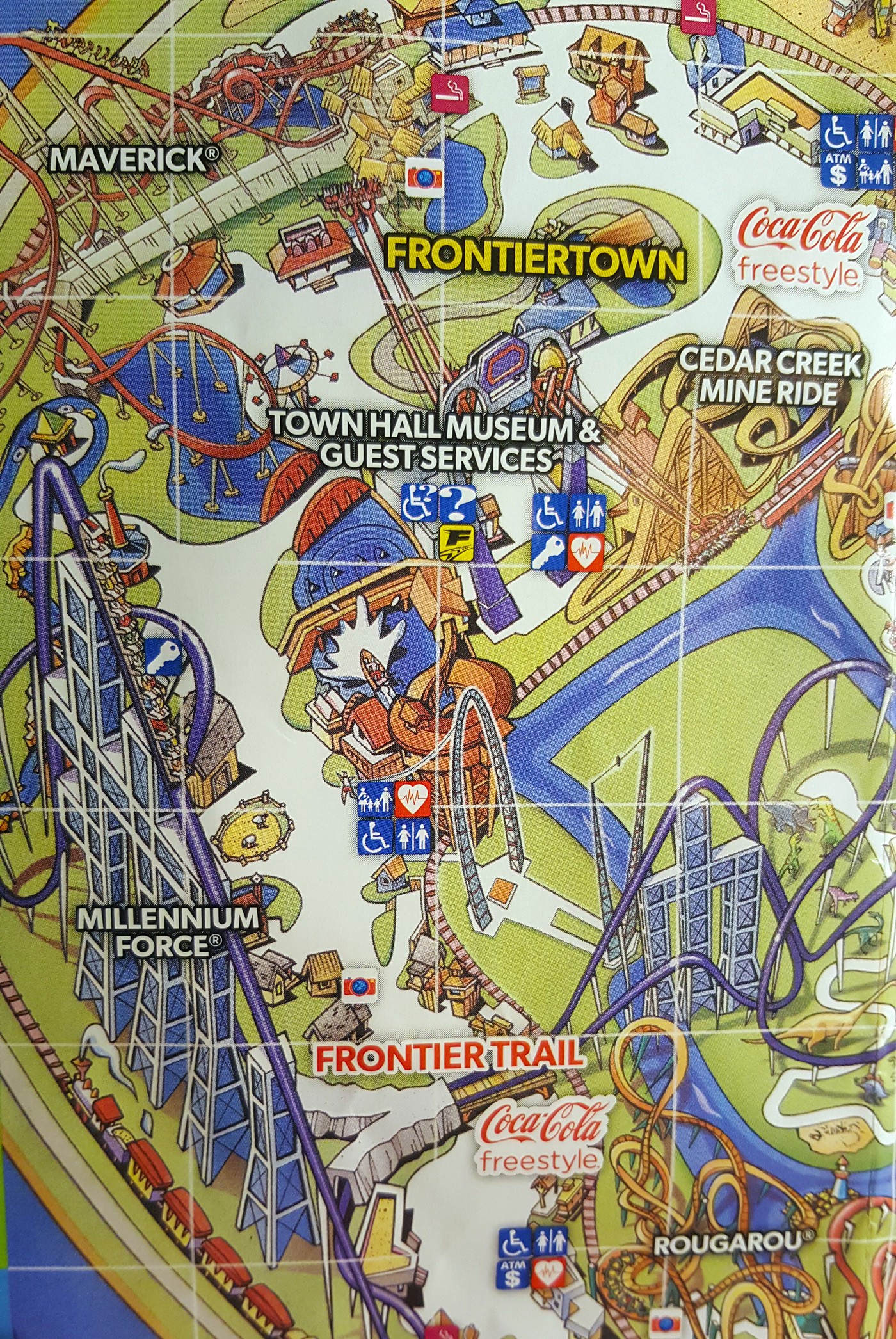
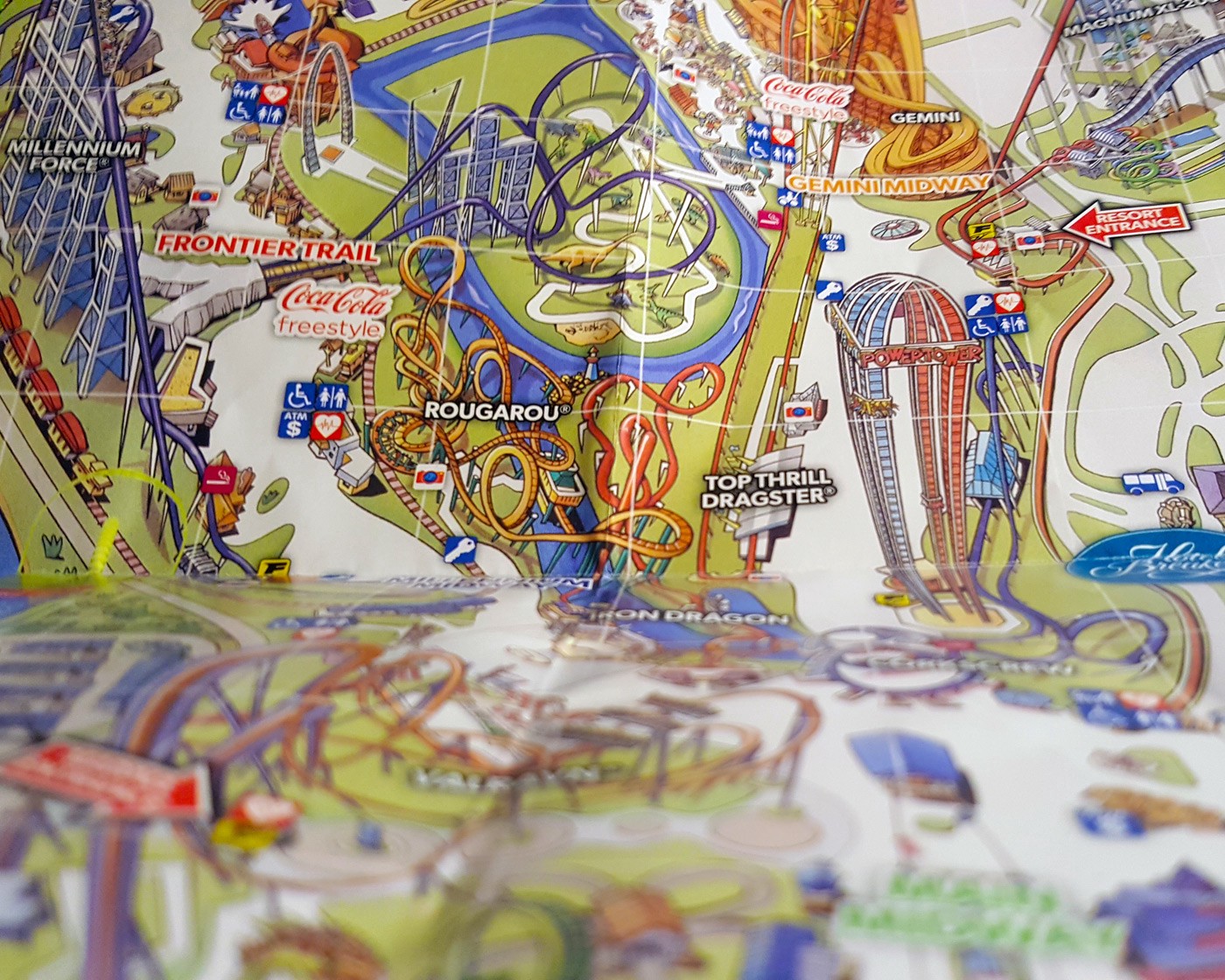 Theme park map of Cedar Point, Ohio.
The Backstory
We live in a world with a ?Google Maps satellite? level of detail and accuracy at our finger tips, yet we are treated to a theme park guide illustrated with exaggerated artwork to find our way. Ugh!
I know you?ve experienced it? you arrive at a theme park, zoo, science center, or related destination, and one of the first things you do is find a park or facility map, open it up, and see where you want to go. Me, I like to have a sense for where I am and where things are before I wander around aimlessly.
On a family trip to Cedar Point, America?s Roller Coast, we picked up our tickets at the campground check-in house and were each given a map.
Except? the map we got was almost WORTHLESS.
The Object
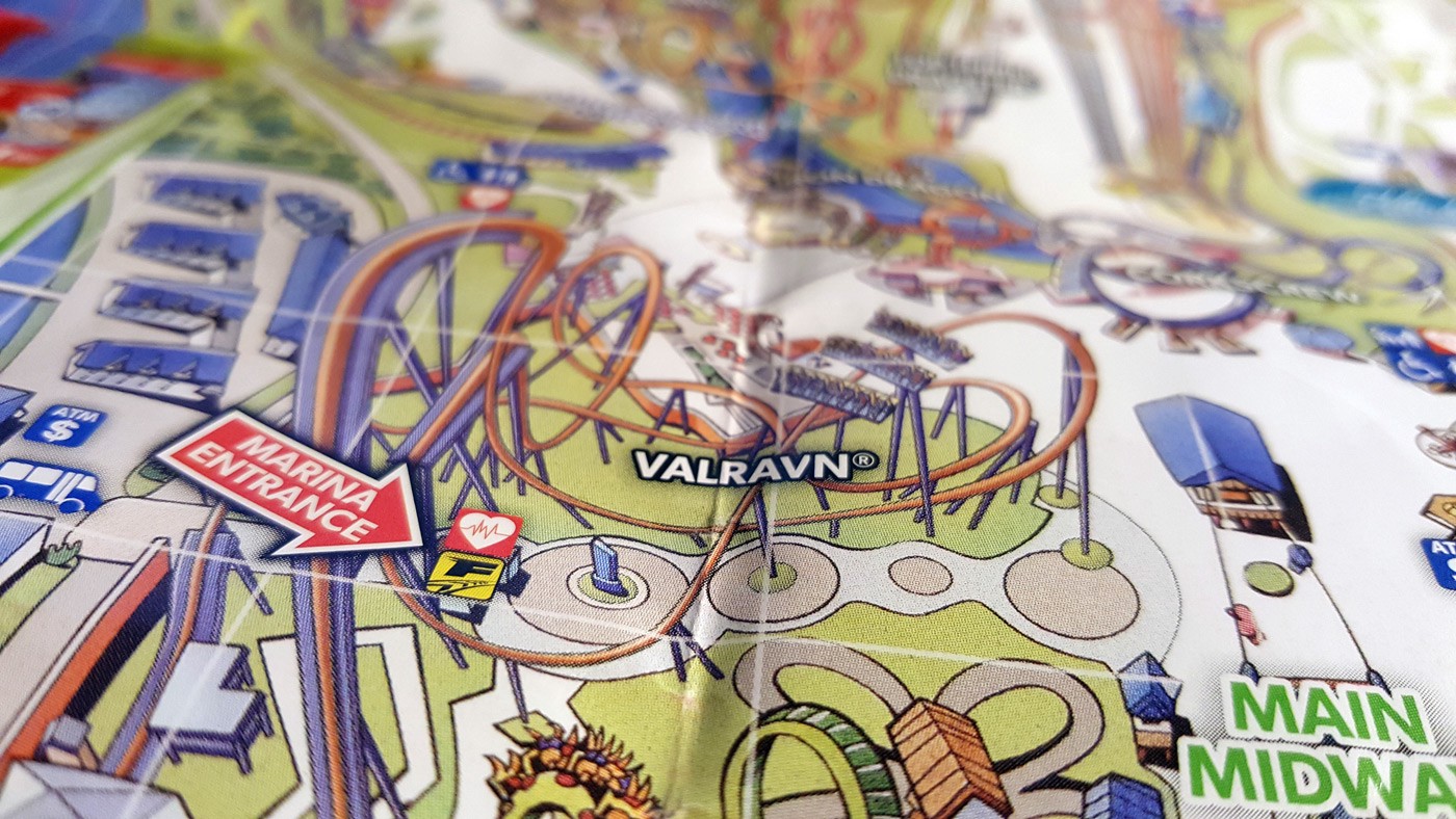 The 2017 roller coaster Valravn. It?s somewhere on the west side of the park in the middle.
Destination attractions with exaggerated illustrations as maps are still a trend, and it?s been going strong since the mid-1990s, at least.
I can see why the employees of the organizations and the general public like them so much?
A. The maps are truly works of art worthy of framing. Just visit the Cedar Point Town Hall museum in the park and see one from the 1990’s actually framed.
B. The maps serve as way-point signage for the popular places.
C. The maps provide more print real-estate for sponsor recognition. How many Coca-Cola stations are there?
D. The maps are great for people without smart phones, who need to smoke in a designated area, and who enjoy trying to fold a map back together after it?s been opened.
 Coca-Cola is clearly a map sponsor in-between roller coasters. At least 7 promo labels covering the map.
I have to admit that I did use the map to get a general sense of direction; though, the peninsula hasn?t changed enough over the last 25 years that anyone whose visited more than a couple of times would be able to find their way.
I did pull out my phone and open up Google Maps, when I wanted to look at detail of where I was and what was around me in the park. There was no way I was getting ?hyper local? information from the amusement park?s paper map, so I relied on getting one from a satellite that photographed the Earth.
The Lesson
So, with the geo-location accuracy, satellite quality images, and real-time weather radar in our pockets, why does Cedar Point use cartoon maps?
Maybe it?s competition? But, exaggerated maps were being done long before cell/smart phones. Maybe it?s nostalgic? Eventually, everyone changes.
So, what is it? I think it comes down to two areas of need:
- People expect a physical map of a place that can be hard to navigate.
- Specific and relevant information needs a place to be communicated.
Considering the two areas of need, the cartoon maps work. But, let?s face it, most people are expecting something more when they look at a map? I suppose that?s where the park?s mobile app comes in.
The Take-aways:
- Don?t overdue something that just needs to be simple.
- People are still fascinated by and need maps, no matter their form.
- Art and functionality don?t always work well together.
- When working with the general public, pleasing the majority is a must, and somebody will always complain.
While I appreciate the artwork and the who-knows-how-much money and rounds of reviews went into creating the cartoon map, there has to be a happy medium? not too formal, not too cartoony? and still be respectful of the need to actually use a map to help find your way.
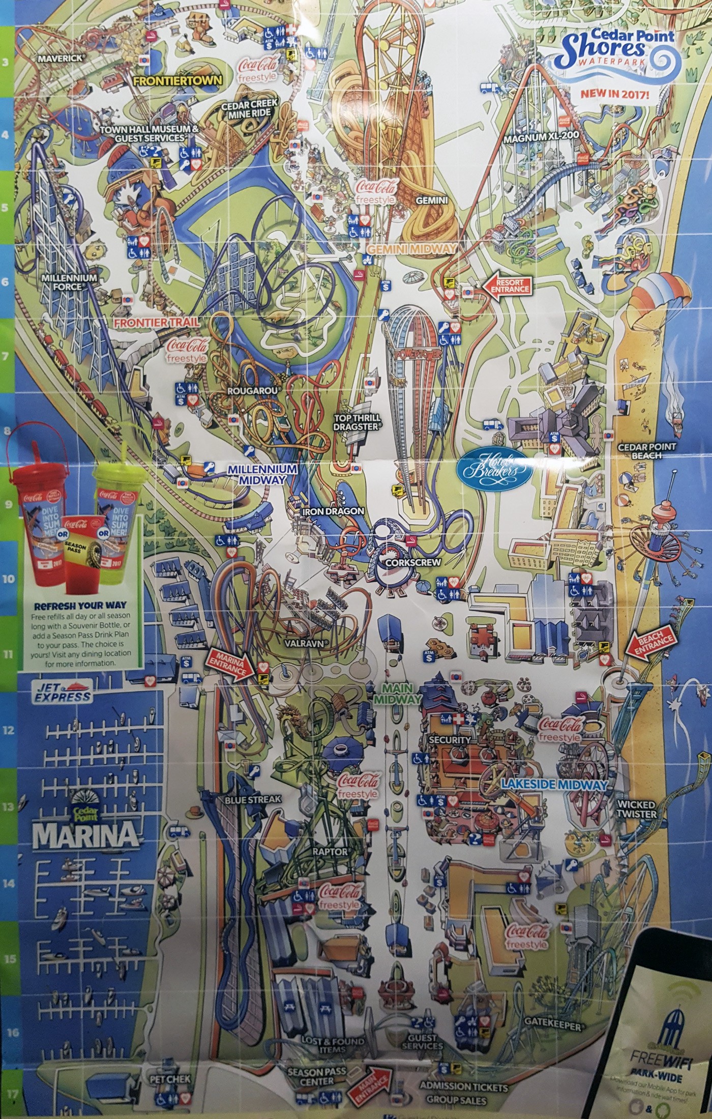 Cedar Point Amusement Park Map, 2017
BONUS: What?s another name for a paper map or atlas? Answer: 2-D navigational device. Thanks to Jeffrey Wray for this gem.
Written by Shaun Holloway.

