Create beautiful, accessible, and adaptive color systems using contrast-ratio based generated colors. Leonardo now supports full theme generation.
If you?ve created a color palette for a website or app, you?ve probably encountered a few of the challenges in creating color palettes for user interfaces. One of the most common challenges is meeting accessibility criteria such as a minimum contrast ratios defined by the Web Content Accessibility Guidelines (WCAG). Current tools check the contrast between colors after you?ve selected them, or they output a list of combinations of existing colors that meet the requirements. But this can become a tedious game of cat and mouse.
Wouldn?t it be nice if we could just generate colors based on a desired contrast ratio?
Well, now you can.
Introducing Leonardo
Leonardo is an open source tool for creating adaptive color palettes; a custom color generator for creating colors based on target contrast ratio. Leonardo is delivered as a Javascript module (@adobe/leonardo-contrast-colors) with a web interface to aid in creating your color palette configurations, which can easily be shared with both designers and engineers. Simply put, Leonardo is for dynamic accessibility of your products.
Creating an adaptive color palette
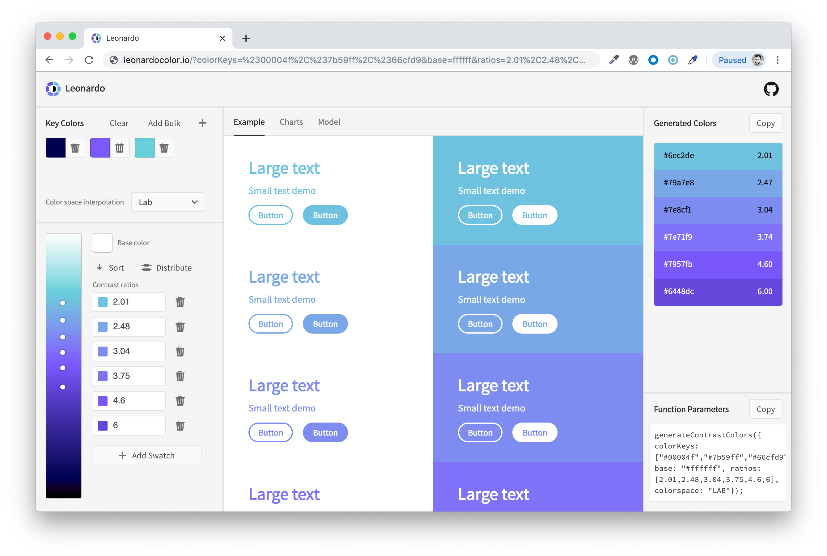
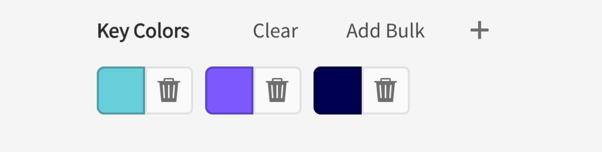
You can start by visiting Leonardocolor.io and enter your ?key colors?. These are a list of colors referenced to generate a color lightness scale (from black, to each key color, to white). Much like key frames, key colors are single points in which additional colors will be interpolated.
Each key color is automatically sorted and placed in your color scale according to its lightness, so the perceptual distribution of color lightnesses is handled automatically (based on HSLuv lightness values). This uniform method of distributing colors helps to equalize the color scale so that you don?t see dramatic shifts in lightnesses as you change or add key colors.
 Key colors placed along scale based on HSLuv lightness
Sometimes a direct path through colorspace does not yield the most appealing colors. Check out this article if you want to learn more on this topic. Adding additional key colors will help to direct the interpolation path in your color scale. As you enter these values, the gradient will update to display the scale you?re creating.
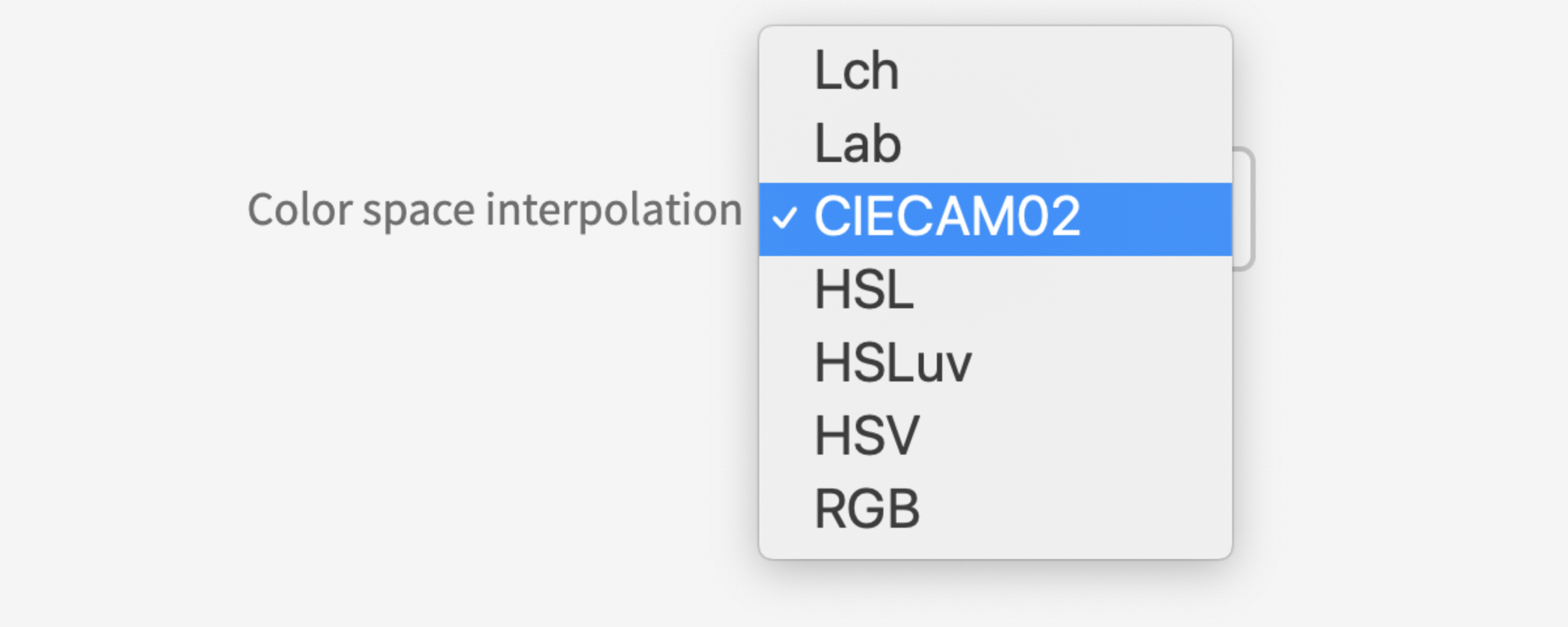
Another way you can affect the output of your color scale is by selecting which color space to interpolate values. The color scale is generated in LCH color space by default, but you can alternatively use LAB, HSL, HSLuv, HSV, RGB, and even the CIECAM02 color appearance model.
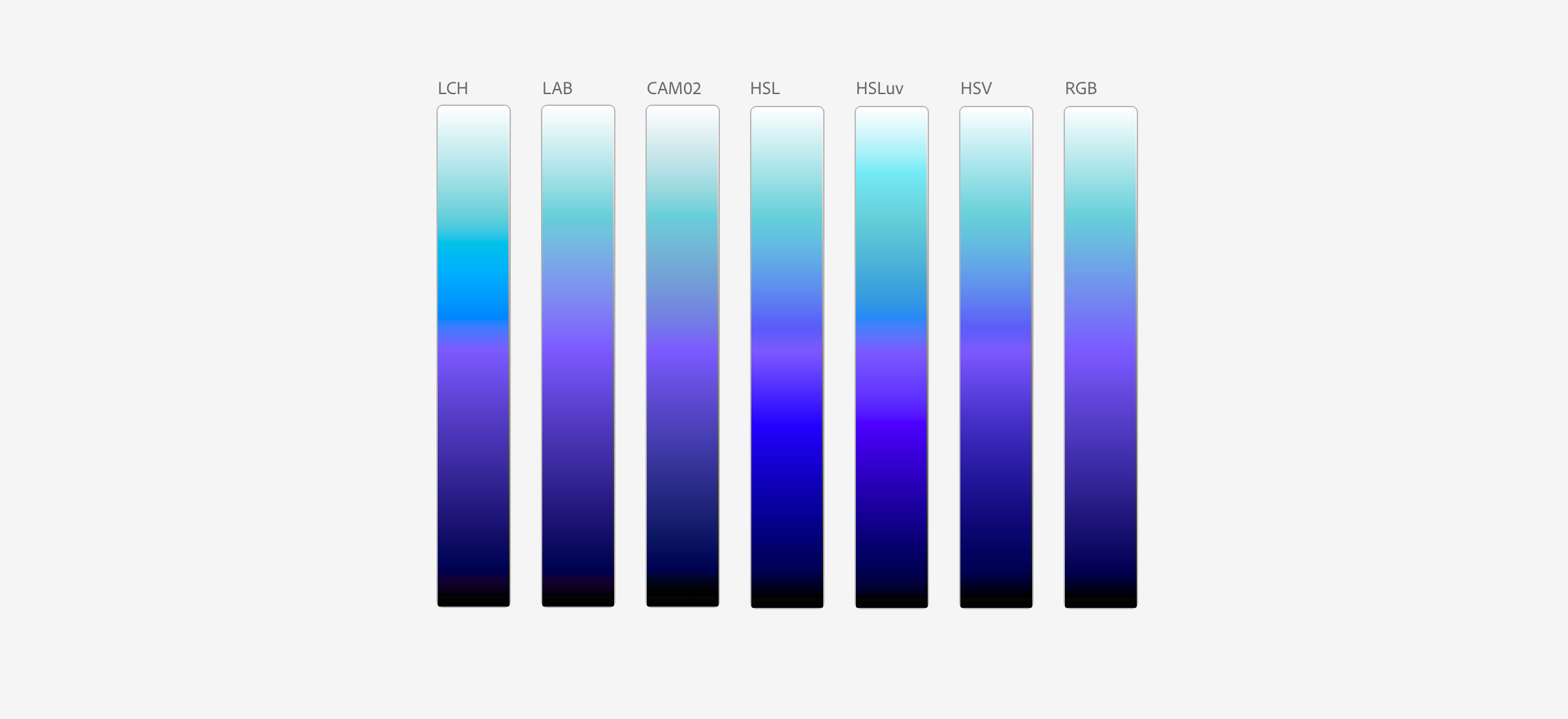 Interpolation through different color spaces produce different color scales
Depending on the type of color scale you?re creating, and the specific key colors that you input, certain color spaces may work better than others. I?ve written more detail on this and how it can affect color scales and choices in the article Colorimetry and the cartography of color.
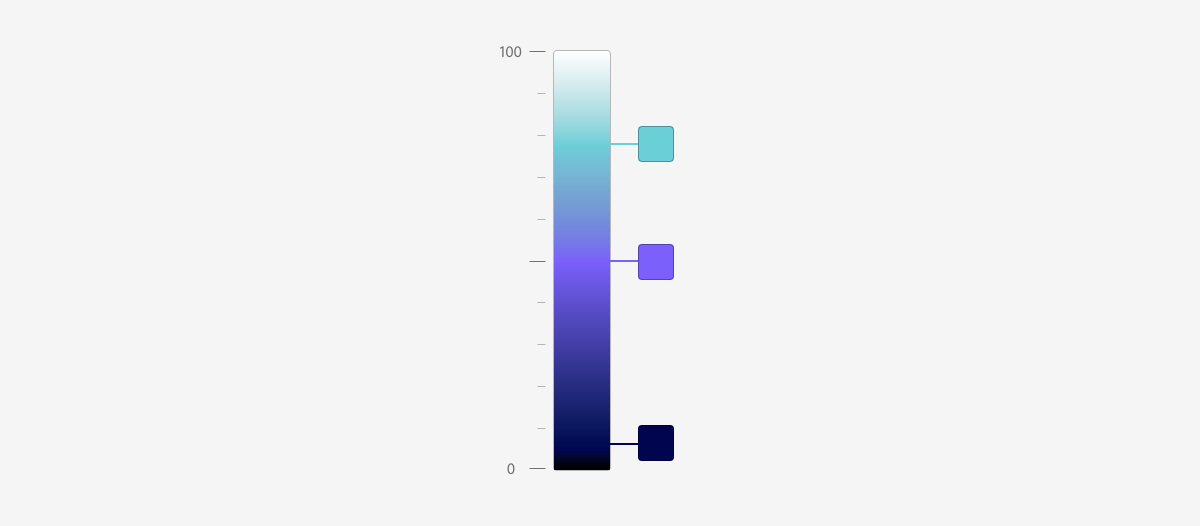
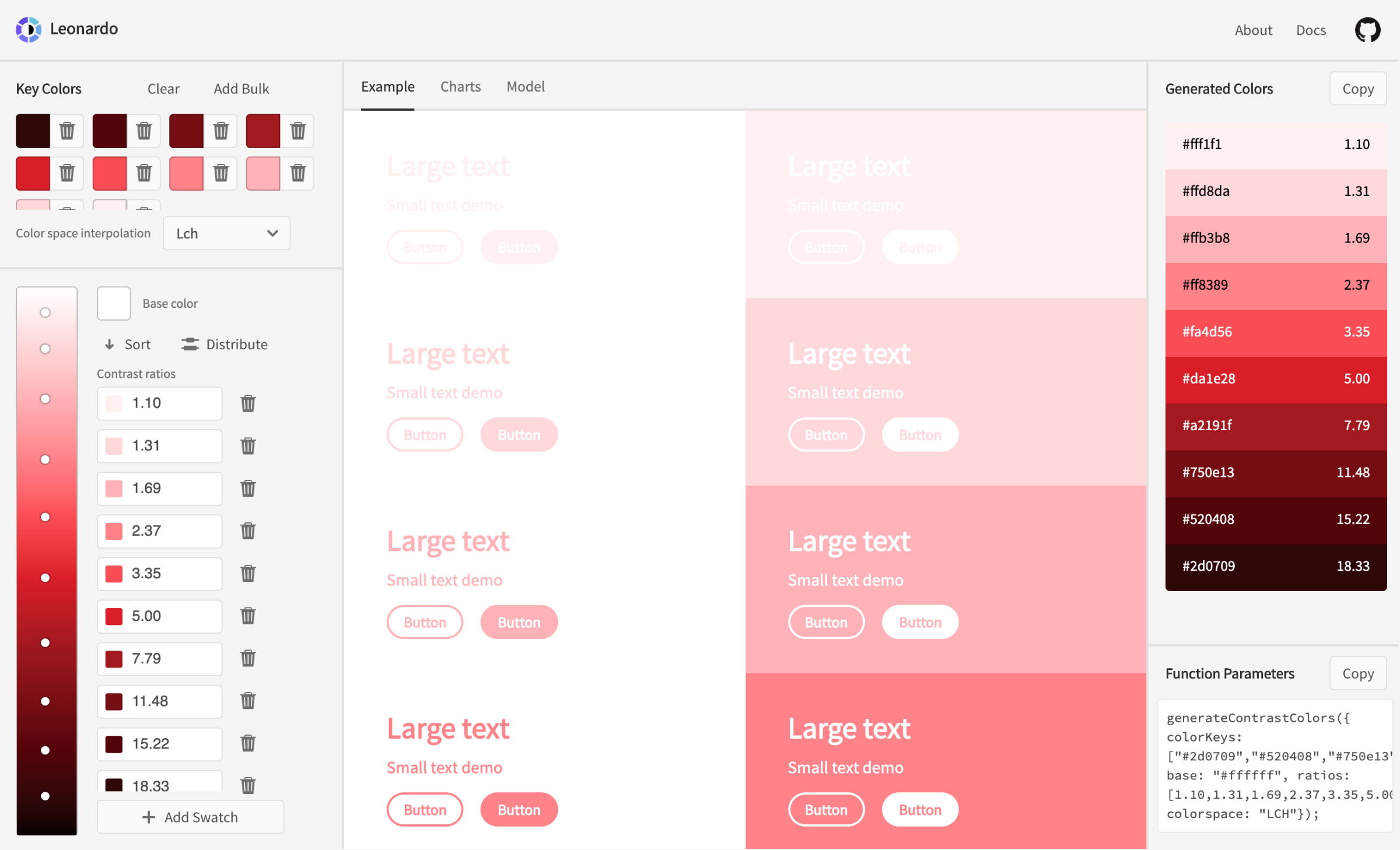
The primary differentiator from Leonardo and other color accessibility tools is the contrast ratio swatches.
 Target contrast ratio inputs show generated color swatch beside value for context.
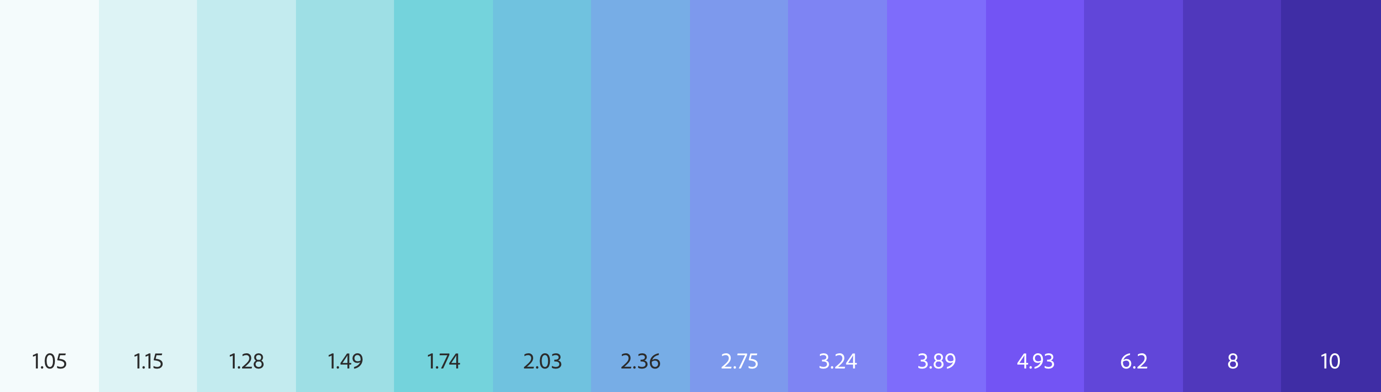
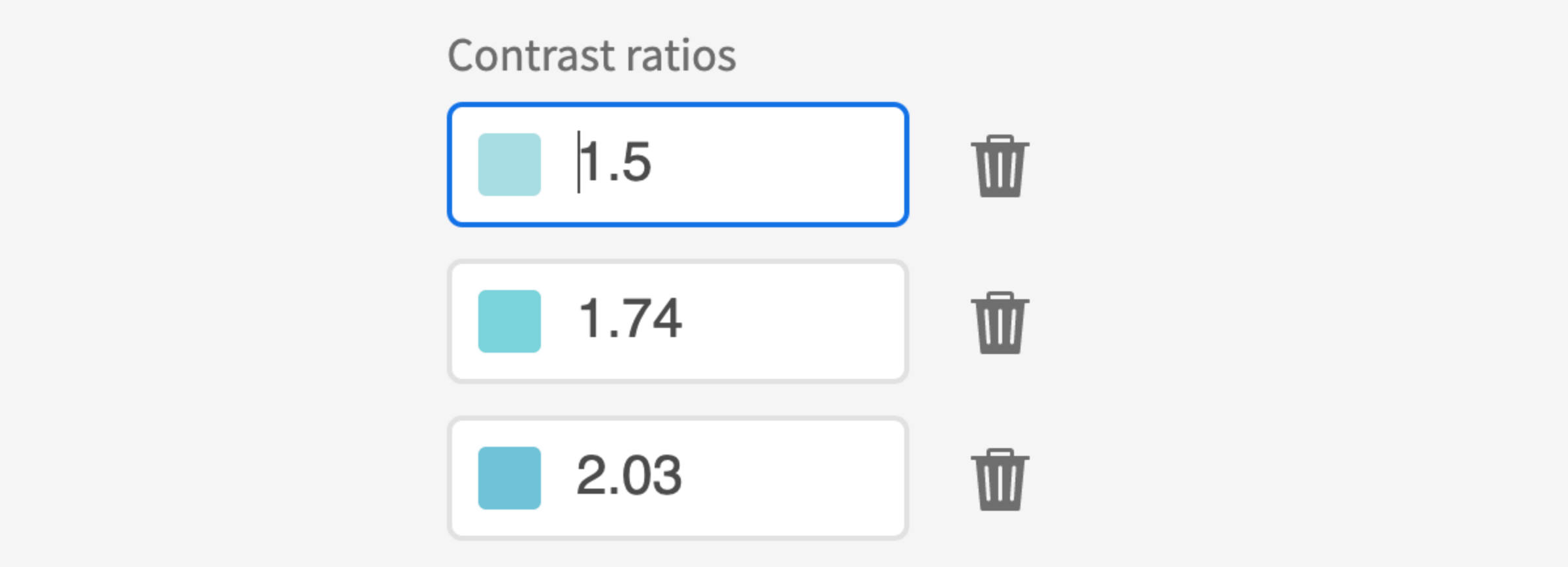
These inputs are where you can define the desired contrast ratio you want to generate for the color you?ve configured. By default, the tool will have two swatches: 3 and 4.5. These conform to the WCAG 2.0 (Level AA) minimum contrast requirements for large text (3:1) and normal text (4.5:1).
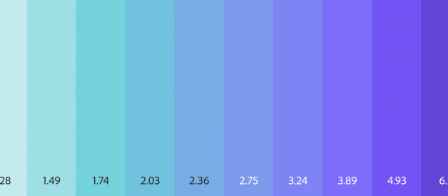
A color swatch is generated using the intersection of your desired contrast ratio and color scale. A dot on top of the gradient makes it easy to see the distribution of swatches along the gradient. The generated colors are displayed in the right panel with the hex value and contrast ratio.
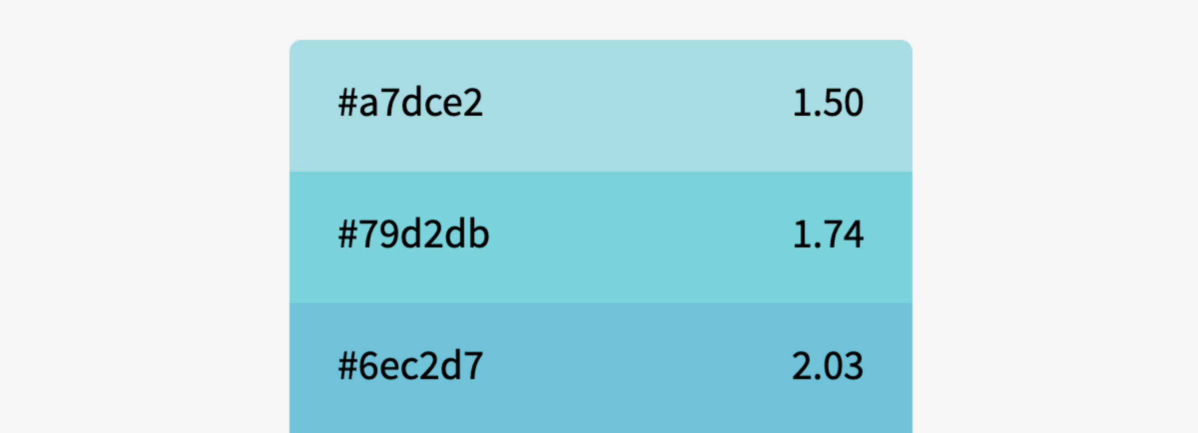 Generated colors shown with hex value and recalculated contrast against the base color
The contrast ratio shown over the generated colors is from a re-evaluation of the generated color against the base color after generation to verify if the generated colors meet your requirements.
Due to the restrictions of RGB colorspace, interpolation methods, and the method of calculating contrast, exact contrast values may not be producible. This post-generation contrast value helps you to identify when a generated color may fall below the minimum requirement, so that you can adjust the target ratio in your contrast swatches and ensure you?re within the required minimums.
Helpful tip: Leonardo can generate bidirectional contrast swatches. When your base color is not pure black or white, negative values will generate colors in the opposing direction. For example, if your base color is light gray and you want to generate lighter values, pass a negative number into your swatches.
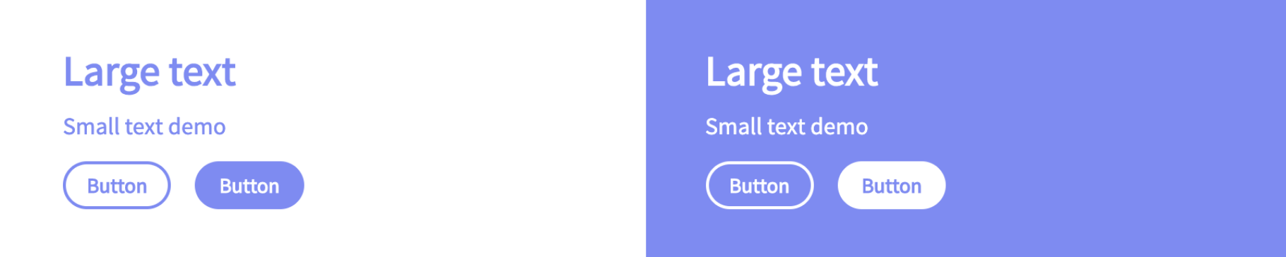
The main body of the Leonardo web app displays simple examples of each generated color as both text over the base color, and as the background color with text that is the base color value. This gives some context to how your colors will appear when used with text or basic UI components.
Under the charts tab is a set of two-dimensional charts displaying the interpolation paths for each channel of your color scale. By default, the charts are shown in CIECAM02 because it is a color space that more accurately represents human perception of color. You have the option to preview charts in any of the supported color spaces independently from the interpolation mode you?ve selected, however CIECAM02 is recommended. Irregularities seen in this color space may help you to identify irregularities in your color scale more accurately.
These charts are helpful in illustrating areas where you may benefit from adding additional key colors and smoothing the path of your color, as well as identifying the appropriate color space interpolation mode.
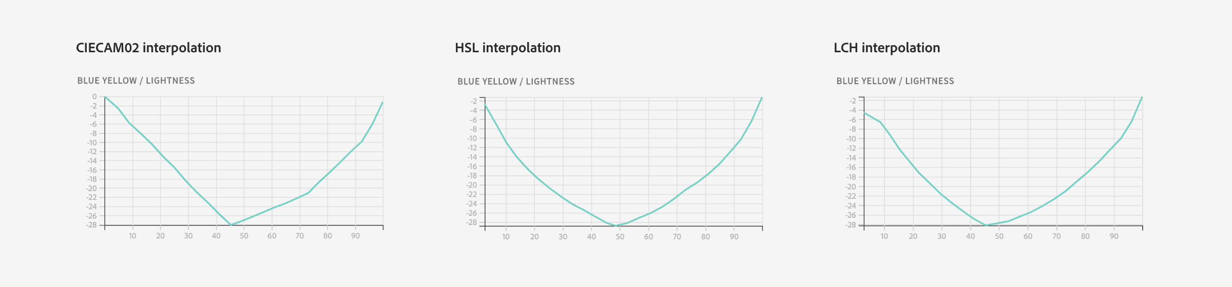 Blue/Yellow curves charted in CIECAM02. Comparison shown with CIECAM02, HSL, and LCH interpolations
Along with the channel interpolation charts is a chart showing the distribution of your contrast ratios. This is helpful to see the difference in contrast between each step that you?re creating. An interesting insight you will see is that when contrasts are evenly spaced on along the color scale, the contrast ratios follow an exponential curve.
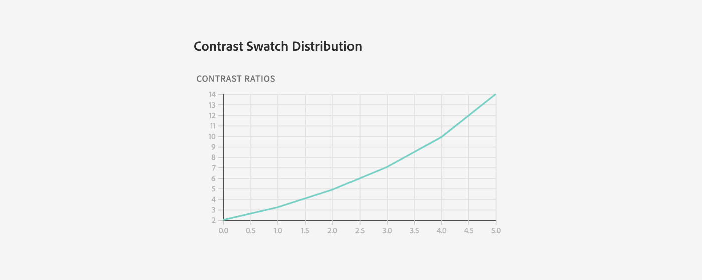 Chart showing contrast swatch distribution
Under the model tab is a three-dimensional model of your color scale in CIECAM02 color space. This 3d preview is another way to see how interpolation through different color spaces affect the generated color values. You may interpolate your colors in one colorspace, but want to see how it?s represented in another.
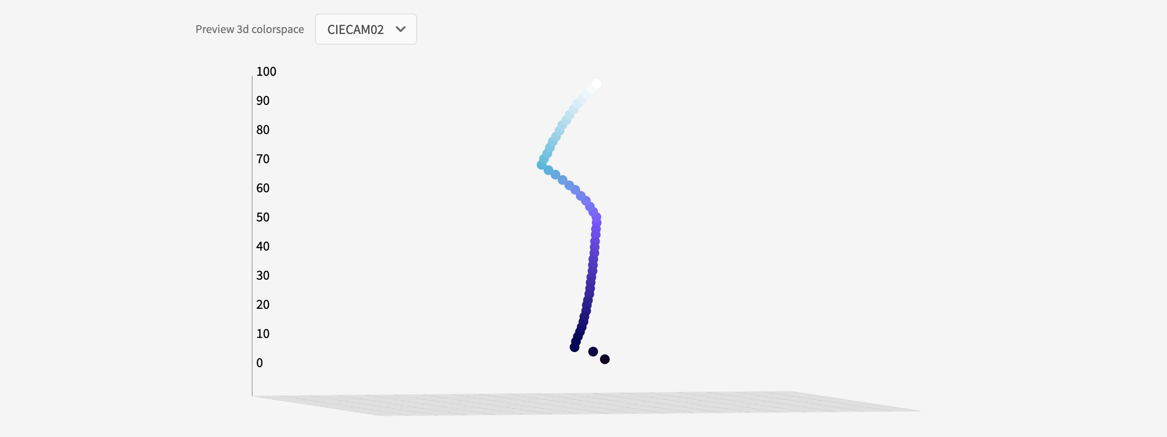 Color scale with LAB interpolation shown in the CIECAM02 color space in interactive 3d model
It is recommended, however, that you use CIECAM02 when evaluating your color scale in 3d for the same reasons. For example, if you have a multi-hue color scale, evaluating it in HSV will be particularly difficult, as the curve will make irregular shapes that are not reflective of the perceived color path you are creating. These color spaces are available in the 3d preview as a way of educating and enabling you to visually understand the differences in how color is modeled in these spaces.
Sharing your palette
Since design is a collaborative process, the configurations you make in the app are printed in the URL, making it easy to share your specific configurations with team members. Just copy and paste the URL and your team members will see what you see.
The custom configurations that you create for your color scale are expressed as parameters in Leonardo?s generateContrastColors() function. When you?re ready to hand over your color configurations to engineers, they can copy and paste your parameters directly.
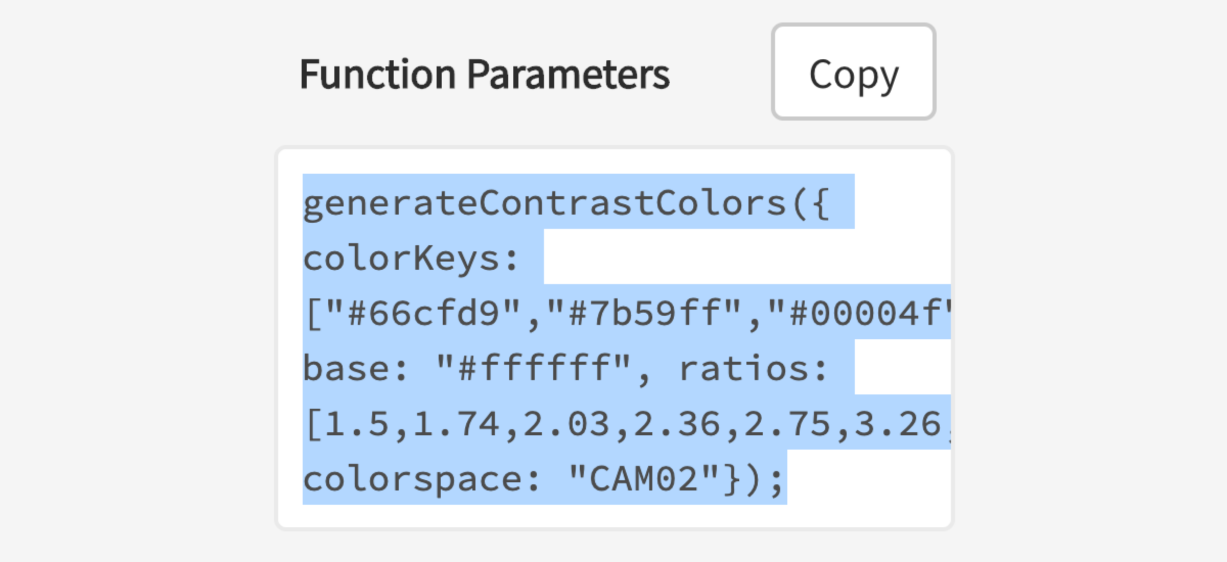 Engineers using Leonardo npm module can copy your parameters directly
Leonardo is a tool intended for both designers and engineers. When Leonardo is integrated into your products, it can be used to generate an adaptive color palette, which can act as a brightness and contrast control for your users. It can also be used for generating static color themes.
Migrating to Leonardo
Creating color palettes for design systems is difficult on its own, and there?s no reason you should completely abandon your existing color palette. For that reason, Leonardo makes it easy to make your existing palette an adaptive palette.
To migrate your palette, start by clearing out the key colors and any existing contrast swatches. Then select the ?Add bulk? option in the key colors.
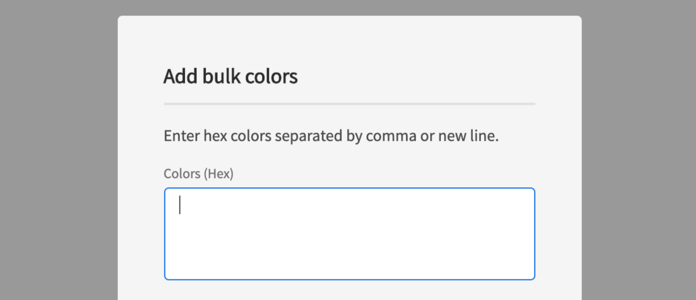
A dialog will appear with a text area for entering multiple color values. Paste in your existing colors (for a single hue) in hex format, separated by either commas or new lines. Select the checkbox labeled ?import as swatches? and input the background color of your existing theme as the ?base color?. When you click ?Add?, each of your existing colors will be added as key colors, and their contrasts will be checked against the base color ? each contrast ratio value will be added as a new contrast ratio swatch.
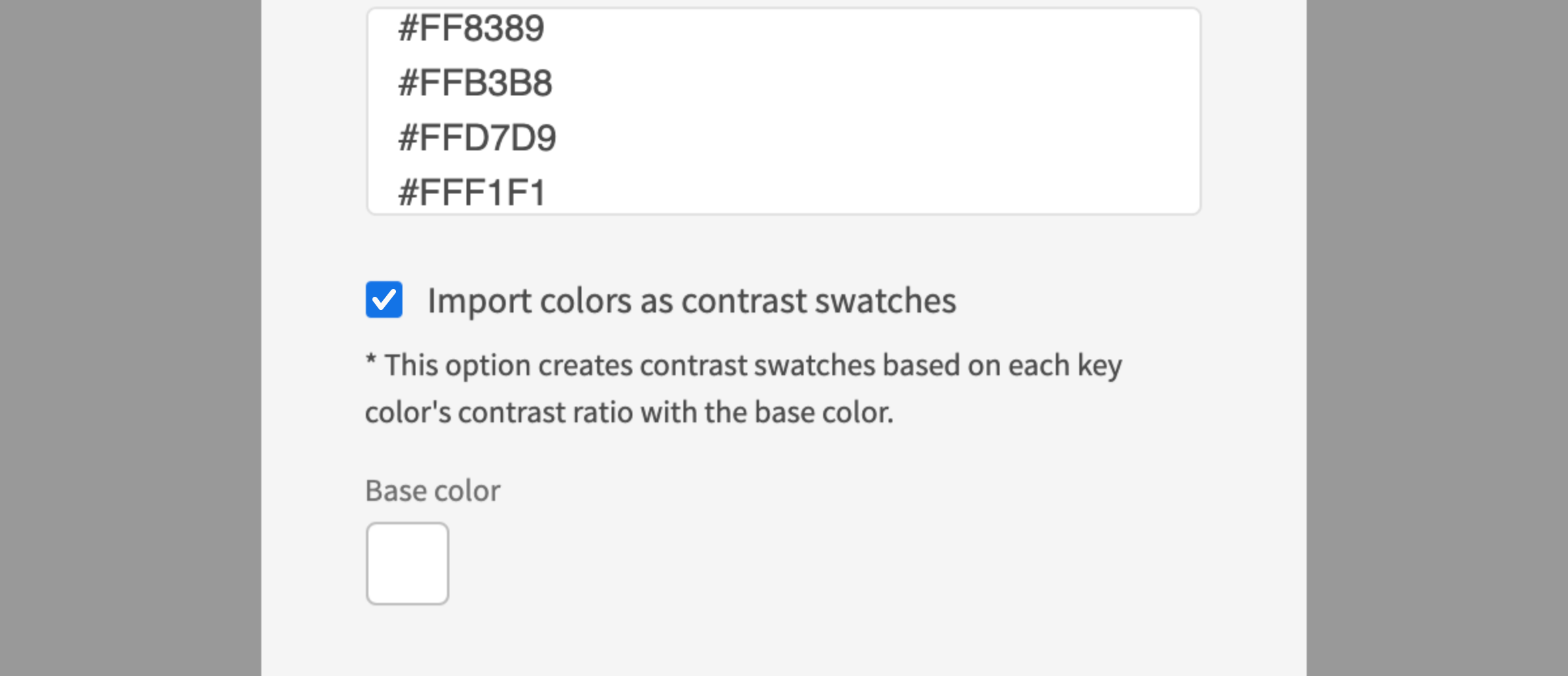 Importing as swatch will create contrast swatches for each color entered
Now your existing palette is contrast-ratio-based. You can begin modifying your color scale and ratios and share the URL with your engineers to pass along the parameters they?ll need to integrate Leonardo and your adaptive color palette into your product.
 Example of Carbon Design System?s red palette generated by bulk entry
Reimagining inclusive design and color contrast
Leonardo allows you to rethink how to approach accessibility of color contrast in user interface design; putting the control in the hands of your end users and making accessibility dynamic.
There are many people who fall between the needs of minimum contrasts and the needs of using high contrast modes. Whether that?s due to low vision, or a host of technological or environmental factors that affect the appearance of contrast on screen. These users simply need to boost or adjust the brightness or contrast of an interface to aid in their experience.
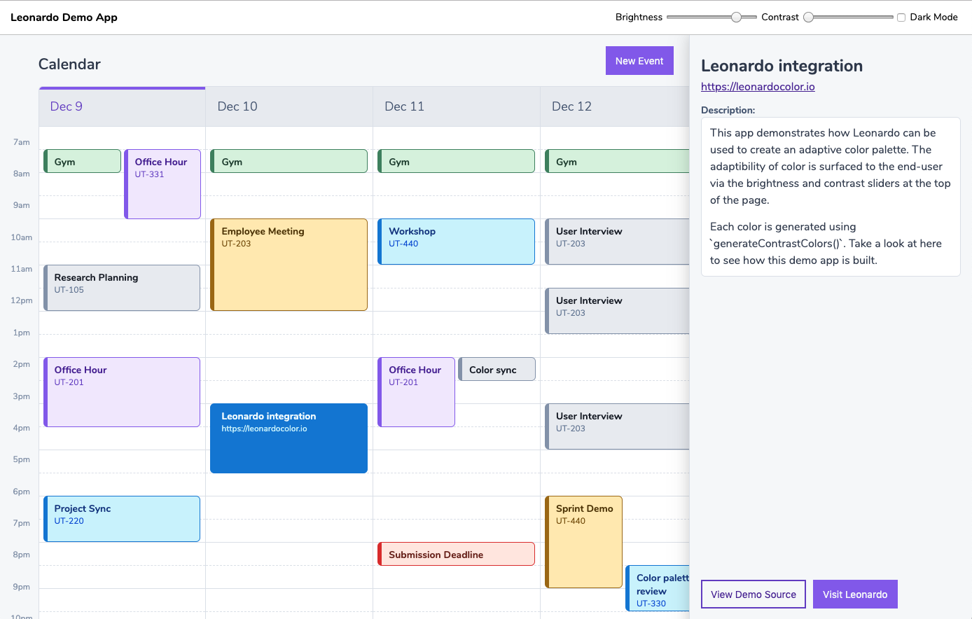 Demo app using Leonardo for fully contrast-ratio-based theme and dynamic brightness & contrast controls
By integrating Leonardo into your applications, you effectively enable users to modify the experience to fit their unique needs while upholding the brand and aesthetic of your color choices.
Creating a full contrast-based theme
This article walked you through how to create a single color scale using Leonardo. The tool has since been improved with the ability to create multiple scales at once, all referencing a common background color ? in other words, you can now author an entire color theme in one place. Take a look at this article to find out how, or jump right in at https://leonardocolor.io/theme.html
Open source
Inclusive design affects us all, which is why it?s a high priority to make Leonardo an open source project. We want it to be easier for everyone to create accessible color palettes, and enable products to put accessibility and inclusive design in the hands of their end users.
Leonardo is an Adobe open source project, and is being used to generate the color system for Spectrum, Adobe?s design system.
Come take a look at http://www.leonardocolor.ioOr visit on GitHub at https://www.github.com/adobe/leonardo
Contributions welcome! ?
Additional credits
Inspiration for Leonardo came from Lindsay Browne, Alan Wilson, and Johnny Hunter. Major thanks to Larry Davis for his invaluable contributions.
It is also inspired by all the work of other designers and engineers who have been making advancement in color tooling and education of colorimetry and color accessibility for user interface design.
Leonardo is built using D3 and additional plugins from the D3 community.
