 src= ? https://paulryan.com.au/wp-content/uploads/2015/01/high-resolution-wallpapers-25.jpg?
If you google ?most attractive website designs?, at first look you get to see amazing background image on most pages that tell you a story about the page and at the same time awe you visually with the exceptional blend of appealing background image and minimalistic portfolio. Now if that doesn?t daunt you as a front end designer/ developer, I don?t know what will. So, if captivating the visitor?s attention to your website at the first glance is what interests you, full screen website background is a way to go that sets the tone for the user experience.
Once have a look at this site:
Winchester College | Independent Boys’ Boarding School
Living Pastoral care is never behind the scenes at Winchester. The school operates as a fully-integrated community?
www.winchestercollege.org
In this tutorial, we will use simple HTML and CSS properties to make a full screen background image. The goal is to have an image cover the full screen of a browser window at all times with no whitespaces or margins. The page must retain the aspect ratios of the image and must be centered to the page while at the same time being responsive to different browser sizes.
Anything more?? Umm? that pretty much sums it up for this part. So, buckle up your belts and let?s get ready for the ride. Hold on, let me remind you when it comes to developing pages there is never a single way to develop a design. You can go for Jquery, add some Javascripts and still end up with same designs. That?s totally upto you as a developer to choose what fits your need. In this tutorial, we will, however, be focusing on CSS. So yea, let?s go through..
Technique 1: Adding style to the body
Step 1: HTML
This is a basic HTML structure enough to build a full-screen background image. We could have also used container elements and then add background to that container, but then the image would have scaled to the size of container rather than the whole body of the page. We will talk about the use of container later. For now, we are going to assign the background image to the ?body? element so that the image always covers entire viewport of the browser.
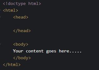 Basic HTML structure
Step 2: Adding Style element
There are three ways to apply CSS to HTML: inline, internal and external. That?s a different chapter entirely. You can look up at here to refer about those CSS implementation. For this tutorial, let?s embed the CSS internally using ?style? element in the head section of the HTML document for simplicity.
The style element encapsulates all the styling to our HTML page. This is the section where we code our CSS.
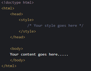 added Style element
Step 3: Using ?body? as CSS selector
Now, to selectively style the elements, several CSS selectors are available. Refer this for Selector tutorial. But since we are styling our ?body? element to contain a background image. We will be using Element Type Selector with ?body?.
 Body element Selector
Step 4: Using background property
The background property of CSS is used to define the background effects for elements. Our purpose is to add image as our background, So lets give the location of the image to our CSS.
background-image: url(?imageLocation.jpg?);
Inside the url the path of the image should be specified. This line just imports the image to the page without adjusting to the screen. When we scale up an image from its natural dimensions, the image quality degrades, so its recommended to use high quality images only.
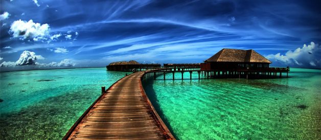
The original image is at the top of this tutorial.
 Image loaded after first code
Since the top left corner of the image is only seen in the screen. Now lets add code to align the image at the center.
background-position: center center;
This line of code centers the image vertically and horizontally.
 Aligning image at center
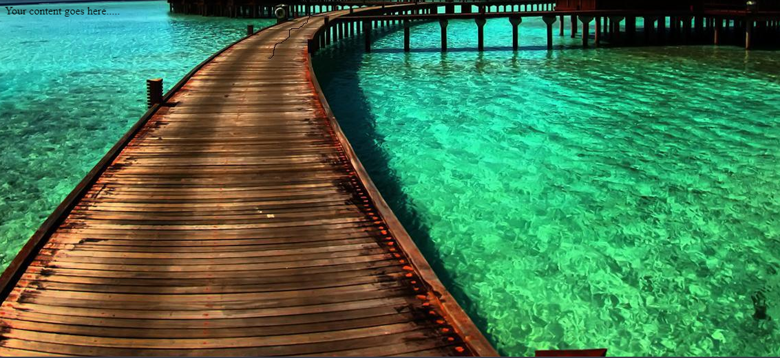
This seems nice. But still the original image isn?t scaled to fit the screen of our browser. So lets add a line of CSS to fit the image to the screen.
background-size: cover;
This property/value pair tells the browser to scale the background image proportionally so that its width and height are equal to, or greater than, the width/height of the element.
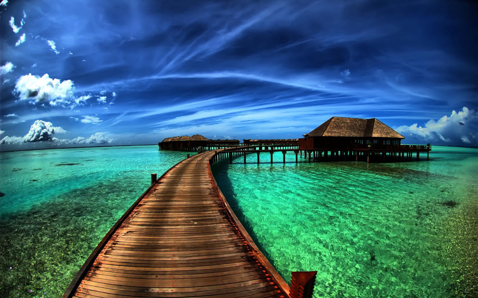
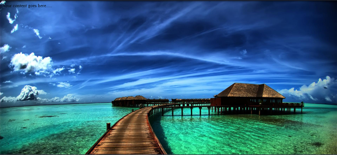 Image scaled to fit the browser
The original image has thus been scaled to fit with our browser size. However, we don?t want our website to just be visited from the browser of our size. If the page is visited from browser with smaller size.
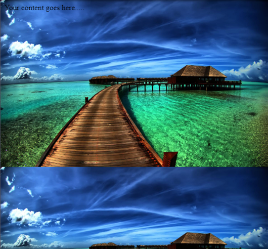 Image tiled and repeated
Oops! The image seemed to repeat itself to fit with the browser size. To remove this repetition or tiling of images, the following lines of code is used:
background-repeat: no-repeat;
Now when the content height is greater than the visible viewport then a scroll bar will appear. As we scroll down the page, the background image scrolls with it. But we want our background to remain attached to the viewport or else when the user scrolls down, the background will move which is very distracting and the bottom of the page will run out of image. So, the following line of code is used.
background-attachment: fixed;
Viola! There we have it, a full screen background image.
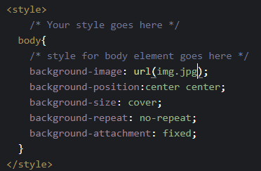 Final CSS component
To ensure cross browser compatibility some tutorials seem to add the following lines of code as well.
webkit-background-size: cover;
-moz-background-size: cover;
-o-background-size: cover;
The equivalent shorthand CSS notation for the above code is:
background: url(img.jpg) center center cover no-repeat fixed;
Technique 2: Adding style to the body
The only problem that styling the background of the ?body? element itself is that, the background remains consistent throughout all the pages. Though you might want a visually appealing background image at the front page, you mightn?t want other pages to inherit the background property. In that case styling the body complicates the situation, So we could rather use some block level elements which could contain the structure for another pages. Or, Consider for a fact if we want to manipulate the background of the page, manipulating the whole body complicates the issue. So confining the styles for a block is a solution for this.
Step 1: Adding div element
The class name of div help identify the particular element for styling in CSS.
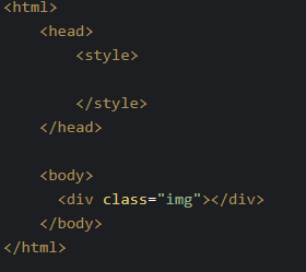 HTML with div container
Step 2: CSS
Without any contents in body section initially the body section remains unfilled. The default value of the height property is auto. So we need to stretch the body field to cover the whole page. Element ?body? looks to its parent (HTML) for how to scale the dynamic property, so the HTML element needs to have its height set as well. Also we don?t want any default margins to appear on our page. So let?s set the CSS
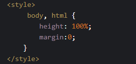 setting body and HTML style
Now lets set the background of the div element using class selector, while the rest styling procedures are same as that of technique 1. However as the styling is given to a particular block, the height of the block should also be set to 100% to cover the whole page.
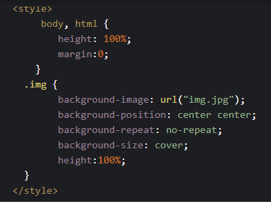 Final CSS for technique 2
Bravo, You got through.. Well if you just scrolled down. Then have a look at this codepen:
Finally, we?ve learned the use of background property to create a full screen background image. From here you can go for the use of media queries to set different styles or different images to create a responsive background images for varying device sizes. Also to enhance the page load speed on small screens, we can use a media query to serve a scaled-down version of the background image file.
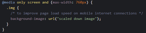 Adding media queries for responsiveness
I think, front end is all about experimenting with designs before settling for the best. So, if you want to further experiment on this very topic, you could go for the use of <img> tags and absolute positions. Though I recommend going for one of the two above.

