
 source: Google images
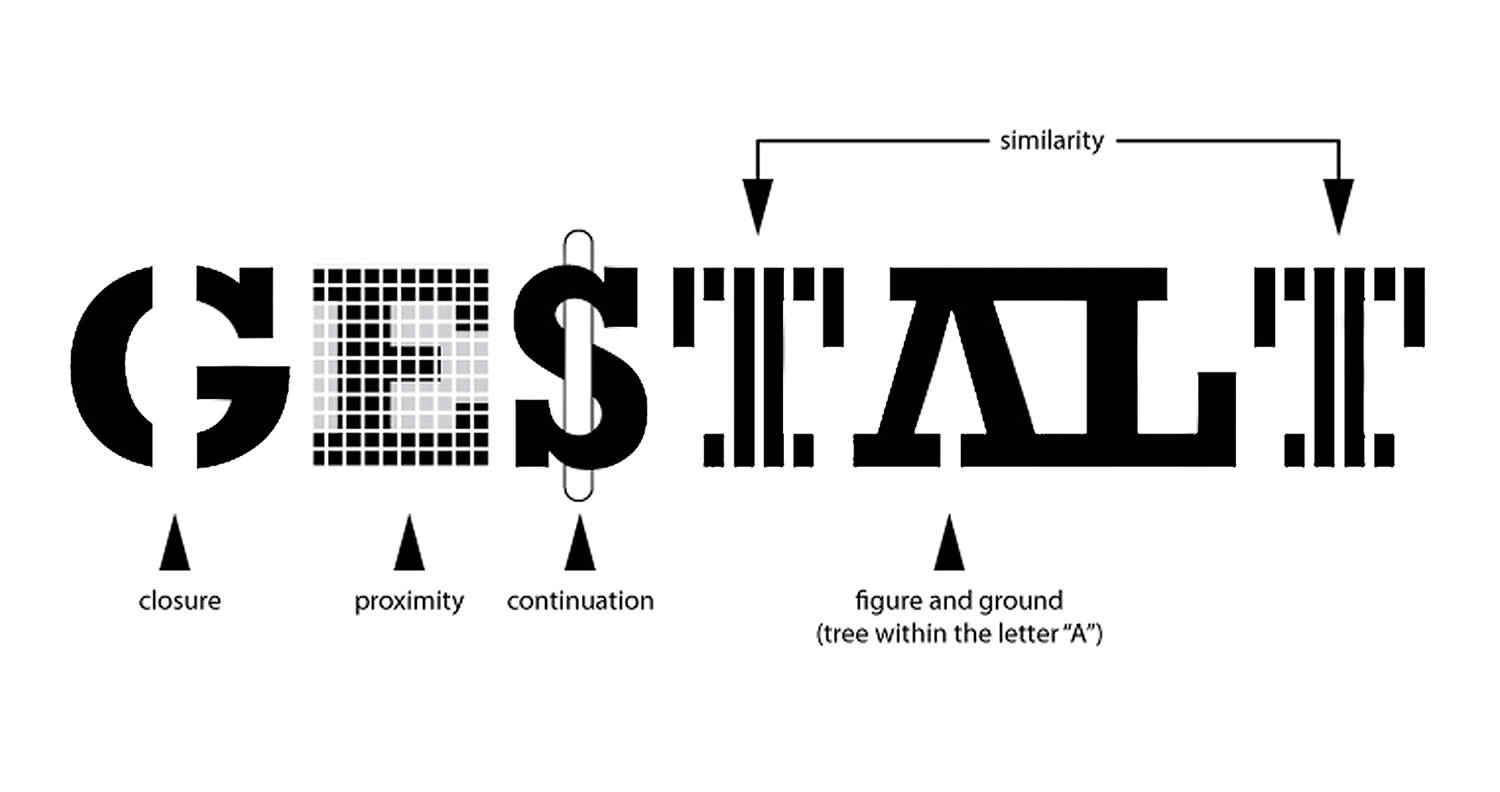
Ever observed how perception changes our behavior? What if we, as designers, could influence the perception for our users and just about predict their understanding? We can! Enter Gestalt principles!
Gestalt Principles comes from the German word ?Gestalt? meaning ?form.? The Gestalt Principles are a set of rules governing, describing and explaining the typical behavior of humans on how they interpret their visual perception. The Gestalt Principles were first written as a culmination of the work of psychologists Max Wertheimer, Kurt Koffka and Wolfgang Kohler, who sought to identify a set of rules which would explain and isolate common behavior of humans where the ?mind? informs what the ?eyes? see.
Gestalt principles were born from a mere observation by Wertheimer when he purchased a toy Stroboscope. A device that gives an impression of motion by quickly alternating between two similar images. Wertheimer, impressed and intrigued by this simple yet inescapable illusion, set out to explain this occurrence using Structuralism. Structuralism is when our mind stitches all our sensations together and draws meaning from it. Wertheimer wondered how alternating between two sensations gives a whole new experience of motion. Gestalt Principles works with the understanding that experience of motion, or perception, isn?t built up using sensations. It works, instead, as a result of perceptual organization. To sum up, the Gestalt Principles not only stress that the whole is greater than the sum of its parts, but that they are fundamentally different.
Gestalt Principles are in the Mind, not the Eye.
 source: Interactiondesign.org
These laws have become a huge part of web design as they help designers just about predict the way a user would perceive their design.
Why?
- Gestalt principles are very fundamental in nature and can act as building blocks
- They provide us with a great rationale to explain why design is intuitive or user-friendly.
- As designers, we can leverage them to promote our designs? quality instead of leaning on generic words like ?user-friendly? or ?intuitive?.
- It can provide designers a set of concrete guidelines while designing
Let?s dive into what these principles are, in simple terms:
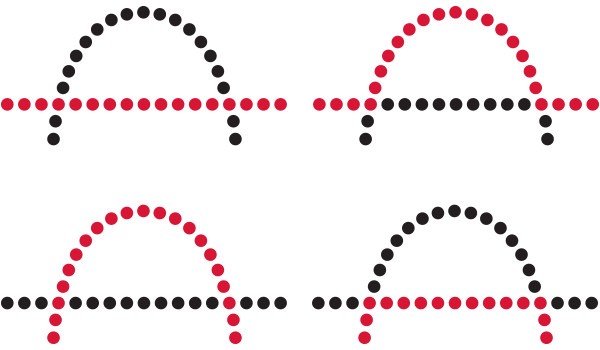
- Closure (Reification): People prefer closed and complete shapes; we automatically fill the gaps between visual elements to complete the image.
 source: Google images
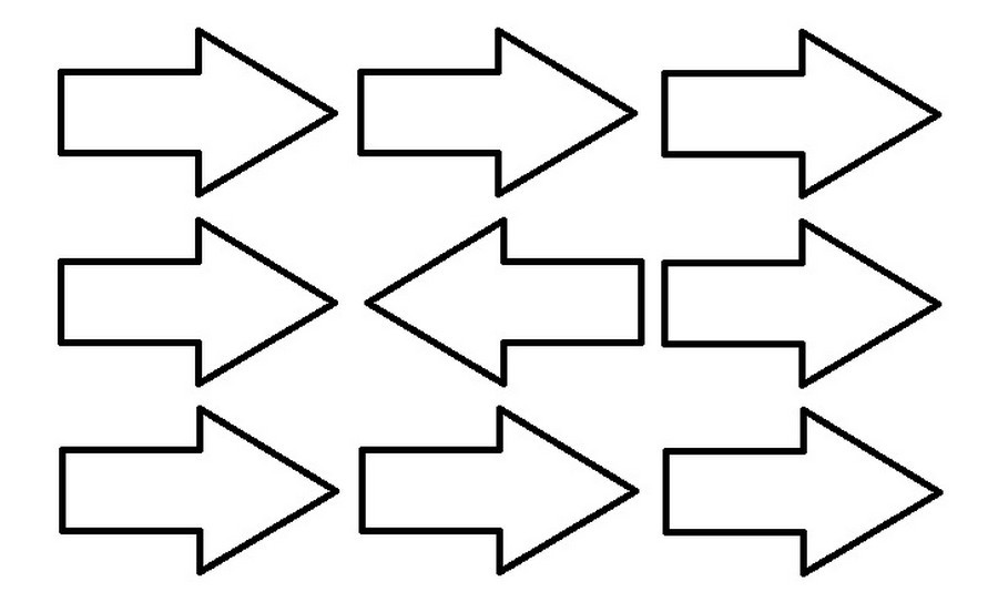
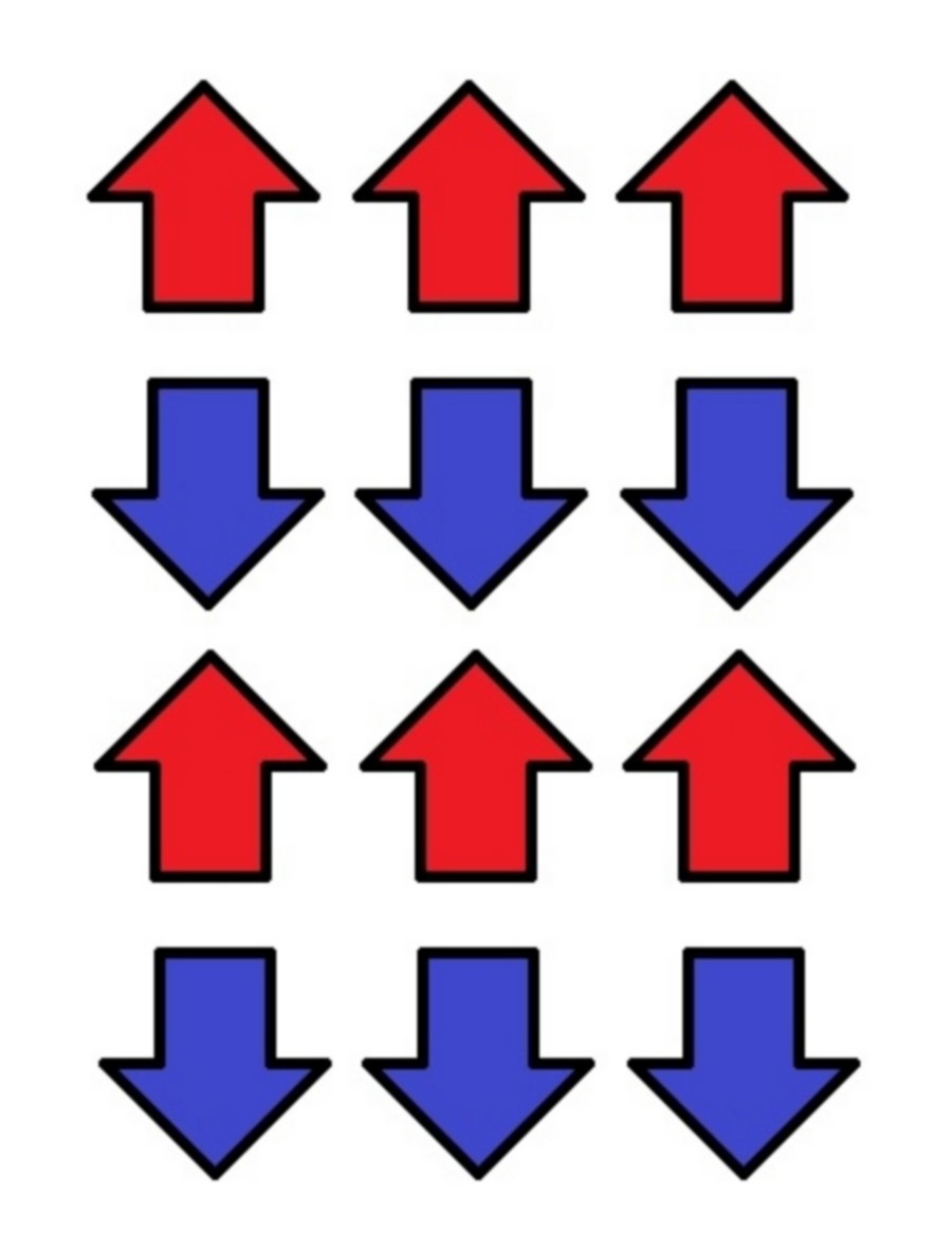
2. Common Fate: People group elements which move in the same direction.
 source: Interactiondesign.org
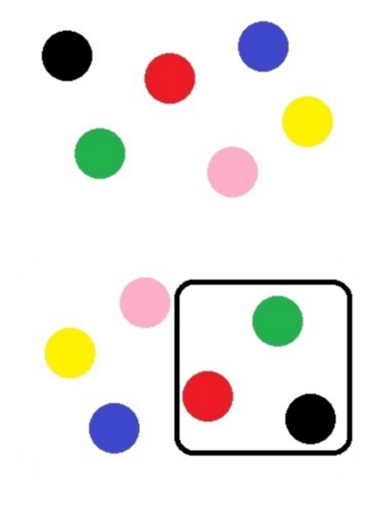
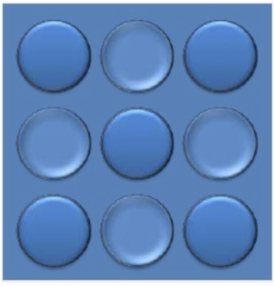
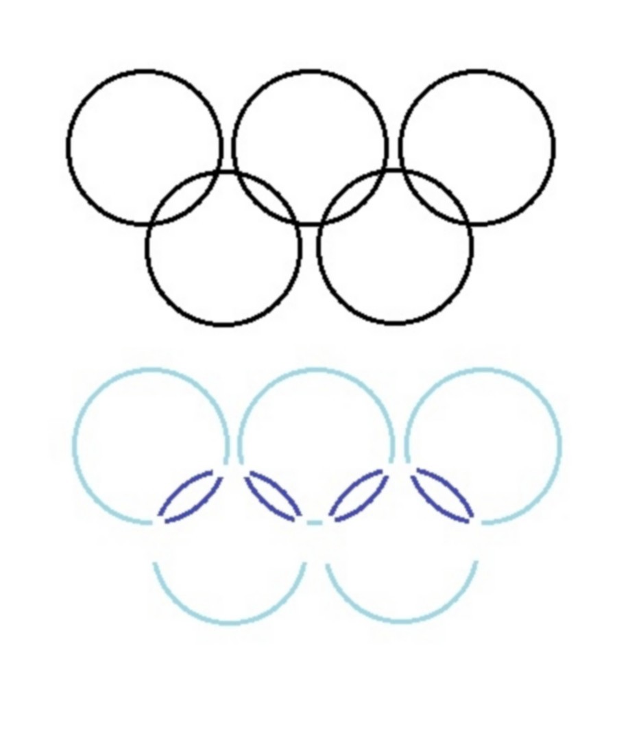
3. Common Region: People group elements which are in the same closed region.
 source: Interactiondesign.org
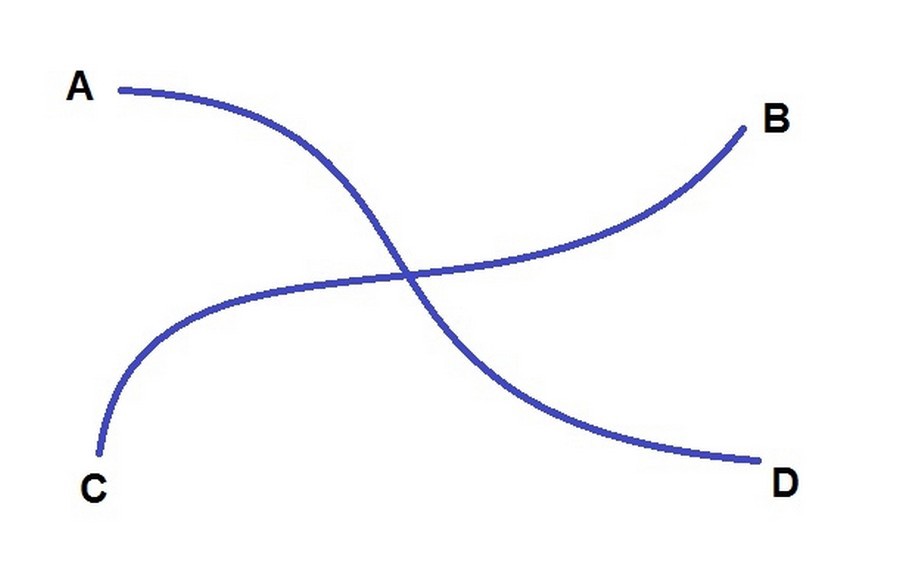
4. Continuation: People recognize and follow patterns in visual flow.
 source: Interactiondesign.org
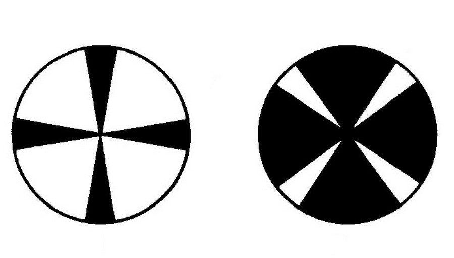
5. Convexity: People perceive convex shapes ahead of Concave shapes.
 source: https://www.slideshare.net/GlennaShaw/the-gestalt-of-slides/14
6. Element Connectedness: People group elements that are physically linked to other elements.
 source: Interactiondesign.org
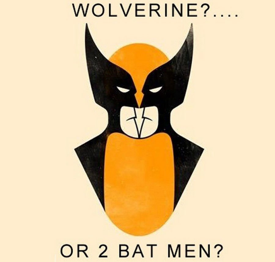
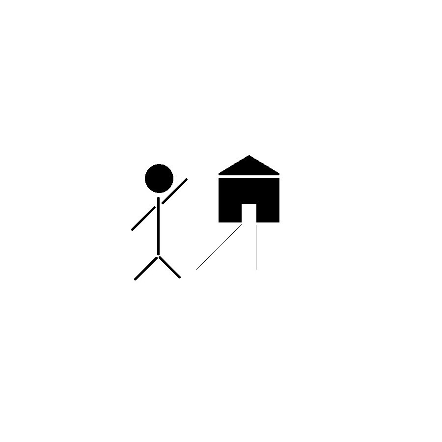
7. Figure/Ground: People often organize their visual perception with the object in focus in the foreground and the rest in the background.
 source: Interactiondesign.org
8. Multistability: People often derive different meanings from a scene depending on which part of their visual observation receives their attention.
 source: Interactiondesign.org
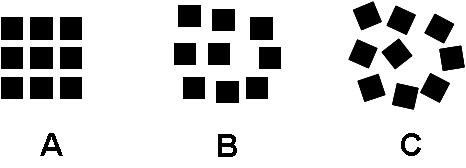
9. Good Form: People group elements that are similar in color, form, pattern, etc. and differentiate them from the rest even when they cluster or overlap.
 source: Google images
10. Meaningfulness (familiarity): People recognize, and group elements if they form a meaningful or personally relevant perception when grouped.
 source: Interactiondesign.org
11. Prgnanz: People break complex or ambiguous images and perceptions in their simplest form.
 source: Interactiondesign.org
12. Proximity (Emergence): People group objects that are visually closer together and visually farther apart than others.
 source: Google images
14. Similarity (Invariance): People seek to form connections between similar observations to make predictions.
 source: Interactiondesign.org
15. Symmetry: People seek to balance visual elements in symmetric patterns.
 source: Interactiondesign.org
16. Synchrony: People group elements that change form or appearance at the same time.
 source: Interactiondesign.org
These Principles have an impact on web-design and interaction design. Some such principles are:
1. Law of Similarity: The Law of Similarity tells us that people find it easy to link similar looking visual elements together and predict the behavior of elements using this knowledge of Similarity.
Example: This law can apply to Links, Buttons, Navigation elements, Titles, and Content. The law of Similarity carries our recognition of standard representation of elements between web pages and websites. The website can have its variant of the standard according to their theme, but overall, the pattern should be similar.
Example: Links in a webpage should all look similar, blue text with an underline. This form of text is usually and almost immediately identified as a hyperlink and web-designers should make use of this. Designing hyperlinks to look differently will throw the user off and could also mislead the user. Some flexibility around this is allowed as long as you don?t stray too far from what the user expects.
2. Law of Proximity: The Law of Proximity tells us that people find it easy to group elements in close visual proximity. This grouping based on proximity also intuitive suggests a link in context.
Example: Bullet points following a Title usually suggests elaboration on a topic whose title has been mentioned. Smart use of White space can lead to a clean and intuitive grouping of elements without clumsy lines.
3. Law of Uniform Connectedness: The Law of Uniform or Elemental Connectedness suggests that elements connected to each other using colors, lines or frames, or other means are perceived as belonging to the same group.
Example: The log in actions such as Login, Sign Up and Forgot Password are all put in the same frame groups together.
4. Law of Continuation: The Law of Continuation suggests that people follow lines, curves or patterns of shape in any order to determine a relationship between them. This law can be used to provide meaning on a higher level than individual elements.
Example: Some websites also use this law to help users predict elements not currently in view.
5. Law of Figure/Ground: The human mind organizes the elements in our visual observation in the 2 main parts. The part that has our attention is called ?figure? or ?Foreground?; the remaining elements are sent to the ?ground? or ?Background?. The background isn?t a part that is ignored or given less priority, it doesn?t have our attention but still contributes to the perception we draw from a scene.
Example: The best example of this law is the text you are reading right now. The background contributes to the clarity of the text, the overall aesthetics of the page, but it?s the actual letters that have your attention. There would be regions on a page with a slightly different colored background, which helps you realize the text it contains has a different context, but still, it?s the text that has your attention.
6. Law of Prgnanz: People like to find a simple breakdown of complex observations which allow them to perceive meaning from the scene.
7. Law of Closure: People find it easy to close gaps and open contours to form whole objects and shapes. This law allows the observer to recognize partially visible or occluded elements as well. Using this law in design, elements with open contours or partial occlusions can be used without risking information overload.
8. Law of Common Fate: Objects that move together are easily grouped together. This law allows people to perceive multiple objects as grouped or linked if they move in similar directions and speed. This law is useful while animating objects.
Example: In page transitions or Carousels. Objects that move on a trigger are grouped and easily distinguished from objects that didn?t.
9. Law of Synchrony: Objects that change form together are easily grouped together. This law is sufficiently different from the Law of Common Fate. The Law of Synchrony doesn?t mandate that objects move; it applies for objects to change state. For example, change the size, color or visibility.
Example: A good Example is a drop down. All elements in the dropdown appear all at once, all elements of a secondary menu appear together. This simultaneous change in visibility helps us group the menu items.
Gestalt Principles are more natural behavior than tricks, but we could use them to direct a user down a path. Hence, they can not only be used for designing intuitive and usable UIs but also provide reasons for the design decisions. Next time someone questions your design, instead of having a battle of opinions, you can provide concrete reasons to defend your design.
These laws have so many examples all over the web and some even in real life. Were you able to spot any?

