If you know anything about the automotive industry, you must be very familiar with the Ford Motor Company.
One of the largest automakers in the world has been alive and kicking for over a century, while drivers recognise the brand by its superior quality and undisputed reliability.
But if you know anything about graphic design, you must be very familiar with Ford?s logo.
The famous Blue Oval Logo is a genuine representative of the brand?s superiority and creative thinking.
The logo has become globally recognised as one of the most powerful symbols of the automotive industry, so it?s always interesting to analyse it and explain what makes it so interesting.
In this article, we are going to show you a complete genesis of the Ford logo design along with the most significant details from the company?s history. Let?s begin!
The history of the Ford logo design has been influenced directly by the development of the company, so we need to present a brief overview of how Henry Ford launched and grew the brand in the early 20th century.
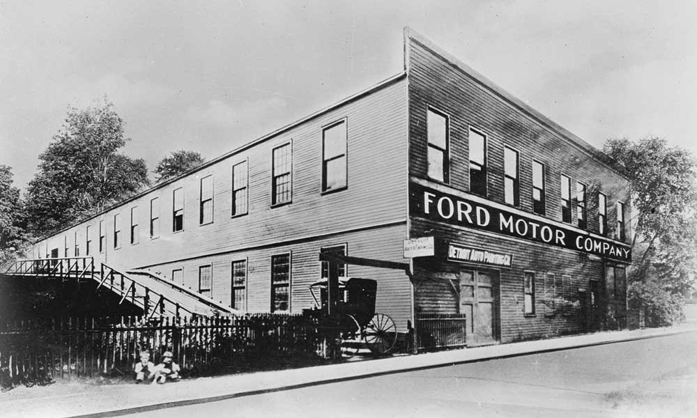
The Ford Motor Company was founded in 1903 in Detroit, Michigan, as the joint project of the businessman Henry Ford and 11 more investors.
Ford did not produce too many vehicles in the first few years because the factory wasn?t able to generate more than a few cars on a daily basis.
However, the situation changed drastically when Henry Ford decided to realise the concept of the assembly line in 1913.
This invention drastically sped up the production process and made automobiles affordable for low-income individuals, too.
It gave Ford a huge boost and allowed the company to sign multiple contracts with both state authorities and private enterprises, including a cooperation agreement with the Russian Government back in 1929.
The Ford Motor Company kept growing decade by decade, turning into one of the world?s largest car manufacturers.
Today, this company is the second-biggest automaker in the US behind General Motors. On a global scale, the Ford Motor Company holds the number five position behind General Motors, Toyota, Hyundai, and VW. Ford sold over six million vehicles worldwide in 2018.
Ford Logo ? History, Meaning, and Design
The Ford Motor Company has a long and shiny history, and so does its official logo.
Designers often call it the Blue Oval Logo due to its specific features, but the origin and the history of this emblem are packed with upgrades, redesign attempts, and interesting facts.
The description of the Blue Oval Logo
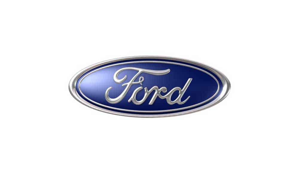
The Ford Motor Company has an oval-shaped logo in which different shades of blue dominate the background. The borders and wording are white.
The current version of the logo is active since 2003. The shape is very simple because the brand wants to make one thing clear: Ford does not play with car quality.
The history of the Blue Oval Ford Logo
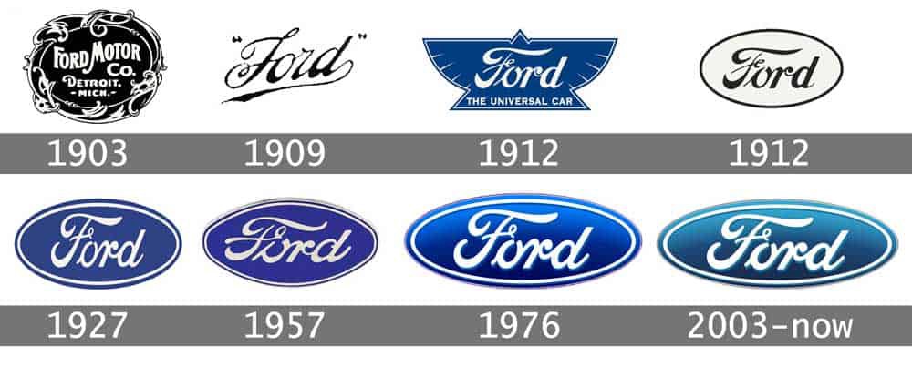
In general, the Blue Oval Logo is certainly one of the most valuable visual signatures in the business universe, but it went through a lot of changes since 1903.
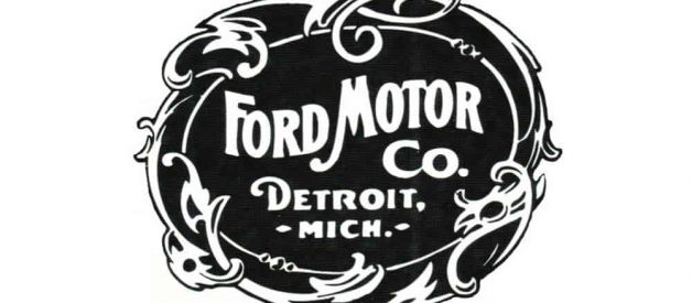
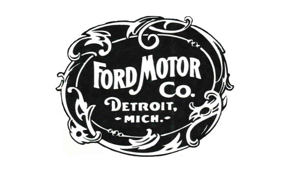
The first car produced by Ford, a famous Model A, has a completely different Ford emblem.
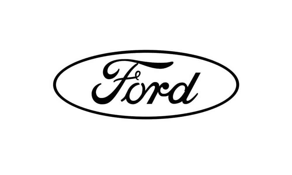
The 1903?1907 version of the logo featured only black and white colours and it included the whole line of text: Ford Motor Co. Detroit, Mich.
It has a delicate artistic touch and the overall appearance was far away from how it looks today.
But it didn?t take Henry Ford too long to realize that something needs to be changed here.
A team of designers came up with a new solution in 1907, but it barely lasted for two years.
Namely, the logo did emphasise the name of the brand, but it had the shape of a football and did not match the expectations of Henry Ford and his closest associates.
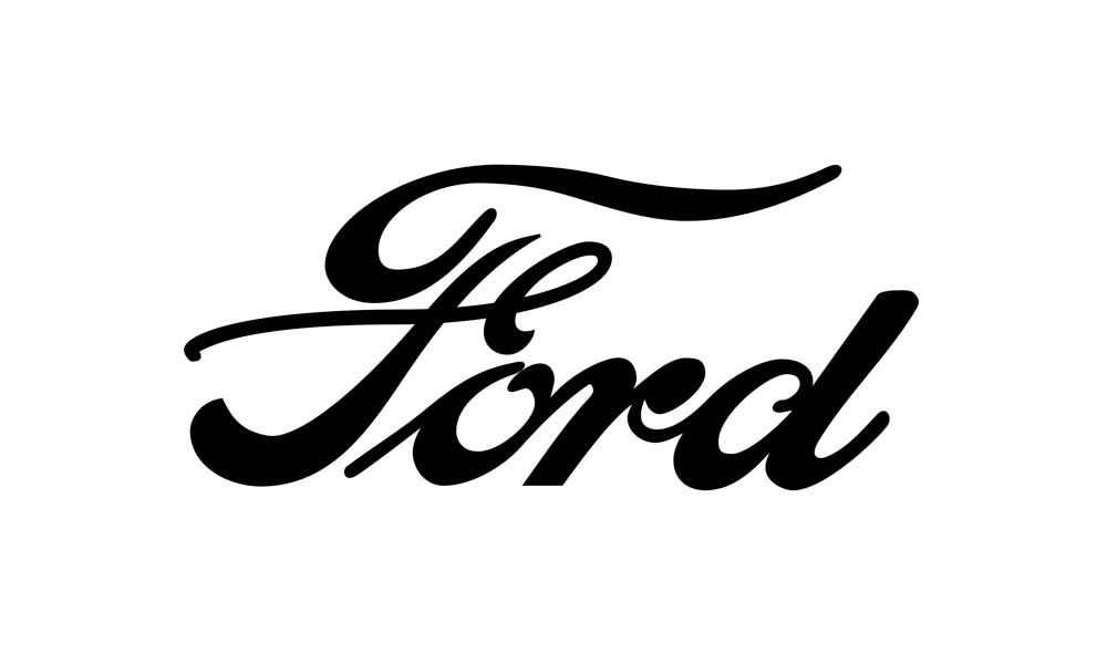
Jake Gardner, a graphic design analyst, says the company experimented with multiple logo designs between 1909 and 1912 trying to figure out the finest solution:
?They realized that Ford needed unique typography and so they created the so-called script with wings. In its essence, it is Henry Ford?s signature with a slight touch of artistry ? letters ?F? and ?D? are a bit longer and spread like the wings.?
By this time, the Ford Motor Company decided not to change the font and so the signature remained the same in the decades to come.
This period is also important because it gave birth to the first oval-shaped logo solution.
Namely, a group of British entrepreneurs and designers proposed the oval shape because it symbolizes professional authority, reliability, and affordability.
The idea was tested successfully in Great Britain, which helped Ford to make the decision and promote the oval-shaped logo universally.
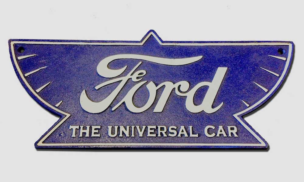
In the meantime, the US branch tested a brand new Ford logo which combined a triangle with a pair of wings.
The emblem included the well-known Ford signature along with the line: The Universal Car.
What they wanted to achieve was to point out the brand?s sharpness and speed, but Henry Ford never really liked the idea and so it has been replaced with the oval-shaped version in 1917.
Ten years later, the company decided to put the Blue Oval Logo on the radiator grill of the Model A, also known as the most popular car of this era.
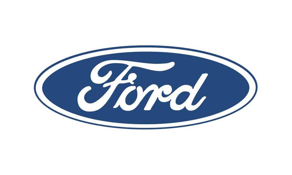
The logo featured the deep royal blue colour and it remained the official logo solution in the next 30 years.
According to design professionals, the Blue Oval Logo went through minor changes in 1957 when white was replaced with silver to create a new combination with the predominant colour blue.
The entire Ford Motor Company experienced those changes because it undertook an enterprise-level rebranding.
This alternative has been active all the way until 2003. That year, the Ford Motor Company celebrated the 100th anniversary and decided to refresh the logo once again.
They did it by using a gradient blue, while the white oval once again replaced silver.
Interesting Facts about the Ford Logo Design
The Ford logo obviously went through a lot of changes in the last century, but this is just one side of the story.
What is interesting to notice is the fact that the Blue Oval Logo had some major ups and downs throughout history. We want to mention the most interesting stories here:
The Ford Motor Company introduced its first logo quite early, but lots of cars have been produced before the actual logo release. Now, the real question is what happened to those vehicles. Did they contain any kind of signature or emblem? Well, it looks like the car had a few wordings that served as inspiration for future logos. The thing you can notice instantly is the famous sign: The Universal Car.
It seems like the phrase the Blue Oval Logo dates back to 1907. However, it is not possible to trace the origin and find out who created it. What is possible to guess is that the phrase doesn?t come from the Ford Motor Company because their oval-shaped logo had not been invented back then.
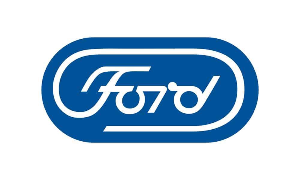
Henry Ford II actually wanted to change the logo in the 1960s, so he asked the designer Paul Rand to come up with something completely different. The result was quite shocking, so Henry Ford II gave up the idea and decided to stick to the good old version of the Blue Oval Logo.
Do you know that the automotive industry in Detroit underwent a terrible crisis in 2006? This is exactly when the Ford Motor Company decided to put their logo down for a loan (among many other assets) to stop the consequences of the crisis. Luckily enough, the trick worked and Ford successfully reclaimed the ownership of the brand logo in 2012.
After everything we?ve seen so far, we have only one question left to answer: How many Ford logos are there? According to our analysis, the Blue Oval changed 11 times since 1903. However, the fact remains that the last five iterations are very similar and bring only minor upgrades.
Conclusion
It?s hard to find the automotive emblem more impactful and recognisable than Ford?s Blue Oval Logo.
Their logo changed throughout the decades, but it never really lost anything of its magic.
As a matter of fact, Ford logo has been widely recognised as one of the most successful design projects of the entire car-making industry.
In this post, we showed you a brief history of the company and gave you a thorough presentation of the Ford logo design.
We are obviously big fans, but let us hear your thoughts in comments: Do you consider the Ford logo to be so beautiful? Do you prefer some other car logos?
Tell us what you think and we will be glad to discuss this amazing topic with you!
Author bio: Justin is a blogger from Leicester, England, UK. When not teaching his little students and rooting for Leicester FC, he loves to share his thoughts and opinions about education, writing for Rush Essay Review and GradeMiners Review.
Originally published at https://inkbotdesign.com on July 13, 2019.
