Edward Tufte?s classic The Visual Display of Quantitative Information is the Strunk and White of data visualization. It made Amazon?s list of ?Best 100 non-fiction books of the 20th century?. It?s also a fascinating history of data graphics ? fascinating if you?re into things like the history of data graphics. ?
This is my quick review of this classic.
The book is very affordable ? my used version of the 2nd edition (2001 ? the most recent) was $13.98 with shipping. My copy from Amazon even showed up with Tufte?s signature on the title page. It?s also a quick read ? I read it in an evening.
Five takeaways
- Less is more. ?Above all else show the data? (p. 92). Erase everything you don?t need.
- ?Graphical excellence consists of complex ideas communicated with clarity, precision, and efficiency.? (p. 51)
- Keep it proportional! ?Lie Factor = size of effect shown in graphic divided by size of effect in data? (p.57). Keep it close to 1.
- You don?t have to use a graphic when there isn?t much data ? a table is often better.
- Pie charts are useless. The dude hates pie charts.
These five insights are just a few of the many nuggets in The Visual Display of Quantitative Information.
A few surprises
I was surprised to learn how new data graphics are. Tufte writes ?It was not until the seventeenth century that the combination of cartographic and statistical skills required to construct the data map came together, fully 5,000 years after the first geographic maps were drawn on clay tablets.? (p. 20).
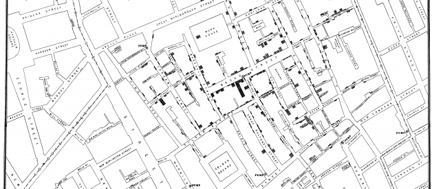
A good chart can inspire action. Early epidemiologist John Snow?s 1854 map with data appears to have saved many lives. Snow showed the location of London?s 13 public wells and 578 cholera deaths by stacked bars perpendicular to the their location. His graphic, in part, appears to have helped convince the city to shut down the infected well.
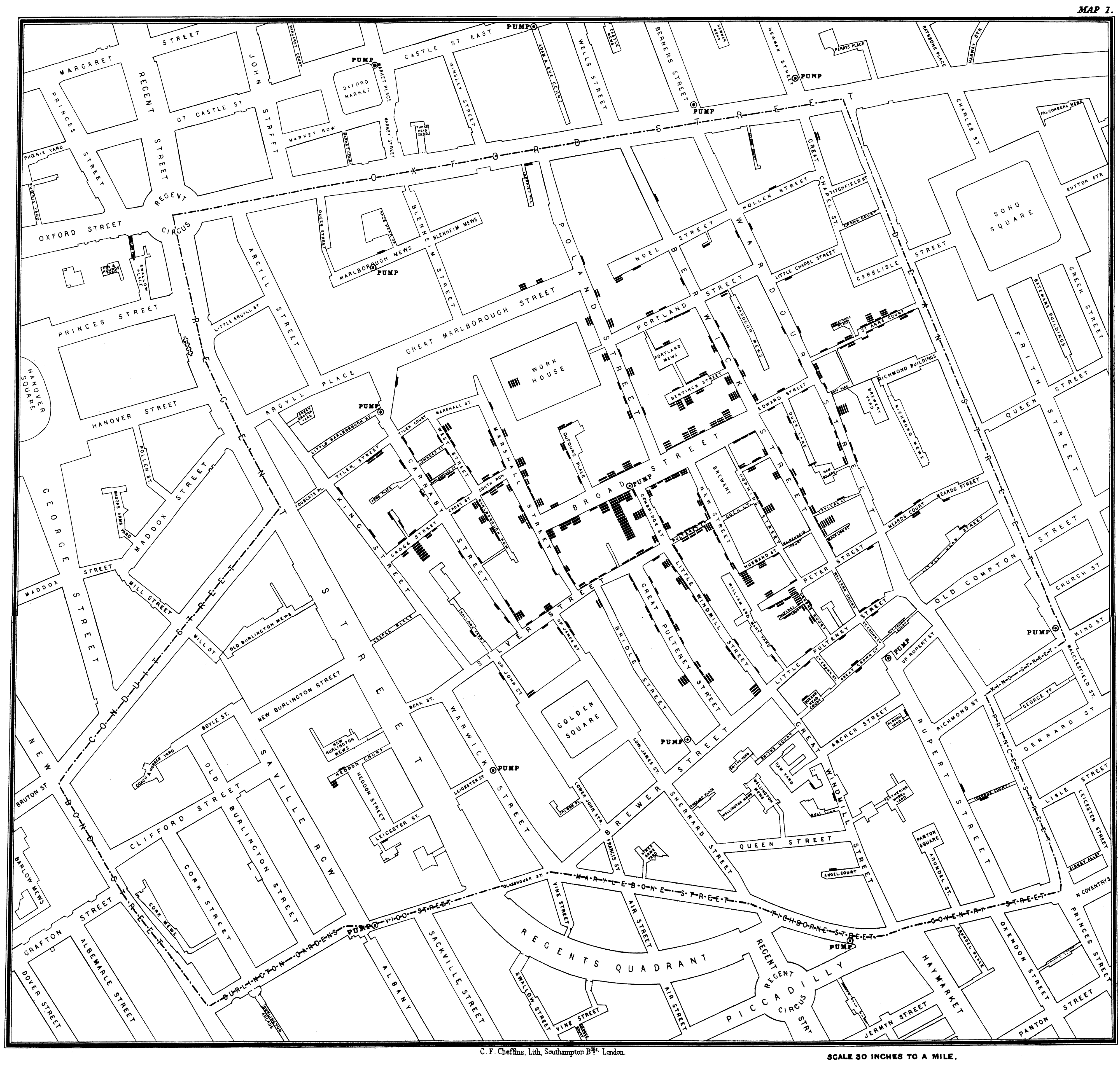 Snow?s 1854 map showing London?s public wells and cholera cases as bars next to the location of death
Maybe the most surprising thing in the book was Tufte?s story of publishing the book. It was 1982. He could have used a publisher who wanted to sell it at as a fancy coffee table book at a high price.
However, Tufte took a gamble. He got a second mortgage on his home to self publish the book at an affordable price point the way he wanted. Tufte?s gamble, at a time when self-publishing wasn?t a matter of hopping on the internet, is quite impressive. It?s a gamble that paid off handsomely, and we can be thankful that he took it.
Wrap
We?re living in a golden age of data graphics. The Washington Post, Vox, the New York Times, The Pudding, and many other outlets making interactive graphics on websites that are informative and beautiful. Interactive digital data graphics can be amazing.
But data graphics can also distort information in their attempts to persuade. As consumers of data graphics, it behooves us all to arm ourselves with a more thorough language and understanding of data graphics. Tufte?s classic should be required reading. After reading it you?re likely to look at data graphics with a more critical eye and view masterpieces with more appreciation.
If you?re a producer of data graphics ? and many data scientists, marketers, and power-point jockeys are ? it?s an essential addition to your book collection. The Visual Display of Quantitative Information is designed both to inspire and improve.
I hope you found this guide useful. If you did, please share it on your favorite social media channels so others can find it too. ?
I write about data science, DevOps, and other tech topics. If any of that?s of interest to you, follow me and read more here.
Happy visualizing! ?
Thanks
I was inspired to read this book because it was the inaugural read of an online data science book group organized by Charlotte Rost at Chartable. I found the blog by Datawrapper, via the excellent DataElixer email newsletter. Thanks for the inspiration to read this classic! ?
