
A Visual Vocabulary to Relate Systems, Products & Brands
So many enterprises present ecosystems far more complex than ?one design system, all our products.? More and more, I?ve found discussions across groups and systems leaders challenging. So far, I?ve lacked the vocabulary to quickly show and teach the breadth of these many systems and how they serve different internal customers with different features.
This article proposes a visual vocabulary of brands, systems, and products. The vocabulary denotes a design system?s varying outputs, documentation, adoption, and organizational boundaries. To conclude, the vocabulary is illustrated via complete, scenario-based example.
Symbols
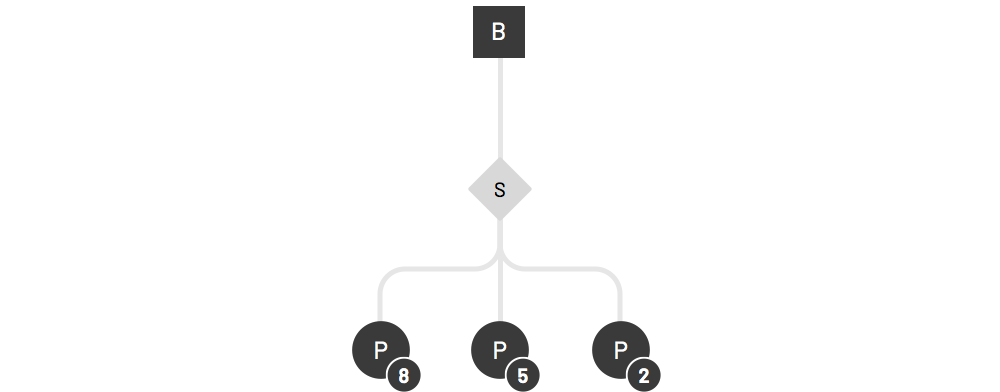
System architecture diagrams use symbols (diamonds, circles and squares) to connote objects (systems, products, and brand identities, respectively).
System, as Diamond
Each diamond represents an explicit or implicit design system feature set, including but not limited to a defined visual style applied to one or more UI components offered as design and/or code assets.

Title & description labels are displayed optionally upper right at 45 degree rotation. While one can adjust label location as a diagram emerges, this default proved least likely to conflict with objects and connectors.
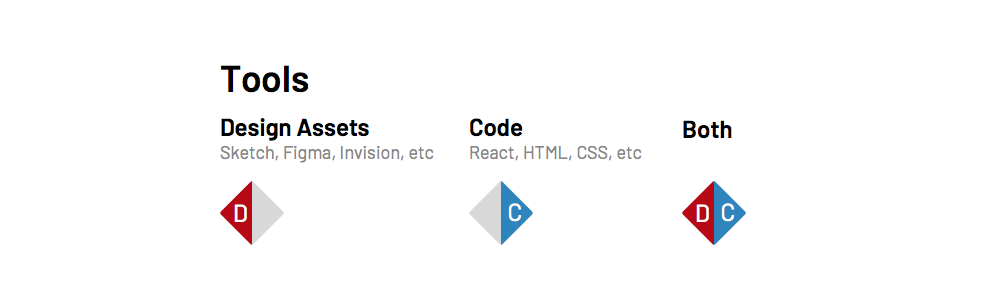
System Tools?Design Assets & Code ? as Semi-Diamonds
Each system offers design assets (such as Sketch, Figma, or Invision Studio), a code library, or both. Therefore, the system diamond is partitioned to denote whether it offers design assets (a red D in the symbol?s left half), code (a blue C in the symbol?s right half), or both to it?s customers.
Design Guidelines & Code Reference as a Diamond Backdrop
Most design systems document examples visually and ? if available ? the code used to produce that result. However, not all design systems offer deeper design guidelines and code reference material. Both are usually communicated through a well-designed, web-based site. Therefore, yellow backdrops on the left and right side of the system diamond indicate the availability of design guidelines and code reference, respectively.
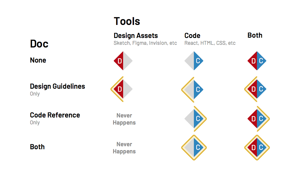
For example, IBM Carbon, Shopify Polaris, Morningstar, REI Cedar (disclosure: I contributed to the latter two) provide detailed design guidelines and code reference material. Therefore, each would include a full yellow diamond behind the D & C outputs.
On the other hand, Financial Times?s Origami offers code reference without design guidelines. Google?s Material had long provided copious design guidelines without code, although that?s changed recently with their more loosely coupled guidelines and code in different architectures of a much broader site.
Salesforce Lightning Design System offers fairly limited design guidance, blended into otherwise code-centric component documentation. Therefore, I?d indicate ? reluctantly ? that it?s site lacks detailed design guidelines.
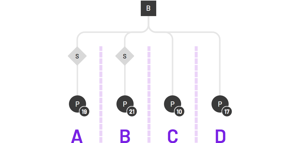
Products as Circles
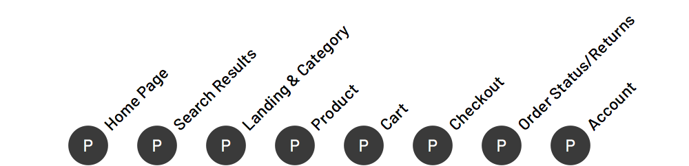
Diagramming connections between a design system and its customers is essential. Some may not consider their work a ?product,? per se. Nevertheless, a circle represents any digital experience (or portion thereof) produced by a team that could choose to adopt a system.

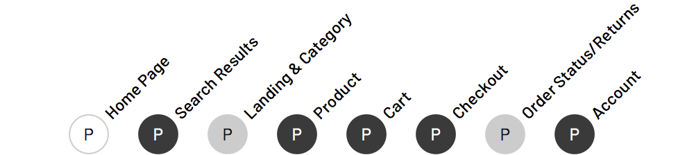
For example, an e-commerce experience may have distinct squads for each step of the process: home page, search results, landing & category page(s), product page, shopping cart, checkout, order status & returns, and account profile. Each would be represented distinctly in a diagram.
Product Quantity as Badges
For ecosystem with many products, consolidate into once symbol representing many and indicate quantity with a badge.

Product Adoption Status as Color
Product adoption of a system is irregular. Therefore, use color to connote status as adopting using using system code (black), embedding the system design into a product?s bespoke code (gray), or not adopting the system at all (white).
These may also be consolidated using badges for quantity.

Connectors, Lines Top-to-Bottom
Vertical, top-to-bottom connectors represent product(s) depending on system(s). While left-to-right and radial displays offer distinct opportunities (particularly, radial ?beauty?), top-to-bottom orientation improves visual efficiency, quickens understanding, and eased production and maintenance.

Lines turn via rounded, 90 degree angles. Straight or arced connectors overlapped and conflated with other connectors and objects, making the presentation messy and routes harder to follow.
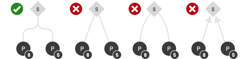
These diagrams closely relate to dependency diagrams that conclude connectors with an arrow. However, feedback strongly suggested that the diagram?s vertical orientation implied directionality. ?Arrows clutter the diagram,? my colleagues asserted. Therefore, rely upon a line?s simple, lower contrast color to connect objects.
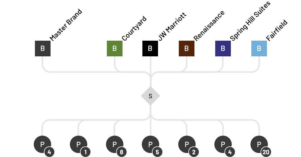
Brand Identities as Squares
It?s amusing at times to see design system pros startled when reminded that their system is not the top of the pyramid. Every (digital) design system I?ve worked inherits visual essentials ? color, typography, illustration ? and other properties from one or more brand identities managed out of a brand or marketing team. Brands are represented as a square.
Multiple Brands as Parents of One System
Displaying brands is useful for portraying many identities supported by a single system. For example, a Marriott design system incorporated rules for distinct hotel properties such as Courtyard, Renaissance, and JW Marriott.
Organizational Boundaries as Columns
No architecture of design systems across the enterprise is complete without an indication of the organizational unit(s) served by each. These may take the form of domains, tribes, and squads. Or maybe lines-of-business. Or segments of a customer?s journey. No matter how your company divides it?s work and teams, if it?s of any scale, it has divisions.
I?ve chosen to use purple boundaries that are dashed and thicker than lines connecting nodes. Additionally, one- or two-level purple labels oriented on the diagram?s baseline clearly label each area.
Examples
To see the visual vocabulary in action, I present a range of examples supported by descriptive stories to set context and reveal high-level challenges faced by the system(s) in question.
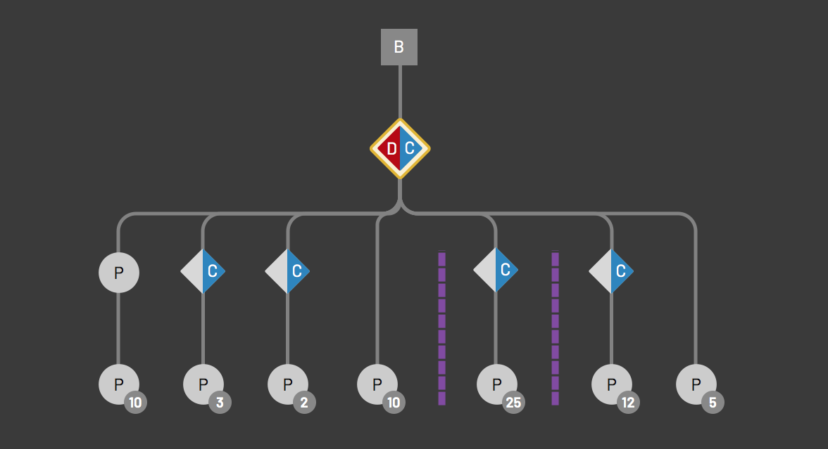
Example: A Central System with Intermediaries
This design system architecture connotes a recognized, single system upon which all digital products depend. Some products adopt the system directly. In other cases, the system is intermediated by teams offering React? and Vue-based JavaScript translations of its vanilla HTML & CSS library.
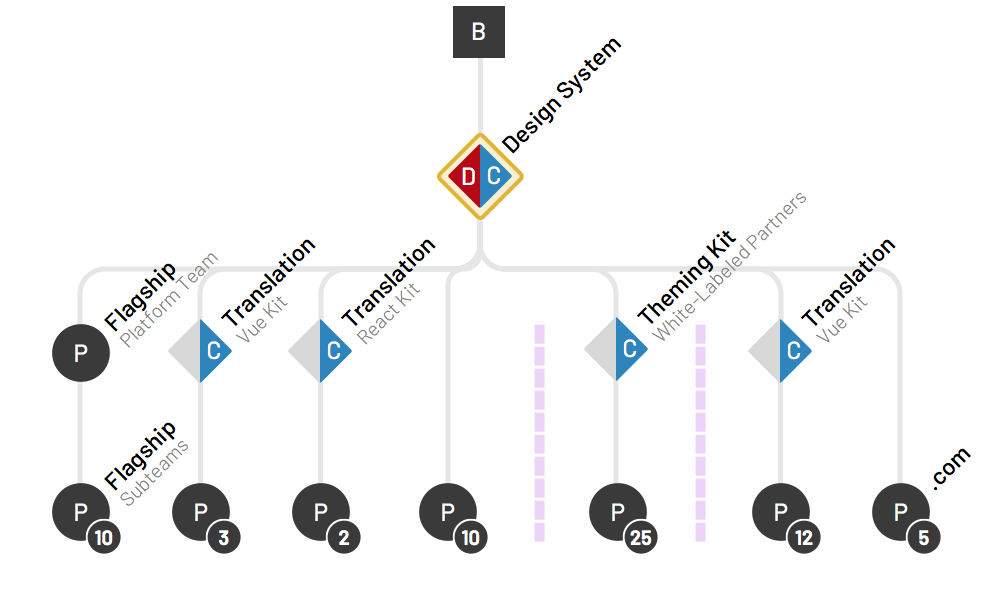
The design system team recognized the architectural redundancy and complexity, leading their next generation of work to offer web components to alleviate the need for such translations.
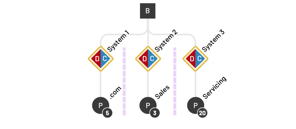
Example: Small Banks and Insurance Companies
Many insurance companies and banks organize digital product teams as the funnel flows from .com marketing through sales funnels acquiring customers to servicing experiences to manage transactions, such as a claim and money transfer respectively. This can result in at least two design systems, splitting at least .com and servicing, if not also a third system for flows acquiring customers in the cleaved space between.
Example: Software-as-a-Service (Education)
Consider a software portfolio under a parent company?s umbrella. Their system arose via a redesign of their flagship offering: content and interactive media as curriculum.
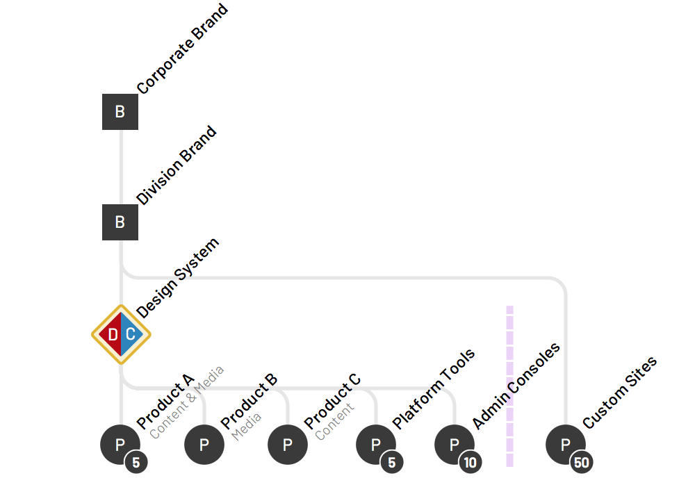
After the flagships rolled out, teams applied the system to cross-product tools (authentication, homepage, dashboard(s), search, and account management) and administrative consoles where educators managed student data and access. With success growing, they began to look towards a sibling unit that produced custom, white-labeled sites for customers.
Example: Business Units by Customer Type
One company organized digital teams into product development units separately serving consumers, employers and their employees, and large institutions in their field. As a result, distinct systems emerged in each unit.
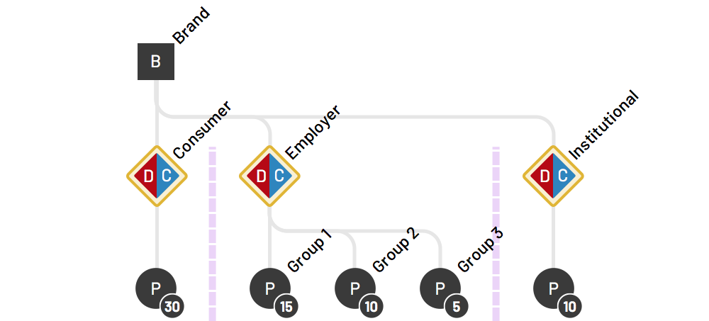
System teams shared practices and tools yet remained autonomous to optimally serve distinct customers. This helped avoid challenges, like prematurely converging a design language that wasn?t yet a priority.
Example: Software-as-a-Service (Enterprise)
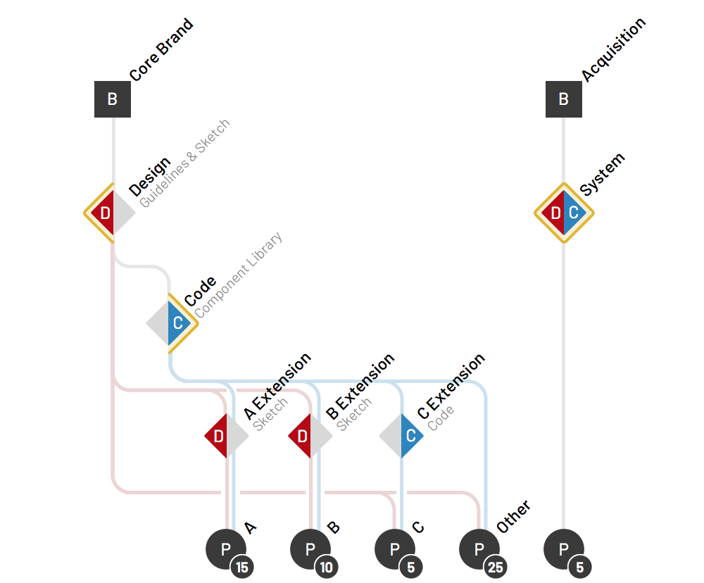
A software company established a strong centralized system with adoption across all flagship and secondary products. That said, it persisted a separate design documentation experience apart from it?s universally applied coded components. Some key products extended the system, whether designers from products A & B managing Sketch libraries or an engineer maintaining component code for her teams. Additionally, a potential acquisition will trigger discussion of integration at product, system, and brand levels.
You can download the Sketch file of symbols and examples displayed here.

