
If you?re looking to better understand wireframes, how they fit in the design process, and how to create them, this is the guide for you. Here are step-by-step instructions to help you get started. I use this method for every new project I start and, when done this way, it helps me create design concepts quickly ? absolutely key so you can test and validate your solution sooner than later.
Step one: Sketching your wireframe
Estimated time: 1?2 hours. I recommend doing this exercise with key stakeholders.
Let?s start with the premise that you?ve been tasked with creating a mobile app. The first thing you should ask is, ?What problem am I solving and who am I solving it for?? The answers to this compound question will set the foundation for your design because they will provide insights that could drive the features and functions of your designs. These answers will also certainly help you decide what the MVP (minimum viable product) will be for your design.
For example, you may have a lot of features on the product roadmap, but you need only focus on the essential features to successfully launch the first version of the app. You can start by asking ?What features and functions do we need to create so that our target demographic can complete their goal/task??
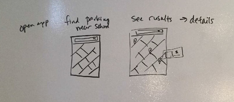
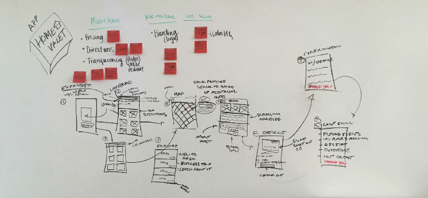
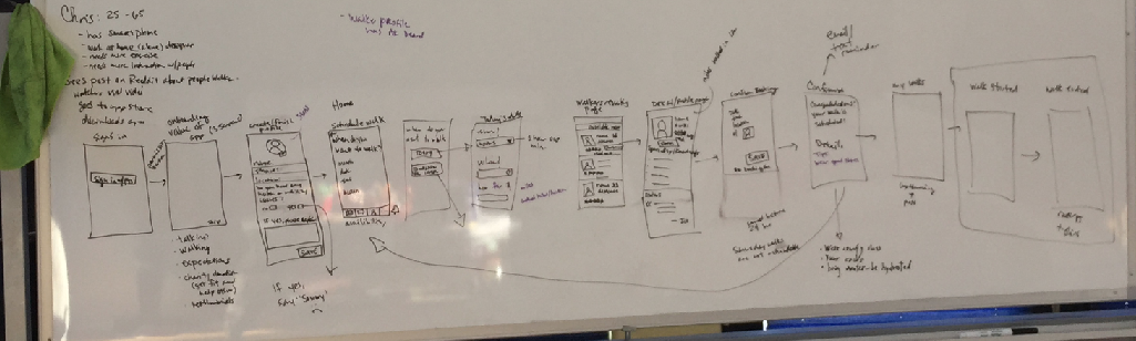
To answer this question, you can create a user flow based on the ?happy path? of your primary user (you can focus on all of the edge cases later). I recommend a whiteboard where you first write out all of the key steps of the user. Once you have those key steps written down, you can start to create high-level sketches of these steps. This helps you determine what affordances the user needs at each step of the way and keeps scope creep at bay.
Note: Try to stop yourself from sketching without first writing the user flow. Our minds can get very creative and off track if we jump straight into sketching.
Here?s what this exercise can look like after you?ve written out your user flow and created rough sketches underneath it. Remember, it doesn?t have to be pretty, but it should convey your ideas enough so that you move on to the next step, digital wireframes.
Example 1
Example 2
Example 3
Step two: Low-fidelity digital wireframes
Estimated time: 2?3 days, depending on the scope of the MVP.
Once you have your MVP wireflows figured out, the next step is to create slightly more detailed wireframes. You could create a paper prototype or go straight into digital wireframes (if speed is of the essence, I usually jump into digital wireframes).
Note: If you are working with an established brand, it might be possible to use components from an existing design system and you could jump straight into high-fidelity, Step 3, below.
I recommend creating artboards for the key screens you uncovered in your sketching exercise. The number of screens you need will increase as you move through the wireframing process of sketching, low-fidelity wireframes, to high-fidelity wireframes.
 Art boards in Adobe XD, a platform for designing and prototyping websites, apps, games and more.
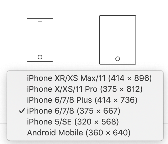
For the low fidelity digital wireframes, use the design tool of your choice to create simple shapes and use basic fonts to create your wireframes. There are also many UI kits out there that can speed up this process and create low-fidelity designs that are a little more visually appealing. I also recommend using a median artboard size that could work across most phone screen sizes. If you have the data of your target demographic and what phone size is predominantly used by them, then go with that screen size.
I use an 875 x 667px size of artboard when using Adobe XD (or any design tool as most have preset sizes built in) as it is the ?middle path? of screen sizes (especially for iPhone). I find that this size works well for iPhone 8 and iPhone X, and I find that this works well for Android as well.
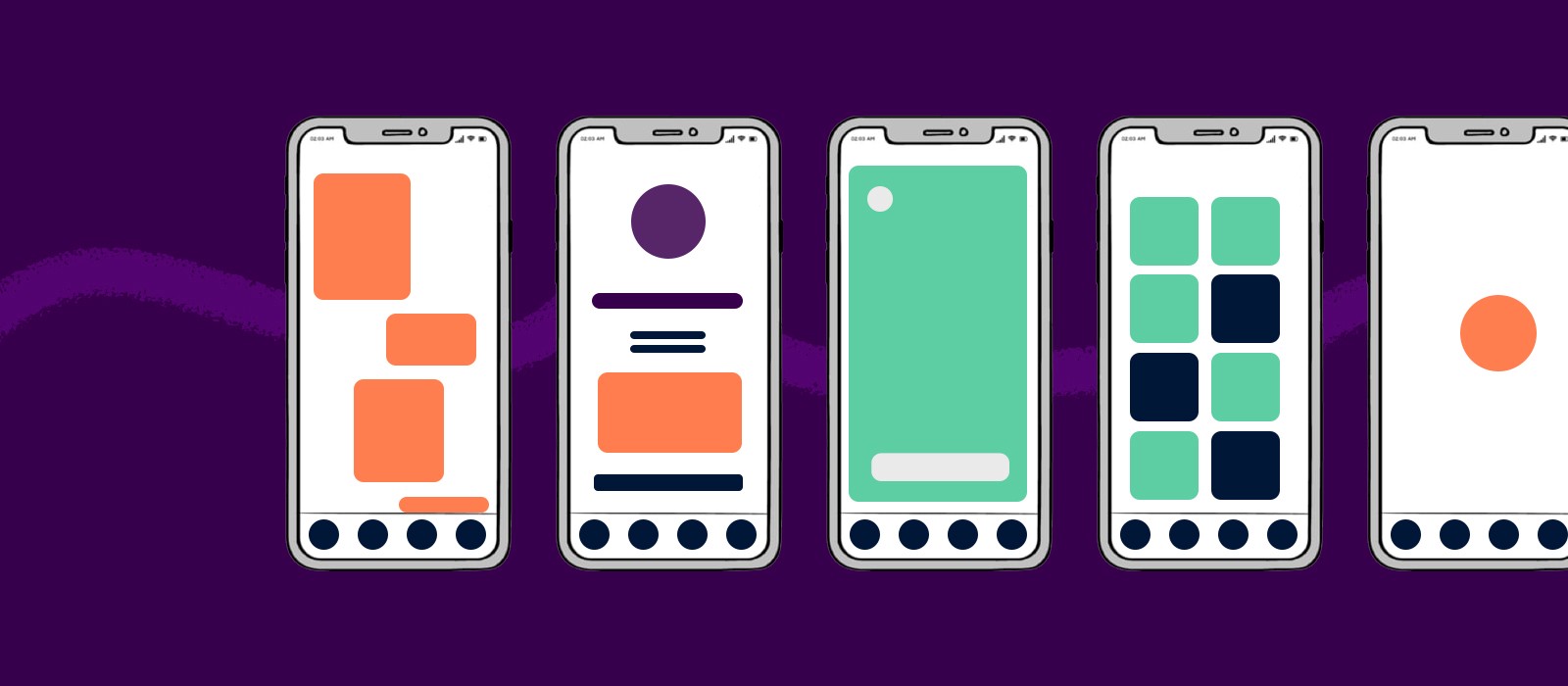
Here?s an example of low-fidelity screens in action:
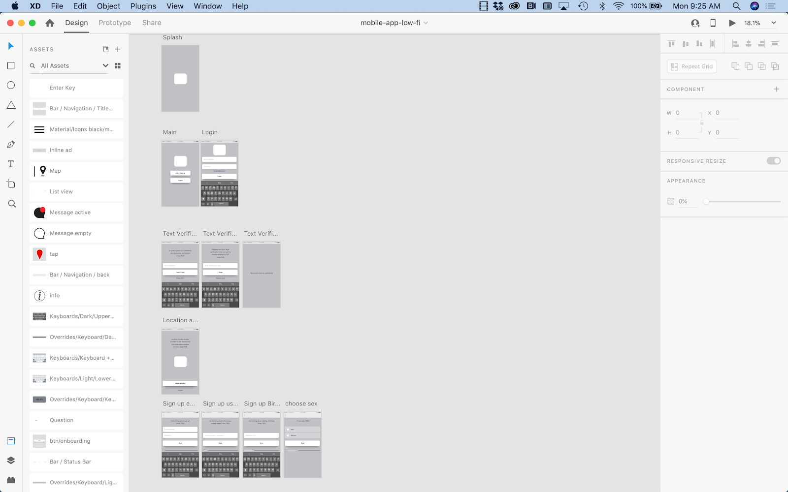 Multiple art boards depict a user flow in Adobe XD.
Once you?ve created your low-fidelity screens, tested your designs with users, and received signoff from stakeholders, you?re now ready to create the high-fidelity screens.
Step three: High-fidelity digital wireframes
Estimated time: 1+ weeks. This will depend on whether you have a design system in place or if you are creating it from scratch as you go. This step also takes longer as there will likely be more screens added than in the low-fidelity phase.
This step is where your designs come to life! It?s also the phase where your designs truly start to look like a working mobile app that you can prototype, test, iterate, get approval on, and then, ultimately, hand off to the development team.
Considerations:
- If the product you are working on already has an established brand, you will most likely pull colors, icons, and fonts from the brand guidelines.
- If the product you are working on doesn?t have a fully established brand look and feel, you can use find and use a UI kit to speed up your design process.
The next consideration is what screens do you start with? You can start with:
- Key screens for each section of your main navigation, or;
- Key user flows for the user, or;
- Prioritize the screens you design based on the order of development schedule (this is typically where I start, so I can work in an agile method, making sure to have screens ready for handoff as the development team needs them).
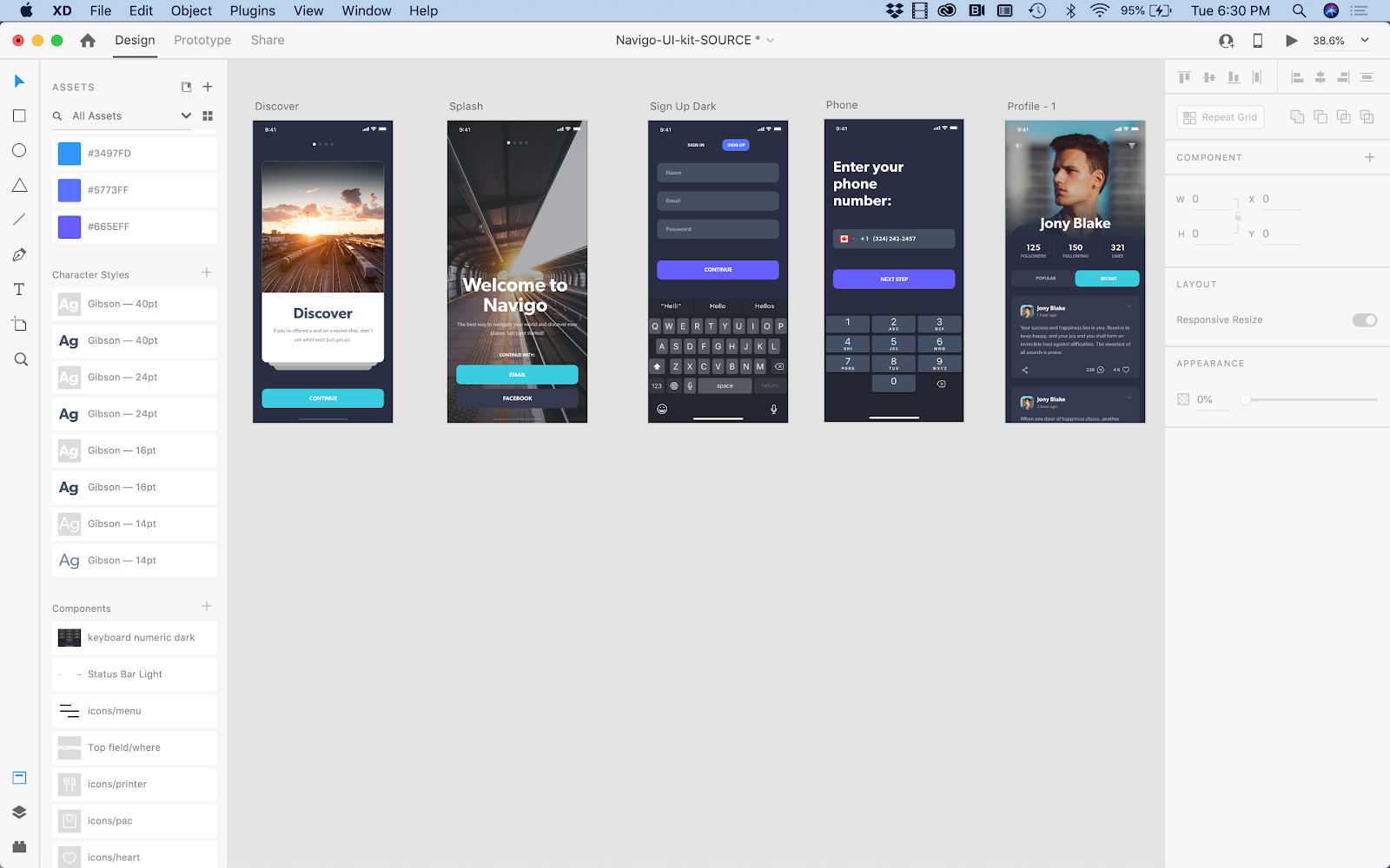
In this example, I am going to show the process of using an established UI kit in Adobe XD. And I am going to start with user login/sign up and profile creation because development teams I?ve worked with typically start with user management in their app development process.
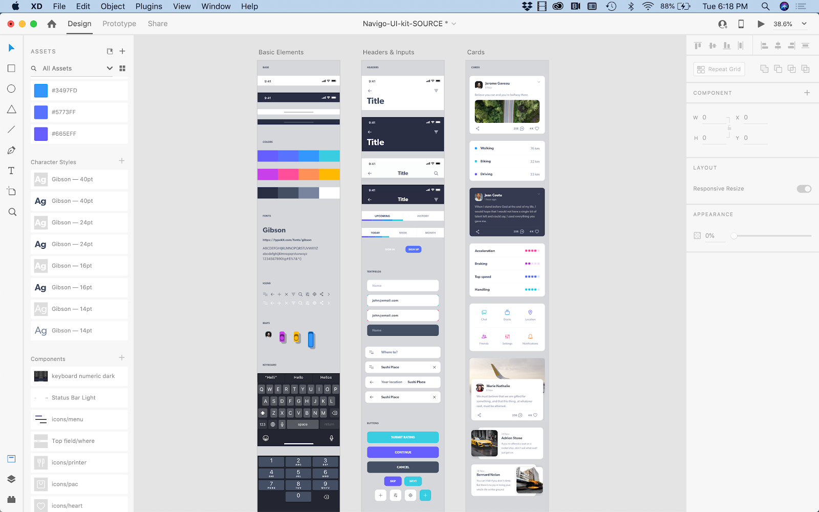
The UI kit that I chose already has an established color palette, character styles, and common UI elements (aka components) that can be copied and pasted throughout the wireframes.
Note: Early on, I recommend turning any elements that you plan on reusing into components (or symbols). This way, if you need to change the back arrow from an arrow ? ? ? to a carrot ?<?, you can change it via the master component and have it update across all of the wireframes vs. having to copy and paste the edit onto every screen that needs to be updated.
Example of colors, character styles, and components:
To begin the process, I would start building out the onboarding, sign in, and user profile screens:
Next, I would start building out global navigation elements:
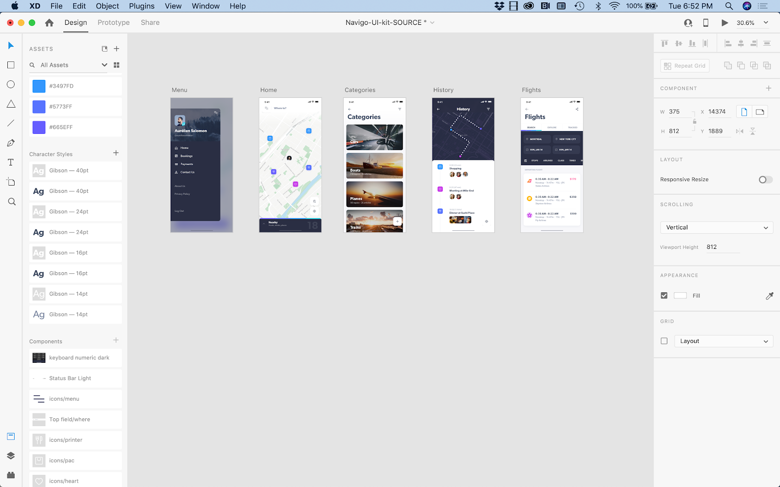
After this, I would start creating high-fidelity wires for all of the user flows for the app, starting with prioritized flows based on delivery to development (or for any items that still need user testing).
I recommend creating separate design files for each of the key user flows so that you can easily prototype and share with development when working in an agile method (i.e. one file for user sign up and account creation, one file for messaging, one file for search experience, etc.).
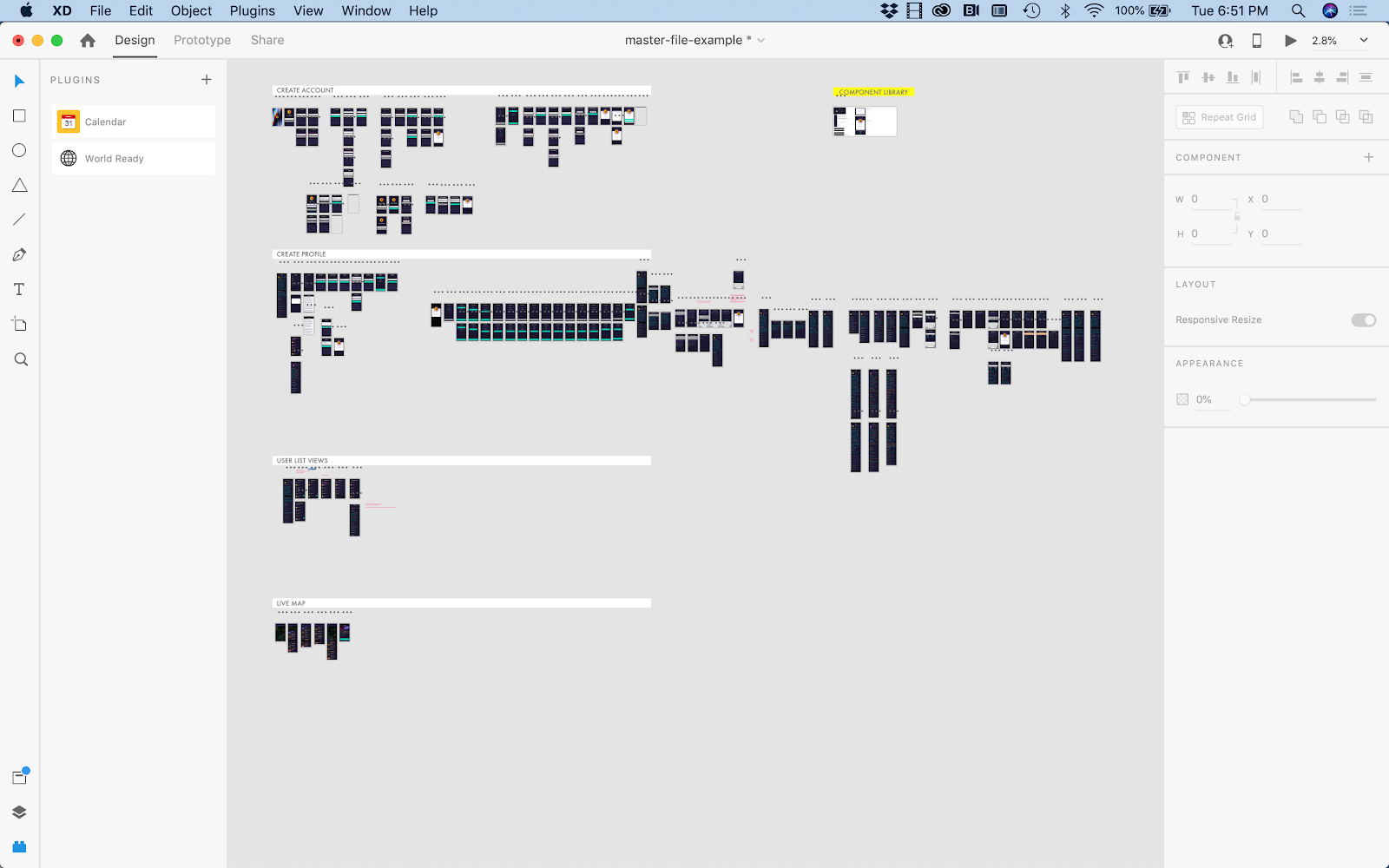
As designs get approved and handed off to development, I recommend creating one master file with all of the screens and master components. When working in teams, I typically recommend that one person be in charge of the master file so as to reduce confusion. This way each team member knows they are pulling from the approved, master file when working on creating new features and flows for the app.
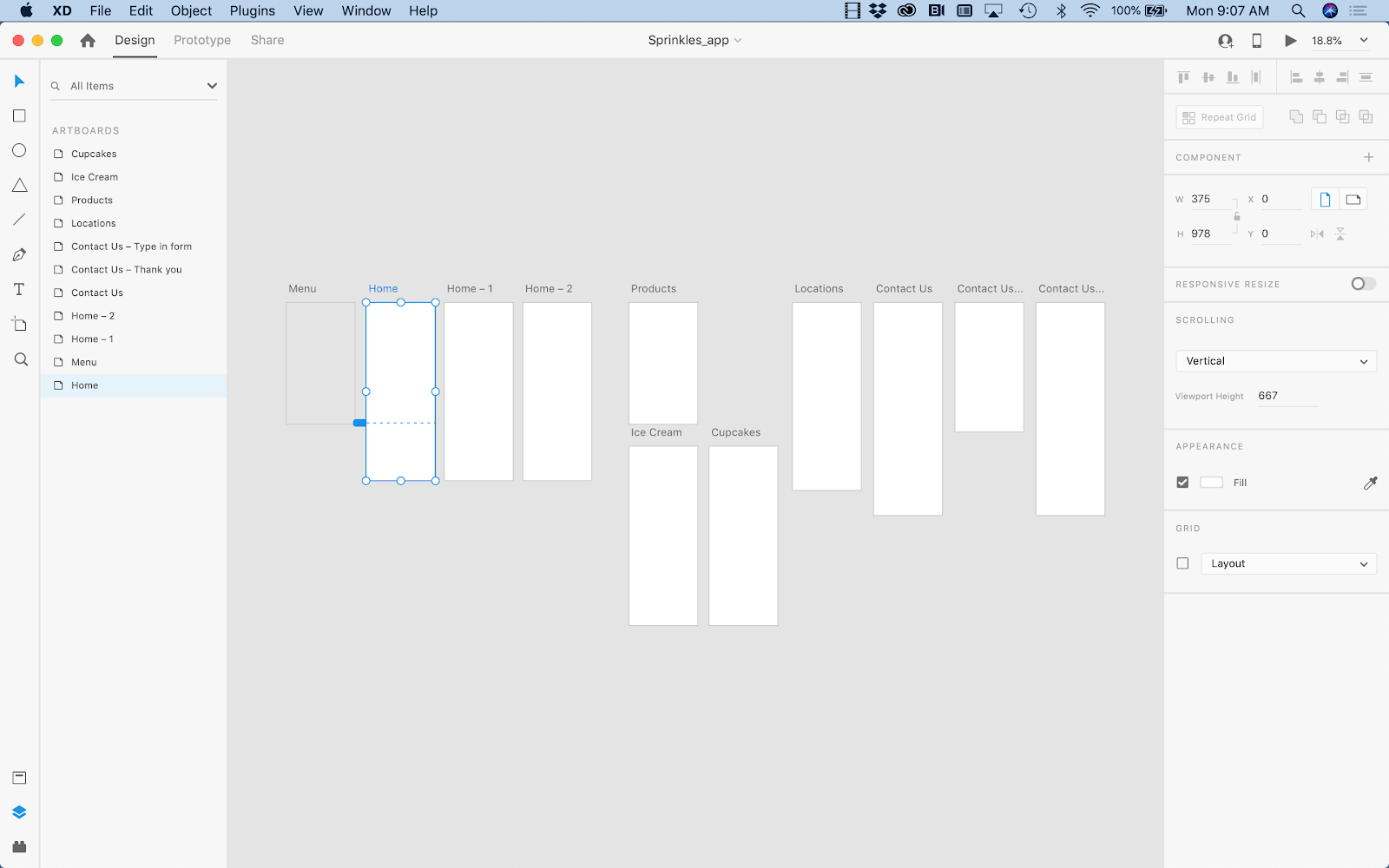
For example, here?s a bird?s eye view of a master file for one of my projects. Note that I have grouped and ordered the screens by user flow and development priority. I will continue to add to this master file as I build out the next sequence of user flows.
Some guiding principles for creating better mobile apps
Now that you know how to get started wireframing your digital experiences, it?s time to level up your design approach. If you are creating an experience for mobile devices, on operating systems like iOS and Android, there are some key considerations to keep in mind. Here are some overall tips (and a few personal opinions) about designing mobile apps and how to spend less time designing for each type of device on the market. If you?re looking for further inspiration, you can also check out these wireframe examples for websites and mobile apps.
I have a strong belief that a design should be as ubiquitous as possible. So whenever possible, I encourage an operating system agnostic design. Here?s why:
- If a user switches from an Android phone to an iPhone, they should not have to learn two different ways to use an app that is solving the same need. The solution should still be the same. Now, I know that there can be gesture differences and device-specific affordances, but I believe that an app should offer the same UI and user flow regardless of its operating system. And important functions shouldn?t be hidden too deep in contextual menus; that?s just bad UX.
- It?s expensive to design, develop, and maintain two (or more) totally different experiences (especially when the experience could be the same regardless of platform).
- When designing and maintaining the different experiences, the experiences can start to become very different. This can hurt the brand and make tracking and implementing feedback and features harder.
So how do you create ubiquitous designs and be device agnostic? Here?s how I do it:
- Treat my mobile designs as if I am designing for mobile web. My designs are responsive because there are infinite screen sizes and pixel densities (these change as fast as companies can engineer them). As designers, we don?t have time to design for every pixel density and I don?t think my clients want to pay for that time, anyway. So, I use an artboard width of 375, which works for most modern iPhone models and Android.
- I deal with the odd screen shape of the iPhone X and iPhone 11 by telling the dev team to just extend the header background color to the top.
- I?m lucky to have several different phone types within my reach so I can then test my designs via the XD mobile app using a USB. This is helpful because I can test font sizes, UI touch points, and the visibility of screen content when the keyboard is up. I can also test the ?fold? line and be sure that important content, like CTAs and important content, stays visible and doesn?t disappear off of the bottom of the screen.
- I try to only use gestures that are universal, e.g. tap, swipe, press and hold. I think we should be able to focus on the best user experience regardless of OS.
- I use SVGs for all icons and logos so that they look great on any screen resolution.
- I use navigation and menu structures that are universal and not too OS specific.
The only time I have to design wireframes that are device specific is when I am prototyping and calling a native device function, like the camera. Even that may vary from phone to phone and OS.
Most of my clients start with iOS. We test and validate the design and, once it?s on the right track, then we develop for Android. And you know what? We try not to change the UI at all, or the user flows. Instead, we focus on the branding, look and feel, features and functions, and user flows. It all comes back to the most important thing: the core user experience.
Visit XD Ideas for more unique insights and authentic points of view on the practice, business and impact of design.
Join a free Daily Creative Challenge to sharpen you UI/UX design skills
Learn about Adobe XD, the powerful platform where teams collaborate to create designs for websites, mobile apps, voice interfaces and more.
Originally published at https://xd.adobe.com.

