Recently, I made the jump from creating fullstack Ruby apps to working with Javascript. As you may already know, Javascript allows users, or clients, to interact with a webpage and dynamically render new content to the DOM based on user interactivity. Compared to coding in Ruby on Rails (in which every rerender requires a full-page refresh), the ability to rerender various page elements based on user interactions with Javascript brought my frontend development skills out of 1994 and into the present. With my rudimentary understanding of Javascript, I can now create an interactive web element that I?ve been looking forward to implementing in my projects: message boxes ? or popups.
A modal, or dialog box, is a message box that appears in the browser after some specified user interactivity. Before we dive into the specifics of creating a modal box for your site with HTML, CSS, and Javascript, let?s first review the various types of message boxes that you may come across.
Types of Message Boxes
Alerts
An alert is a message box, typically locked within the browser, that requires a user response or interaction before it can be dismissed and disappears from the page. Perhaps you want the client to acknowledge information (Terms of Use) or the page itself is confirming completion of a form. However, until the alert is dismissed, the client cannot interact with the rest of the page.
 Alert Message Box
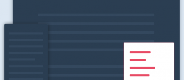
Popup
A popup is a sticky (think ?sticks? to the page, not sticky like candy) message box that appears in the browser that does not require immediate interaction or attention. If a user wants them to disappear, they?ll need to close or interact with the popup at that time, but interactivity of the rest of the page is still functional. Notifications are an example of a popup.
 Popup Message Box
Growl Notification/Flash Notice
A growl notification is a popup that dismisses itself after an associated period of time. These are sometimes also referred to as flash notices. The user can interact with the growl notification ? perhaps to dismiss the message box early, or to click on a button within the notification ? or can choose to ignore and it will disappear after the timer expires. Like a popup, the growl notification does allow the client to continue to interact with the rest of page. An example of this is an email or social media notification.
 Growl Notification
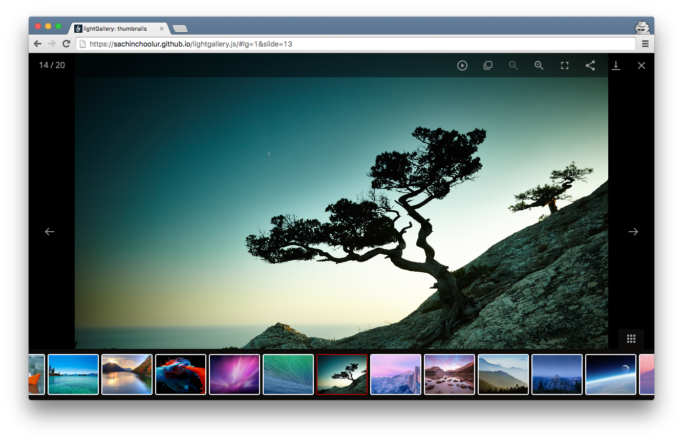
Lightbox/Theatre
A lightbox or a theatre is a message box that typically enlarges content that was already available in the browser for a user to focus on it. A common use case is an image, or series of images displayed in a gallery. When a lightbox or theatre is employed with multiple pieces of content, it is considered ?locked? when a user can navigate through the associated content within the lightbox itself, instead of returning to the original page and thereafter clicking on the next image in the series to enlarge.
 Lightbox/Theatre
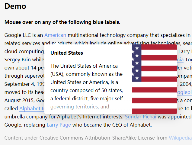
Popover/Hovercard
One of the smaller message boxes, a popover or a hovercard only appears on the screen when a user hovers their mouse over a selected area. These message boxes can contain instructions or explanations regarding the button or container that the user is currently hovering over; they may also contain a preview to information available if the user clicks on a link.
 Popover/Hovercard
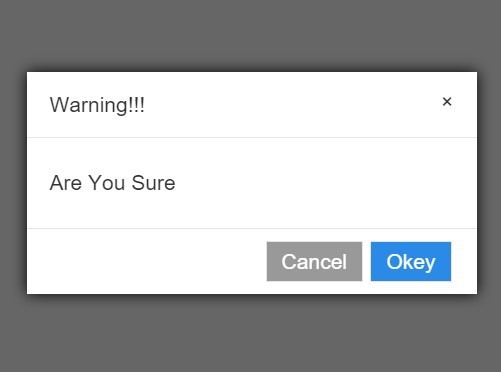
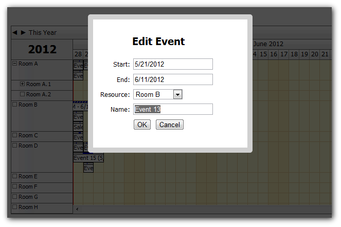
Modal/Dialog Box
Finally, a modal or dialog box is a message box that allows further interactivity of the page without navigating away from the current content in the browser. A modal box is not locked to the screen (i.e., the client can navigate away from it without a required interaction), though it is typically the user?s focus (based on your styling of the box). In most instances, if a user wants to dismiss the modal, they can simply close the box with a provided button, or click outside of the modal. An example of a modal is when a user needs to complete a form or provide specific information for a search query, but you don?t want them to navigate to another page.
 Modal/Dialog Box
Implementation of a Modal
In order to create and implement a modal on your page, there are three steps that you have to complete for functionality:
- HTML: markup to create the modal element
- CSS: styling to determine how your modal looks and appears on the page
- Javascript: placing event listeners so the modal appears/disappears depending on your user interactivity
HTML
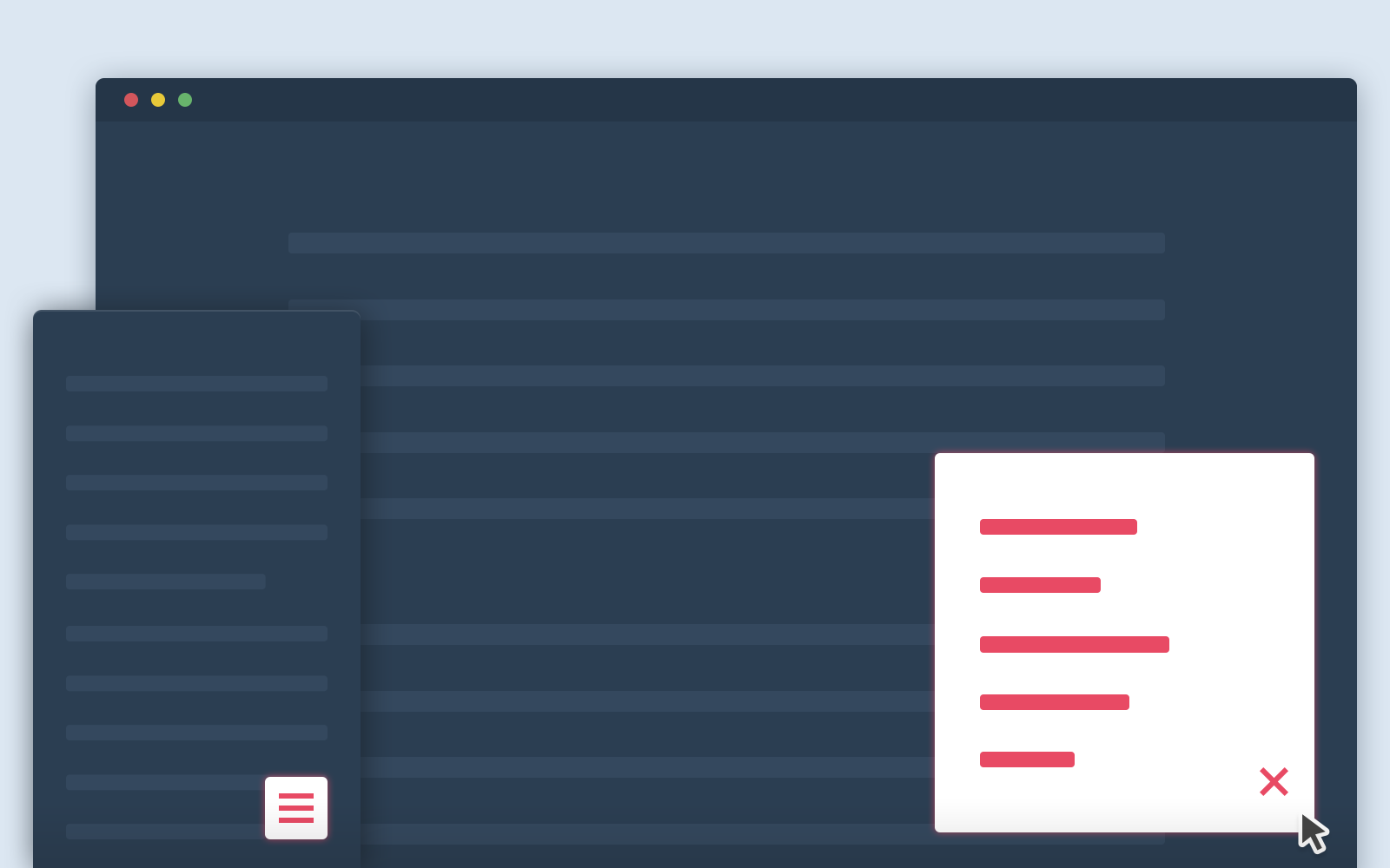
For the simplest of modals, we need a button (or whatever page element you prefer) that a user can click on to activate the modal, the actual modal, and you?ll likely want to implement a close button within the modal.
<button id=”modal-btn”> click me, I make a modal</button><div class=”modal”> <div class=”modal-content”> <span class=”close-btn”>×</span> <p>this is the text inside the modal</p> </div></div>
In the above, you can see that we have a button that will appear within our HTML, as well as a a modal, with three CSS classes: modal, modal-btn, and close-btn. Each of these will be included in the CSS below. The first div is the parent container that contains the entire modal with a class of modal. Internally, we have a div that contains the content for the modal itself: the button to close the modal in the span and the text within a ptag.
As a quick aside, you can also implement headers and footers in your modal by simply creating more divs within the HTML and further CSS classes for styling purposes. For example:
<div class=”modal”> <div class=”modal-header”> <span class=”close-btn”>×</span> <h2>I am the Header</h2> </div> <div class=”modal-content”> <p>this is the text inside the modal</p> </div> <div class=”modal-footer”> <h2>I am the Footer</h2> </div></div>
CSS
To style each of the elements in our simple modal?s HTML, we need to create the associated CSS classes: .modal, .modal-content, and .close-btn. Further, you can see below that there is also CSS included to create animation for the modal.
.modal { display: none; position: fixed; padding-top: 50px; left: 0; top: 0; width: 100%; height: 100%; background-color: rgb(0, 0, 0); background-color: rgba(0, 0, 0, 0.5);}.modal-content { position: relative; background-color: white; padding: 20px; margin: auto; width: 75%; -webkit-animation-name: animatetop; -webkit-animation-duration: 0.4s; animation-name: animatetop; animation-duration: 0.4s}.close-btn { float: right; color: lightgray; font-size: 24px; font-weight: bold;}.close-btn:hover { color: darkgray;}@-webkit-keyframes animatetop { from {top:-300px; opacity:0} to {top:0; opacity:1}}@keyframes animatetop { from {top:-300px; opacity:0} to {top:0; opacity:1}}
In the above classes, we have styling for each of the elements that we created in our HTML.
The .modal class itself has attributes that determine how it treats the page behind the modal itself: a width and height in comparison to the page behind the dialog box, a color (this example uses a semi-opaque gray) and a visibility setting so that we can toggle it in our Javascript when a user clicks on the button.
For the actual dialog box, we also have separate styling in .modal-content: positioning it against the background styling, a background color for the dialog box itself, padding, and in this example there is animation included so that the modal drops down from the top of the page.
Further, we styled a .close-btn class that floats an ?x? to the right, and with .close-btn:hover, when the user hovers over the close button, the color will change. For clarity, the user can click outside of the modal to close the dialog box the same as clicking on the close button. We?ll create an event listener for both options in our Javascript.
This barely scratches the surface of CSS that you could implement on your own. Feel free to adjust the above code to best suit your own needs.
Javascript
Lastly, we need to write some Javascript in order to create the functionality of the modal.
let modalBtn = document.getElementById(“modal-btn”)let modal = document.querySelector(“.modal”)let closeBtn = document.querySelector(“.close-btn”)modalBtn.onclick = function(){ modal.style.display = “block”}closeBtn.onclick = function(){ modal.style.display = “none”}window.onclick = function(e){ if(e.target == modal){ modal.style.display = “none” }}
We?ve selected several objects from our HTML and assigned them to variables: a modal-btn, the modal itself, and the close-btn. Then, we?ve create event listeners for onclick events. When a user clicks on the modal-btn, the display style is set to “block?, but when they click on the close-btn or the window outside of the modal (represented in our styling as the semi-opaque gray), the display style is thereafter set to “none”. This effectively hides the modal until they click on the modal-btn again.
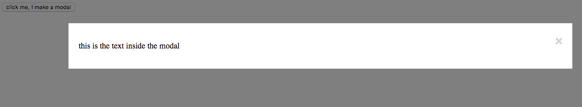 Modal Printed to the Screen
Overall, playing with the DOM with Javascript has been incredibly fun and rewarding as a beginning coder. Hopefully the above code will help you implement modals and message boxes on your own too. With some quick Googling, you can also find further resources to adjust modals and dialog boxes for your use cases.
Good luck out there, and happy coding!
Resources
Stack Exchange: Modals, Popups, Popovers, and Lightboxes
w3schools: How To ? CSS/JS Modal
Sabe: How To Create a Modal Popup Box with CSS and JavaScript

