Delete the magic, replace it with metal
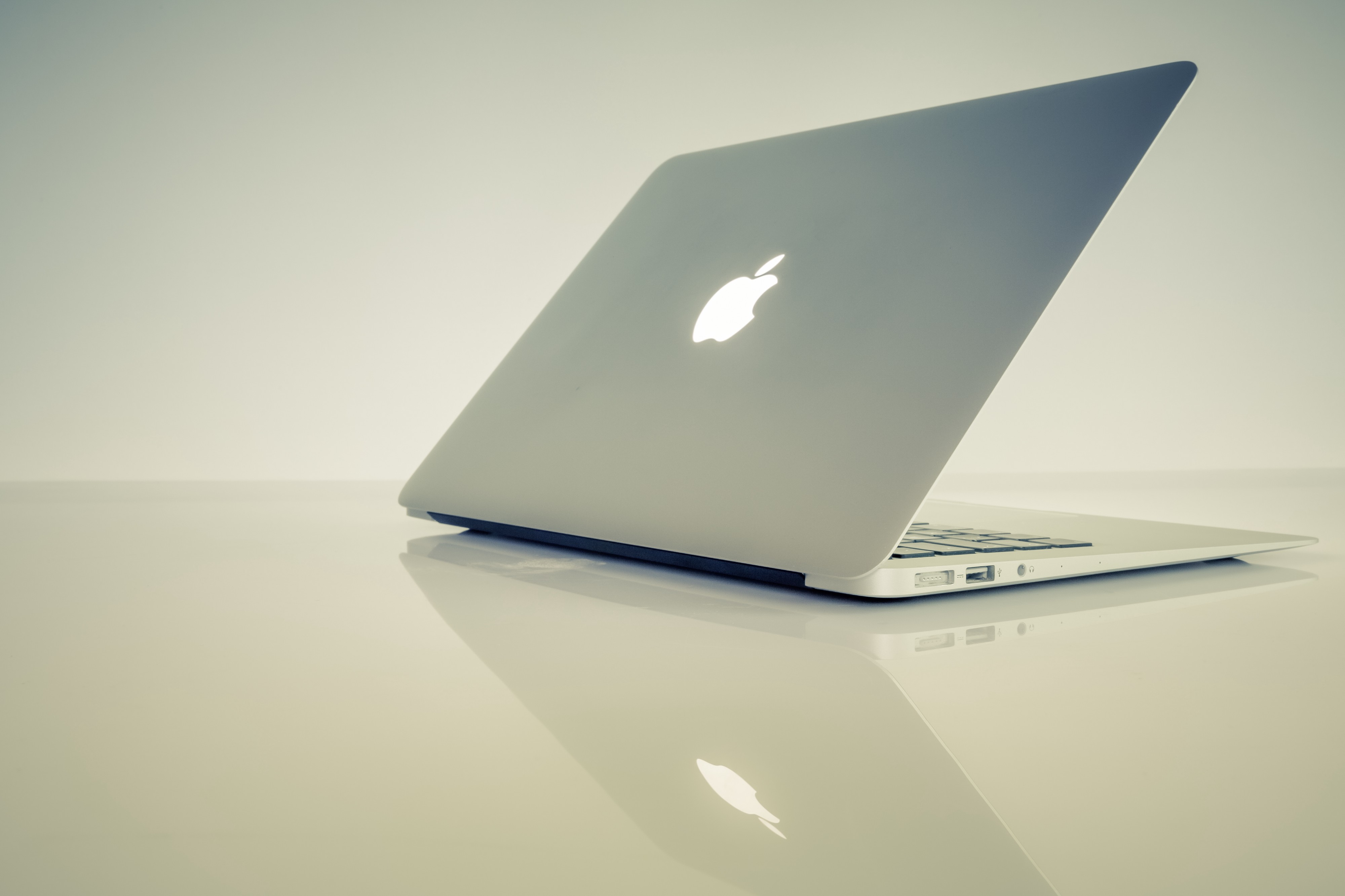
 Photo by Markus Spiske on Unsplash
Every time I see an older MacBook with the bright white lighted Apple logo?I get envious.
I imagine that was exactly the point of the logo light in the first place.
In an era where Apple has killed MagSafe, the Startup Sound, Skeuomorphic design, and the iPhone?s headphone jack, among other things?I realize that it?s weird to focus on the silly little white light that used to be on the back of their laptops. A light that you can?t even see while you?re using the computer.
But it was fun and cool. Sometimes that?s enough.
The MacBook Air was the last holdout, and now that it?s been 12-inch-MacBooked, the light is effectively dead.
I do a lot of writing in coffee shops, and over the last four years I?ve watched the screen landscape transform. It used to be a field of soft glowing white Apple logos, which stood in stark contrast to the occasional black PC monolith.
Now, one by one, the lights are vanishing as the laptops are upgraded, replaced by cold metallic mirrors of aluminum.
I never had the pleasure of personally owning a MacBook with the lighted Apple logo. My first MacBook was a 2016 12-inch model, which I still use from time to time in spite of Apple?s increasing attempts to squeeze it out of its own product line.
The aluminum Apple logo is fine. It has a nice premium smooth feel to it, with materials that would be at home on a yacht, or an airplane, or a stereo system, or whatever.
But those glowing white lights felt like they were from the future. Not the awkward 90’s-but-with-smartphones-and-broadband future we?re actually living in, but the sleek future that science fiction continually promised me as a kid.
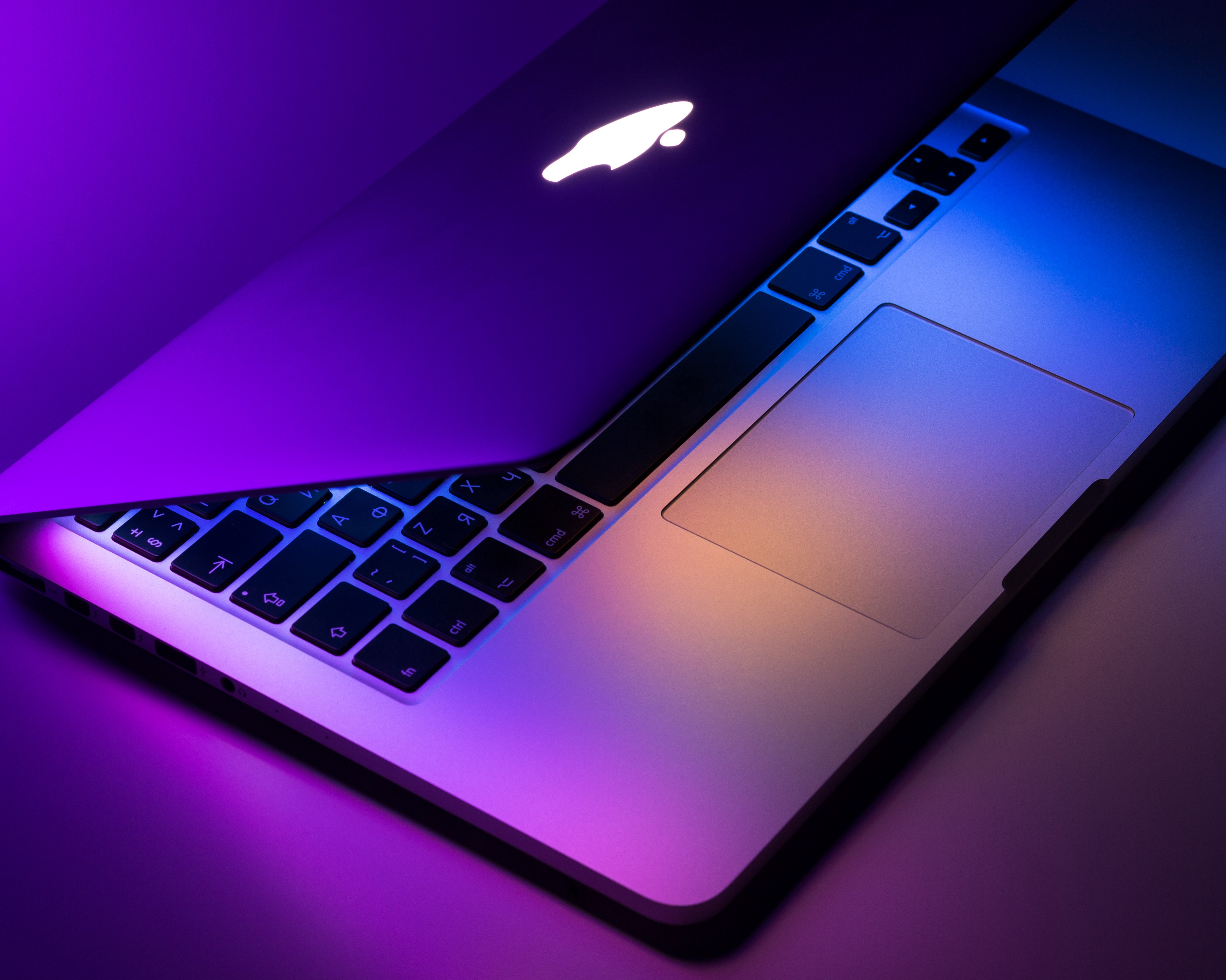
There?s something magical about the way those logos glow, and how perfectly bright and natural they look even in a sunlit room.
It?s a brilliantly simple design too, though its brilliance also means you can never turn the light off without turning off the machine. Perhaps Apple was so confident in its cool glowing they just figured that no one would ever want to turn it off?
Unlike bespoke LED case lighting solutions, the Apple logo is simply a partially transparent window into the innards of the display, which allows the backlight to shine through.
A clever trick, indeed.
 Photo by Dmitry Chernyshov on Unsplash
I get that removing the light/magical window helps make the laptop thinner, makes the casing more robust, and helps cut down the costs of producing and repairing the display. I?m sure that piece of shiny aluminum is much easier to produce and easier to not break during production than whatever mystical semi-transparent acrylic they used for the old logos. And I know there are plenty of RGB-enabled PC?s out there if I want to get my lighting fix on.
But none of them have the soft, audacious glow of the old MacBook logo. It announces itself with the firm authority of the sun, and you cannot turn it off.
While I was writing this in my local coffee shop, two different dudes sat down, each of them using previous generation MacBook Airs, complete with those soft glowing logos. There?s one both to my left and my right. It?s like the Apple universe is calling out to me, thanking me for paying one final homage to their old lights.
I?m not joking. Here are some bad quality photos taken with my cell phone. I have cropped both of these to stupidly small sizes because these men are far away, and I want to protect their anonymity.


The second man is wearing an Atari shirt. I?m not sure what to make of this.
If I were running Apple, in spite of being completely unqualified since I care more about lights and trackpads than anything else, I would have added lights to the backs of every Apple product.
The iPhone. The iPad. The EarPods, even. How cool would it be if the EarPod case had a tiny glowing Apple logo on it for the charge light?
At 35, I?m officially old enough now to ?not know what?s cool,? but I think Apple really blew it by taking the last bits of whimsy out of the MacBook. I don?t care if it?s trying to be a fancy ?productivity? machine, part of what I?ve always liked about Apple is their nod towards fun.
I worry that as they push into a bigger audience and focus more and more on sleek efficient luxury, the fun will be lost forever.


