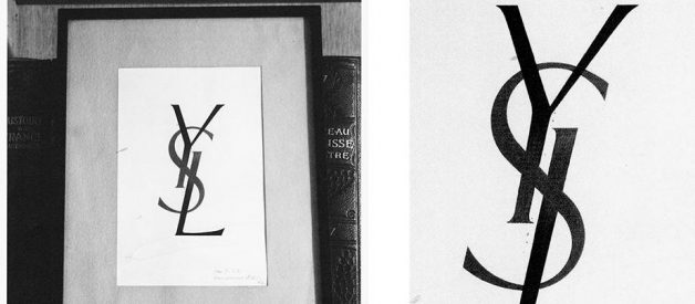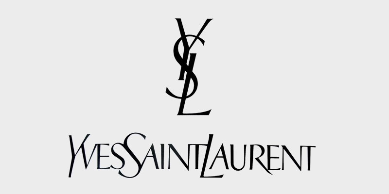
Yves Saint Laurent is one of the world?s most recognisable lavish brands. A.M. Cassandre designed and created the infamous logo for the high-end brand. The logo is a focus point in a number of advertising campaigns, magazine spreads, clothing designs, accessories and more.
A.M. Cassandre was one of the most influential poster artists of the 20th century. Born in January, 1901 in Ukraine. Cassandre worked for multiple firms as a designer: Hachard and Cie, Lille, McCorquodale & Co, Bemrose & Sons, Nijgh en Van Ditmar are just a few to name. In 1933 he turned his focus to painting and the theatre. His work featured a combination of his typographic sensitivity mixed with his fine arts background. Cassandre was heavily influenced by surrealism and cubism, which you can see from his designed advertisements and magazine covers. Cassandre went on to teach in Paris at a graphics art school from 1934?35, before joining the army. He was demobolised from the second world war in the fall of 1940 and upon so, retreated back to his painting and theatre. His work became more effortless after the war. Up to 1944, painting was his sole priority.
In 1929, while he was working for Debern & Peignot, ?Bifur? was designed. This was his first advertising typeface. ?Bifur? relates back to a period of time where posters and prints were categorised by capital only sanserif typography. A year later in 1930, his second typeface was designed. A ?black-and-gray sanserif Acier display face? was published by Debern & Peignot. ?Peignot? is one of Cassandres most famous typefaes, named after Charles Peignot who commissioned the typeface. This typeface is a tribute to what Cassandre saw, reflecting the deformation of the lower-case alphabet. Cassandres typefaces represent personal statements about typography and communication.
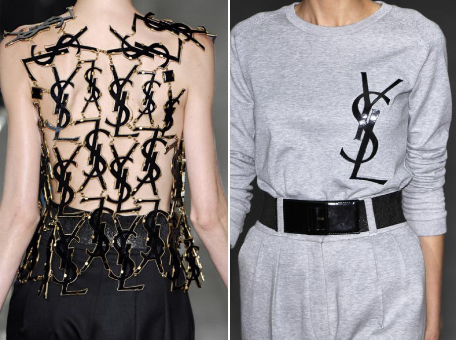
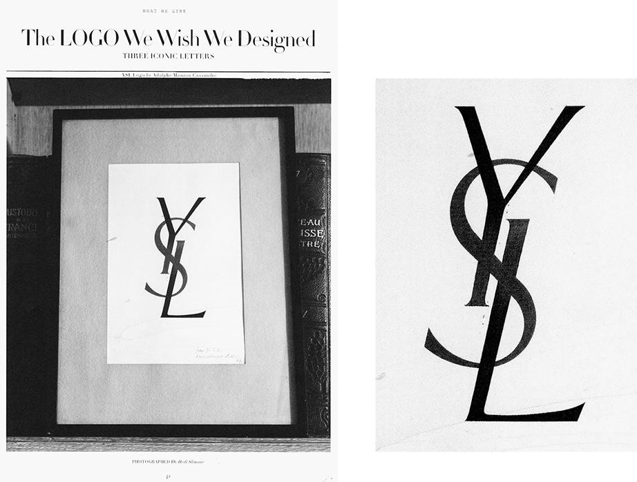
Yves Saint Laurent was a French designer who founded and created the infamous luxury fashion brand, ?Yves Sant Laurent?, in 1961. The designer had just just been fired as head hondo at Dior. By creating this new brand and looking for a fresh start, Laurent needed a logo. Cassandre designed and created the YSL logo that helped make the brand into what it is today. The initial logo was created as a vertical monogram of Y, S and L. He created the logo by mixing sans and serifs, while intertwining it with roman and italic forms at once. Cassandre challenges the rule with this logo by breaking the principles of not mixing in the same words with two typeface features, as they are ?incompatible?. The logo is flawless, with no presence of odd ligatures or uneven looking lines. The words ?Y, S, L? flow between one another, creating a rhythm between the letters.
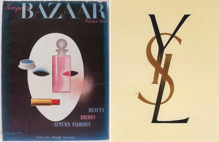
The logo is unique, it has created a graphic identity for the brand and is still being used in today?s society. The logo sets itself apart from other brands, standing up to the test of time. Cassandre has created a logo which has become a symbol of luxury and quality. The logo represents not just the brand itself but what it stands for and represents. This is what makes it not just a good logo but a great one. The logo is almost deceiving, it looks extremely simple and minimalistic. Clean but bold. But when you look at the typeface specifically and analyse the design, thought and careful precision has been put into the design.
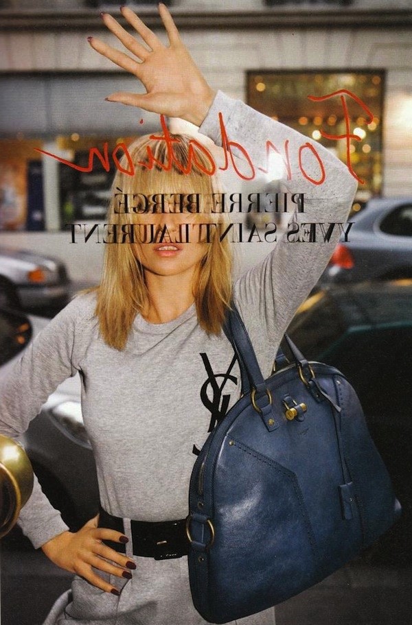
In this situation, the role of the designer was to create a logo for a new company. Branding. Create a recognisable brand which reflects the company and what it stands for. In my opinion Cassandre successfully did so. His design grabbed the attention of a target audience and prospective clients, creating an image and idea of a brand and driving sales towards it, as well as being aesthetically pleasing.
