The culture of #Paperless digital writing has become a serious trend during the last several years ? and this trend keeps on growing. Several app developers have tried to develop an app for these purposes ? but who dealt with the task better than others? We will try to figure out.
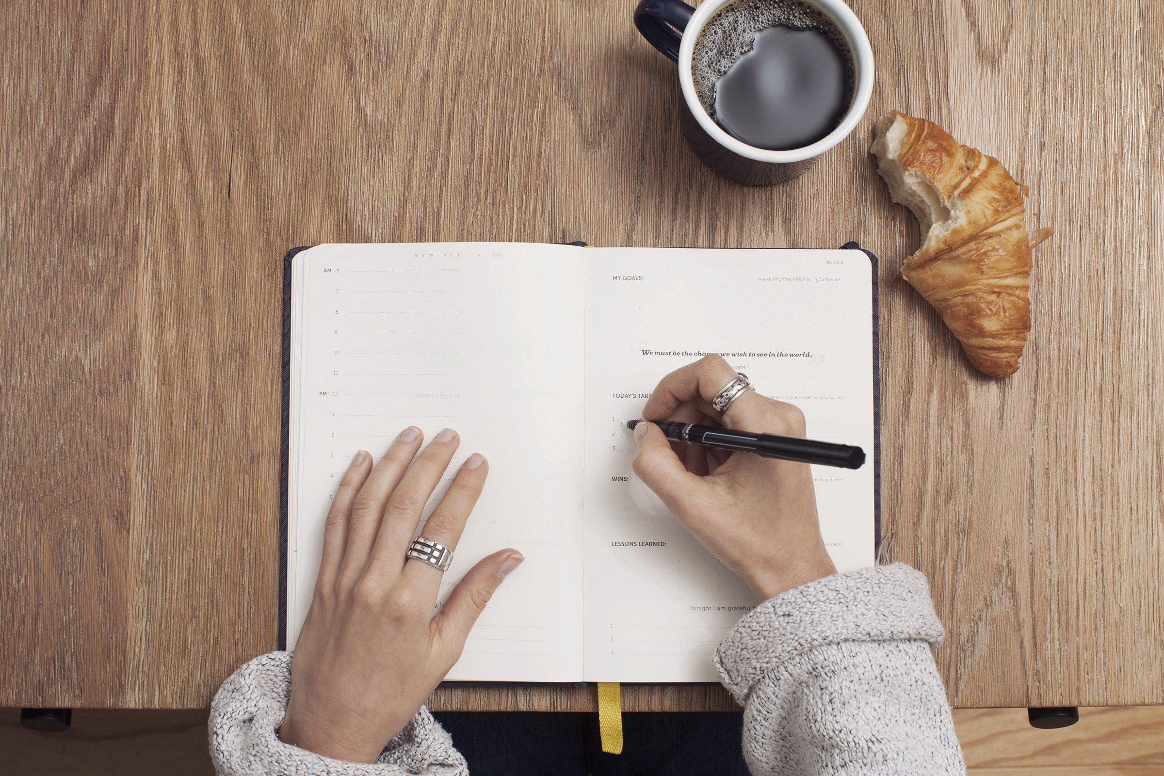 Photo by Cathryn Lavery on Unsplash
User Interface and Usability
With no doubt, a start screen is the most important part of the whole application providing the best user experience and showing all; the further logic on how to work with the application next.
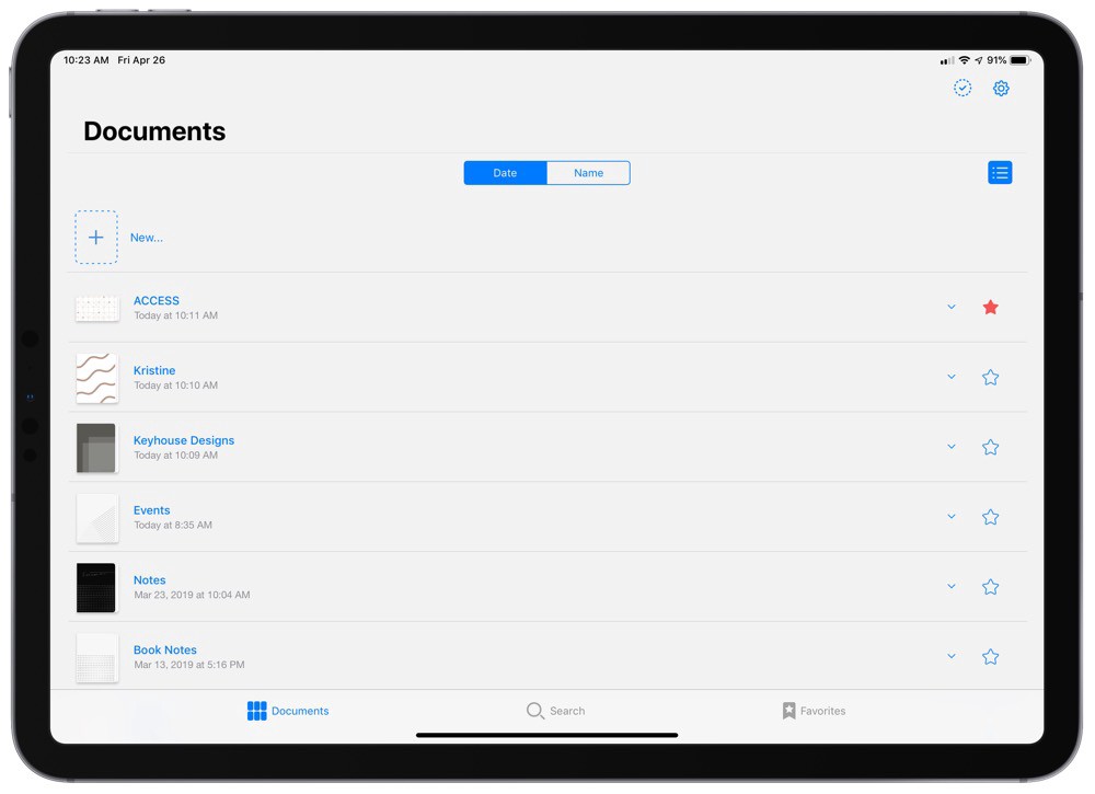
Good Notes presents a ?Documents? view on the start screen. It can be sorted in alphabetical order. What is more, it is possible to sort all the documents in different rows and columns and to structure them by different amounts of accessed dates or any other data.
Meanwhile, Notability uses a two-column interface, where all the data and documents are being systematized. As in GoodNotes, the documents may be any length and of any amount pages, also a folder system is displayed from the beginning.
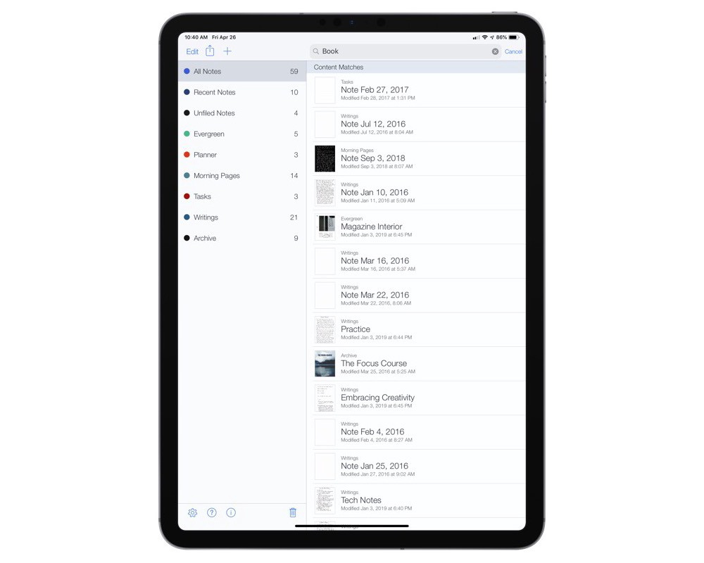
In common, the Noteshelf interface looks more complicated, but for the first view, an amount of available functions is more complex and provides more different possibilities. But such thought is just a mirage ? the functionality of file organization is pretty common.
Document creation
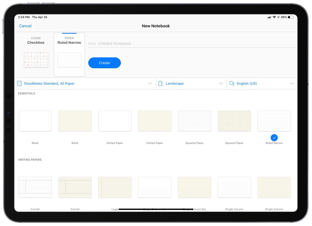
GoodNotes offers a great number of various page templates to choose from. These templates are called papers and broken down into categories. Here you can select different visual types, and a killer feature is that one template can be multi-paged with different layouts to add or delete.
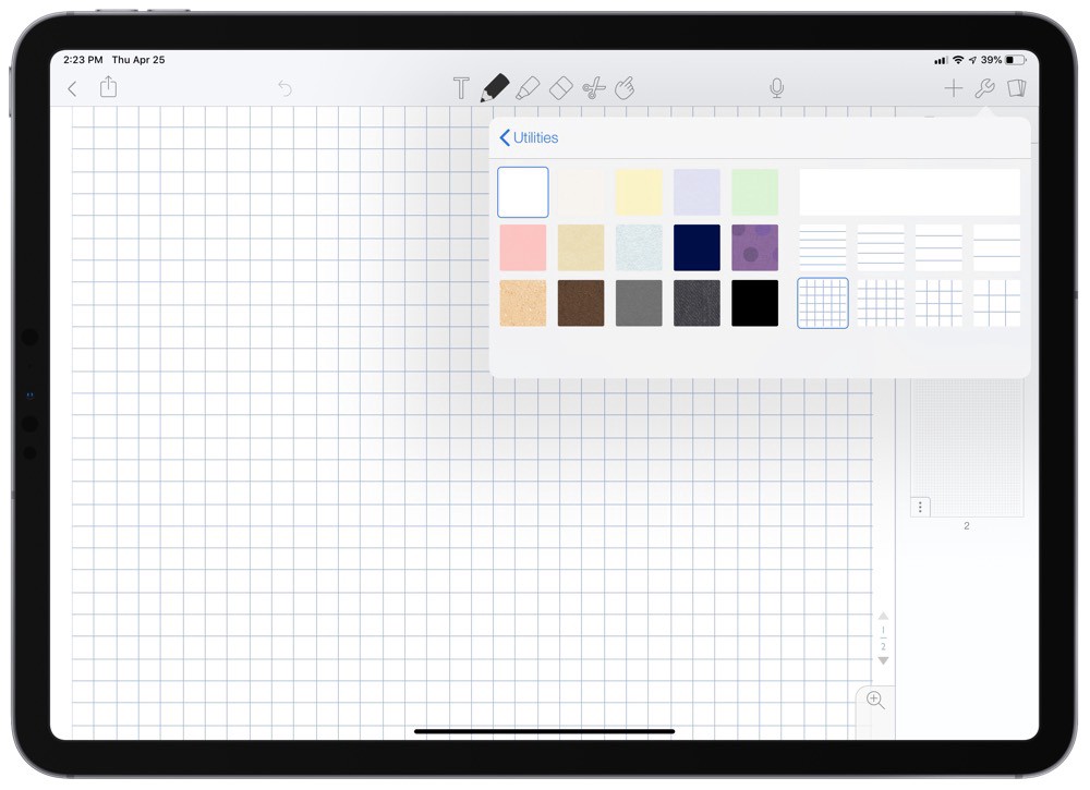
Noteshelf is much more simple in that case ? there are 4 variations of lined and 4 ? of squared paper, with up to 15 colors to select. Customization ends right at this point ? so GoodNotes for that section is an obvious winner.
The process of note-taking
Note-taking comes up to a number of tools provided by an application. And here are lots of things to choose from!
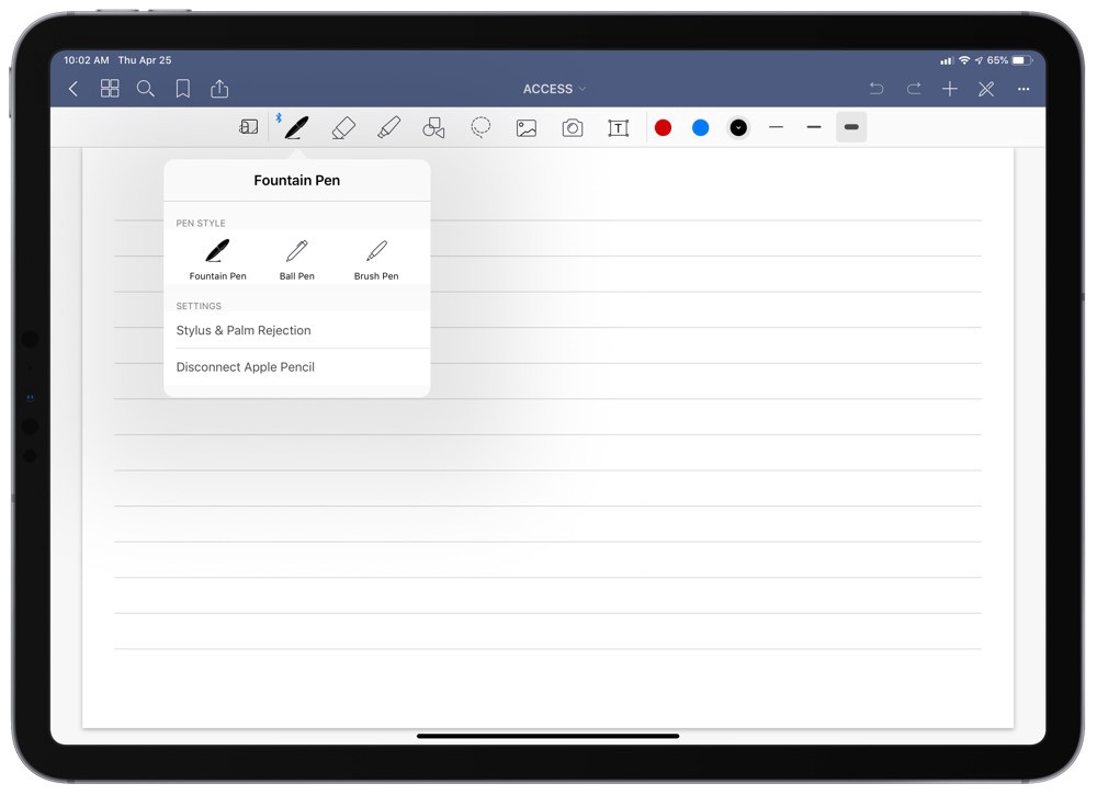
GoodNotes toolbar gives the user a pen, eraser, highlighter, shape tool, lasso, photo library, and camera access, and a text box. The pen can be set to fountain pen, ball pen, and brush pen, and each of the main tools can be set to any custom color or width (with three quick access colors and sizes in the toolbar itself). The highlighter only lets you toggle the ability to draw in straight lines. A possibility to change options of each tool is pretty cool, but for a first-time user, it looks pretty complicated.
Notability?s tool bar consists of a text box tool, pen, highlighter, eraser, lasso, and microphone for recording audio. Geometric shapes, photo library, and camera access are available via an additional plus button menu, along with GIFs, web clips, and stickies. The pen and highlighter have two shapes (comparable to the fountain pen and brush pen in GoodNotes) and feature a drop down menu that offers 12 sizes and any custom color. And sooth to say, such approach to a toolbar looks much better and simple than a one made by GoodNotes.
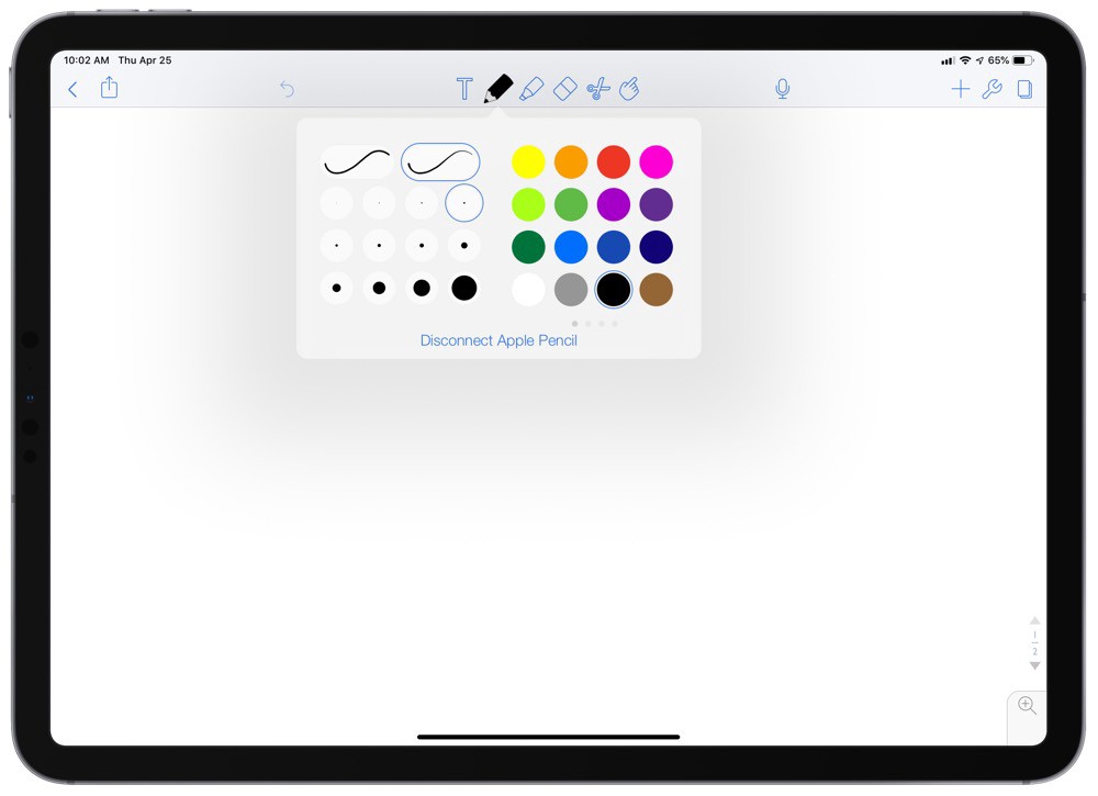
Bonus: Dark Mode
Of course, this is far from useful function, but as long as iOS offers its users dark mode from the box, why not use it in full power?
Unfortunately, GoodNotes does not offer dark mode at all and there are no real ways of customization. Meanwhile, Notability has a whole bunch of things to customize, including dark mode with different toolbars customizations, additional bars, etc.
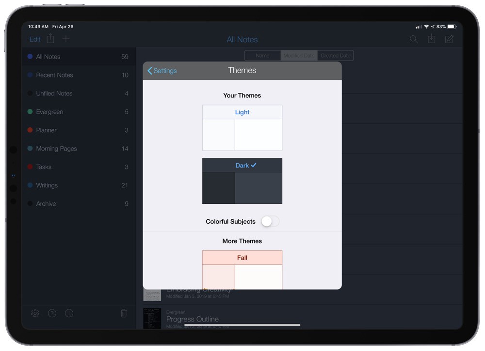
With GoodNotes opting out of this feature entirely (at least for now), Notability is the preferred choice for people who require a dark mode for their note-taking needs.
Instead of conclusion
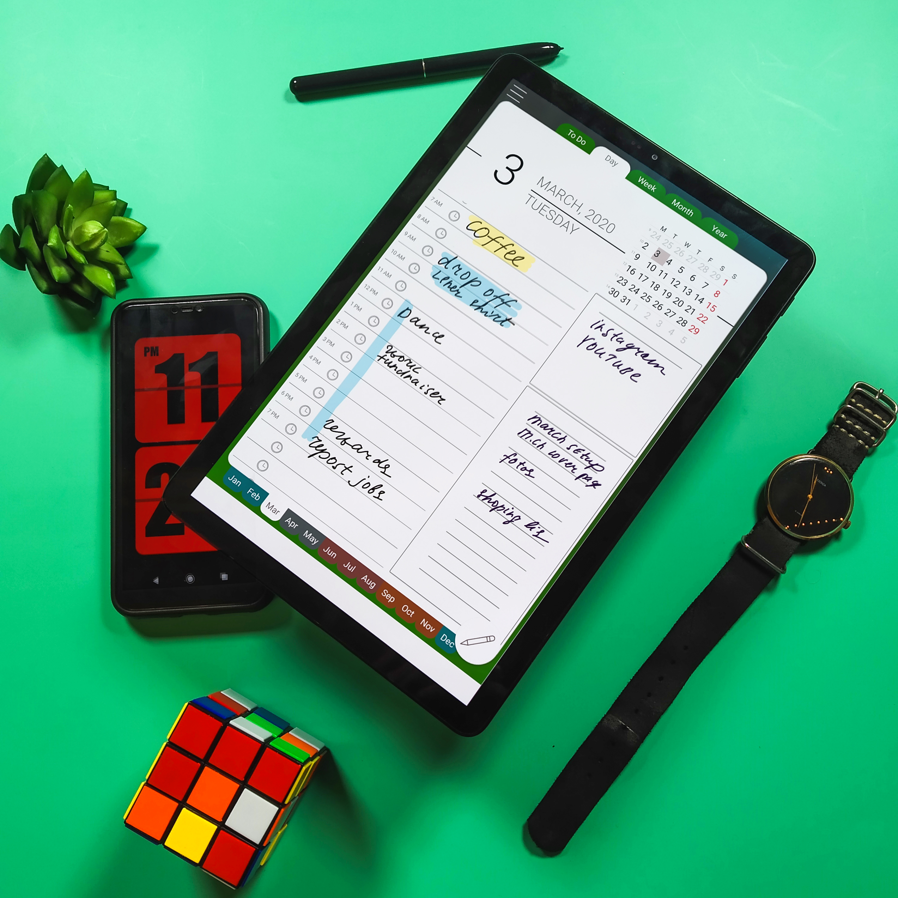
Both GoodNotes and Notability are market players for a pretty long time ? and it is hard to choose a winner as long as each app has its pros and cons. Meanwhile, you may want to look for something new. If you would like to, check out our Inksot Notes and Inksot Calendar apps ? maybe they will become sort a fresh breath to you.
Matthew Holland, CTO Inksot LLC
Based on thesweetsetup.com materials.
