Media query is a concept that acts a major part in responsive web design. Responsive web design refers to creating web pages which can dynamically change its appearance according to the user?s screen, (mobile, tablet, laptop, PC etc.) with the intention of giving a better user experience. You could say it?s like adding conditions to a .css file.
Syntax
@media media-type and (media-feature){
}
Media types
These are the category type of device. Generally used media types are ?screens? , ?print?.
Media features
Media features This is optional in media queries. Basically, this would further change the user experience depending on the behaviour and features of the user & output device. Some commonly used media features are mentioned below.
- Orientation
- Resolution
- Aspect ratio
- Width
- Height
Basic explanation of min width & max width
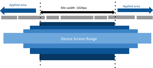
There are more breakpoints for devices which you can tested for. Although we are using the term as device screens, what we actually consider is the screen width. Because of that lets have an understanding about min-width & max-width using a small example.
Min-width :
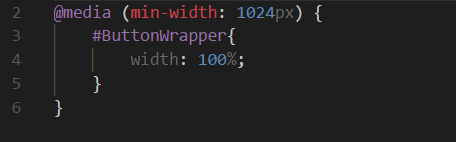
Above example says that HTML element which has the id name as ?ButtonWrapper? will take the width of 100% (from its parent element) when the device width is greater than or equal to 1024px.
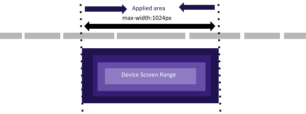
Max-width :
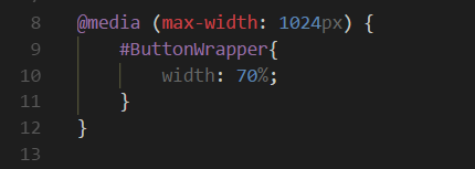
max -width means less than or equal to the width specified in that media query. So, in above example element which has ?#ButtonWrapper? as the Id, will get width of 70% to all the screens widths which are less than or equal to 1024px.
Logical Operators
Since these media queries are known as kind of if statements, we can use logical operators in order to make it more complex & efficient. All the basic logical operators such as ?AND? , ?OR? & ?NOT? can be use. Let?s take one by one.
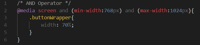
AND Operator :
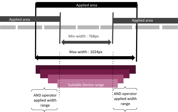
According to the below example ?buttonWrapper? class element will take 70% width to all the screen widths which are greater than or equal 768px and less than or equal 1024px. Operator act as its same root feature.
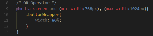
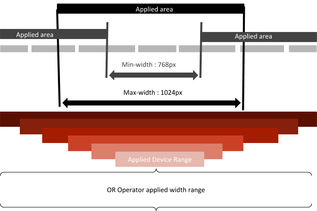
OR Operator :
This is actually a various media queries which are separated by a comma. Developers use this to reduce number of code lines. Not only that but also ?OR? can use to the media queries which uses common set of styles.
So, with reference to the below example, ?buttonWrapper? class will get 80% of width to all the screens which are greater than or equal to 768px in width as well as the greater than or equal to 1024px in width.
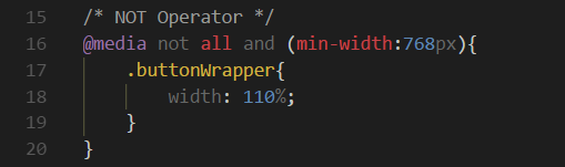
NOT Operator :
This will apply to the places where the condition in the media query got false.
What is Breakpoint ? I?m pretty sure now you may wonder what are breakpoints. It is the place where your design should change to look better. In other words, the situation where content starts t look bad & hard to read to a user, that?s the point where we should apply media query. Now you may get confused with these two keywords, media query & breakpoint. Is it same? yes, it is.
This was a brief introduction about what is media query & explanation of what is actually meant by max-width & min-width with reference to the concept of media query. Hope everything is clear.
Bye till the next article ! ?
