I?m not the only one to write about this. In fact, you can easily search ?should I use click here for links? in Google and pretty much find all the information you need to convince yourself it?s a bad practice.
?Click here? has gone viral
If there?s so much information out there, why is it still so common to see ?click here? links on the web? Why am I (and likely others) still receiving copy from content strategists and editors that is riddled with well-documented mistakes? Why does it seem like the disease is still spreading?
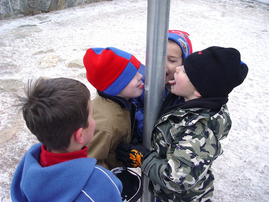
 Photo of kids sticking their tongues to a frozen flag pole. Credit: Matt Hollingsworth
I think we?ve unashamedly trained ourselves to believe that a call-to-action looks like ?click here.?
Habits are hard to break, especially when they?re reinforced by our peers and other professionals who don?t know any better. Plus, how often do you think content writers question the practice enough to do a search in Google?
So, this article is yet another article on why using ?click here? and other common hyperlink mistakes are a horrible disease plaguing the web; one we need to cure as soon as possible.
Using vague and uninformative phrasing for hyperlinks will have several adverse effects on your website:
- Decrease in overall usability
- Decrease in overall accessibility
- Decrease in search engine performance and content find-ability
These are huge issues, so I?ll address them individually before providing better options.
How vague link phrasing affects usability
Through the many studies on how users consume information on the web, user experience experts have concluded that users only read about 20?28% of the content on a given page. This scanning happens in an F-pattern; users search for keywords as shortcuts to the information they?re seeking?a process called information foraging.
Since hyperlinks standout (typically in blue) and are representative of a destination for more information, they are a critical part of this information foraging. Therefore, using vague words as hyperlink text will lessen the impact ? due to the lack of keywords ? and create what is known as poor ?information scent.?
In other words, ?click here? gives the user no concrete description of exactly what information is just a click away ? it has no meaning. This forces the user to search the phrasing surrounding the ?click here? in order to piece together some context. ?Click here? may sound actionable, but user research suggests that it will, instead, slow the user down and increase cognitive load.
Another aspect of the effect on usability is the emphasis on the mechanics of a specific action, like ?click.? Clicking is a behavior inherent to a mouse, and makes less sense on touch devices where the focus is on tapping with a finger. While this is a very real factor in usability, it takes a bit of a backseat to requirements surrounding information foraging.
How uninformative hyperlinks affect accessibility
Quick note: If you hold the opinion that accessibility is one of those things that only concerns those mandated by law (e.g. government organizations), then it may require a separate article on the relevance of web accessibility to convince you otherwise. But for the sake of brevity, I?m only going to highlight how accessibility relates to hyperlinks.
This is best illustrated by an example. Imagine you?re a blind user and you?ve landed on a page with a bunch of uninformative links?
You skim or skip through the page using the [tab] key while your screen reader announces each stop. You reach a few links. This is what it sounds like to you:
- ?click here? Link.
- ?click here? Link.
- ?Learn more? Link.
- ?go here? Link.
Where do those links go? What information do they provide? Since the screen reader only announces the text within the hyperlink, using vague phrases like these create a barrier ? not allowing visually impaired users to effectively use your website.
Instead, we should hope to provide our blind users with the following:
- ?should I use click here for links? Link.
- ?studies on how users consume information? Link.
- ?users only read about 20?28% of the content? Link.
- ?F-pattern? Link.
Those are more informative, right?
You can easily test this yourself in Chrome by installing Chromevox.
How obscure linked text affects search engine optimization
If your ranking in Google is more important to you than not discriminating against an entire group of users, then you?re in luck! Improving hyperlink accessibility will have a direct and rather significant effect on your search engine optimization.
How so?One of the easiest ways to think about search engines and their web crawlers is to consider them blind ? since they can?t see. They scour your website much like how visually impaired users orient themselves on the web.
The value of a page (and any page it links to) is prioritized first around the context provided in the title of the page, the headings, and the text in the hyperlinks.
When a search engine indexes your page, it strings together relationships of keywords to their URLs. Keywords are determined by both the link text and the targeted page?s content. If the link text is accurate for the targeted page, then the web crawler knows the link is legitimate and indexes the page for that keyword. If you use an uninformative phrase, like ?click here,? then the search engine will not make a close enough connection between the link text and the targeted page. This will negatively impact your page?s search engine performance, because the ?information scent? is poor. In fact, even deferring the keyword to the end of the link (e.g. ?click here for product documentation?) has the same drawback.
If you?re recognizing that this happens to be closely related to how sighted users forage for information, you?d be correct. It?s all related. In other words:
Put your users first, and search engines will love your site.
Other uninformative hyperlink phrases
When creating hyperlinks, avoid using vague phrases like the following:
- here
- more
- read more
- learn more
- link to [some link destination]
- info
Instead, it is recommended that hyperlinks meet these criteria:
- Are as descriptive and concise as possible
- Start with a keyword
- Contain concrete nouns
- ?Is not a verb phrase?
- Provide ?information when read out of context? (remember how screen readers read them)
- Don?t discuss specific mechanics
Other common hyperlink mistakes
Using URLs as link text
Much like the vagueness of phrases like ?click here,? using URLs as hyperlink text is a bad practice, and should be avoided as much as possible.
- Usability: URLs are not human-readable, they provide little to no value in information foraging, and they increase cognitive load.
- Accessibility: URLs are annoying to and impossible for blind users to gain the context of a link. A screen reader will literally read out every single character in the URL. Try to imagine stumbling across a linked URL. You?d hear this: ?h-t-t-p-[colon]-[forward slash]-[forward slash]-w-w-w-[dot]-m-e-d-i-u-m-[dot]-c-o-m-[forward slash]?? ? OMG, shoot me now!
- Search engines: URLs as hyperlink text provide no added value to search engines; a URL is not a keyword, therefore there?s no relationship. The search engine will ?award you no points and may God have mercy on your soul.?
Plus, URLs don?t contain spaces and using long URLs as links may result in unwanted horizontal scrolling.
De-emphasising links
The perceived affordance of click-ability encompasses several mistakes:
- Not using a link color that stands out from the rest of the content.
- Using your link color for non-linked text.
- Not underlining links, and not reserving the underline style for links only.
- Not using a different color for visited links (#3 in the top 10 mistakes).
- Not styling (or removing the style on) the :focus state on links.
We can do better
Retraining ourselves to phrase hyperlinks appropriately may require some effort at first. But, I firmly believe we can do better than phrases like ?click here? and ?learn more,? and we owe it to our users.
After all, if we keep them in mind first ? through improving the overall user experience ? we will benefit in return with better website performance (search engines included).
So, let?s kick the habit and cure this disease. Did I stretch the metaphor too much?
Noteworthy resources
The Nielsen Norman Group (NNG) has written numerous articles about writing hyperlinks and the user psychology ? and research ? behind information foraging.
And there?s more:
- Web Accessibility in Mind (WebAIM) has written guidelines on hyperlink text.
- The W3C?s tips on not using ?click here? for hyperlinks.
- Mozilla?s tips on creating hyperlinks.


