The world?s largest chain of fast-food restaurant, McDonald?s is more famous for its logo than its mouthwatering foods.
Founded by the two brothers, this fast-food brand is among the most valuable brands in the world.
A significant part of the success of McDonald?s is associated with its striking logo design.
Famously known as the Golden Arches, the emblem of McDonald?s has a fabulous story that should inspire every graphic designer.
The journey of McDonald?s logo begins with the rapid growth of its business.
However, before we discuss the visual aspects of the logo, we want to take you back in time to let you know that how McDonald?s evolved into the most prominent fast-food brand and how it changed the lifestyle of people around the world.
The inspiring story of this world?s most well-known fast-food brand started in 1937 when Patrick McDonald opened a drive-in restaurant that he named ?The Airdome? which was located at Route 66 in Monrovia.
In 1940, the Richard McDonald and Maurice McDonald, the two sons of Patrick McDonald, relocated the restaurant to San Bernardino and renamed it ?McDonald?s?.
The immense success of the restaurant brand compelled the two brothers to remodel their business.
The first thing they did was change the architect of the restaurant.
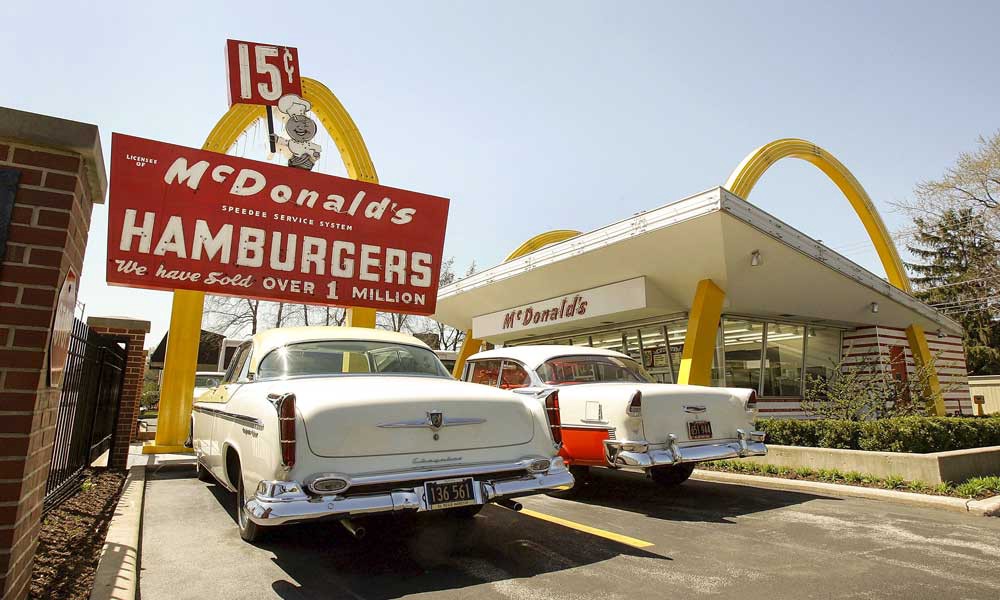
They hired Stanley Clark Meston to design the architecture of the building.
This was when the Golden Arches were created which later became the imagery of the famous McDonald?s logo.
However, the rapid expansion of the McDonald?s business came when Ray Kroc joined the company.
A salesperson by profession, Ray Kroc became the franchise manager of McDonald?s in 1955.
He spread the business in every corner of the country.
In 1961, Ray Kroc bought the business at a massive deal of 2.7 million dollars.
This deal marked the start of significant growth of McDonald?s under the leadership of Ray Kroc who used his astute marketing skills to promote the business and increase its outreach throughout America.
By 1968, McDonald?s has more than one thousand restaurants operating in the country.
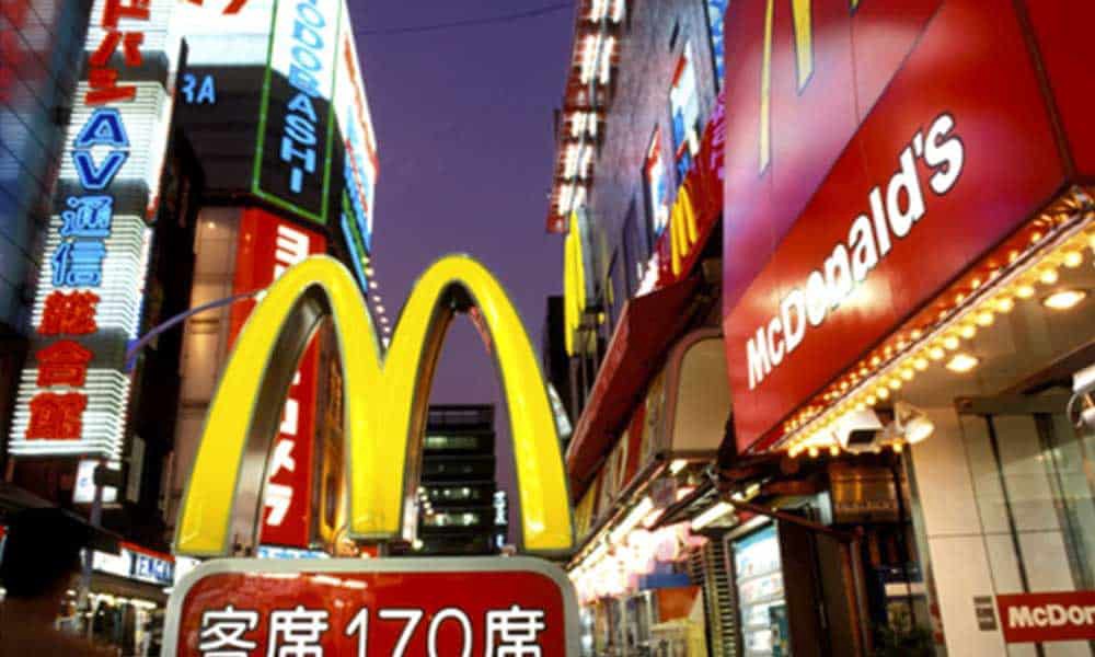
The next few decades saw the globalisation of the company, and it opened its restaurant facilities in other countries.
This was a significant step in the history of McDonald?s which made it famous around the world.
Related Post: Flat Design & Skeuomorphism
What started as a small drive-in restaurant facility transformed into a conglomerate with operations in every corner of the world.
Currently, McDonald?s has a presence in more than hundred countries where it operates more than 3600 restaurants.
While the arrival of other fast-food companies did affect its business, it is still the largest fast-food company in the world.
Today, it is the most successful fast-food company with a brand value of 40.3bn dollars.
The Impact Of McDonald?s In Popular Culture
The arrival of McDonald?s not only redefined the concept of dine-out, but it also became a symbol of the urban life.
It changed the lifestyle of people and symbolised the modern living.
With the passage of time, the name of McDonald?s became synonymous with pop culture.
Celebrities like Justin Timberlake, Kobe Bryant, and Kris Wu became the brand ambassador of McDonald?s.
The fast-food restaurant changed the attitude of the people towards eating out.
Food items like Big Mac, McGriddles and Happy Meal became a household name.
The inspiring success story of McDonald?s branding led many other entrepreneurs to venture into the fast-food industry.
Fast-food companies like Taco Bell, Burger King, and Subway followed the business model of McDonald?s and became its more significant competitors.
The fantastic success of McDonald?s has been the subject of many popular books, documentaries, and movies.
The most popular among them is ?The Founder? which depicts the story of Ray Kroc and how he managed to transform McDonald?s into a billion-dollar business.
The Famous McDonald?s Logo
The fascinating story of McDonald?s success cannot be completed without the mention of its famous logo design.
Those Golden Arches are one of the most popular things on the surface of Earth.
From North America and the Middle East to Sub-Saharan Africa and Subcontinent, McDonald?s restaurant logo can be easily recognised by anyone from any geographic background.
There is no denying that the McDonald?s logo has a significant role in creating its brand image.
The logo of McDonald?s has been revamped several times before it went through the final iteration in 2003.
However, the famous arches remained part of its design since 1968.
Today, it is an integral part of the brand identity of McDonald?s and makes up the major part of its logo design.
The rich history of McDonald?s logo has many more exciting stories.
However, before we discuss them, let us introduce you to the salient features of the McDonald?s logo design.
Shape
The McDonald?s logo is symbolic of the arches that were the substance of the newly-constructed architecture of the first franchised restaurant in 1952.
Related Post: Paula Scher
After Ray Kroc took over the business in 1961, he incorporated the two arches to form the new McDonald?s logo that looked like the letter ?M?.
This new logo remained the brand identity of the McDonald?s for more than fifty years.
Colours
McDonald?s uses the Golden and Red as primary colours in its logo design.
The Golden colour represents the famous arches of its first franchised restaurant, while the red colour represents the food industry of this company.
The synergy of both of these colours creates the great brand identity of McDonald?s.
Fonts
The McDonald?s logo uses the McLawsuit font in its name.
It is the simplicity of the fonts that make the name of McDonald?s look appealing to the eyes.
1948: Speedee Service Logo
When a stressed-out student thinks ?who can write my assignment fast?? what would be the first thing they would look forward to academic consultancy firm?
Obviously, they would look for a quick service.
That is what a hungry person needs when feels hunger pangs, and this is the idea that clicked the McDonald?s brothers.
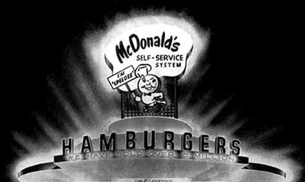
In 1948, the McDonald?s brothers pioneered a new way to serve fast-food.
They called the new system ?Speedee Service System?.
Among the many changes they introduced, the most significant was the removal of the Barbecue in their menu.
The idea was to speed up their service.
The winking chef in the logo was designed to represent the fast service of the food facility.
1961: The Golden Arches Logo
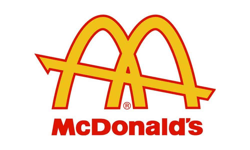
The Golden Arches of the McDonald?s logo was inspired by the first franchised unit of McDonald?s which was designed by Stanley Clark Meston.
However, the arches were the brainchild of Richard McDonald?s, one of the McDonald brothers, who thought that they would catch the attention of the bypassers.
After Ray Kroc bought the business from the McDonald brothers, he redesigned the logo and changed it into a new design that resembled the arches of the restaurant facility.
Together with Fred Turner and Jim Schindler, he created a model that represented the two overlapped arches and a line passing through them.
It was the first McDonald?s logo that featured the famous arches.
1968: The ?M? Logo
As the business of McDonald?s flourished, Ray Kroc continued to modify the brand identity of the company.
The first change he did was redesigning the logo.
He got rid of the double arches and joined them to make them look like the letter ?M?.
Related Post: Top 10 Most Expensive Logo Designs & Rebrands Ever
He put the name of the company into the letter of the logo.
This version of McDonald?s logo remained the brand identity for thirty-five years until it went iteration in the year 2003.
2003: The ?I?m lovin? it? Logo

From 1968 till 2003, the McDonald?s logo went through several revisions.
However, none could make more impact than the one that represented the ?I?m lovin? it? campaign that started in June 2003.
One of the most successful marketing campaigns in McDonald?s history, the one-liner ?I?m lovin? it? became a worldwide slogan of the company.
The highlight of the campaign was the new logo design that was created by Heye & Partner GmbH.
The design team did some changes in the original shape of the logo.
The most notable among them was the cylindrical arches and shadow.
This design has been the icon of the company since 2003.
The Future of McDonalds Logo?
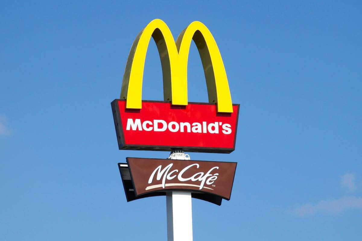
The rich legacy of McDonald?s logo has inspired a generation, and people look up to its logo as a symbol of excellence.
The emerging values of the new generation and the growing industry of fast-food business have changed the way people perceive the idea of dine-out.
The emergence of so many fast-food companies has given more choice to the consumers, and now they can find the best foods at the rates of their choice.
Would the new logo of McDonald?s stand up to this transition in the food industry?
Only time will tell.
McDonald?s logo is one of the most popular emblems in modern history.
It looks equally amazing on every surface whether it is a neon-sign board, vinyl banner or a computer screen.
Its memorable design easily retains in your memory.
You can quickly identify those arches even from a long distance.
What sets it apart from the rest is its simplistic design.
Whether it is the use of imagery or the colours, everything fits perfect in this emblem without making it look complicated.
The McDonald?s logo preserved the integrity of this business for fifty years, and we hope that it continues to carry forward its profound legacy to the next generation.
If you wish to discuss how we can develop your brand or provide graphic design for your product or business, email us: [email protected]
Inkbot Design is a Creative Branding Agency that is passionate about effective Graphic Design, Brand Identity, Logos and Web Design.
T: @inkbotdesign F: /inkbotdesign


