In a press conference in 1981, there was a question from a journalist about why Jobs chose the name Apple. To this question, he answered, ? I love apples and like to eat them. But the main idea behind Apple is bringing simplicity to the public, with the most sophisticated way, and that?s it, nothing else.? ?The fruit of creation, Apple. It was simple but strong. ? Join us in this article as we discuss the Apple Logo Evolution ? It all Started With a Fruit
Despite carrying the name Apple, the company?s first logo did not describe the physical shape of an apple.
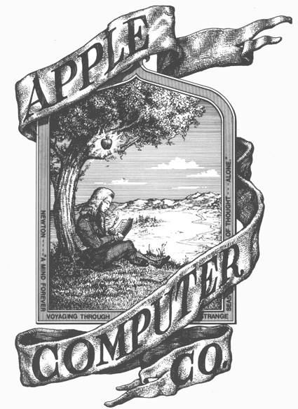
The first logo was created by Ronald Wayne, one of which co-founded Apple in the early days in 1976, who wanted to represent the law of gravity that is inspired by an apple.
The first image to represent the computer company was Isaac Newton, the man who revolutionised science with his discoveries on gravity. How did he figure it out? An apple fell on his head! Apple?s first logo was a depiction of this event, with Newton sitting under an Apple tree.
The Logo included a quote from William Wordsworth, a romantic English poet; ?Newton? a mind forever voyaging through strange seas of thought.? The poem was written on the frame of the logo.
However, this logos use did not last very long.
Steve Jobs, who undertook many roles at Apple for the business of design, decided he was going to explore something new for the logo, something different. He believed that the original was too old fashioned and considered difficult to be used to reproduce an image in a small size, and the logo was judged to be in harmony with the modern Apple computers that impressed.

Steve Jobs wanted the Apple name and logo to be fused as one. Steve Jobs soon hired a graphic designer by the name of Rob Janoff, who then created the now classic and world-renowned logo of the bitten apple. Jobs quickly threw out the old Newton logo, and Apple?s logo was fully established and used by the end of the company?s first year.
When Rob Janoff was scheduled to have the initial meeting with Steve Jobs in early 1977, Apple Computer was still in the startup stages and nowhere near the hights of the mega-company we know today, and the company had only been operating for less than a year. Apple?s offices were based in a local strip mall, consisting of just the three partners ? Steve Jobs, Steve Wozniak, and Mike Markkula.

The initial identity development was to coincide with the introduction of the brand?s first personal computer, the Apple II. The entire design process with the upstart client only took about two weeks. After the agency?s initial meeting, Rob Janoff went to work developing the Apple icon based on his examination of physical cross-sections of real apples. In fact, when asked how he approached designing the Apple logo Rob Janoff replied ?It was very simple really. I just bought a bunch of apples, put them in a bowl, and drew them for a week or so to simplify the shape.?
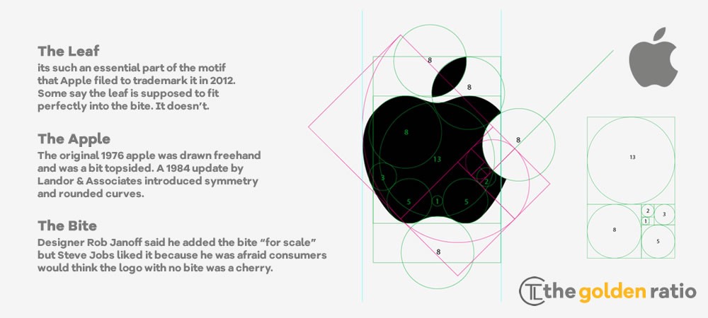
A single design illustration was then created of a ?rainbow-striped? apple. Janoff?s original apple logo design contained a rainbow spectrum, a nod towards Apple?s computer Apple II which was the world?s first computer with colour display. The logo debuted a little before the computer?s launch. Janoff has said that there was no rhyme or reason behind the placement of the colours themselves, noting that Jobs wanted to have green at the top ?because that?s where the leaf was.? According to Janoff, the ?bite? in the Apple logo was originally implemented so that people would know that it represented an apple, and not a cherry tomato. It also lent itself to a nerdy play on words (bite/byte), a fitting reference for a tech company.
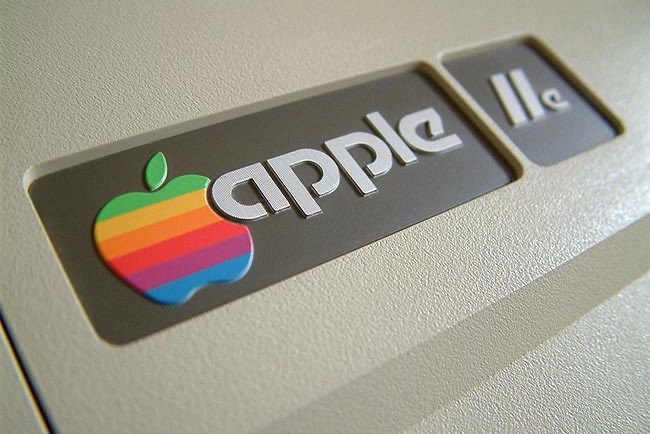
The Apple design with multi-coloured stripes was promptly approved for production by Steve Jobs. The artwork was then developed for print advertisements, signage hardware emblems and software labels on cassette tapes, all in preparation for the launch of the Apple II Computer in April of 1977 at the West Coast Computer Fair. For the next 20 years, the now-famous ?rainbow version? logo adorned all Apple products from its computer products to the Newton PDA. The only concept ever presented to Apple was an immediate success!
The multi-coloured Apple logo had been in use for 22 years before it was axed by Steve Jobs less than a year after his return to Apple in 1997. In its place was a new logo that did away with the colourful stripes and replaced it with a more modern monochromatic look that has taken on a variety of sizes and colours over the past few years. The overall shape of the logo, however, remains unchanged from its original inception 33 years ago.
The bitten apple logo may have had quite a history, a history whose parts remain unknown to people. However, it has not stopped the logo from being recognised all over the world. In fact, the company does not even have to print its name alongside the logo. The logo itself already tells it all.
Former Apple executive Jean Louis Gasse called the logo ?the symbol of lust and knowledge.? The Apple logo symbolises our use of their computers to obtain knowledge and, ideally, enlighten the human race.
Monochrome Apple Logo: 1998 ? Present
The current apple logo, the one everyone today knows, wasn?t made simply because Steve Jobs is always looking to change things. When Jobs returned to Apple in 1997, the company was bleeding money, and Jobs realised that the Apple logo could be leveraged to their advantage.
If the shape of the Apple logo was universally recognizable, why not put it where people could see it?
When Apple released their first ever iMac, the Bondi Blue, the logo was changed and it?s rainbow colours disregarded. The rainbow-colored logo would have looked silly, childish and out of place on the sky-blue computer.
The logo then took on a metallic look with embossing, which was applied to many of their products. The ?Glass? themed logo was the next evolution for the logo.
Today, the company uses a more modernised flat ?Minimal? Apple logo. The logo comes mainly in 3 colours; silver, white and black.
The millennial apple logo is now one of the sleekest and famous logos in the world, just as famous or even more than McDonald?s yellow arches. Steve Jobs?s decision to hire Janoff, and go for a minimal style logo (which is currently in fashion and may have started the ?flat? logo craze) was another genius choice by the brilliant minded founder. Steve Jobs wants everyone at Apple to ?think different. ?
Iconic
Despite the colour change, leaving the shape of the apple intact. Colour on the Apple logo will continue to define Apple products in the future.
Janoff assesses colour changes on the Apple logo looks good from time to time. Every colour and line meets the objectives and in accordance with the current conditions. He believes Steve Jobs was aware of the design, and Apple has a graphic design team as well as strong industrial design.
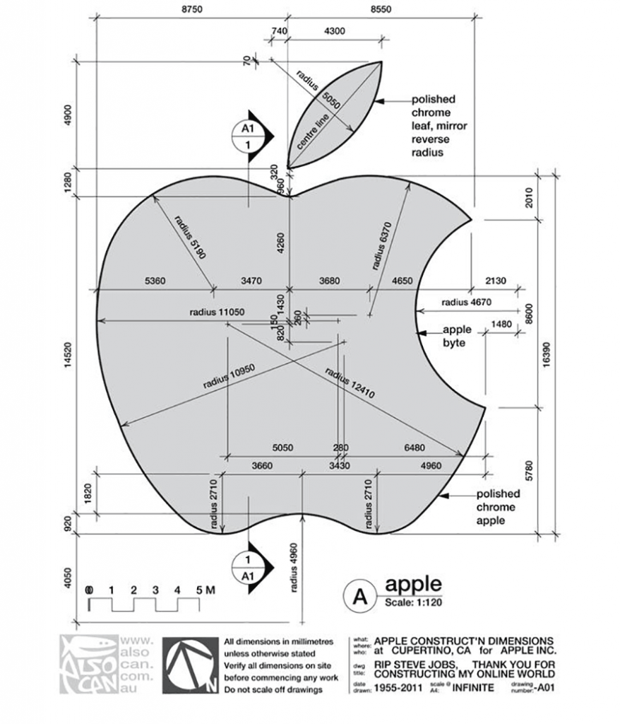
?Apple shape changed slightly from my original design in the early 1980s. Landor & Associates a branding firm based in San Francisco made the changes in the late 1990s. They where bright colours, they made the shape more symmetrical, much more geometric, ? said Janoff
The slight makeover by Landor & Associates was because Landor used Macs running Adobe software, tools that Janoff did not have in 1977, to refine the logo making it more geometric, more symmetrical.
In the technology industry, Janoff later worked on designs for the IBM and Intel.
Rob Janoff himself likes a simple character logo design, Volkswagen, NBC, and FedEx. He likes positive and negative space logos, where there will be something revealed there.
?The logo is usually to be interpreted from the very, very small, to very, very large, and it is not always easy to do. So, I think the simplicity and readability are key, ? he explained.
Regardless of myths circulating about Apple logo, Apple?s design work of Janoff recognised as one of the most iconic corporate logo designs in the world and proven to survive for 37 years until 2014.
The Apple logo is very easily interpreted. This is the reason why Apple never put information about the company name in the logo. Rob Janoff succeeded in giving identity to Apple, which is simple and powerful, to Steve Jobs liking. We hope this article about Apple Logo Evolution ? It all Started With a Fruit was interesting, and be sure to leave your comments below.

Originally published at The Logo Creative | International Logo Design & Branding Studio.

