
 Photo by Chris Liverani on Unsplash
Ever wondered how to use technical indicators in trading? Well wonder no more, this article introduces 7 popular indicators, and the strategies you can use to profit from their signals.
Technical trading involves reviewing charts and making decisions based on patterns and indicators.
These patterns are particular shapes that candlesticks form on a chart, and can give you information about where the price is likely to go next.
Indicators are additions or overlays on the chart that provide extra information through mathematical calculations on price and volume. They also tell you where the price is likely to go next.
There are 4 major types of indicator:
- Trend
- Momentum
- Volume
- Volatility
Trend indicators tell you which direction the market is moving in, if there is a trend at all. They?re sometimes called oscillators, because they tend to move between high and low values like a wave. Trend indicators we?ll discuss include Parabolic SAR, parts of the Ichimoku Kinko Hyo, and Moving Average Convergence Divergence (MACD).
Momentum indicators tell you how strong the trend is and can also tell you if a reversal is going to occur. They can be useful for picking out price tops and bottoms. Momentum indicators include Relative Strength Index (RSI), Stochastic, Average Directional Index (ADX), and Ichimoku Kinko Hyo.
Volume indicators tell you how volume is changing over time, how many units of bitcoin are being bought and sold over time. This is useful because when the price changes, the volume gives an indication of how strong the move is. Bullish moves on high volume are more likely to be maintained than those on low volume.
We won?t cover volume indicators here, but this class includes On-Balance Volume, Chaikin Money Flow, and Klinger Volume Oscillator.
Volatility indicators tell you how much the price is changing in a given period. Volatility is a very important part of the market, and without it there?s no way to make money! The price has to move for you to make a profit, right?
The higher the volatility is, the faster a price is changing. It tells you nothing about direction, just the range of prices.
Low volatility indicates small price moves, high volatility indicates big price moves. High volatility also suggests that there are price inefficiencies in the market, and traders spell ?inefficiency?, P-R-O-F-I-T. We?ll cover 1 volatility indicator today, Bollinger Bands.
So why are indicators so important? Well, they give you an idea of where the price might go next in a given market. At the end of the day, this is what we want to know as traders. Where is the price going to go? So we can position ourselves to take advantage of the move and make money!
As a trader, it?s your job to understand where the market might go, and be prepared for any eventuality. You don?t need to know exactly where the market is going to go, but understand the different possibilities, and be positioned for whichever one materializes.
Remember, traders make money in bull AND bear markets. We take advantage of long AND short positions. Don?t get too attached to the direction of the market, as long as the price is moving you can profit. Indicators will help you to do this.
Without further ado, here are the stars of the show.
1) Bollinger Bands
Bollinger bands are a volatility indicator. They consist of a simple moving average, and 2 lines plotted at 2 standard deviations on either side of the central moving average line. The outer lines make up the band.
Simply, when the band is narrow the market is quiet. When the band is wide the market is loud.
You can use Bollinger Bands to trade in both ranging and trending markets.
In a ranging market, look out for the Bollinger Bounce. The price tends to bounce from one side of the band to the other, always returning to the moving average. You can think of this like regression to the mean. The price naturally returns to the average as time passes.
In this situation, the bands act as dynamic support and resistance levels. If the price hits the top of the band, then place a sell order with a stop loss just above the band to protect against a break out. The price should revert back down towards the average, and maybe even to the bottom band, where you could take profits. Check out the screenshot below.
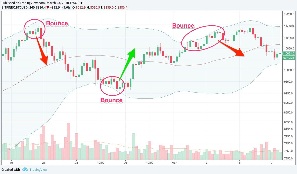 Bollinger Bounce, chart via TradingView
When the market is trending, you can use the Bollinger Squeeze to time your trade entry and catch breakouts early on. When the bands get closer together (i.e. they squeeze), it indicates that a breakout is about to happen. It doesn?t tell you anything about direction so be prepared for the price to go either way.
If the candles breakout below the bottom band, the move will generally continue in a downtrend.
If the candles breakout above the top band, the move will generally continue in an uptrend. Take a look at the screenshot below.
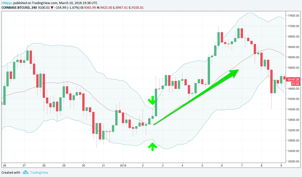 Bollinger Squeeze and subsequent upwards breakout, chart via TradingView
In summary, look out for the Bollinger Bounce in ranging markets, the price will tend to return to the mean. In trending markets, use the Bollinger Squeeze. It doesn?t tell you which way the price is going to go, just that it?s going to go.
2) Ichimoku Kinko Hyo (AKA Ichimoku Cloud)
Ichimoku Kinko Hyo (AKA Ichimoku Cloud) is a collection of lines plotted on the chart. It?s an indicator that measures future price momentum, and determines areas of future support and resistance. At first glance this looks like a very complex indicator, so here?s a breakdown of what the different lines mean:
- Kijun Sen (blue line): Also called standard line or base line, this is calculated by averaging the highest high and the lowest low for the past 26 periods
- Tenkan Sen (red line): The turning line. It?s derived by averaging the highest high and the lowest low for the past nine periods
- Chikou Span (green line): Also called the lagging line. It?s today?s closing price plotted 26 periods behind
- Senkou Span (red/green band): The first Senkou line is calculated by averaging the Tenkan Sen and the Kijun Sen and plotted 26 periods ahead. The second Senkou line is calculated by averaging the highest high and the lowest low over the past 52 periods, and plotting it 26 periods ahead
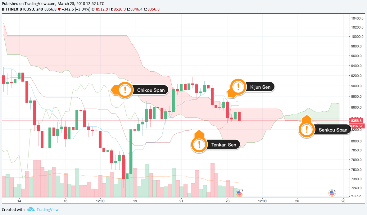 Ichimoku Kinko Hyo, chart via TradingView
So how can you translate these lines into trading profits? I?m glad you asked.
The Senkou span acts as dynamic support and resistance levels. If the price is above the Senkou span, the top line acts as first support, and the bottom line as second support.
If the prices below the Senkou span, the bottom line acts as the first resistance, and the top line as the second resistance. Simple as that!
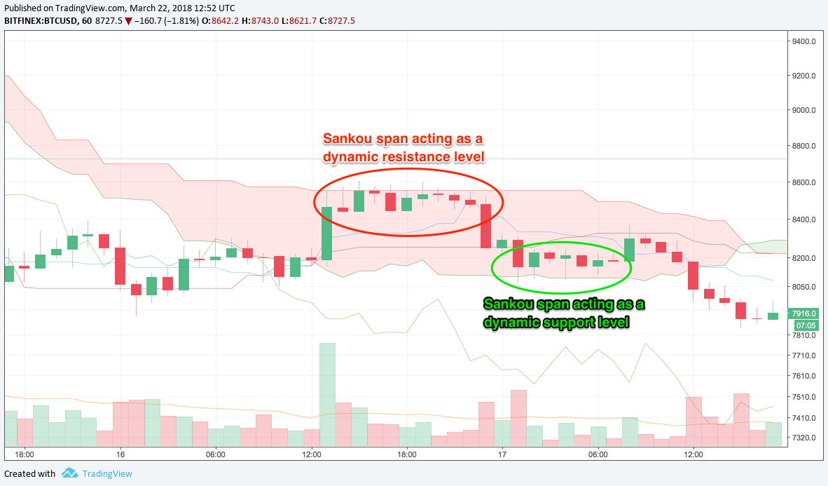 Senkou span as dynamic support and resistance, chart via TradingView
The Kijun Sen (blue line) can be used to confirm trends. If the price breakouts above the Kijun Sen, it?s likely to rise further. Conversely, if the price drops below this line, then it?s likely it?ll go lower.
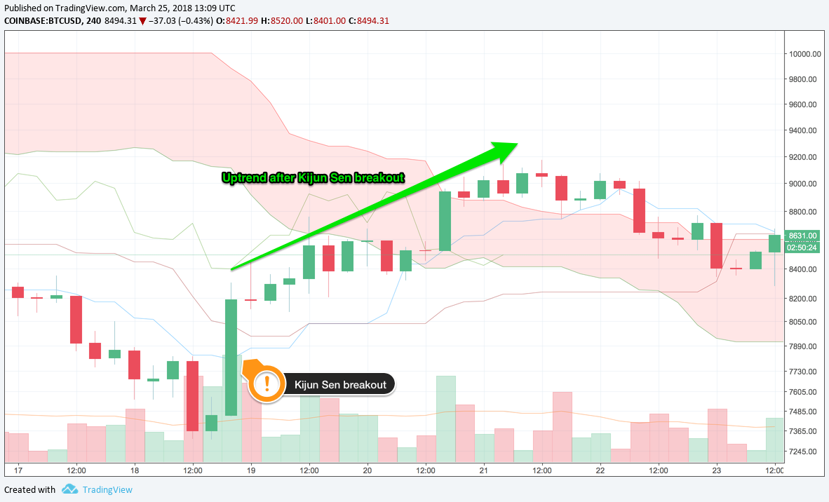 Kijun Sen breakout into an uptrend, chart via TradingView
The Tenkan Sen (red line) can also be used to confirm trends. If the line is moving up or down, it indicates the market is trending. And if it?s moving sideways, then the market is ranging.
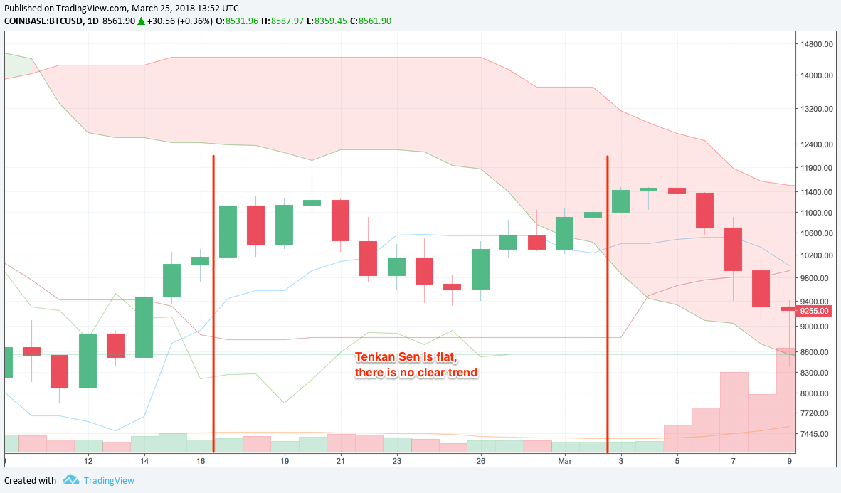 Flat Tenkan Sen = ranging market, chart via TradingView
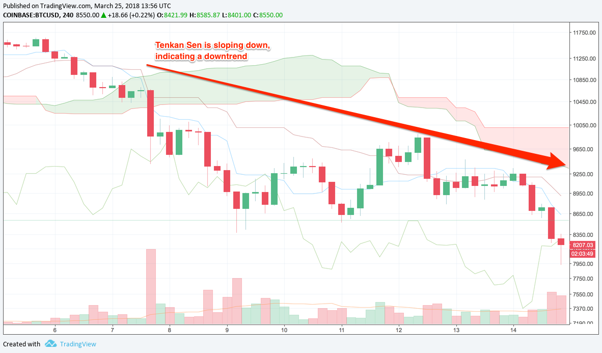 Downwards Tenkan Sen = downtrend, chart via TradingView
Remember, the red line is a trend indicator.
The Chikou span (green line) is plotted 26 periods BEHIND the current period. This is a key fact to remember. It can be used as a trend indicator of sorts. When the line crosses the price in a bottom-up direction, the price is likely to go up. When the line crosses the price in a top-down direction, the price is likely to go down.
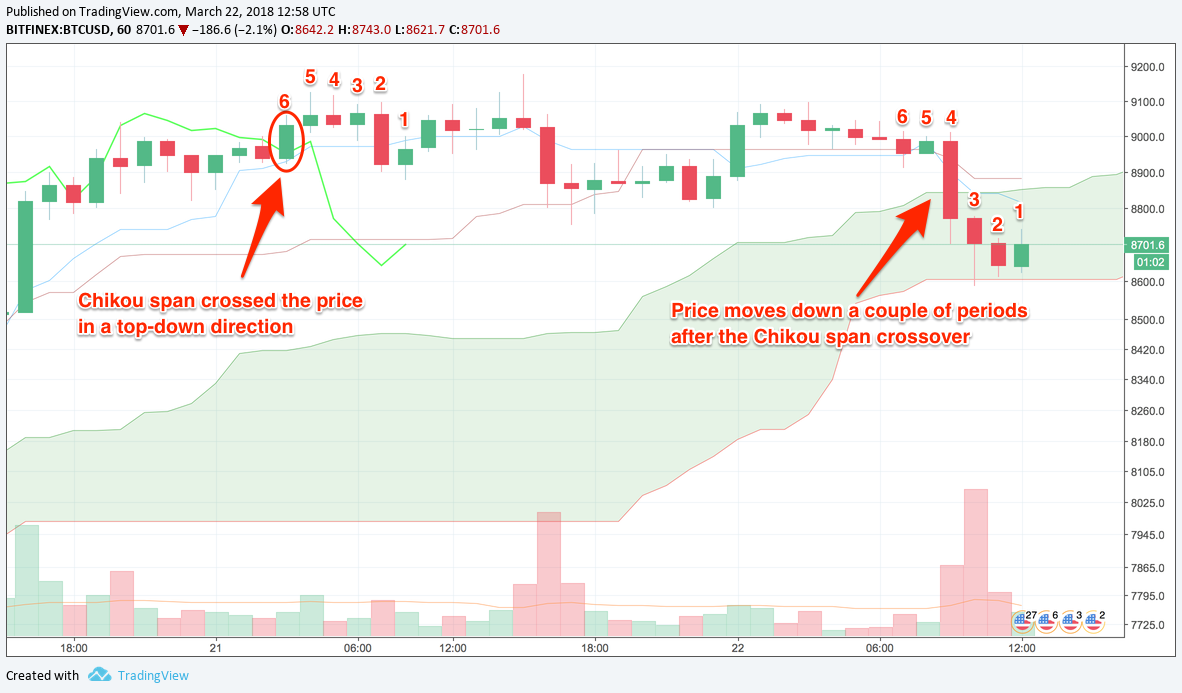 Chikou Span crosses price from top-down = start of downtrend, chart via TradingView
That?s a whole lot going on in one indicator! And a whole lot of information it can give you. You just have to remember what each line means. If you get your Kijun Sen and your Chikou Span mixed up, then you could mistake a downtrend for an uptrend. And that?d be disastrous for your trading account!
3) Relative Strength Index (RSI)
Next up, the Relative Strength Index (RSI). This is a momentum indicator plotted on a separate scale. There?s a single line scaled from 0 to 100 that identifies overbought and oversold conditions in the market. Readings over 70 indicate an overbought market, and readings below 30 indicate an oversold market. Got it? Alright, let?s see how you can make money from this guy.
The whole idea behind RSI is to pick the tops and bottoms, to get into a market as the trend is reversing. This can help you to take advantage of the whole move. Take a look at the chart below.
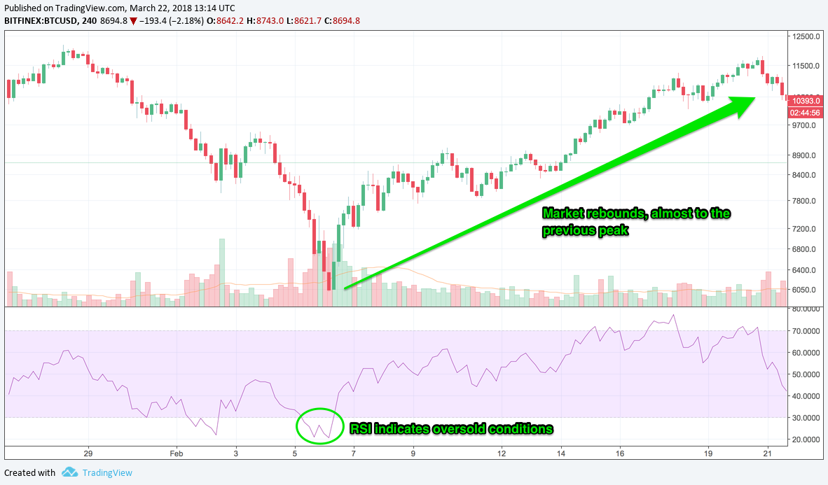 Uptrend after RSI indicates oversold conditions, chart via TradingView
Around Feb 6, the market was deep into oversold territory. This is a strong buy signal. If you had bought the market here and held on until RSI moved above 70 (around Feb 17), then you would?ve grabbed a whopping 490,000 pips! That?s almost $5,000 per BTC!
RSI can also be used to confirm trend formations. If RSI is above the 50 level, the market is probably in an uptrend. Conversely, if the line is below 50, the market is probably in a downtrend.
In the example below, RSI indicated oversold conditions on Feb 1?2. This looked like a good buy at the time. But it turned out the be a fakeout. See how it turned out?
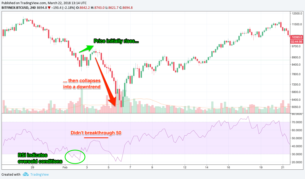 RSI didn?t breakthrough 50 = fakeout, chart via TradingView
Initially, the price started to rise, but RSI didn?t breakthrough the 50 level on Feb 4. And you can see what happened after that. The market dropped like a stone, all the way down to below $6,000.
In the previous example of the uptrend, you can see that RSI did manage to breakthrough 50, even though it hovered around that area for about a week.
If you?re more risk-averse, then waiting for trend confirmation may be the way to go. It?s a trade-off between 2 things. On one hand you stand to make more profit by getting into a trend early, but you?ll also be wrong more often and potentially lose a lots of pips to your stops.
On the other hand you can wait for the trend to be confirmed and be right more often, but you?ll also miss a portion of the move so stand to make less profit.
It all depends on your risk disposition. Are you willing to accept many small losses and a few big winners? Or do you want lots of smaller winners?
Only you can make that decision. It?s my job to provide you with the methods and tools to play the game, but you have to decide how you?re going to use them.
4) Moving Average Convergence Divergence (MACD)
Next on the roster we have Moving Average Convergence Divergence (AKA MACD). This is a trend indicator and it consists of a fast line, slow line, and a histogram. Have you had a coffee yet? This is going to be a little confusing, so pay attention!
The inputs for this indicator are a faster-moving average (MA-fast), a slower-moving average (MA-slow), and a number defining the period for yet another moving average (MA-period).
The MACD fast line is a moving of the moving average of the difference between MA-fast and MA-slow. Let that sink in.
The MACD slow line is a moving average of the MACD fast line. The number of periods is defined by MA-period.
Finally, the histogram shows the difference between the MACD fast and slow lines.
Don?t worry if you don?t get it first time, we?ll go through an example.
Say you have MACD ?12, 26, 9? (a common default setting). This means that the fast line is the moving average of the difference between the 12-period and 26-period moving averages. The slow line is a 9-period moving average of the MACD fast line. And the histogram is the difference between the MACD lines.
You might have to re-read that a few times to get it. And make sure you do get it because MACD is a very useful indicator.
So what?s this ?convergence divergence? thing all about? Well, the moving averages and the histogram are plotted on a separate chart and you?ll see that the lines crossover from time to time.
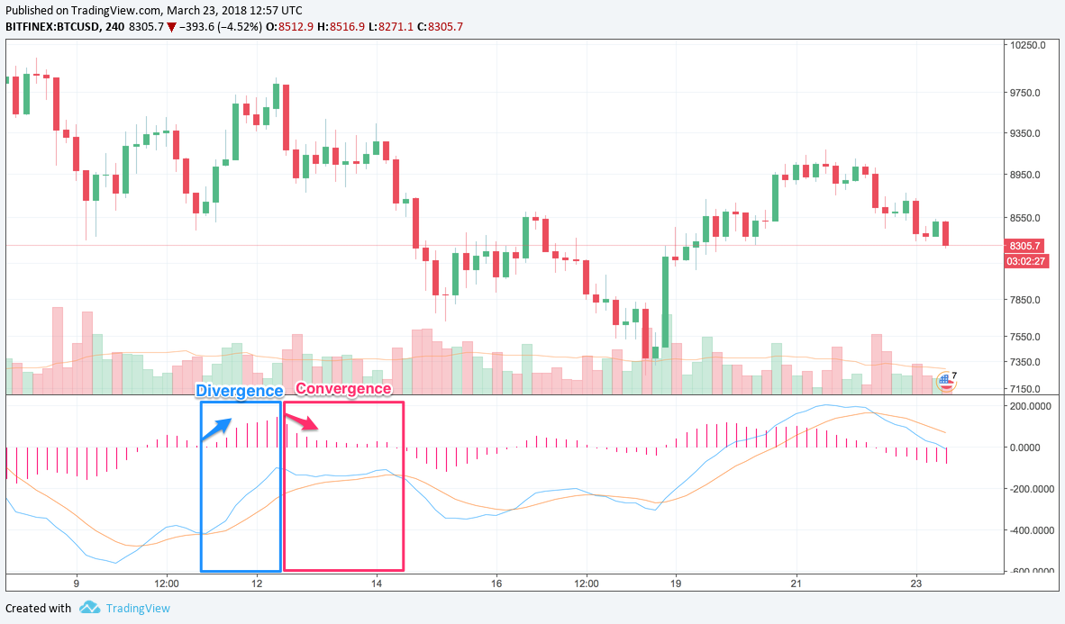 MACD convergence and divergence, chart via TradingView
As the difference between the 2 lines gets smaller, they get closer together, i.e. converge. When the difference gets bigger, they get further apart, i.e. diverge.
It?s this characteristic of the indicator that you can use in trading.
When a new trend is forming, the MACD lines will converge, eventually they?ll crossover (indicating that the trend has reversed), and the lines then start to diverge. At the point of crossover, the histogram will disappear because the difference between the lines is 0.
Take a look at the chart below.
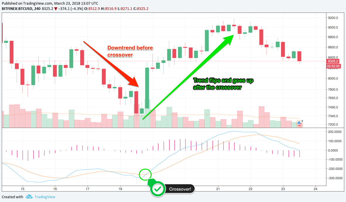 MACD crossover, chart via TradingView
The fast line (blue) crossed over the slow line (orange) around Feb 19. This indicates that the previous downtrend has ended and an uptrend is starting. And would you look at that? There?s an uptrend for the next few days! Almost a 200,000 pip move and a good $2K profit per BTC.
One thing to note about MACD is that it?s made up of moving averages of other moving averages. This means that it lags behind price quite a lot, so might not be the best indicator to use if you want to get into trends early. But it?s great for confirming trends.
5) Parabolic Stop and Reverse (SAR)
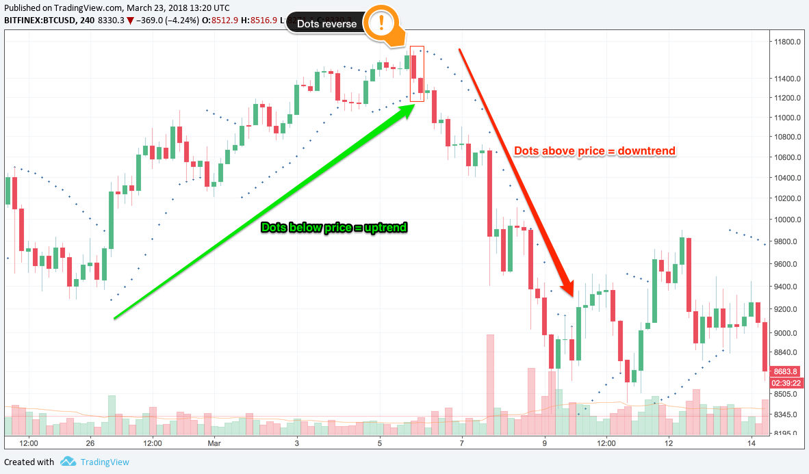
Time to move on to something a little simpler, Parabolic SAR. This is a trend indicator. Dots are placed on the chart above or below the price, and they indicate the potential direction of the price movement. Does it get much simpler?!
 Parabolic SAR, chart via TradingView
How can such a simple indicator be used in trading? Well, I?ll tell you. When the dots are above the price, the market is in downtrend, indicating that you should be short.
When the dots are below the price, the market is in an uptrend, indicating that you should be long. Easy as pie.
 Parabolic SAR points, chart via TradingView
One thing to be aware of. Do not use Parabolic SAR in a ranging market, when the price is moving sideways. There?ll be a lot of noise and the dots will flip from side-to-side giving you no clear signal.
Add Parabolic SAR to your trading arsenal and use it to get a handle on strong trends.
6) Stochastic
Next in line, the stochastic indicator. This is a momentum indicator, and can be used to find where a trend might be ending. In a similar fashion to RSI, it?s used to determine when an asset is overbought or oversold.
It?s made up of 2 lines plotted on a separate chart.
As you might?ve already guessed, stochastic can help you to pick an entry point and get into a trend at the very beginning. When the stochastic lines are above 80, the market is overbought, and a DOWNTREND is likely to follow.
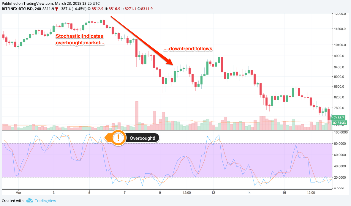 Stochastic > 80 indicates overbought market, chart via TradingView
Now when the stochastic lines are below 20, it indicates that the market is oversold, and an UPTREND is likely to follow.
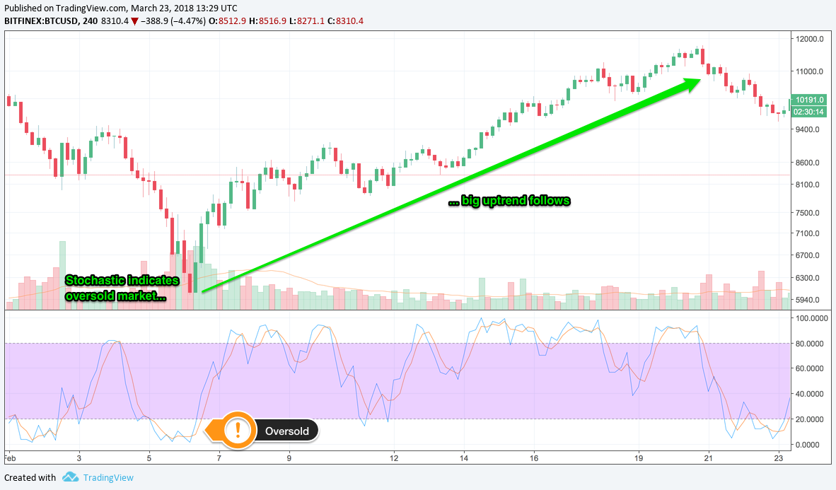 Stochastic < 20 indicates oversold market, chart via TradingView
The same caveats as RSI apply here. When trying to get into trends early, there will be many fakeouts, so you should be prepared with stop losses in case the market doesn?t go your way.
As always, use the indicator to give you an idea of where the market is likely to go. Don?t bet your house on it though. Good risk management prevails.
7) Average Directional Index (ADX)
Here?s another oscillator, but this time it?s a trend indicator. Average Directional Index (ADX) values range from 0 to 100, and is intended to give you a signal of trend strength.
If ADX is below 20, the trend is weak. If it?s above 50, the trend is strong. Bear in mind though, that ADX doesn?t tell you the direction of the trend, just the strength.
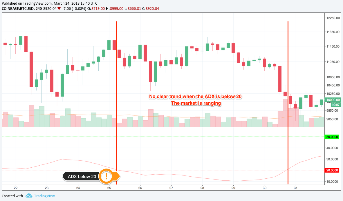 ADX below 20 (red line), price is ranging, chart via TradingView
When trading, you can use ADX to avoid fakeouts. It?s really best used in combination with other indicators, as (despite the name) it doesn?t give you any information about trend direction.
Combined with a directional trend indicator, such as Parabolic SAR, ADX can confirm that a trend is strong and is going to continue. This should give you more confidence when entering into a position.
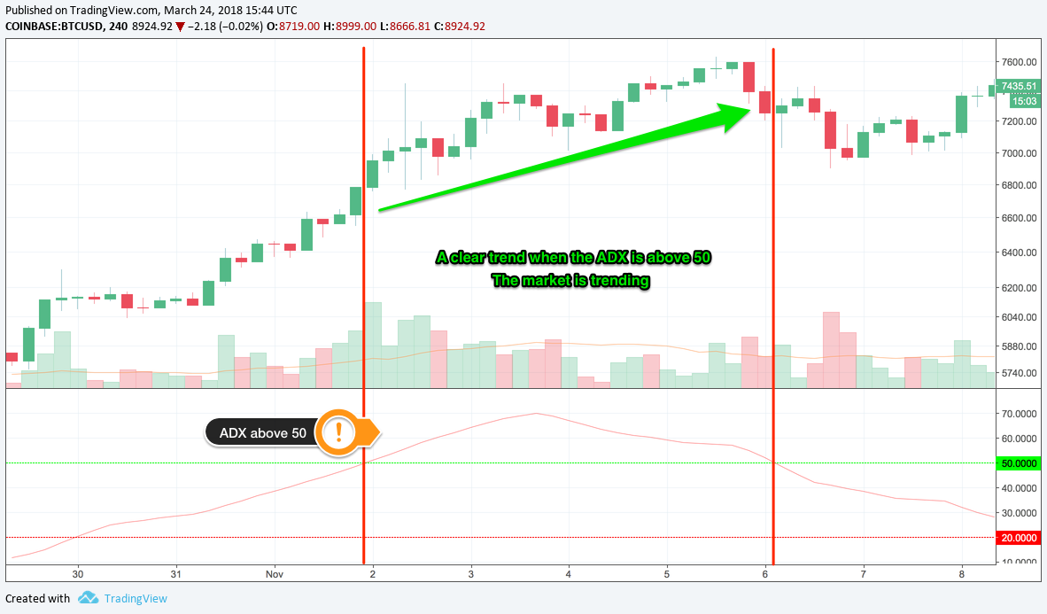 ADX above 50 (green line), strong trend, chart via TradingView
ADX can also help you to exit the trade when the trend weakens, to avoid getting caught by price retracements.
As with many trend indicators, ADX lags behind the price, so is not useful if you want to get in on trends early. But it is useful if you only want to trade strong trends.
Those are 7 popular indicators that you?ll see around. Create your own charts, play around with the indicators and get a feel for how they work.
Be aware, the default parameters for the indicators might be the best for cryptocurrencies, or for your trading style, so change them. See how the parameters affect the signals you get from the indicators, and whether this gives you better entries, or helps you to catch better trends.
I highly recommend experimenting early on and finding your own style.
BONUS: Trading with multiple indicators
One big caveat to all of the above. Trading from a single indicator will not make you rich. Each indicator has it?s own limitations and will not be correct 100% of the time.
However, you can use these indicators in concert to get better signals and overall make more profitable trades. Here are a couple of examples to get you started.
Parabolic SAR & Ichimoku Cloud
 Trading with the Ichimoku Cloud and Parabolic SAR indicators, chart via TradingView
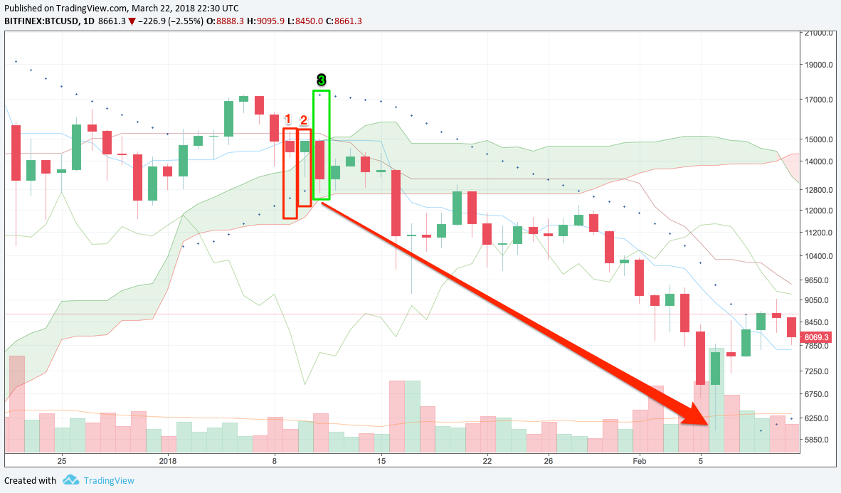
Here I?ve added the Parabolic SAR indicator and Ichimoku Cloud to a BTCUSD 1D chart. On day 1, the price closed below the Kijun Sen (blue line), indicating that the price might go lower. If you were using the Ichimoku by itself, you might?ve entered the trade here. But you?re not, so hold on.
On day 2, there was a slight recovery, but the price is still below the Kijun Sen, so still bearish. Parabolic SAR is still below the candlestick, a bullish signal. There?s still conflict between you?re 2 indicators, so do nothing. Wait it out. Be patient.
On day 3, there?s a big drop in price. We?re now way under the Kijun Sen, and look, Parabolic SAR has flipped sides, it?s now above the candlestick! Both indicators are showing bearish signals, now?s the time to enter the market and go short!
You enter the market and for the next 26 days, the market goes the way you want. DOWN! If you?d sold around $14K on day 3, you could?ve picked up over 800,000 pips. That?s $8K per BTC. A big win.
You can see that there were a couple of fakeouts where the price closed above the Kijun Sen (Jan 20 and 28). If you?d only been looking at the Ichimoku Cloud, maybe you would?ve closed out your position. Parabolic SAR was still bearish, so could?ve given you much needed information about where the price was headed.
RSI & Bollinger Bands
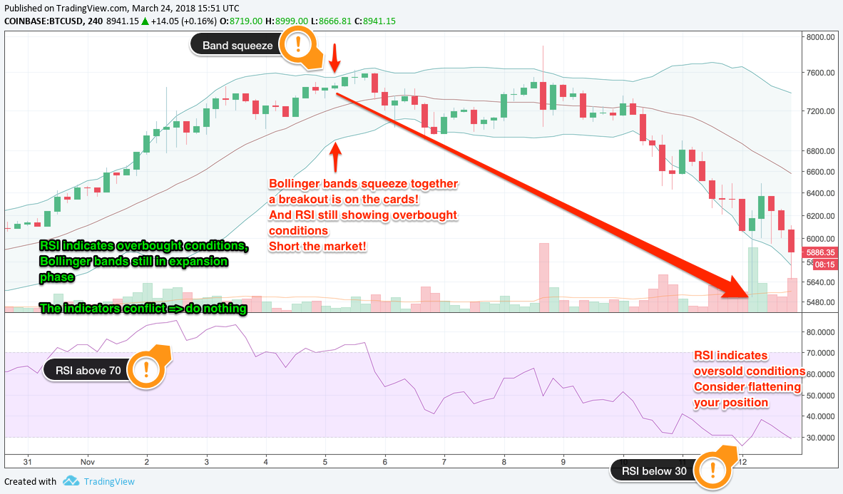 Trading with Bollinger Bands and RSI, chart via TradingView
Here?s another example where 2 indicators are better than one. Using RSI and Bollinger Bands, you can confirm when the market is turning and pick a great entry point.
At the end of October, 2017, RSI started to show the market was overbought. This might?ve prompted you to sell! But the Bollinger Bands were still expanding, so no dice.
RSI continued to show overbought conditions through the beginning of November, and the market continued to rise through this time. If you?d bought back in October, you would be having serious second thoughts by now. The Bollinger bands have started to contract though, showing that the market is getting quiet.
On November 5, the bands really start to squeeze together AND RSI is showing that the market is overbought. Is it a good time to sell? Yessir! Both indicators agree! The market is ready to make a move, and that move is down.
If you?d sold on November 5, you could?ve picked up 200,000 pips over the next week, a nice $2,000 per BTC. That would?ve set you up for a great Christmas 2017!
As you can see, indicators are a great tool for you to use. They can help gauge trade entry, the direction of the market, and overall make you more confident to trade. But indicators don?t do so well on their own. They need a little help from their friends.
That?s why combining indicators is a great way to give you more confidence in your positions, avoid fakeouts, and overall make more money. It?s not a bulletproof strategy, nothing is, but it will tilt the odds in your favour and that?s the best you can hope for.
Try out your own combinations of indicators, see what works for you, what signals you can spot, and when you?re comfortable to make trades. As I said before, don?t be afraid to adjust the parameters and tweak the indicators, you might find a golden combination.
By trying things out, you can define your own strategy. That?s the ultimate goal, to find a way of trading that you can commit to and be confident that you?re going to make money with.
DISCLAIMER: The information in this article is provided for educational purposes only. I am not a financial advisor and this article does not contain financial advice. Make your own decisions about risk, or consultant a professional financial advisor.

