Merriweather
 by Sorkin Type
Merriweather is a medium contrast semi condesed typeface designed to be readable at very small sizes. Merriweather is traditional in feeling despite a the modern shapes it has adopted for screens.
Montserrat
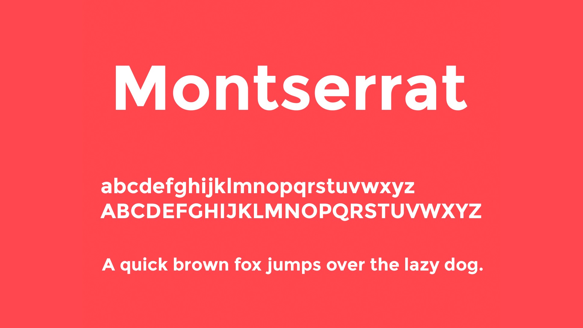 by Julieta Ulanovsky
Montserrat is a geometric sans-serif typeface was inspired by signage from her historical Buenos Aires neighborhood of the same name. Montserrat is often mentioned as the closest free alternative to Gotham and Proxima Nova,
Pluto Sans
 by HVD_Fonts
Pluto Sans ? the straight companion of the Pluto Family ? was designed by Hannes von Dhren in 2012. This clear Sans Serif family is based on the Pluto architecture and it still has a hint of the friendly feeling the quirky Pluto conveys. With its geometric forms and its large x-height it is perfect for long texts in small sizes and usage in print & on screens. Both Pluto Sans and Pluto have the same range of weights and styles and can perfectly be used together.
Tisa
 by FontFont
FF Tisa designed by Mitja Miklav quickly became a new-millennium favorite of graphic designers, in print as well as on the web. Its large x-height and sturdy, well-spaced forms aid its legibility at text sizes, while its low stroke contrast and range of weights allow it to successfully function at larger sizes as well.
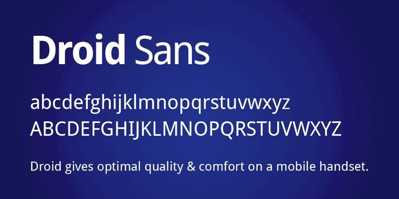
Droid Sans
 by Ascender
Droid Sans was designed with an upright stress, open forms and a neutral, yet friendly appearance. Droid Sans was optimized for user interfaces and to be comfortable for reading on a mobile handset in menus, web browser and other screen text.
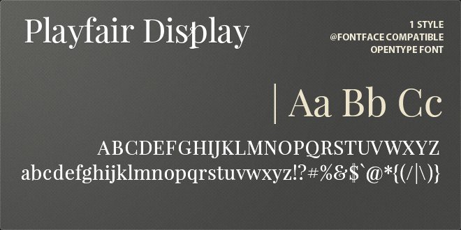
Playfair Display
 by Claus Eggers Srensen
Playfair is a transitional design. From the time of enlightenment in the late 18th century, the broad nib quills were replaced by pointed steel pens. This influenced typographical letterforms to become increasingly detached from the written ones. Developments in printing technology, ink, and paper making, made it possible to print letterforms of high contrast and delicate hairlines.
Minion
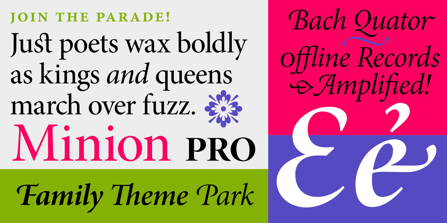 by Adobe
Minion Pro is inspired by classical, old style typefaces of the late Renaissance, a period of elegant, beautiful, and highly readable type designs. Minion Pro combines the aesthetic and functional qualities that make text type highly readable with the versatility of OpenType digital technology, yielding unprecedented flexibility and typographic control, whether for lengthy text or display settings.
Open Sans
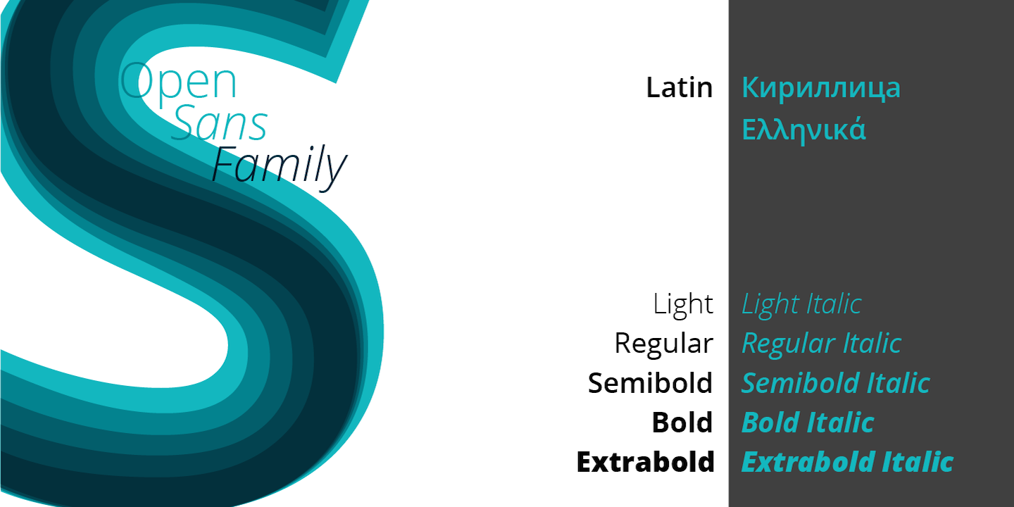 by Steve_Matteson
A humanist sans serif typeface designed by Steve Matteson of Ascender Corp. Since its release in 2010, Open Sans quickly became the preferred typeface by many designers, as it was a fantastic substitute for (sometimes loathed) Helvetica.
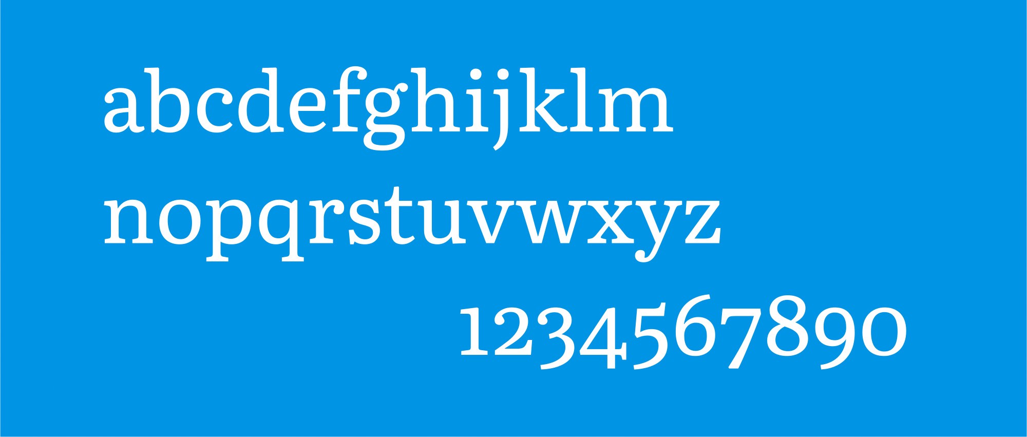
Bookerly
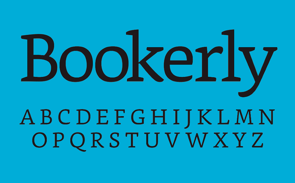 by Dalton Maag
Bookerly is a serif typeface designed exclusive for reading on Amazon?s Kindle devices. Combined with a new typesetting engine, Amazon.com asserts that the font helps the user ?read faster with less eyestrain.?
Literata
 b Veronika Burian, Jos Scaglione, Irene Vlachou, Vera Evstafieva
Literata is a typeface created by Type Together for Google Play. It is created to establish a graphic identity to Google Play and replace Droid Serif as the default font in its digital books in May 2015 1 . She is inspired by humanes and Scotch Roman 2 .

