The process of creating a digital product is similar to the process of building a house. When we think about building a home, we usually mean the process of construction. And the first step of creating this appearance is creating blueprints ? outlines of areas that give those involved in building a clear vision of the project structure. A wireframe is like an architectural blueprint in the design process. It serves as a reference point for functional specifications and gives the product team a basis to begin creating screens. Wireframing is a step that should not be skipped.

In this article, we?ll share an excellent collection of inspiring, must-see wireframe examples for websites and mobile apps then give you a little more background on wireframes and how they?re used. You will also find a helpful collection of wireframe kits that you can try in your next project.
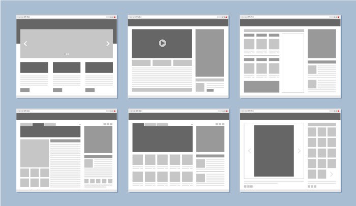
12 excellent wireframe examples
1. Search results for eCommerce website
Author: Micha? NowakowskiPlatform: WebFidelity: High
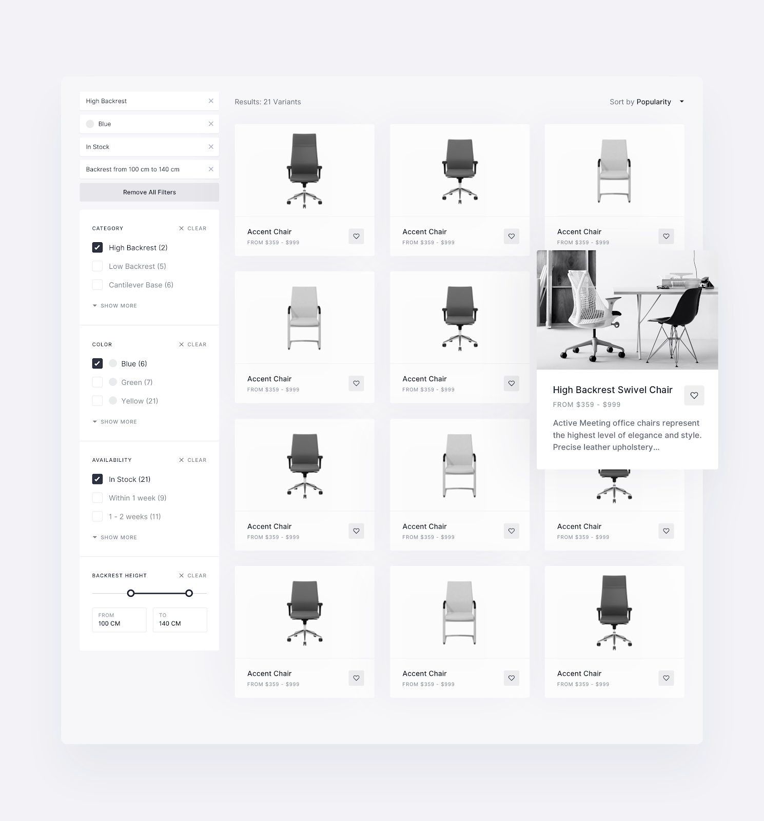
Micha? Nowakowski shared an excellent collection of website wireframe examples for eCommerce. The wireframe listed below features a few essential areas ? filters, relevant products, and sorting. It?s easy to understand how the filtering will work just by looking at this wireframe.
You can also notice that this sample has an excellent visual hierarchy. The products are distributed in an easy-to-scan grid. Each item in the grid contains essential information about the product ? product image, name, and price.
2. Loan app screens
Author: Ryszard CzPlatform: Mobile (iOS/Android)Fidelity: Medium
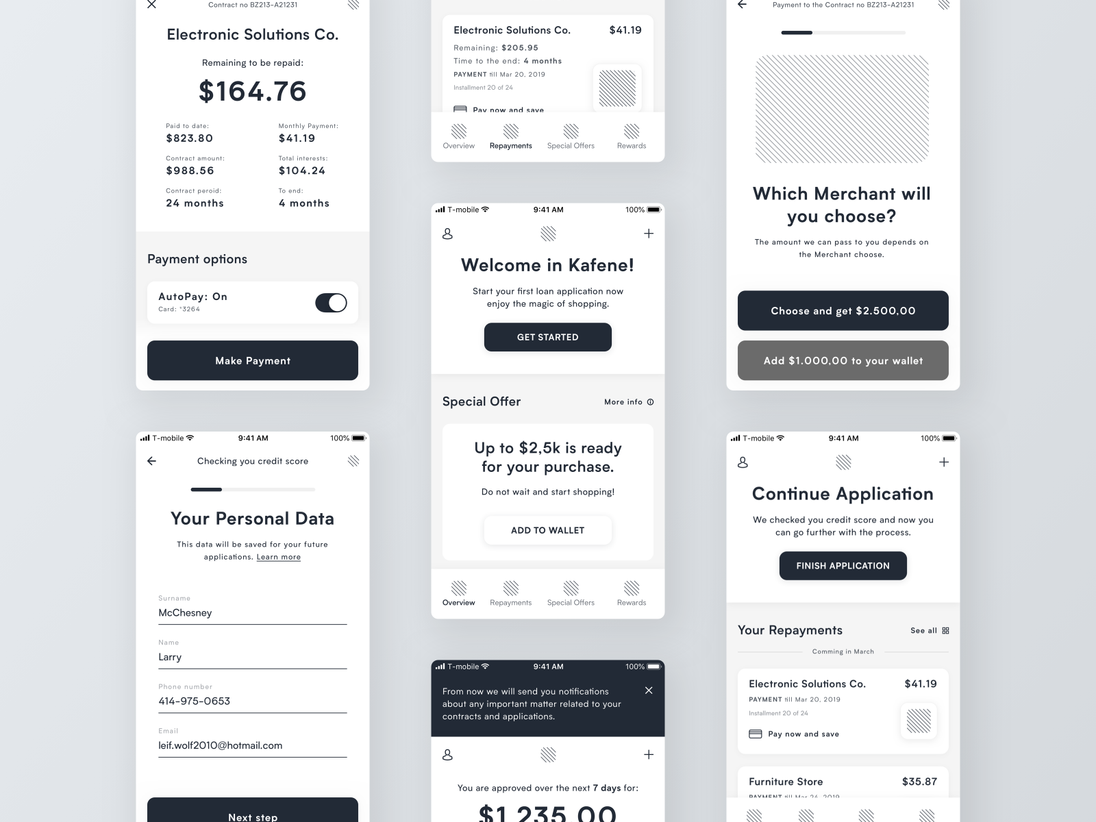
Simplicity and transparency of information are two key characteristics of good design for people who are thinking about investing their money. It?s easy to see that crucial information in Ryszard Cz?s app wireframe examples is visually prioritized. Each screen helps users find all the required information at a glance.
3. Landing page for product/service
Author: Piotr Ka?mierczakPlatform: WebFidelity: Medium
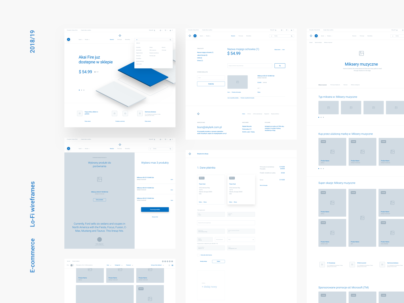
Landing page design should always be optimized for fast scanning. Visitors should be able to get a general idea about the product/service in just a few seconds. If you?re thinking about what layout to choose for your landing page, take a look at the Piotr Ka?mierczak?s website wireframe examples listed below. You will find various layouts optimized for fast scanning.
4. Sales management platform
Author: Pawel KwasnikPlatform: WebFidelity: Medium
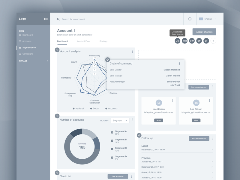
This is an excellent example of a dashboard for the sales and marketing team. The wireframe is created in high fidelity, so you do not need to imagine what the final product will look like. Notice that this wireframe also shows the mechanics of user interactions ? it?s easy to see how the drag and drop interaction will work for end-users.
5. Podline podcast app
Author: Fernando AletaPlatform: Mobile (iOS/Android)Fidelity: Low
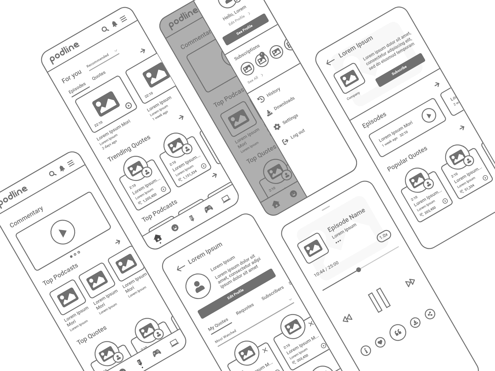
Podcast is a set of app wireframe examples created in low-fidelity and intended to demonstrate the key content and sections needed on individual screens. Podcast makes it easier for designers to see the basic structure of the user interface. There is a limited amount of real content in these wireframes, and most sections have Lorem Ipsum content.
6. Adventure app
Author: Piotr Ka?mierczakPlatform: Mobile (iOS)Fidelity: High
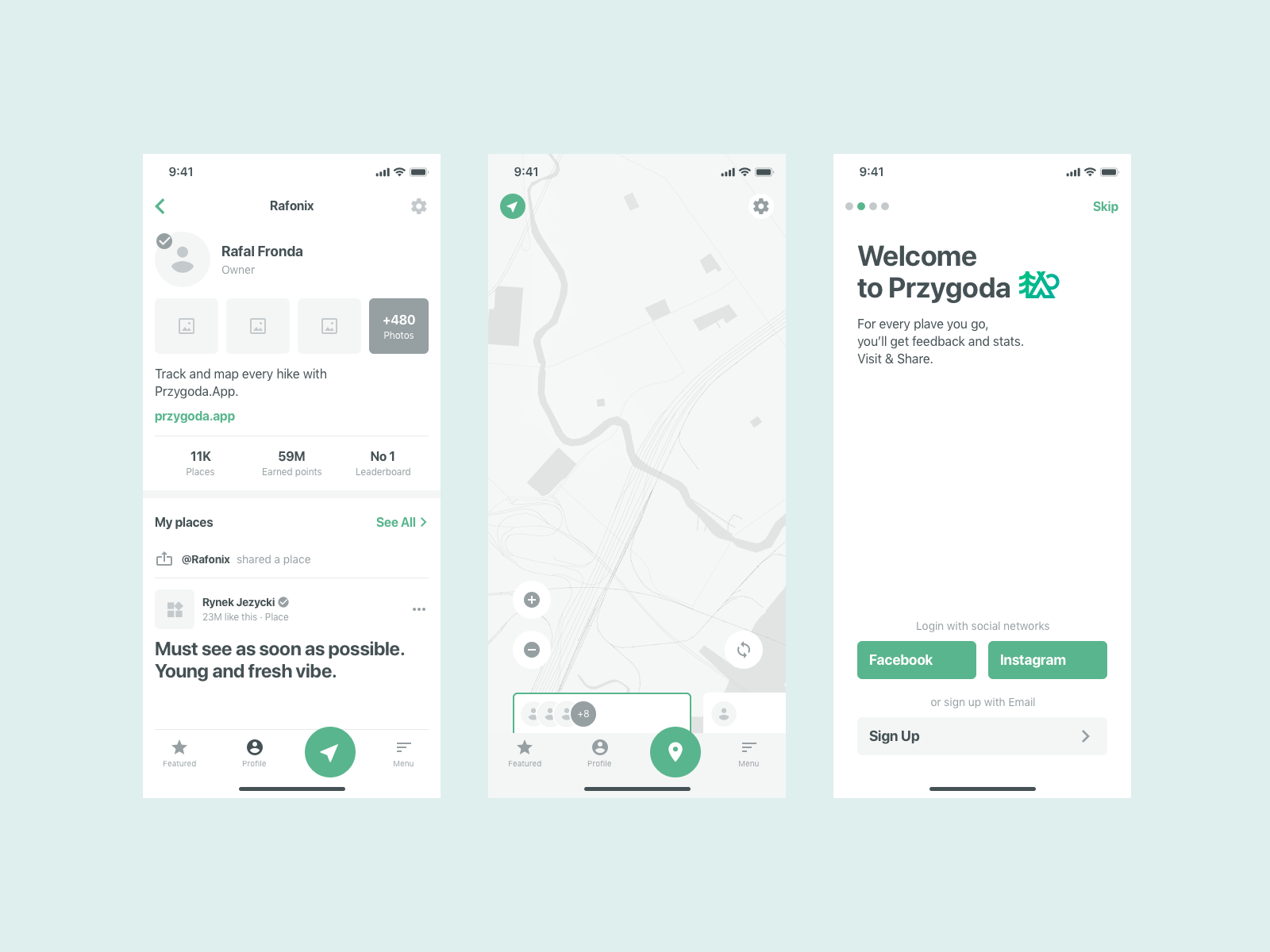
Adventure?s app wireframe examples are a mix of social network and map-based app screens. Wireframes are built in color and showcase the screens in a fidelity close to the final visual design.
7. Mobile app analytics
Author: Ketevan PhagavaPlatform: Mobile (iOS/Android)Fidelity: Medium
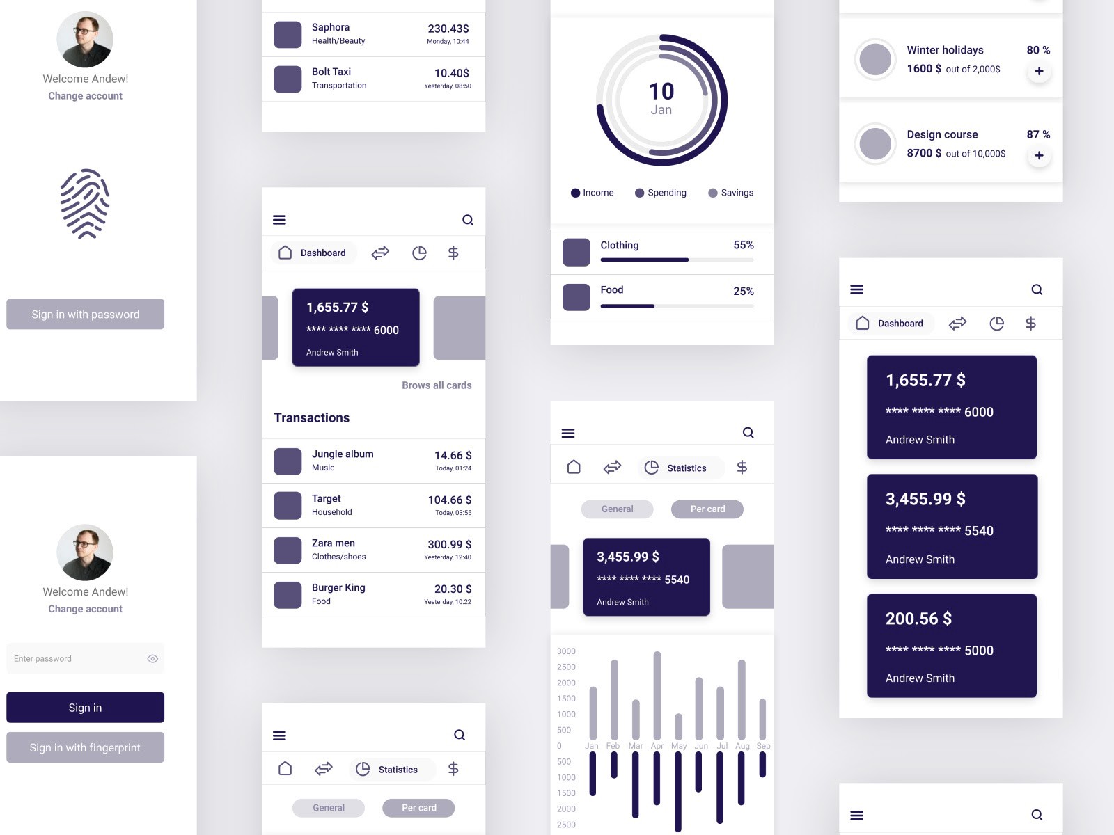
Mobile app analytics is a set of app wireframe examples designed for financial institutions such as banks. Data visualization plays a key role in this collection so you can see various charts and graphs that simplify the process of data comprehension. It?s a well-known fact that communicating information through visuals is a great way to make data engaging and easy to understand.
8. Web app dashboard
Author: Agnieszka KorberPlatform: WebFidelity: High
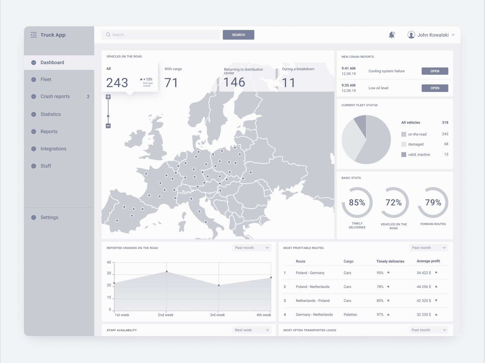
Web app dashboard is another project that demonstrates the power of data visualization. The layout contains a significant amount of information, but it doesn?t feel overloaded with too many details because it is designed using an F-shaped scanning pattern. As a result, the viewer will get a sense of valuable information in a glance.
9. Decision making app
Author: Inna HavrykPlatform: Mobile (iOS)Fidelity: Medium
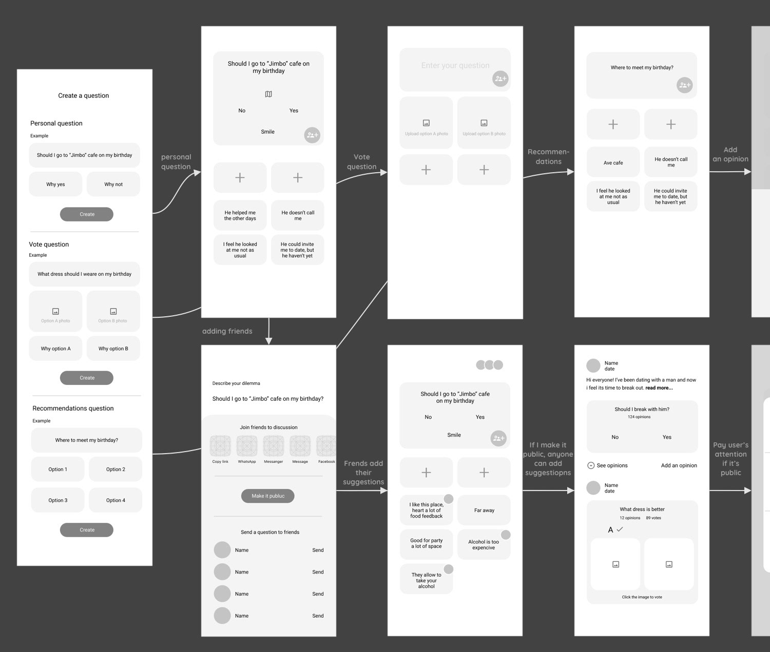
Decision making app helps users solve tough questions. The wireframes are provided in a format of user flow, and this format helps communicate the concept to the product team and stakeholders. The layout is minimalistic but contains all essential information and UI elements.
10. Media content for TV
Author: Andrew MialszygroszPlatform: Android TVFidelity: Medium
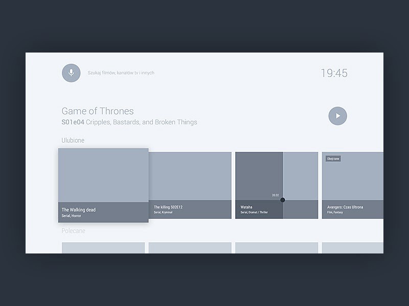
When it comes to designing for TV, it?s vital to adapt both for the large size of the screen and different ways of interaction (users will rely on a remote to interact with content). So it can be challenging to create a decent layout for a TV experience. This wireframe can be an excellent reference point for anyone who designs for TV. If you?re curious about what this wireframe will look like if you fill it with real data, be sure to check the following example.
11. Money transfer in a banking app
Author: Vadim KendyukhovPlatform: MobileFidelity: Low
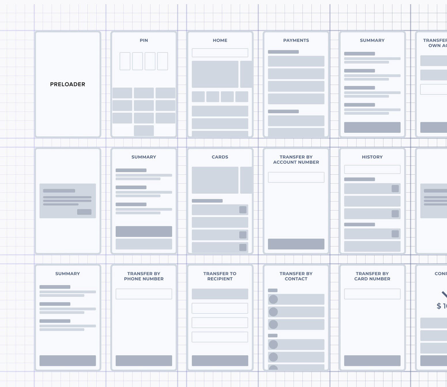
The wireframes listed below cover only one part of the banking app ? money transfer. According to the author, the user flow for this operation includes four main payment modules ? transfer by phone number, by card number, by account number, and transfer between own accounts. The wireframes are also provided in the format of user flow.
12. Smart House
Author: Villi R.Platform: MobileFidelity: Low
Villi R, the author of this wireframe, wanted to create a minimalistic but very user-friendly interface. He removed all the unnecessary elements and left only essentials. The wireframes listed below are created in low-fidelity, so they provide only a general sense of what the design will look like. If you want to see how the author turned those wireframes into the final design, be sure to check his case study on Behance.
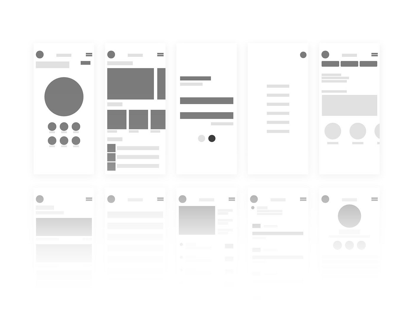
What are wireframes
A wireframe is a simplified and schematic visual representation of a layout for a website page or screen that focuses explicitly on the prioritization of available content and functionalities.
Why wireframes are important
The easiest way to think about a wireframe is in terms of building a house. It?s hard (or nearly impossible) to build the house without any plans. It?s equally hard to create the interface out of thin air.
A wireframe is the first visual representation of a designer?s abstract idea. Wireframing is a fast and cheap way to plan the structure of a page or screen design. Typically, wireframes are used by UX designers in the early design process. UX designers use wireframes to communicate their ideas about product design, and they allow them to map out the functionality of the pages, discuss the design, and catch problems early. In case the team wants to introduce some changes, a wireframe is much easier to reshape. So, at the end of the day, wireframes save a product team a lot of time.
What wireframes look like
Traditionally, wireframes are low-fidelity sketches or digital illustrations created from boxes and lines illustrating content blocks and navigation elements. The lo-fi wireframes give a product team a chance to see the basic structure of the user interface. By eliminating the color, imagery, and other visual details, designers are forced to think about the big picture ? the layout and functionality of individual pages and how they relate to each other.
However, modern design tools allow creating mid and even high-fidelity wireframes without much effort. Medium-fidelity wireframes are created in a monochrome palette, often gray-scale, which makes it similar to the previous one. But unlike lo-fi wireframes, the UI components in mid-fidelity wireframes are more detailed and realistic. Mid-fidelity wireframes also can contain real imagery, and this property makes the wireframe look more like mocks rather than wireframes. High-fidelity wireframes are static versions of the app screens or website pages, and they are beneficial during prototyping.
When to create wireframes?
Wireframing is especially useful at the beginning of the design process when the main objective is to create a product?s structure. Below is a general product design process:
- User and market research
- Defining the scope of work and estimation
- Wireframing
- Prototyping
- Development
- Testing
- Release
- Maintenance
As you can see, wireframing is not the first step of digital product creation, but it?s usually the initial phase of actual design when the future product gets its first visual presentation. Before a product team starts to create a wireframe, it needs to have a strong grasp on the user?s goals, motivations, and tasks they will want to complete.
Wireframing vs. prototyping
High-fidelity wireframes are often confused with prototypes because both are created in color and look realistic. Nevertheless, wireframes and prototypes are two different concepts, and they have different aims. Wireframes are focused mostly on the structure of the page. Prototypes, on the other hand, are all about interactions ? they created to demonstrate not only how the product will look but also how it will work for users. Prototypes allow testing of the interactions between the user and the interface, similar to the final product.
Five great wireframe kits for Adobe XD
Wireframe kits contain an assortment of graphic files, including UI components (input fields, buttons, progress bars, etc.) and even individual screens for the purpose of wireframing and UI design. Wireframe kits help you streamline your wireframing process, since you won?t need to create any individual components from scratch.
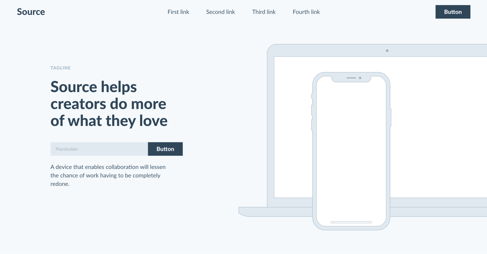
1. Source Wireframes
Platform: Web, Mobile
Source Wireframes is an excellent collection of XD ready-made layouts for desktop and mobile. The kit includes more than 500 unique layouts, 12 templates, and two color schemes.
2. XD UX Kit
Platform: Mobile
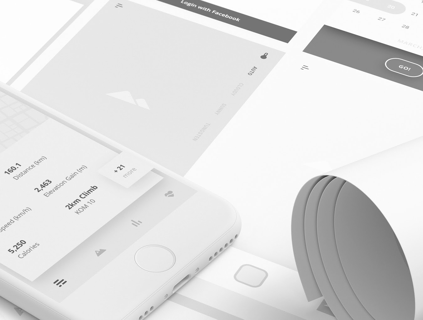
XD UX Kit is a mobile wireframe kit built specifically for Adobe XD. This kit contains seven mini-applications; each app includes seven screens + one key screen, and all common elements are converted into symbols. The kit also comes with a free video tutorial.
3. FreeWire
Platform: Web
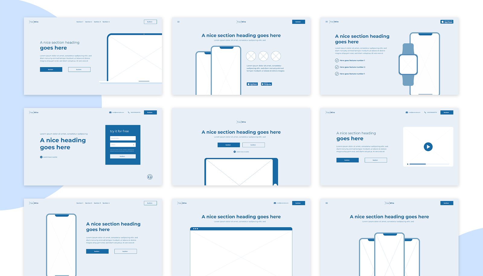
FreeWire is a free wireframe UI kit for Adobe XD. The kit includes 11 web pages and four device frames.
4. Platforma ? iOS XD Wireframing Kit
Platform: Mobile (iOS)
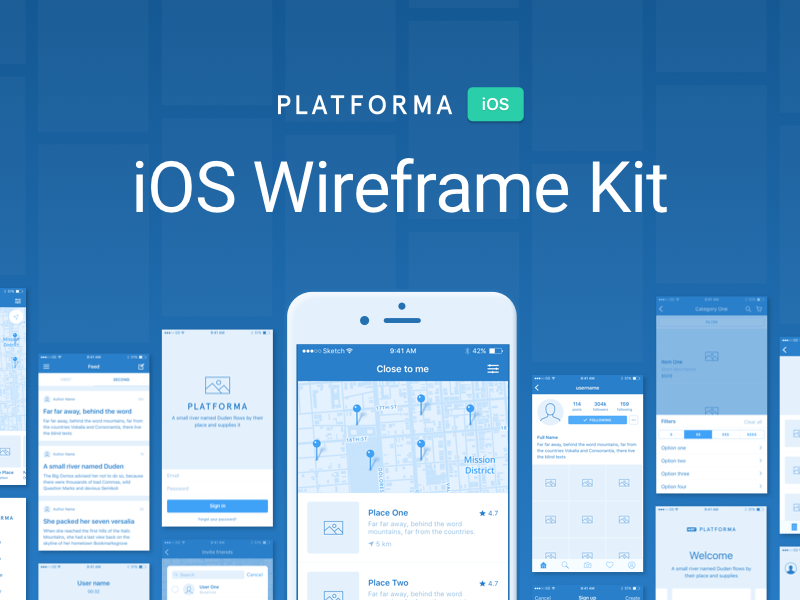
Platforma is a collection of 300+ screens made with care for iOS guidelines and divided into 28 popular content categories and carefully assembled for Sketch, Photoshop, Illustrator, and Adobe XD.
5. Wires
Platform: Mobile, Web
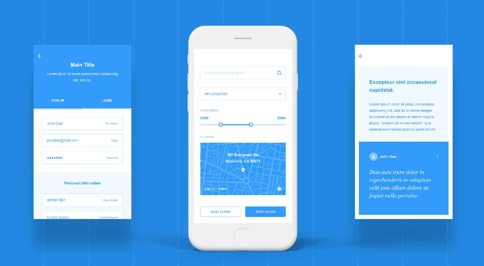
Wires are two free wireframe UX kits for mobile and web, built exclusively for Adobe XD. You will find 170 mobile templates, 90 web templates, and 240 components inside.
Whether you?re building a new website or mobile app, wireframes are invaluable in keeping everyone on the same page. Wireframes become a floor plan for your product, creating a vessel for which design and content can flow into. We hope that the wireframe examples listed in this article will serve as an inspiration when you work on your next digital product.
For more unique insights and authentic points of view on the practice, business and impact of design, visit Adobe XD Ideas.
To learn about Adobe XD, our all-in-one design and prototyping tool:
- Download Adobe XD
- Adobe XD Twitter account ? also use #adobexd to talk to the team!
- Adobe XD UserVoice ideas database
- Adobe XD forum
Originally published at https://xd.adobe.com.


