Helvetica is not a bad typeface per se, but nor is it the gold standard of type design that many starting graphic designers hold it to be.
Here are four reasons why you could argue Helvetica is (contextually) bad:
- If Arial is a rip-off, then so is Helvetica.
- It?s not consistent in style; it pretends to be modern, but it isn?t quite.
- It?s not at all legible.
- It?s badly hinted.
Rip-off
I don?t really want to make the argument that Helvetica is a rip-off. The notion of a rip-off is ultimately not very applicable in typography, where many typefaces are based on each other, historical typefaces are digitized by various foundries, and typefaces are made metrically compatible (which used to save time on older printing technology, as was the case with Arial). However, for those who consider Arial to be a rip-off of Helvetica, you should then consider Helvetica to be a rip-off of Akzidenz-Grotesk and Schelter Grotesk.
For a moment, have a look at the typefaces below.
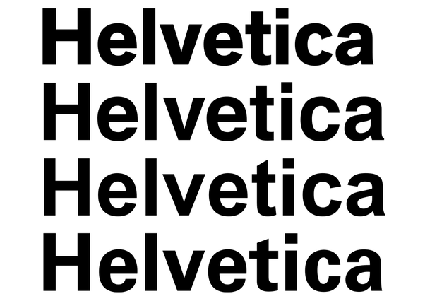 Akzidenz-Grotesk, Helvetica, Arial, and Univers.
As you can see, all four of these typefaces are reasonably similar, and there are many more typefaces that resemble these typefaces. But while Arial was designed to be metrically compatible with Helvetica, Helvetica was designed after Akzidenz-Grotesk (to the point of tracing letters from Akzidenz-Grotesk) to take over its popularity ? which it did. While Akzidenz-Grotesk is warm, Helvetica has been streamlined with horizontal and vertical (rather than diagonal) endings of letters, called terminal cuts. The remarkable thing is that while Helvetica was released in 1957, Akzidenz-Grotesk was released in 1896! That?s 61 years earlier. And yet, could you even tell?
Univers was released in the same year as Helvetica, and features an ?a? that more closely resembles the one of Akzidenz-Grotesk. Arial, released in 1982, features diagonal terminal cuts as is the case with Akzidenz-Grotesk, and a diagonal apex of ?t? which resembles Univers?. So rather than Arial being a rip-off of Helvetica, it was inspired by several typefaces, in the same way Helvetica was.
Rip-off or not, I don?t think this has any bearing on whether Helvetica is bad. However, Arial is often considered to be in bad taste due to the reason it was designed in the first place. If that is how you feel, then by the same token you should consider the creation of Helvetica to be in bad taste, too.
I?m not urging you to do that, though. I guess what I?m saying is, go easy on poor Arial.
Style
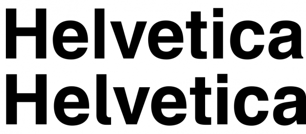
What has always bothered me is how Helvetica is presented as a modern typeface. As revolutionary as Helvetica might have seemed, let?s not forget that it?s based on late 19th century typefaces, so no surprise then that it retains some distinctly antique qualities.
Helvetica is indeed modernist, as it embraces minimalism and neutrality, which is invoked by the straight terminal cuts. However, the letter ?a? rather stands out. Instead of sharp corners as can be seen everywhere else in the typeface, it has this teardrop bowl that curves into the stem. Not only that, but it features a serif-like spur (the foot on the lower right); a feature that is seen nowhere else in the typeface except for the leg of ?R?.
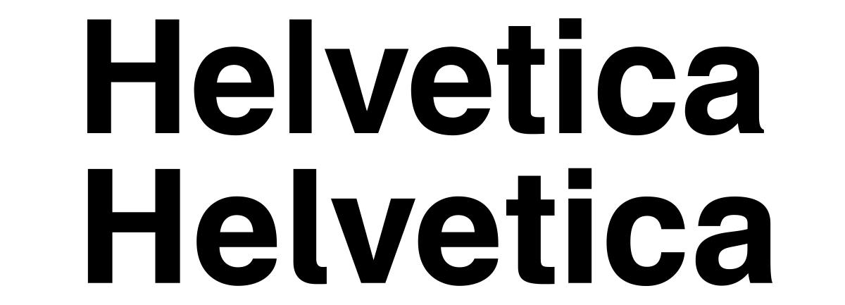
In the image above you can see Helvetica and Schulbuch Nord. Schulbuch features an ?a? that is much more in line with the spirit of the typeface; in terms of style and texture, it?s a lot more consistent.
Legibility
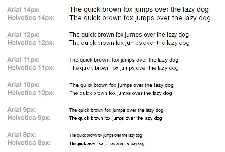
And here is the best reason for why Helvetica could be said to be bad, which is that it?s very low in legibility. Legibility is the ease at which letters can be differentiated from each other. In the case of Helvetica, some characters are quite hard to tell apart. In the image below you can see that at small sizes, some of the letter combinations of Helvetica become disastrous both in terms of legibility and readability.
 Image by Erik Spiekermann
Clearly, Helvetica is not a great typeface for body text. In fact, with its closed aperture (closed letterforms), it?s quite a horrendous choice for body text. Even Arial performs better both in terms of legibility and readability (due to greater differentiation between letters, and slightly more open letterforms), but there are many better sans-serif typefaces to choose from for body text.
Helvetica is fine when used for headings and logos, but if you consider using it for body text ? in print or on the web ? do reconsider your choice.
Hinting
Typefaces on the web ought to be properly hinted, which means that rules are assigned to the typeface in terms of where each pixel is located, which depends on the size of the text and the resolution of your screen. As it happens, Helvetica is lacking proper hinting.
In the Mac environment, the rendering engine takes care of it all, and so typography will look smooth (though not always equally crisp). In the Windows environment, how well typefaces render depends on the hinting of the typeface itself. Typefaces in the Windows environment are crisp but at times less accurate to the actual typeface, while in the Mac environment the typefaces are accurate, but may have pixels located in places where they shouldn?t be.
In the image below you can see Arial and Helvetica at different sizes, and you will probably conclude that Arial is (far) superior when it comes to the quality of rendering. Yes, it does become a bit blurry at smaller sizes, but at least pixels are located where they should be (unlike the ?n? of Helvetica at 8 px), and don?t create dark patches (at 8?10 px) or render letters unreadable (at 8 px).
The hinting of Neue Helvetica is better already, but I still wouldn?t recommend it for the web at all.
Update 2019: Helvetica has now been reincarnated in the form of Helvetica Now, which I assume has better hinting, and which includes a micro version for very small text.
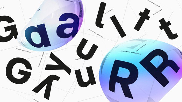 Image attribution: Monotype

