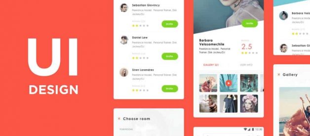

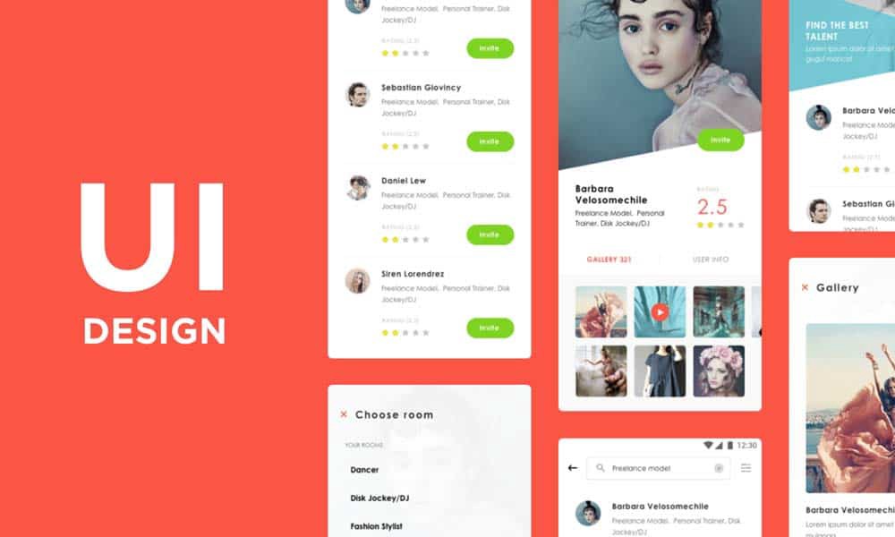
What Makes a Good User Interface? 13 UI Design Principles
Creative visuals, attractive logo design, or intricate animations? What makes a good user interface?
The definition of an effective UI is very vague and usually contains such words as clear, consistent, simple, and user-oriented. But what does it really mean?
The question is especially critical if you are considering IT outsourcing. Knowing the main principles that turn a user interface into a powerful tool for user generation and retention, you will be able to find the best vendor for the task.
So, let?s not nibble around the edges but dive right into the main principles of an effective and attractive user interface.
What is a User Interface?
Before we move to the main principles of a good user interface design, it is crucial to understand what is hiding behind the two-word definition.
UI is not about attractive visuals and design of elements. User interface defines the interaction between a user and a product.
It is not about deciding which colour to choose and where to place buttons. It is dedicated to the choice of the right visual tools for the set technical tasks.
The vast majority of users do not think about software architecture and back-end processes when interacting with an app or website.
A good user interface should both clearly broadcast the right message to the end-user, meet their needs and wants as well as get in line with the technical implementation of the software.
This is why it is necessary to understand and apply the best practices to create top user interfaces.
The 13 Principles of a Good User Interface
The following is a list of what makes an attractive and intuitive user interface inside a web or mobile app application.
1 ? Clear and intuitive user navigation
Where is the main menu? If you have ever asked yourself the same question, you?ve probably had to deal with a poorly designed user interface.
While it should be visible to users, it should be ?invisible? in terms of user disruption.
A highly qualitative user interface should consist only of necessary elements and have a good structure.
You may also like: The Ultimate Guide to Colour Psychology in Branding
A well-created UI takes user experience in a priority.
For instance, a car-renting website should not be cluttered with unnecessary buttons, menus, and visual elements but rather offer the option to rent a car right on the main screen.
Thus, it will decrease the time users need to navigate your solution to accomplish a task.
2 ? Target audience is well defined
A digital product with a clear understanding of its target users can achieve higher user retention and engagement.
The main task of any web or mobile app is to solve users? pain points, which is impossible to do without knowing how they interact with an application.
Preliminary and in-depth market research, engagement of the best practices from similar products, as well as evaluation of the target audience, is a cornerstone of a good user interface.
This allows acting on the needs and wants of a user from such an analysis and transfer the solution to the pain points on the app interface.
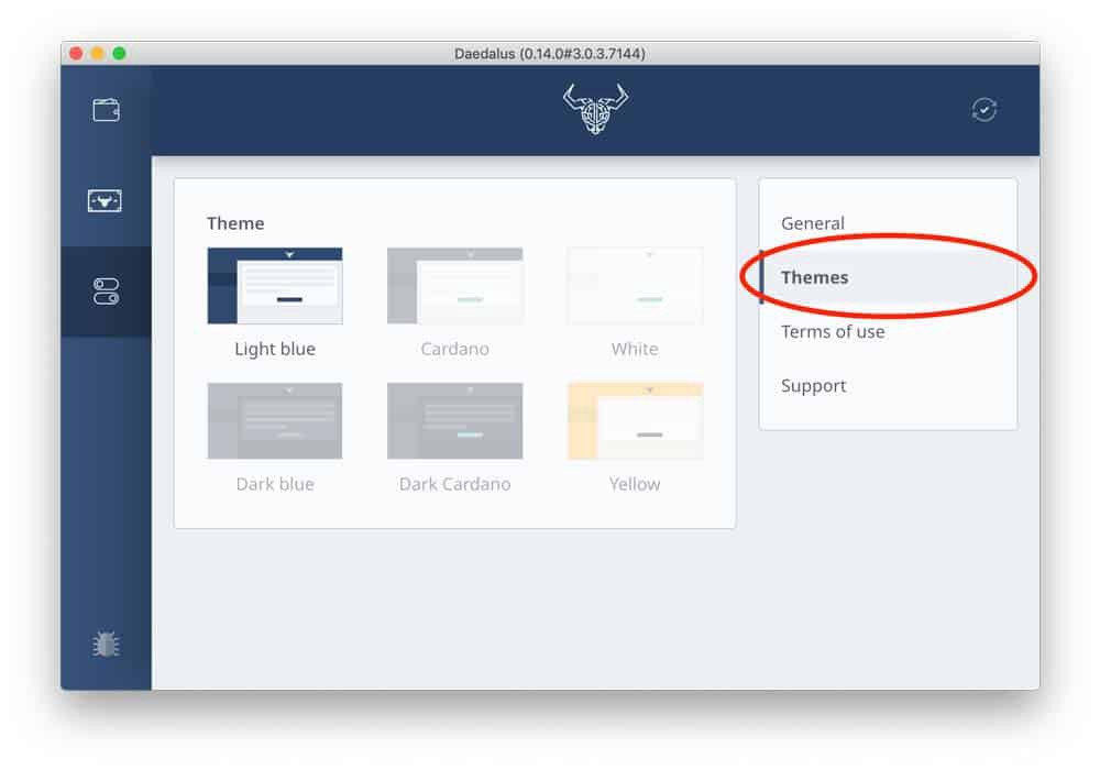
3 ? Consistency is the key
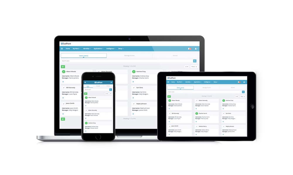
The problem of consistency is persistent in good user interface design.
It concerns everything: from colours, icons, and fonts, to the placement of menus and buttons.
The issue becomes even more critical if changes are due and the designers who worked on the first version are no longer available.
Top digital solutions do not surprise their users with drastic changes. Instead, they use brand books and company style guides to follow the unified style and consistency throughout UI design.
4 ? Transparency of user actions
When clicking on a button, you expect to see some feedback. Leaving users without any is considered to be bad manners in UI design practices.
When users click on a menu, a good practice is to confirm the action with some indication of successful operation, like animation, colour change, pop-up window, progress bar, etc.
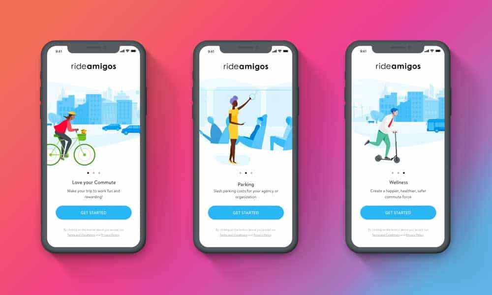
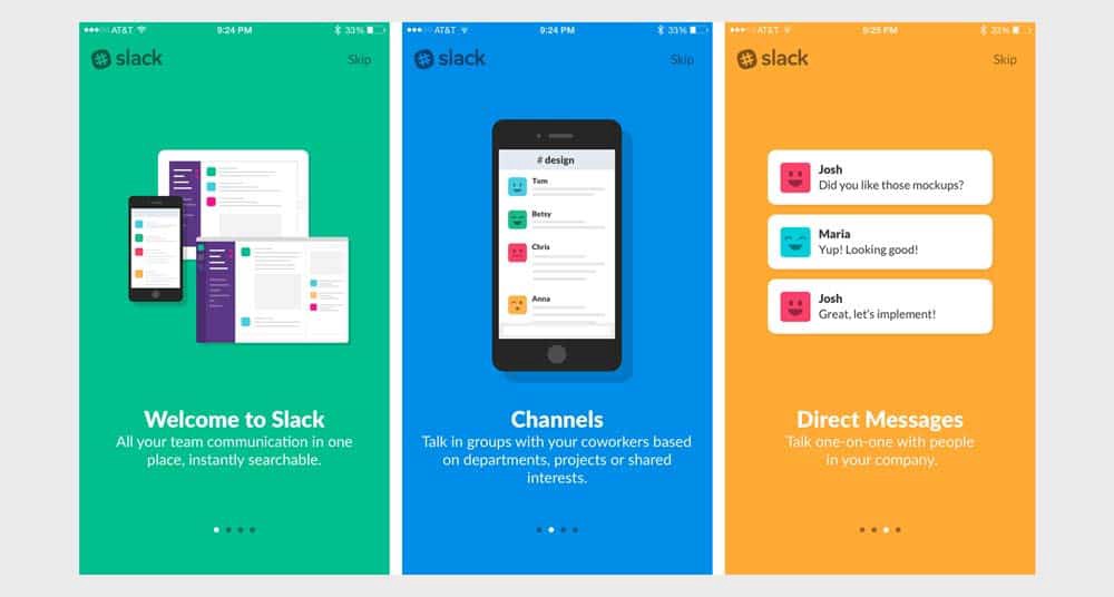
5 ? Familiar UI elements

Intuitive design ? you have probably heard this definition a time or two. The reason is the importance of making a UI seem familiar to end-users.
This means that after they open your application or run the software, they do not need to ask what to do next.
The hamburger menu is a great example. When users see these three lines, they instantly know where to find and how to open the menu.
6 ? The hierarchical order of app screens
One mistake some inexperienced designers make is trying to highlight everything on a single screen.
Instead of leading customers to a purchase or any other desirable action, they overwhelm them with the flood of information.
That is why hierarchy is an internal part of a successful UI.
It should be designed in a way that will allow users to quickly find the point of focus and understand what you are trying to convey with the help of visual means.
7 ? Top-notch attractiveness
Despite being a little bit controversial concerning others, this point is critical.
You may also like: 7 Proven Strategies for Creating SEO Friendly Images
A good user interface is the one that is attractive and reflects the personality of the brand.
Buttons, colours, fonts, and visual elements create a unique brand story.
What might seem attractive to one group of users might be repulsive to another group.
That is why a successful user interface should be based on thorough research.
What is more, the visual aspect of user design should reinforce functionality.
Popular and famous applications do not apply colourful visuals that have no real value for UI.
8 ? Design is made for people
Nobody is perfect. The same goes for users who sometimes make mistakes.
The interface should be designed in such a way that it can quickly address any issues.
Has a user accidentally deleted an important file? Provide a method to restore it quickly.
This way, users will not get frustrated with your application if they mistakenly tap the wrong button.
9 ? Proactive user interface
While predicting what users will need in the future is not a simple task, the most successful digital solutions do just that.
They are based on the proactive approach and foresee the needs of end-users.
Let?s take eCommerce, for example.
If the holiday season approaches, customers are very likely to look for gifts. The main task of a designer is to provide them with an easy way to find the needed products.
The goal can be achieved with the placement of a banner on the main page that redirects to the page where all possible gift ideas are gathered.
Turning a proactive approach into the icing on the carefully designed UI is always a good idea.
10 ? Everything is easily accessible
Users do now like searching for a solution to their tasks. That is why a good UI should be reinforced with tabs, shortcuts and hover tooltips.
Such elements make the interface more intuitive and user-friendly.
For example, if an app provides the functionality to upload photos, it should have the buttons to crop, resize, rotate, and edit the image right next to it.
The goal of the designers is to help users figure out where they can find such options and whether such features are provided at first glance.
11 ? Additional tips and tricks
User retention is the main task and, at the same time, the main struggle of any digital product.
Fortunately, the goal can be achieved with an effective user interface.
You may also like: The Best Drawing Apps for iPad and iPhone
A good practice for very complex solutions is to create onboarding tips and show them to customers.
By placing little tips here and there, like hover tooltips, the UI carefully guides them through the app and helps to remember what each element is responsible for.
12 ? Number of gestures is limited
Swiping, tapping, pressing, gesturing, or voice command. All of these actions are used in the user interface to lead customers to needed results.
Even though it might seem like a bright idea to utilise them all within an application, top interfaces like WhatsApp or Facebook stick to the limited number of gestures.
When working with an application, users should have a clear understanding of the actions they need to perform to get the desired result.
If tapping is used to open a file, the same gesture should be used in all similar instances.
13 ? Compliance with design standards
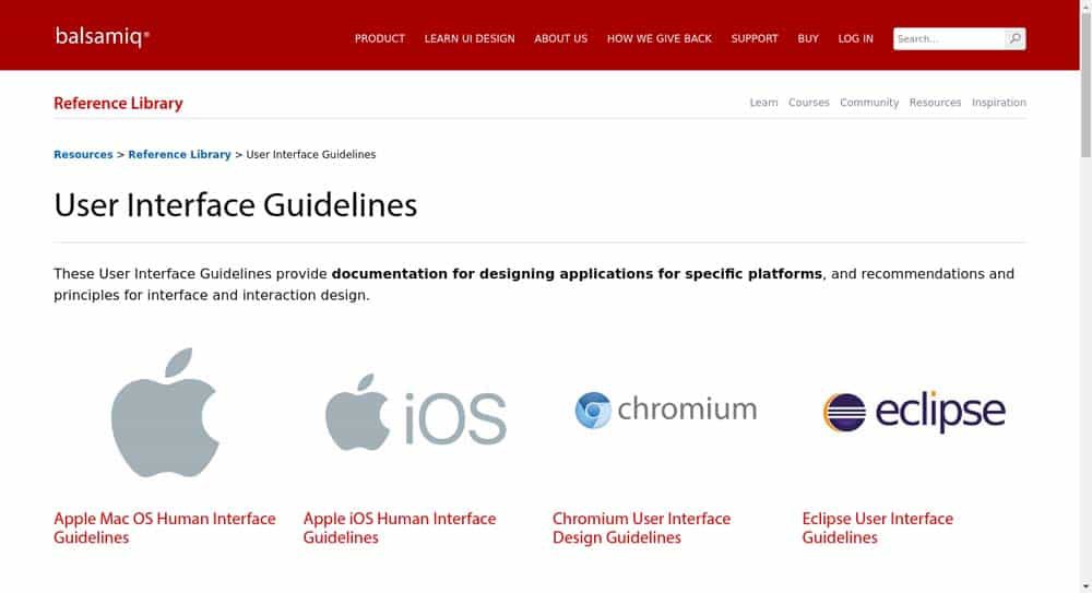
As it was already mentioned, users need to know what to expect from a user interface.
Following the primary and well-known design standards for Android by Google and iOS by Apple is a good idea.
For example, let?s take a search bar.
Moving it from the top of a page to its bottom is not the best idea.
This way, UI will not accidentally make users struggle to perform actions that should be intuitive.
Concluding Ideas
Creating a beautiful user interface is simple.
Creating a functional and user-friendly interface is an entirely different story.
So, let?s repeat everything you have learned.
A good user interface utilises the following principles:
- well-defined target audience
- intuitive user navigation
- consistency throughout a digital product
- feedback on user actions
- familiar UI elements
- the hierarchical order of elements
- attractive visuals
- design is made for people
- proactive approach
- all features are easily accessible
- tips and tricks are included
- a limited number of gestures
- compliance with design standards
These tips and approaches are utilised by top digital companies like Apple and Google.
At the same time, these companies always innovate to make their solutions stand out while keeping the interface intuitive to end-users.
Author Bio: Ana Lastovetska is a technology writer @ MLSDev, a web and mobile app development company in Ukraine. She has been researching the field of technologies to create educative content of distinct topics, including app development, UX/UI design, tech & business consulting, etc. The opportunity to deliver information for people who want to understand more about IT and app development processes is something that inspires Ana. You can get in touch with her on LinkedIn or reach her at [email protected].
Originally published at https://inkbotdesign.com on January 24, 2020.

