Hi everyone. In this article I am going to discuss everything about box plots. But before we get started you may ask why box plots? Why are they so special? You see, box plot is a very powerful tool that we have for understanding our data. Using box plots we can better understand our data by understanding its distribution, outliers, mean, median and variance. Box plot packs all of this information about our data in a single concise diagram. It allows us to understand the nature of our data at a single glance.
Consider the diagram below:
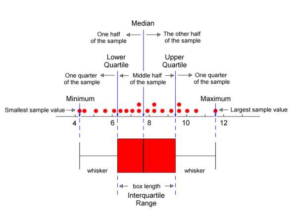 Image source: (http://web.pdx.edu/~stipakb/download/PA551/boxplot_files/boxplot4.jpg)
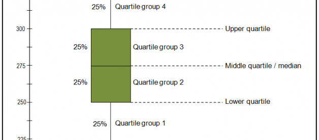
Every box-plot has two parts, a box and whiskers as you can see in the figure above. That?s why it is also sometimes called the box and whiskers plot. The start of the box i.e the lower quartile represents the 25% of our data set. So by looking at the diagram we can instantly conclude that 25% of our data has a value less than 6.2, similarly the end of the box i.e the upper quartile represents 75% of our data. So again from the diagram we can conclude that 75% of our data is less than 8.8. The bold black line in the box represents the median value of our data. In our example the median lies at about 7.8. The difference between the lower quartile and upper quartile is called the inter-quartile range. So basically the entire red box represents the inter-quartile range.
The following diagram will explain the quartiles even further:
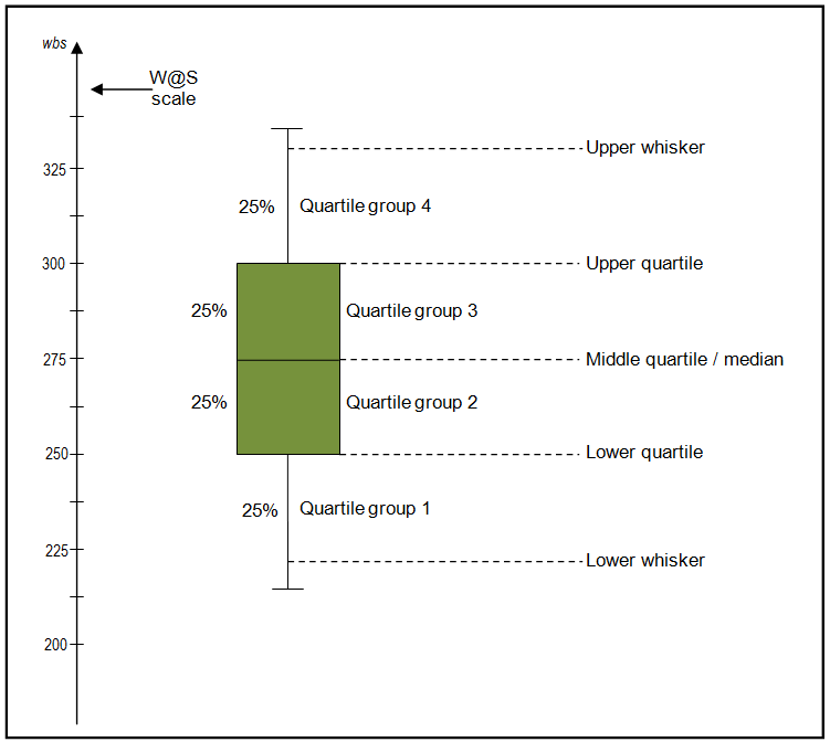 Image source (http://www.wellbeingatschool.org.nz/sites/default/files/W@S_boxplot-labels.png)
Now for outliers
Now lets talk about the whiskers of boxplot and how do we visualize outliers in a boxplot. In box plot the whiskers are generally defined as 1.5 times the inter-quartile range. Anything this outside the whiskers is considered as an outlier.
 Image source (http://www.itl.nist.gov/div898/handbook/eda/gif/boxplot0.gif)
Identify Skewness
We can also identify the skewness of our data by observing the shape of the box plot. If the box plot is symmetric it means that our data follows a normal distribution. If our box plot is not symmetric it shows that our data is skewed. You can get a better understanding by looking at the diagrams below:
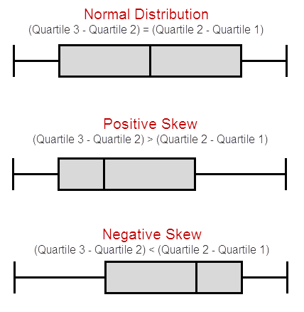 Image source (http://datapigtechnologies.com/blog/wp-content/uploads/2014/11/111714_1527_MethodsofMe7.png)
Here is a box plot with respect to the distribution curve:
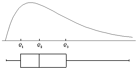 Image source (https://onlinecourses.science.psu.edu/stat500/sites/onlinecourses.science.psu.edu.stat500/files/lesson02/rt_skew.gif)
I hope this article helped you in understanding box plots at least to some extent. Stay tuned for more. Bye 🙂 !
