Choose Fonts, Set a Hierarchy, and Integrate with Components
Everyday digital interfaces include a rich variety of images, visualizations, and other pictures. However, more than anything else, they are made of words. Oh so many words. As we equip teams to design and code usable, consistent, beautiful interfaces using systems, it?s essential that words depend on a strong foundation of typography.
I?ll admit, I am not a typography expert. I lack a graphic design degree. I?m never the person choosing a font, scaling type, or finessing letter spacing. As a result, I?ve always been reluctant to write about typography.
On the other hand, I am a pattern hunter. Over the years, I?ve contributed to many design systems that set a foundation for typography. Each traversed of steps and decisions to set a foundation and apply it to an emerging library of interface components. This article summarizes those patterns.
Typography starts by setting a foundation of font families and weights along with fallbacks. It then explores how to build hierarchy using size, color, additional details like line-height, and layering responsiveness. Those models are then applied to components in a system?s library (like Article and Header) as well as custom components made by other teams.
Fonts
Before you dig into details, you have to settle on basics: font(s). Through exploration, comparison, research, and often ? for large companies ? making a font themselves, every display cascades from and depends on this choice.
Families, Weights, and Fallbacks
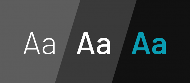
While systems can vary fonts based on theming, most ground themselves initially by identifying primary serif and/or sans-serif font family. Each font is augmented with a cascade of fallbacks (Hello, Arial and Times), and many systems throw in a monospace font for code displays (even if only their own).
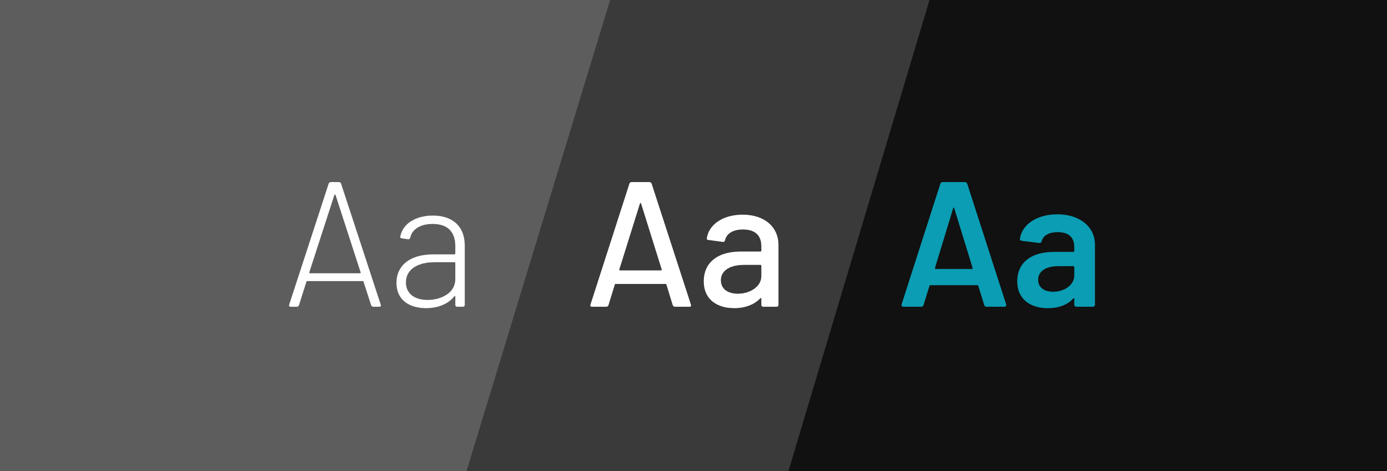
 Type specimens across three weights of the Barlow font
Some systems can get away with as few as two or three weights of their primary typeface, seeking to balance variety and flexibility with governance and download weight.
Takeaway: Getting to a primary font isn?t always hard, but choosing what weights to include carries long term consequences. Adding fonts and weights is easy. Managing download size and changing them is hard.
Getting the Fonts, Whether by Download, Link, or CDN
Whether or not a design system program owns the fonts, users of a design system expect a system to provide the instructions necessary to use the fonts.
From a designer?s perspective, it?s all about downloads. Some fonts are tightly held intellectual property with very intentionally limited sharing. So, at a minimum, a Typography page must provide direct download or instructions on how to get approval to obtain them. Most teams provide a downloadable ZIP that includes all the files you need to install and use fonts locally.
For developers, it depends on approach, providing options like:
- Direct font download to serve the fonts themselves
- Instructions for linking to a service like Google Fonts
- CDN references that all products refer to collectively
- An invitation to contact a technical architect, since a license for the font is required. Organizations requires this to control the recurring and often non-trivial cost of hosting and serving the font.
Takeaway: Fonts are needed by different people in different ways. System users expect the system to explain how to use everything easily, even if it?s not the system team?s job to make custom fonts or serve fonts themselves.
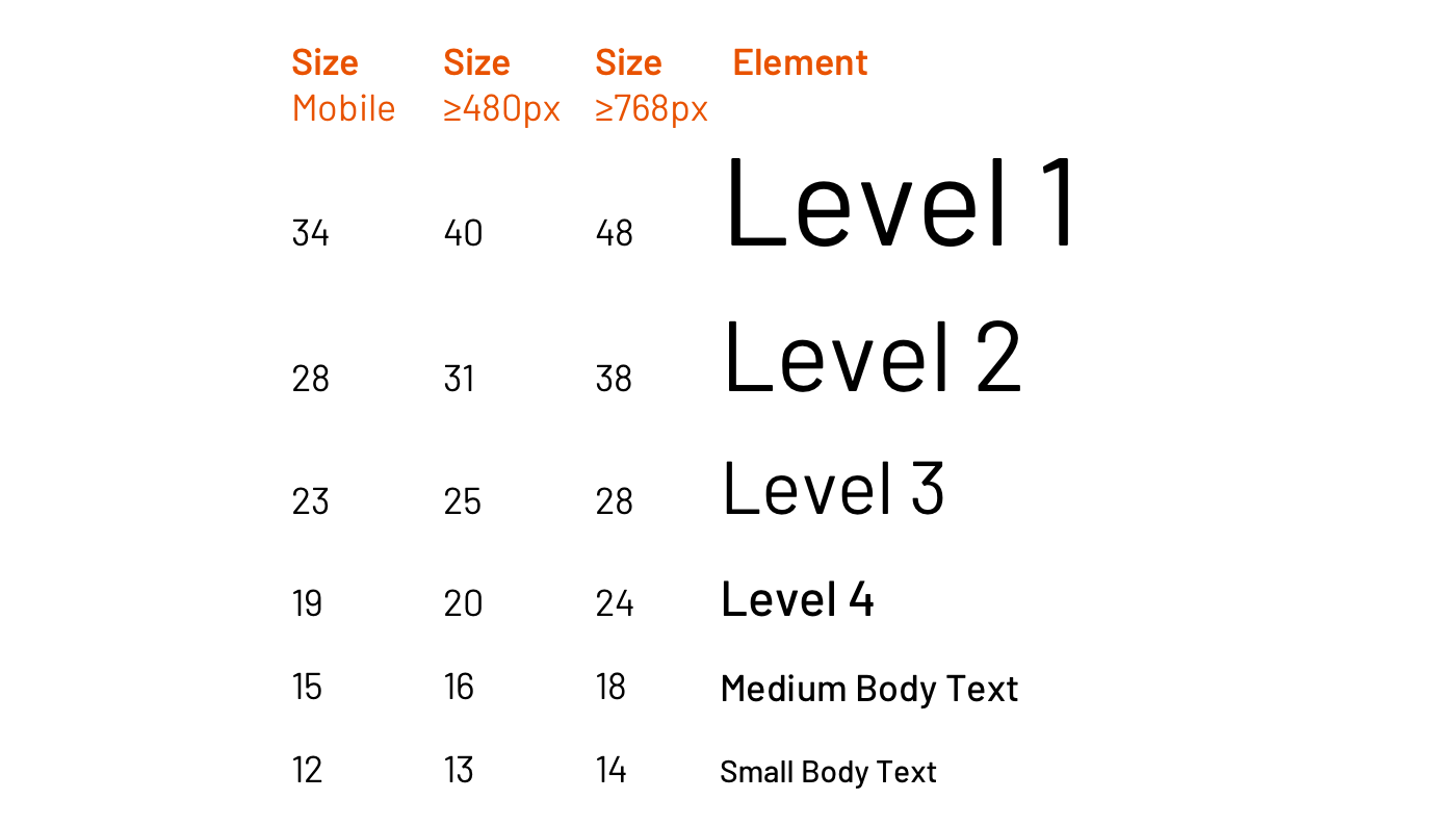
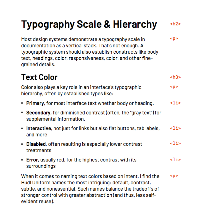
Typography Scale & Hierarchy
Most design systems demonstrate a typography scale in documentation as a vertical stack. That?s not enough. A typographic system should also establish constructs like body text, headings, color, responsiveness, color, and other fine-grained details.
Body Text
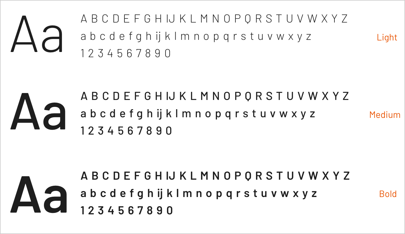
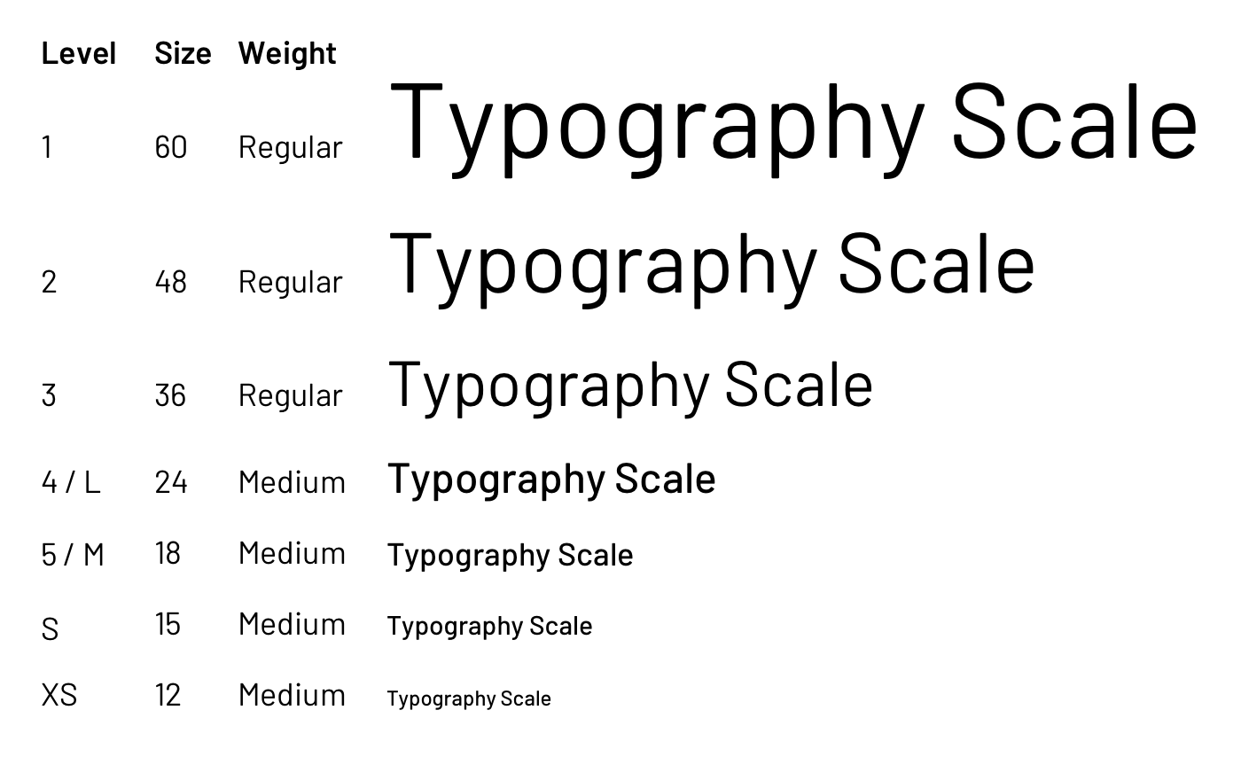
Systems leverage a type scale to offer core text sizes ? often named simply as text or body ? that include small, medium, large, and if you need it, xs, xl, and so on. Most systems need three or so (thus, my comfort with using t-shirt sizes). Start with a few and expand as necessary as component designs ? and page compositions in the wild.
 Small, medium and large text sizes
Body copy may also offer a distinct ?Lead? (alternatively, ?Lede?) paragraph to open a page, such as in an article (more on that later). Thus, a simple S/M/L scale may also need other variants lead. This is especially relevant in systems offering multiple sizes, since a Lead for larger, lower density displays would be larger than a Lead for smaller, high density alternatives.
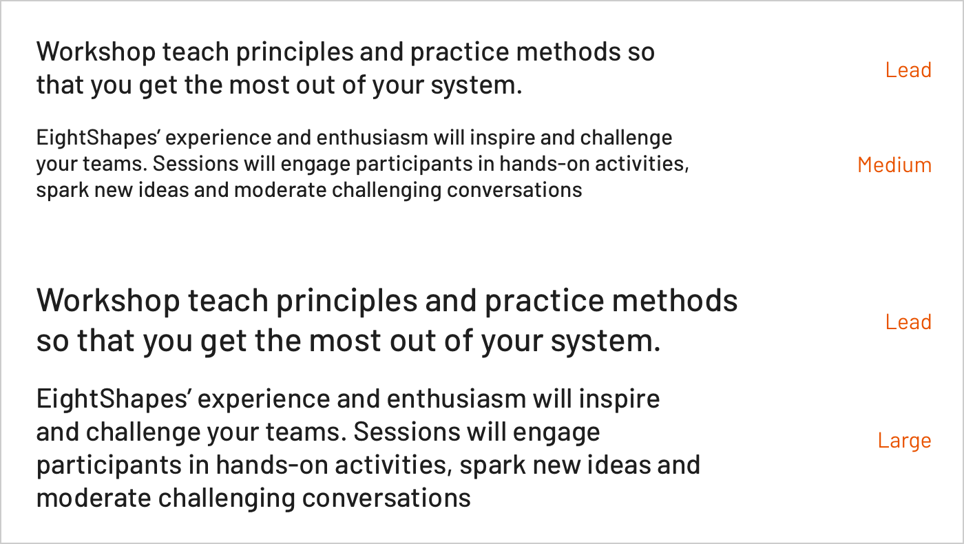 Contrasting a Lead paragraph from medium or large text
Takeaway: Keep body sizes simple and few, but allow for specific variants outside the scale. Since body copy weaves through most components, these options each offer properties ? size, weight, line-height, ? ? to tune to get each just right.
Text Color
Color also plays a key role in an interface?s typographic hierarchy, often by established types like:
- Primary, for most interface text whether body or heading.
- Secondary, for diminished contrast (often, the ?gray text?) for supplemental information.
- Interactive, not just for links but also flat buttons, tab labels, and more
- Disabled, often resulting is especially lower contrast treatments
- Error, usually red, for the highest contrast with its surroundings
When it comes to naming text colors based on intent, I find the Hudl Uniform names the most intriguing: default, contrast, subtle, and nonessential. Such names balance the tradeoffs of stronger control with greater abstraction (and thus, less self-evident reuse).
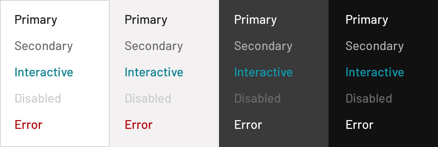 Text color across backgrounds
These types are typical, encountered during early component designs like button, input and link. As a library grows, they become littered throughout the component catalog via tools like tokens and mixin. Notably, they become necessary as component designs span in light and dark settings.
For example, in the eightshapes.com library (far less rigorously maintained, cobbler?s children and all), we employ a text coloring mixin that iterates through background colors, by type.
Takeaway: Typographic hierarchy isn?t limited to size and weight; color carries considerable impact too. Design systems require consistent color application to create contrast within and across components, and relying upon well-modeled types is essential to managing such relationships.
Heading Levels and Special Cases
Headings are a critical contributor to page hierarchy. Most systems offer at least four, although some offer many more. Page titles usually (but not always) align with the largest heading level. Remaining levels are woven throughout components: a Card title here, Alert Message title there, and Modal two level title too.
Additionally, some systems offer specialized headers outside the typical heading scale, such as a picture?s caption or an eyebrow (see Morningstar Design System). Just because a header exists outside the traditional scale doesn?t mean it?s not a header viably reused across a catalog.
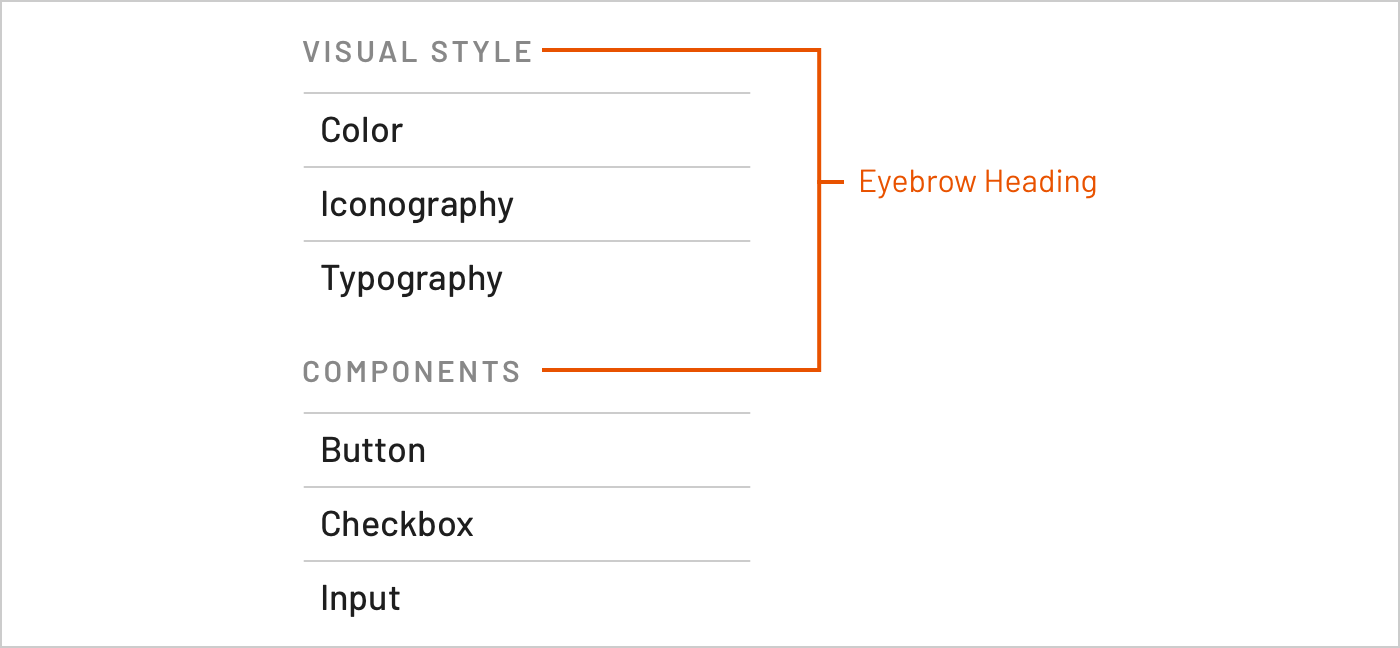 Eyebrow heading
Systems can offer more sophisticated combinations of headings and body text, too. For example, IBM Carbon grounds typography in the IBM Plex typeface, and distinguishes headings relevant for either web-based product (Productive) and digital marketing (Expressive) interfaces.
Takeaway: Solve for just enough heading types , and layer more complicated header controls only as needed and context is clear. Usually, four to six heading level and a sprinkle of special variants will do.
Heading Levels ? H# Tags
In HTML, heading tags assign semantic meaning to an element?s role within a page?s hierarchy. However, a component?s tags don?t or can?t align with each every page?s HTML on which it?s used, especially across pages or a whole app. In addition, what might be the largest heading on one screen (such as a product spec?s page title) may be the third largest heading on another page (such as a product?s home page).
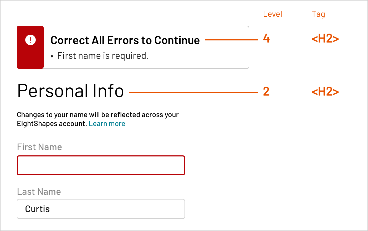 Heading levels distinct, yet using same HTML tag
As a result, I strongly encourage teams to separate the concept of heading level (the visual outcome of applying style properties) from H tag (HTML elements like H1, H2, H3, and so on).
Takeaway: Applying heading scales shouldn?t require use of a specific HTML element. Instead, tease apart the two concerns. A system should weave heading levels consistently throughout components and offers tools for adopters to do the same with their custom creations.
Line Height & Other Properties
Typography is influenced by many other properties, including:
- line-height
- alignment (rarely controlled at the system level, usually defaulting to left)
- letter-spacing
- text-transform (such as uppercase)
In particular, line-height is challenging. In some libraries, we?ll use conventions and tools to crop away negative space established by line-height from all text included in components, as described in Space in Design Systems.
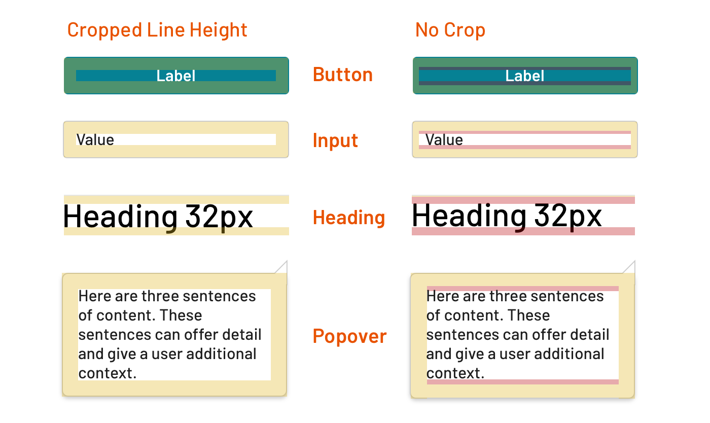 Cropped line height vs text elements that include impacts of line height
Libraries cropping line height include Morningstar Design System, Discovery Education?s Comet Design System, and ~50% of others we?ve made since 2016. In all the other libraries, we?ve ?let line-height do its thing,? predictably colliding with padding of containing elements.
Takeaway: As a system gets started with type, dig into details and start some conventions, such as how you?ll cope with line-height. However, avoid finalizing all rules before making the first thing. Instead, be comfortable with chaos early and smooth details as a library takes shape. As you near a major release, lock in conventions and ensure tools are consistently applied.
Responsive Typography
Systems can offer centrally-tuned responsive type sizes across a predictable set of breakpoints. For body text, size increases slowly. On the other hand, larger headings can increase dramatically across those same breakpoints.
If responsiveness is included, a system must choose whether it?s ?always on? or optional. If it?s optional, is responsiveness on or off by default? If off by default, responsiveness may be enabled via an API for tools like mixin like sys-heading-level-2:
@mixin sys-heading-level-2($responsive: false);
and CSS modifier class like sys-header–responsive:
<div class=”sys-header sys-header–responsive”> <h2 class”sys-header__title”> Heading </h2> <div class=”sys-header__actions”>…</div></div>
Systems can release components that lack responsive typography. It?s OK. Don?t feel too bad. In fact, some systems lack centralized responsive type controls for months or beyond a year. However, doing so risks a cost down the road. So early technical design may be warranted so that code tools and testing plans anticipate responsiveness eventually.
Takeaway: While an MVP might not solve for it, responsive typography is a hallmark of a mature, stable system. Establish a scale per breakpoint, and make invokable at varying hierarchy composition levels: by element, by component, by region of a page, and for an overall page.
Relating Typography to Components
If Tempted to Reset Pages, Control What You Can Control
In rarer ecosystems, a system is central and authoritative. It defines how all front end development works and how all pages are constructed. In most enterprises, including those I serve, a system lacks that luxury. One product may integrate code of many product squads depending on different system versions or system altogether.
In those scenarios, a system can?t rely on page-level resets. Instead, elements are reset at a boundary that is controlled, such as a component block mixin?
.system-button { @include component-font-reset(); …
?to reset at least a range of type properties, such as:
Takeaway: There?s hubris in believing a system controls everything on a page, convinced it won?t collide with anything other styles. So fortify what you ship in the context you control, including reseting elements for typography.
Tools for Adopters to Make Components Themselves
A system never offers ?all the components you?ll ever need.? Adopters build anywhere from 30% to 70% of their remaining interface . Therefore, they?ll depend on system tools to style text in what they build, such as Sass mixins.
For example, an adopter could want to apply a heading to title element?
.my-custom-component-title { @include system-level-3-heading();}
?in order to obtain system-compliant CSS like:
.my-custom-component-title { font-size: 24px; font-family: “Barlow”, …; font-style: normal; font-weight: “Semibold”; line-height: 1.2;}
While code tools shouldn?t overwhelm gorgeous typography doc, that page is a reasonable location many developers should find handy, powerful tools.
Takeaway: Don?t limit access to typography using only pre-built components. Instead, empower users to make their components aligned with the system?s typography. Lower level tools help and lead to clean contributions later, too.
UI Typography ? Articles (former lacks spacing)
A misconception I debunk early and often: developing a typography system for UI components is equivalent to solving for long-form reading displays involving mostly headings and body text.
This isn?t the case, since:
- Article typography is made of headings, body text, and a few other components (like an captioned image); UI typography addresses a very diverse range of components and elements within.
- Article typography density tends looser.; UI typography density varies.
- Article typography headings start at 2 and ascend one by one; UI typography uses irregular combinations of heading levels like 3, 4 and 5.
- Articles command a main, often wide column down the middle of a page; UI typography occupies spaces narrow and wide all over a page.
- Articles typography include a small set of predictable combinations; UI typography addresses an incalculable quantity component combinations.
- UI typography resides in many-column layouts across which text is impossible to align consistently on a shared baseline grid. Frankly, I don?t even try. Yet, baseline grids dominates discussion of article typography.
Takeaway: Typography contexts around a UI vary substantially, and an article format is just one among many. Separate rules applicable across a UI component library from those relevant to narrower contexts like an article.
The Header Component
Heading level styles are widely applied throughout a component library. But that doesn?t mean that page compositions couldn?t create their own hierarchy by including a Header component that offers a few bells and a whistle.
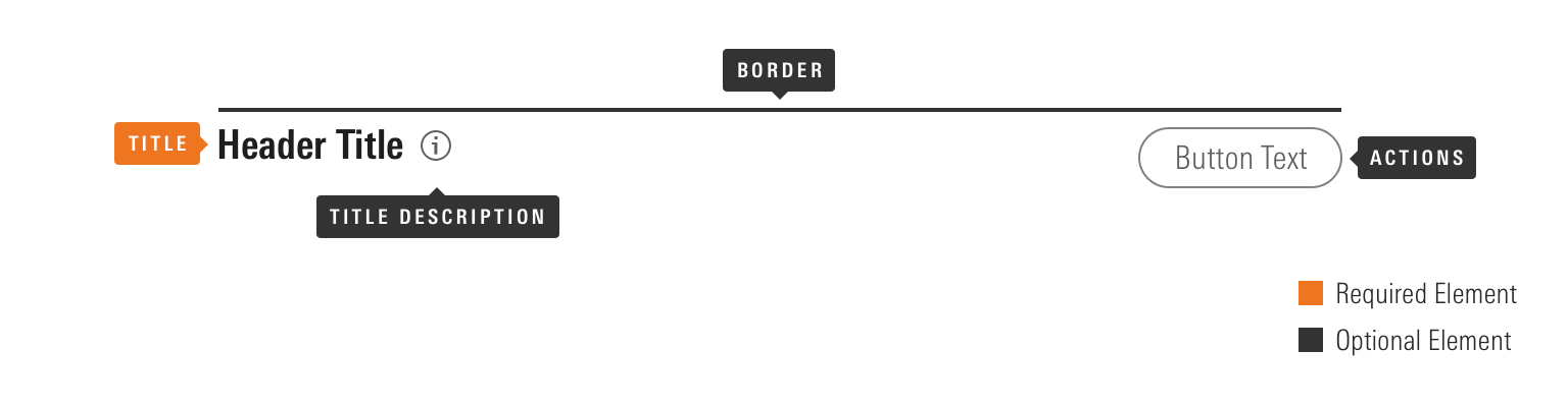 The Header Component from Morningstar Design System
For example, Morningstar?s Header component solidifies the arrangement of many oft-related elements, including properties for:
- An icon (with built-in tooltip?) adjacent to the heading label
- Actions, whether as buttons or icon buttons
- Border options to create contrast between page regions
Takeaway: Heading typography is but a part of a potential Heading component, which relates that type to adjacent signals, interactions, and additional type. Package those rules and relationships in a Heading component as needed, separate from generic heading style tools.
The Article Component, Including Line Length & Element Pairings
An Article (or Long Form Text) component contains rules separating heading levels, body texts, lists (unordered and ordered), and other ?basic? elements such as an image with a caption. It also may offer an author byline and a few other element types. Essentially, the range of elements you traverse in a Medium article like this or a system?s component documentation page.
 Article component?s basic elements, including spacing embedded
I like to equate an Article component to ?All the styles you?d need to properly format typical content entered into a CMS?s rich text editor.? The Morningstar Design System also includes a robustly featured Article component.
One must be very wary of paired relationships outside context controlled by a component. However, an article context offers a closed set of predictable element combinations: h2 then h3, h3 then p, or h2 then p, and so on. Each of those combination can be perfected based on spacing model (such as ?used margin-bottom” or ?use margin-top”).
Takeaway: Take great care in refining the long form reading experience of your users. The challenge includes not just hierarchy, but also line length, space between lines, relationships with other article elements ? deck, author byline, images, and more ? within that broader, widely reusable block.
Typography?s depths require more days, months and years of learning than this article provides. Nevertheless, armed with a strong foundation, design systems and the teams they support can produce so much faster, better, and consistent experiences than before. May these tools be a helpful start.

