Type design may be intimidating to many, with terms such as leading, baseline, kerning, ascender, tail, and many more ? The good news is, there are eight basic, universal typographical design elements: typeface, hierarchy, contrast, consistency, alignment, white space, and color. Even a basic understanding of each of these elements can revolutionize any design project.
Typographical principles aren?t just arbitrary aesthetic philosophies some pretentious design student made up, they are techniques to help you present your ideas to viewers and get the most out of each word. The principles, that address each of these elements, revolve around one central idea: good communication. Good typography is imperative to any situation where you want to transmit an idea to another person via text ? such as a website, blog post, magazine ad, interface, billboard, or newsletter.
Typeface
There are three basic kinds of typefaces: serif, sans-serif, and decorative.
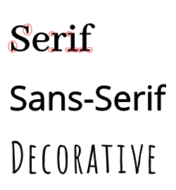 Typeface categories.
Notice the little embellishments at the end of lines on the serif font, circled in red. Those are actually called ?serifs,? hence the name of the font category. ?Sans? means ?without,? which is why all fonts without serifs are called ?sans-serif.? Decorative fonts are such that don?t really fit strictly in either of those categories, and are often elaborate, creative fonts used for titles.
It?s best to use a maximum of three fonts in a given design project, and two is often even better. It keeps your design uncluttered and simple. Try to pair serif fonts with sans-serif fonts, such as putting main body text in a serif font and putting your title in a sans-serif font, or vice-versa. Use decorative fonts minimally, and almost never for main-body text, because they often have low readability and just won?t look right most of the time.
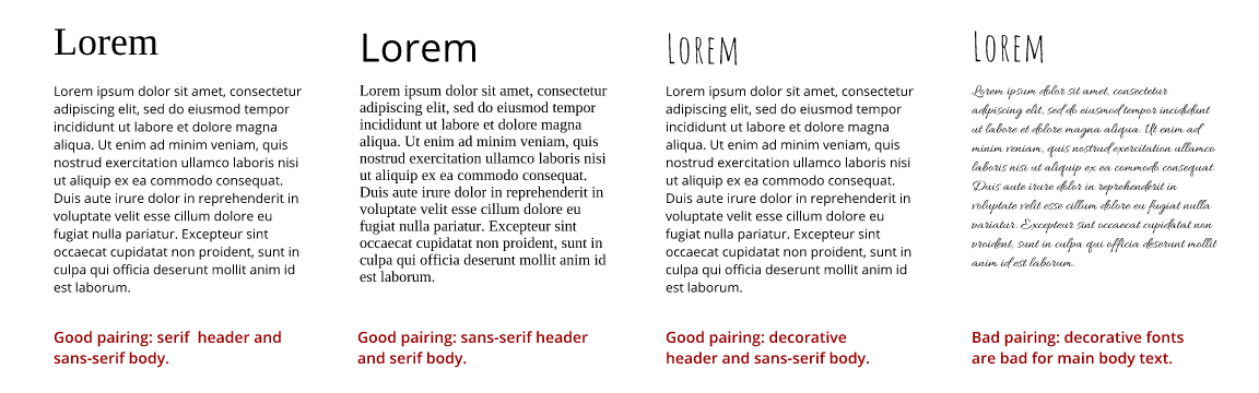 Font pairings.
Using Gravit Designer, you can easily choose great font pairings by selecting the text layer you want to modify (1), choosing the ?Appearance? tab (2), and scrolling through either ?Web Fonts? or ?System Fonts,? which are the fonts already on your computer (3). I recommend searching to web fonts to avoid the tacky, overused fonts that come with most computers. Pay close attention to the font previews (4) and identify whether they are decorative, serif, or sans-serif. The font I?ve selected below, ?Adamina,? is a serif font and looks great with the bold sans-serif title.
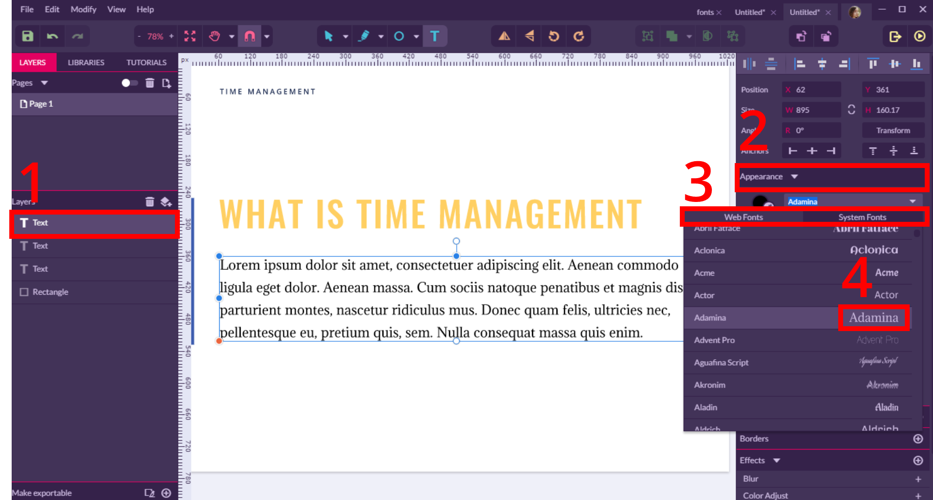 Choosing fonts in Gravit Designer
Hierarchy
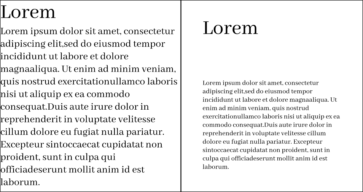
One of the main roles of hierarchy is to help keep your ideas organized, so that viewers can always identify which category of information they are reading. A typical example would be a website, where the title of the site is at the top of the page in a large header, while main navigation pages within the website are listed below the header in a smaller font. This is a visual cue, that helps readers identify the context of the text without even having to consciously think about it. Notice that in the website below all of the text is in the same size, font, weight, and color, with little distinction. All of the text appears equal and nothing jumps out?this is bad design!
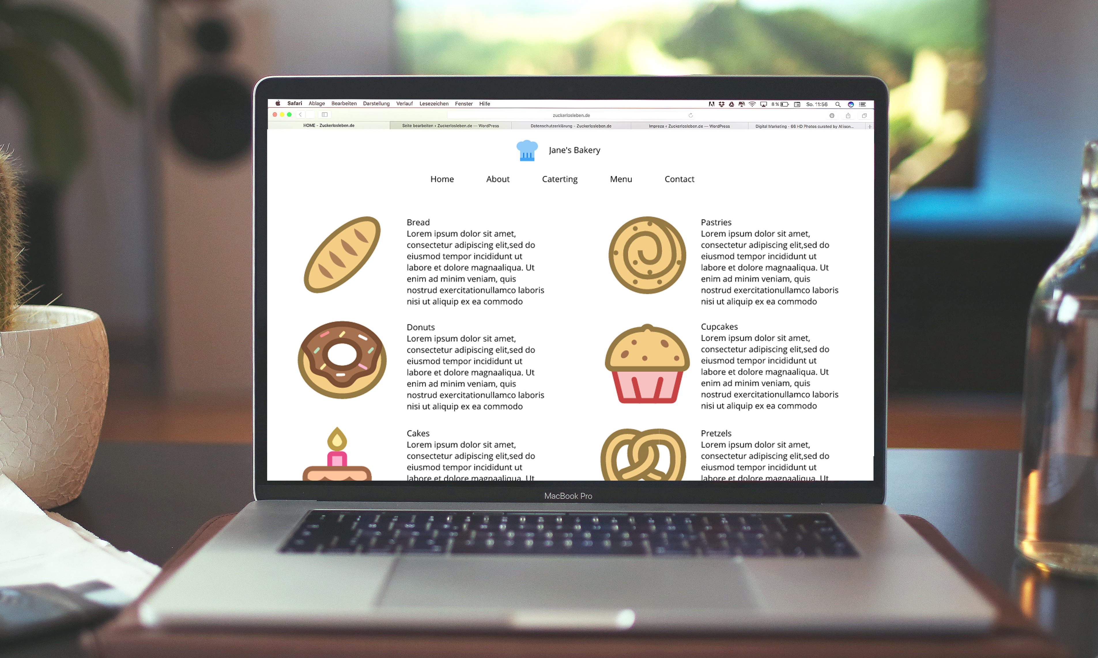 A design, that lacks hierarchy.
In the next image, the font, size, color, and format of each hierarchical level has been modified to be unique and stand apart from the other categories. Notice that the webpage title, navigation menu, and main content headers, and body text each have consistent styles, that are unique to their respective categories.
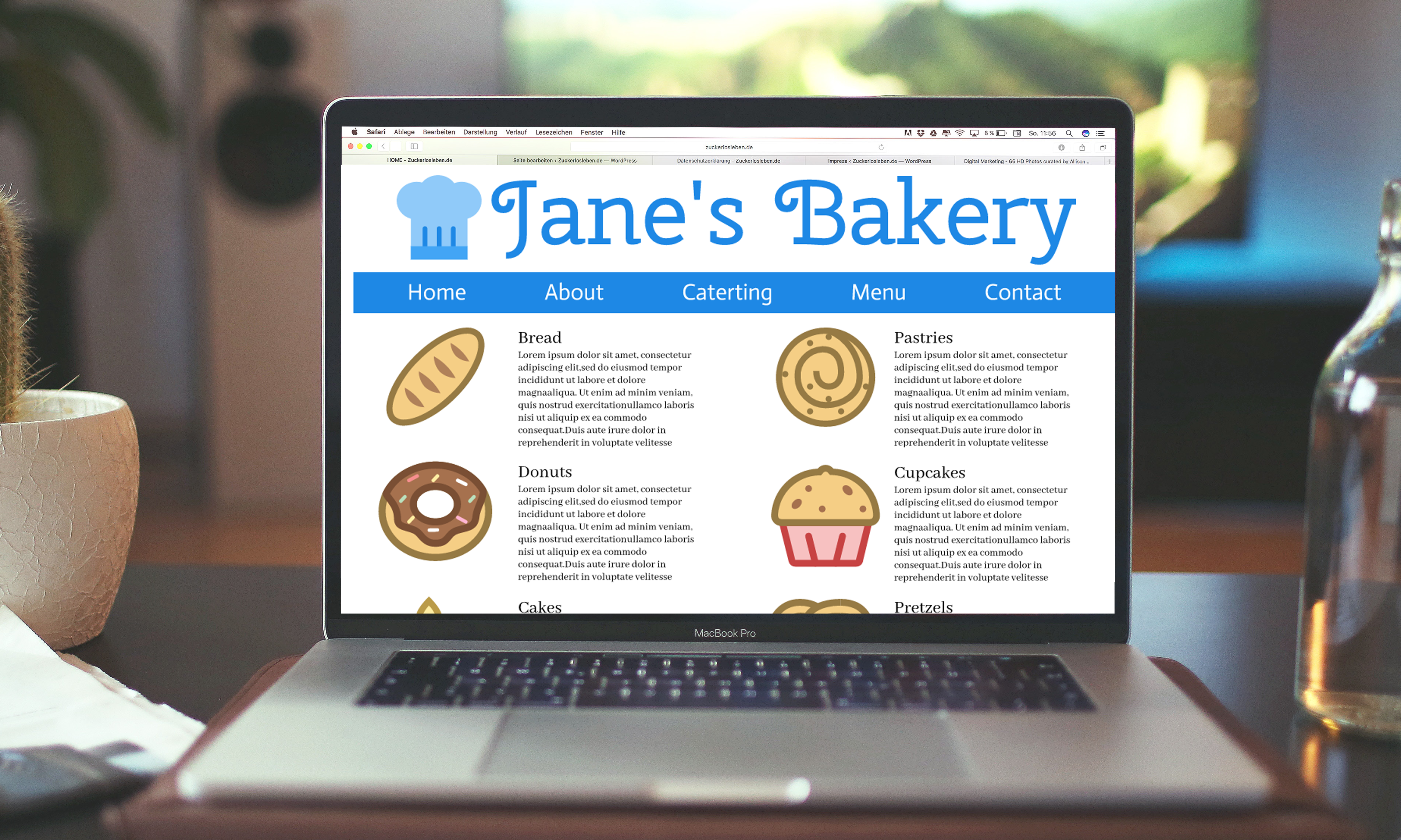 design with good hierarchy [website illustrations compliments of Gravit Designer?s sticker gallery]
Hierarchy also helps to make your text ?scanable.? In the age of 140 character tweets and TL;DR (too long; didn?t read), writers and designers must now, more than ever, seek to be concise and provide readers with the ability to consume large amounts of information quickly. One of the best ways of doing so is to employ hierarchy in making your text scanable.
For example, if someone is reading a brochure for your bakery business but is only interested in cupcakes, you want to provide them with a quick way of finding that information. Instead of making the viewer read through blocks of body text, organize the types of baked goods with bold headers to let the viewer quickly find the area of relevant information before having to look more closely.
Contrast
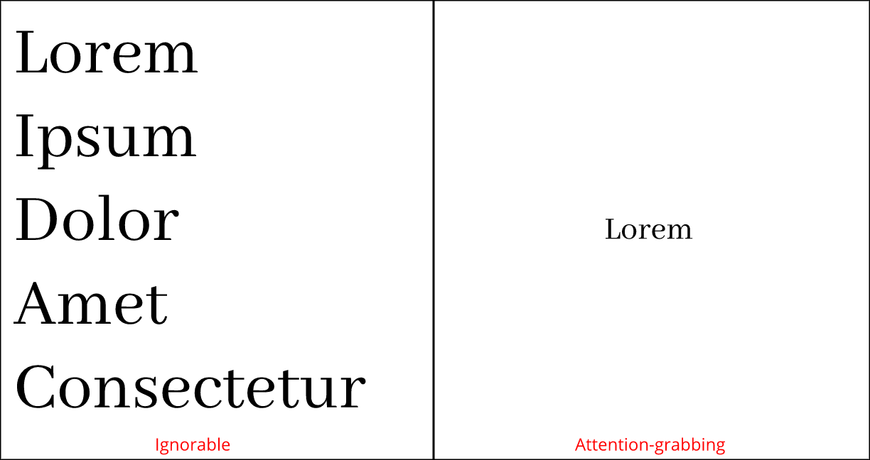
Contrast makes text interesting and can help you communicate which ideas you want to emphasize. Varying size, typeface, weight, color, and style can give your designs a big impact as well as make your ideas organized. Below, you can see how contrast helps you to give your text an interesting, attention-grabbing, and even more meaningful appearance. Below, the word ?Small? is black, aligned right, lightweight, in an italic serif typeface with increased space between letters. ?Large? is red, heavy weight, in a regular sans-serif typeface, and is about 10x bigger than the word ?Small.?
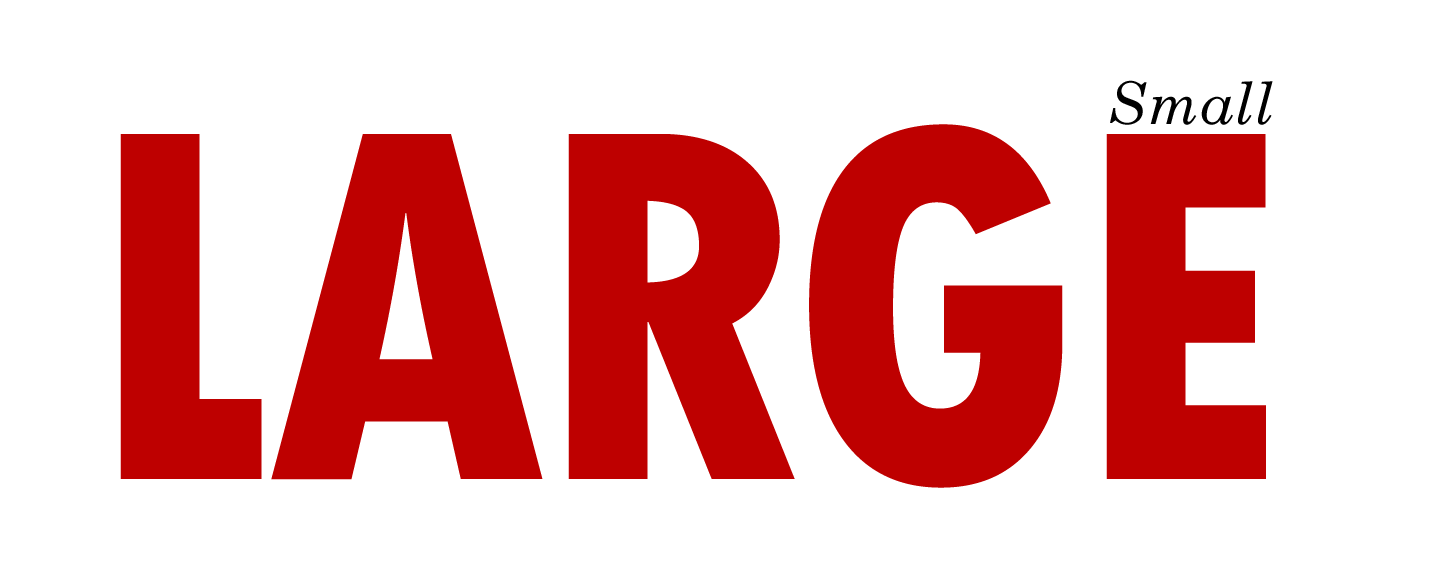 Lots of contrast, and thus, impact!
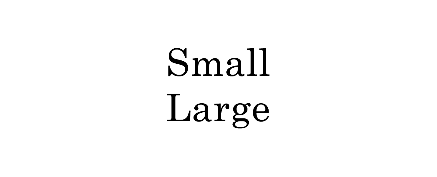 No contrast = boring!
Clearly, elements of contrast make the first design stand out much more than the second design, where both words have the same styling.
Consistency
Consistency is a key principle for all typography. Consistent fonts are especially important, as using too many can lead to a confusing and messy look, so always use the same font styling for the same information. Decide on a hierarchy of styles and stick to it. Even though you may have many levels of hierarchy, you should keep to an overall theme for the design.
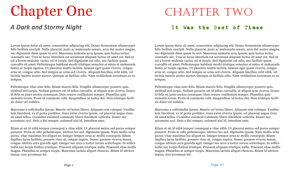
The ?Chapter One? page below has a pleasing design with only two font faces, two colors, and three font sizes. Even though only two font faces are used, hierarchy is achieved by using size and color. All of the text is left-aligned except the page number, providing clean, consistent lines. However, on the ?Chapter Two? page, there are four different font faces, four colors, four font sizes, and each element has a different alignment ? all of this creates a messy, unattractive design.
Alignment
Alignment refers to the ?line,? that the text orients towards. It can apply to a whole body of text, individual words, or even images. Alignment should be as consistent as possible and every element of your design is meant to align to one of the other elements in some way, to create equal sizes and distances between objects. For example, you may want the logo to align in size with your header, and you may want your body text to align with the same margins the header falls in.
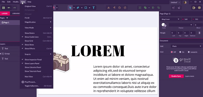
Gravit Design?s ruler tool is the best way to keep track of aligning images, shapes, lines, and text. Select View > Show Rulers on the top menu to open the ruler tool, and drag guides out from the rulers that appear on the left and top of your document. To change the unit of measurement displayed on the ruler, select Document > Unit on the tabs at the right side of the screen (with no element selected on the canvas). You can also turn on a grid on the the right below to help you.
 using rulers to align objects
Many amateur designers make the mistake of overusing center alignment ?it is tempting, but can be messy and look imbalanced. Left alignment is usually the best choice, and right alignment can also be interesting. However, avoid using right alignment for body text.
 see how much better left alignment is than center!
Whitespace
Whitespace refers to the empty space around objects or text, and can take the form of margins, padding, or just an uncluttered area. It creates a pleasing visual experience and can even draw attention to text. In the first box below, the text is crammed against the bounding box, making it hard to read. In the second box, the text has breathing room and the design even looks more stylish.
We often think flashy colors and bold fonts are the only way to draw attention to text, but amazingly, white space can be the best way of drawing the viewer in, as it indicates that whatever is within the large field of empty space must be important.
Color
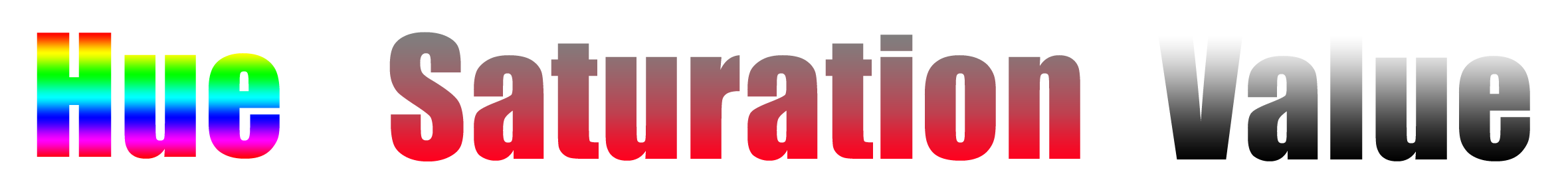
Color can really help to set the mood for your design, and getting it right can make your text stand out. There are three main components of color:
- Hue ? the shade of color
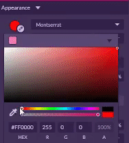 Adjusting Hue in Gravit Designer
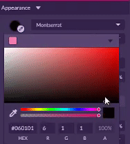
2. Saturation ? how brilliant the color is
 Adjusting Saturation in Gravit Designer
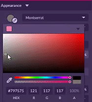
3. Value ? lightness or darkness of the color
 Adjusting Value in Gravit Designer
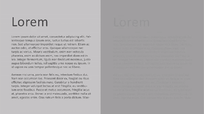
Remember to contrast hue, saturation, and value in a way that makes your text easy to read. A good way to tell if your colors have enough contrast is to view your design in grayscale and if it doesn?t look good you may need to tweak values. Notice how the text on the right become almost invisible in grayscale, while the image on the left still looks great:
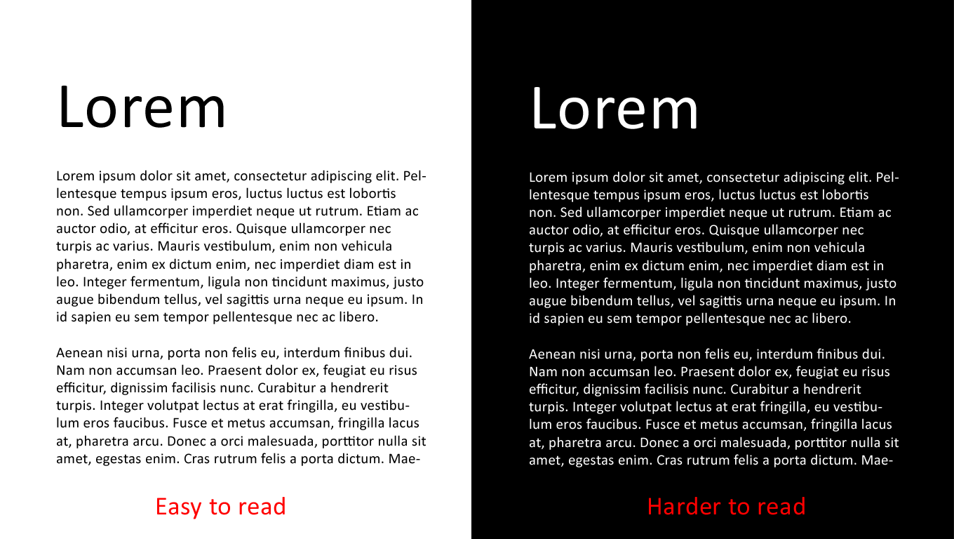
One situation where contrast just isn?t enough is with light text on a dark background ? even if the contrast seems high, it just isn?t as easy to read as dark text on a light background, especially with small text, so use that style sparingly!
When making any design, asking yourself these three questions will help you recall the aforementioned guidelines and principles:
- Is my text readable?
- Is my styling consistent?
- Does my styling use contrast?
I hope this has been a helpful introduction to using basic typographical elements. Comment below what element you think is the most important or the most overlooked, and let us know any tips or principles you?d like to share!
Website | Facebook | Twitter | Forum
