Internet rumors suggest the Atlanta Falcons, along with their confirmed new uniforms, may receive an update to their logo in 2020 as well. Whether or not that is true, now still seems the appropriate time to write my appreciation of the team?s current logo. If it is indeed seeing its final days, let?s send this masterpiece of logo Design off with the farewell it deserves.
What makes the possibility of change to the logo worrisome is the recent track record of the NFL in this category of logo alteration.
What might be considered as the ?Reebok era? of the NFL (the years Reebok made uniforms for all NFL teams from 2002?2011) was a prosperous time in the League?s Design history from which the current Falcons logo came. A time where team logos were simplified and strengthened, with high attention paid to craft and detail.
You might then consider the following years (2012-now) to be the ?Nike era? and coinciding with that is where things have gone quite the opposite direction. (To my knowledge, this is no fault of Nike. They just design the uniforms).
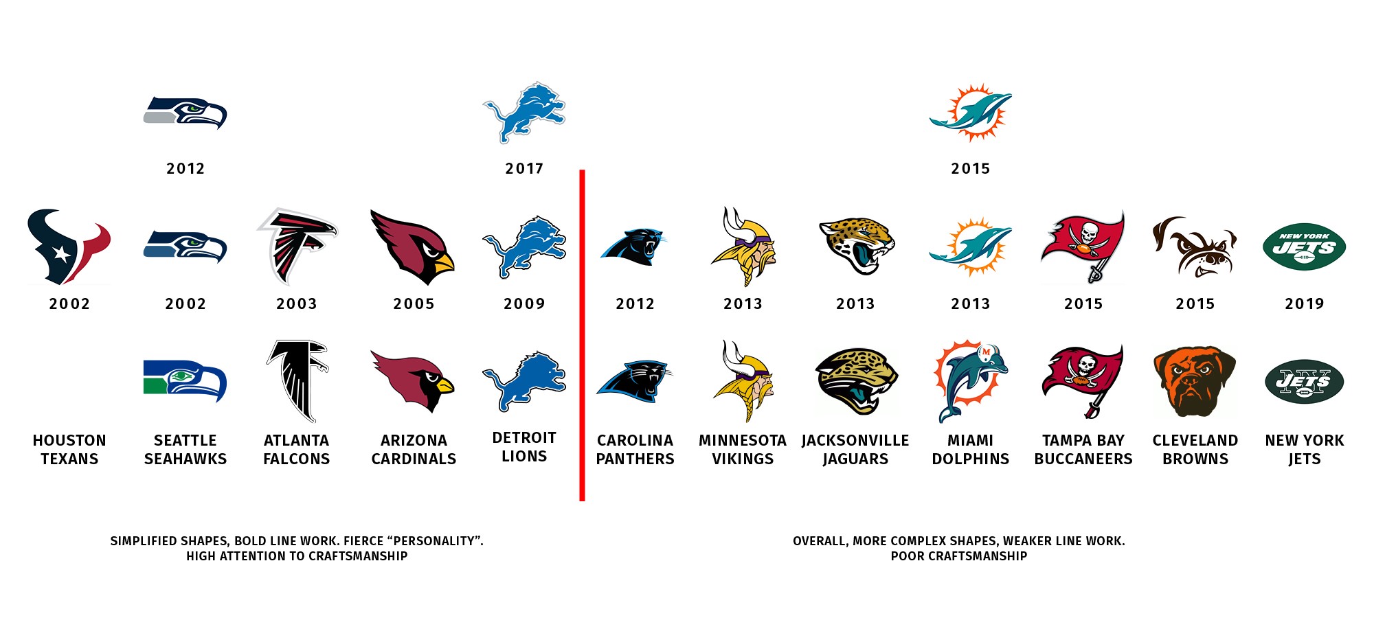
The early 21st century of NFL branding lays the foundation for how this art, this craft of logo design, should be done. Every significant update to NFL team logos since 2012 however, has either made that logo lesser or has had an equally terrible logo replace it. (Props to the improvements made with the Vikings? line work.)
Through thinner lines, rapid tangents, grotesque bezier curves, ideas made more complex, and shapes slapped on top of other shapes, 6 of the 7 logo updates since 2012 are a step backward, or come with a whole new set of issues? Sure the Jets logo is simplified, but now it features 2 football shapes and odd type stacking. As if there?s nothing that could possibly be a symbolic representative of the teams namesake or city. They insist on full team name and 2 footballs.
You could teach a class in the craft of logo design using the Reebok era and counter it with exactly how not to do it through this Nike era.
But, why? What were these teams trying to accomplish here and what motivated change to begin with? For all but the Panthers, these logos came with new uniforms.
It?s easy to fear what might happen next to one of sport?s very best logos.
Body And Soul
The brilliance of the 4 redrawn NFL logos from 2002?2009 is while they all stayed true to their original compositions, they were simplified to be more streamline and bold. They reduce in size better and become more flexible in application, look better on helmets, and simply perform better as logos. They are by all means and measures a better realized version of the original, often adding a sense of speed and the right amount of football?s inherent aggression.
By comparison to the ?Reebok era?, the original logos look like the roughly sketched ideas of what they were ultimately intended to be.
We could pick apart very specific details or anchor points to make the logos different, but better? I don?t believe so. That?s missing the forest for the leaves. These 5 logos have a clear concept, or reason for their update, which they all capitalize on beautifully while honoring their original composition.
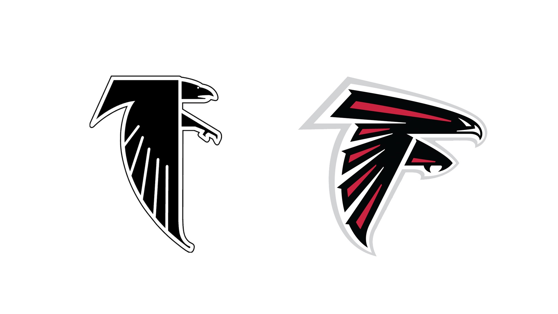 Atlanta Falcons logos, 1990 and 2003
Deliverence
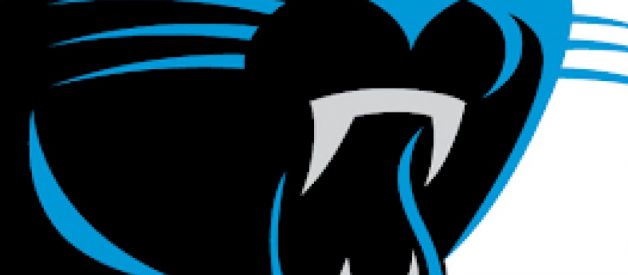
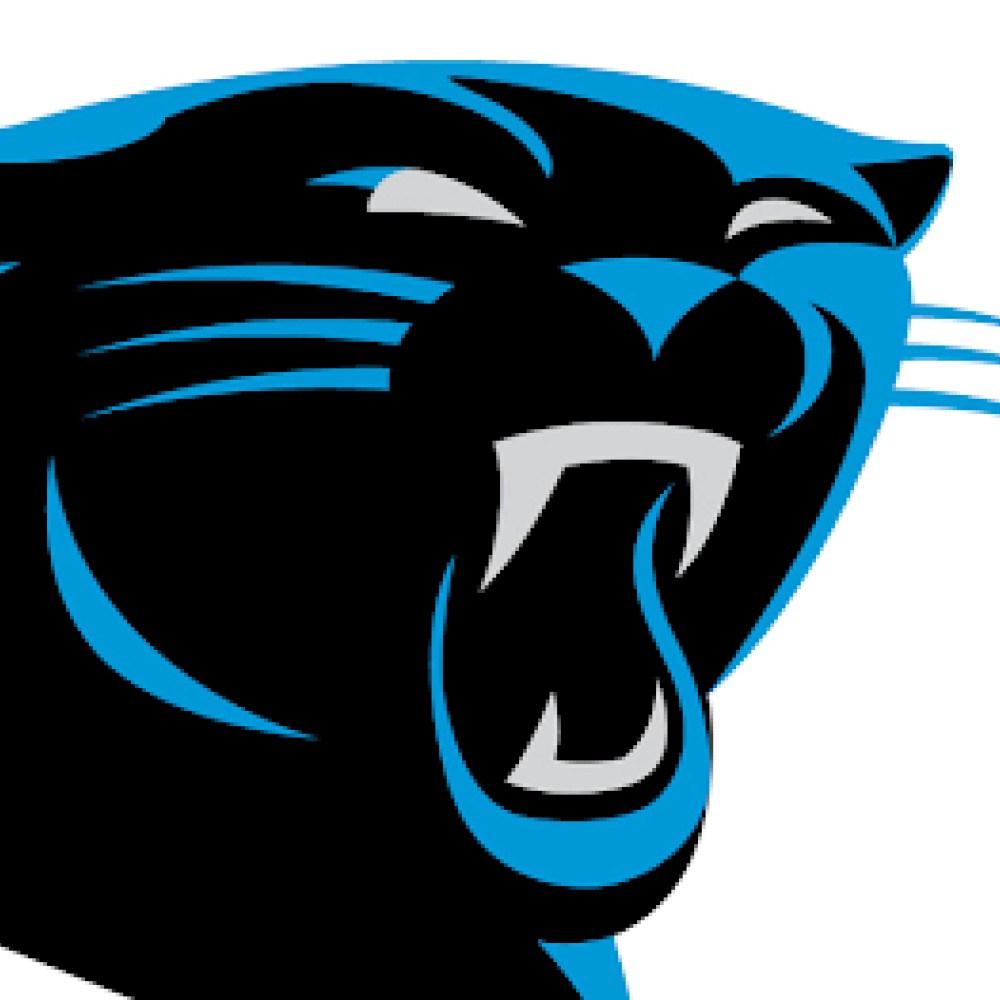
Comparing to the former logo, even the way the different parts of the current bird have been separated happens in a smarter way than the solid white line running through. The current logo does it without separating the head from body but we still get the sense the leg is behind the wing. Theres just enough hint at dimensional form we believe the wing is in front, the leg behind, and all these parts are not just growing out of one another in a weird way.
All the Reebok era logos have this sense of speed and aggression, but none more fitting than for the fastest raptor on Earth. The concept is made stronger with the swept-back wing where the vertical white line of the old logo visually locks it in place, stalling the ?movement?. The thicker leg and talon hint at the animal being more powerful.
The furthered simplification and abstraction allows the logo to use fewer lines and points, forming a bolder silhouette. If you saw an ?F? in the logo before, its made even more evident now.
I love the line work of the current logo and how every shape works with the next, ?locking? into place. Note the lines in the wings of both versions. There?s no form with the old. They don?t work with the shape of the wing, which really makes it seem like more of a sketch. Losing the annoying, oddly rounded points at the tail and wing tips in itself is an improvement worth doing and the newly tapered points, of course, appear as though they are moving fast. The dopey beak and eye now look like that of a true bird of prey.
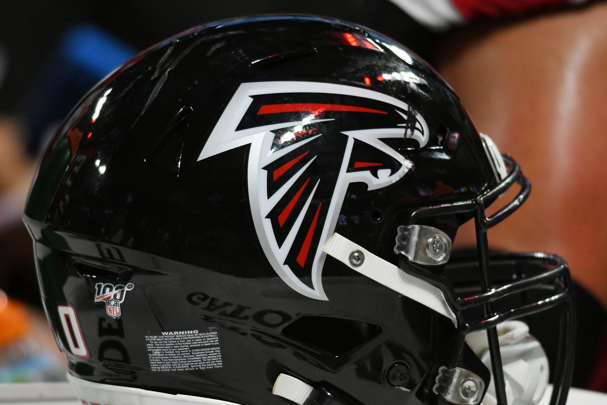
Adding splashes of red brings the aggression up another level. It?s a lovely use of team color when placed onto a black helmet. Its easy to suggest more contrast and maybe make the logo primarily red or white, but by using the most vibrant color to call attention to those specific lines, it builds on the concept of speed.
From the big picture concept down to the last detail, everything has been considered and drawn to suggest speed, power, and movement.
Opinions vary wildly, but it is as close to perfection in logo Design I can point to in the world of sports. There is a handful of others. Three more of them come from the Reebok era of the NFL.

