Top 10 United Nations Logos ? UN Logo Design Inspiration
When it comes to designing a logo, website, or any other material, the main objective of every commercial organization is to grab the attention of the target audience and make profits.
But non-commercial organizations have no such objectives. These organizations work for public welfare.
Since the objective of both commercial and non-commercial organizations is different, it is evident that their design requirements are also different.
Starting a non-commercial organization is somewhat similar to starting a commercial organization.
You need to have a clear objective, business message, and most importantly, an eye-catching logo design.
A logo is a symbol or an image that is designed to represent a company. It is the most recognizable identity that any business or organization can have.
One of the challenges a designer faces while working for a non-profit organization is that they cannot differentiate the purpose of designing a logo between a business and social purpose.
Over the years, non-profit organizations have changed a lot. These organizations, nowadays, run much more professionally.
It has thus become crucial that their logo, website, or any other materials reflect their professional approach in conducting a social cause.
In this blog post, we will be sharing the meaning behind the top United Nations logos so that designers get some insights on how to design a logo for non-profit organizations. Let?s get started!
1) The United Nations Logo
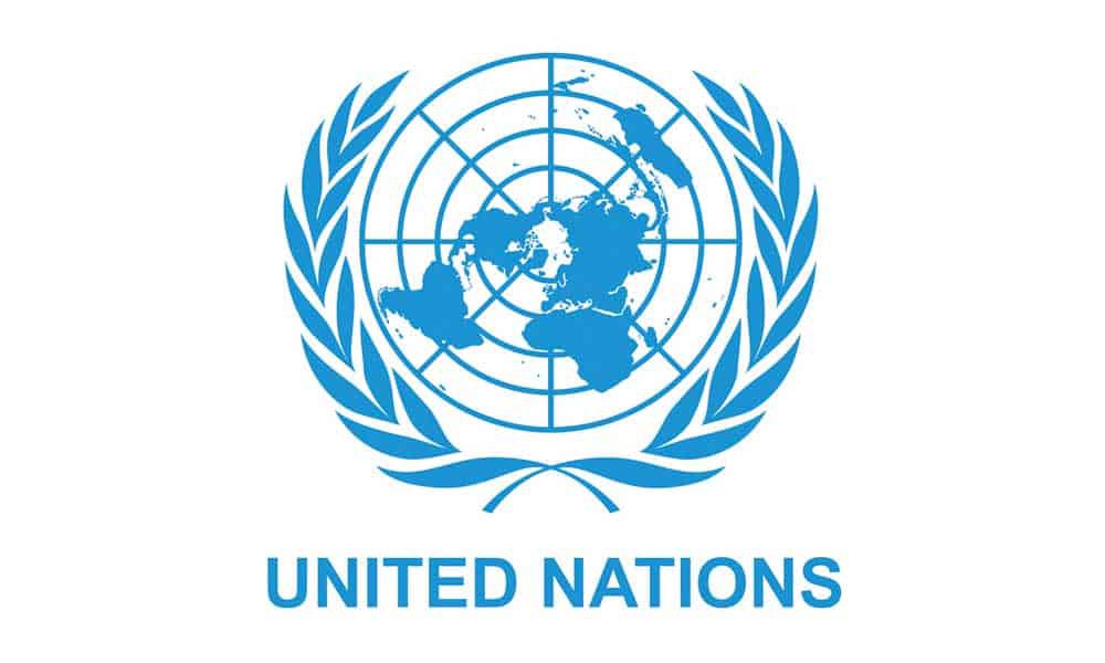
In 1945, a team of designers, during the United Nations Conference on International Organization, designed the United Nations logo. Oliver Lincoln Lundquist guided the team.
The design features a globe surrounded by laurel leaves. The white and calming blue colour in the logo signifies the objective of the organization, i.e. to solve problems and make the world a more peaceful place. The UN logo has been included in the logos of various UN family members.
2) The World Health Organization Logo
The World Health Organization (WHO) is a United Nations specialized agency which functions as coordinating officials to build a better and healthier future for people worldwide.
Founded on 7th April 1948, with headquarters in Geneva, the organization inherited its forerunner?s authority and resources, the Health Organization, which was an agency of the League of Nations.
Talking about the logo, well, it has an icon similar to the United Nations but with a little addition. Inside the globe, the designer has incorporated a coiling snake, which is considered to be a symbol of medicine and the medical profession. The name of the organization has been placed adjacent to the logo.
3) The World Food Programme Logo
The World Food Programme (WFP) is the dominant humanitarian organization that was established in 1961.
The main objective is to provide food assistance during emergencies and work with communities to save and change lives by improving nutrition and building resilience.
You may also like: How To Trademark A Logo
With headquarters, in Rome and offices in 80 countries, every year on average, the organization assists 91.4 million people in 83 countries.
If you look at its logo, you will find the shape similar to the logo of the UN, except with different features.
Instead of a globe, the logo features the image of a hand holding grain leaves and maize.
The image is surrounded by laurel leaves similar to the UN logo. The designer has included both the short and full name of the organization in the logo design.
The short form (WFP) has been written just above the icon, whereas the full form (World Food Programme) has been written adjacent to the symbol.
4) The International Monetary Fund Logo
In 1944, the representatives of 44 countries gathered in Bretton Woods, to create a plan for the economic order of the post World War.
The main objective behind this was to refrain from the reiteration of the critical policies that could cause another conflict.
Therefore, they created the IMF to promote the international monetary corporation.
Since then, the International Monetary Fund (IMF) is trying to maintain the stability of the international monetary system ? the exchange rate system and international payments that allow countries and their citizens to trade with each other.
The organization also encourages high employment and sustainable economic development and reduces poverty worldwide. The organization is governed by and accountable to 189 countries.
IMF has a shield-shaped logo that features two overlapping lateral hemispheres of the globe.
The shield is covered with a circle. The designer chose the shield shape to symbolize heraldic achievement.
Below the globes and inside the shield, olive leaves have been designed to signify that just like the bitter olive fruit takes a long time to ripen and once it ripes, it cannot be eaten directly from the tree.
The business of IMF is also similar to that fruit ? to give loans under strict conditions. The name of the organization has been written around the shield.
5) The Human Rights Council Logo
The Human Rights Council is a United Nations body whose objective is to promote and protect the rights of humans worldwide.
The UN General Assembly created this organization on 15th March 2006. The first meeting took place from 19th to 30th June.
The Council, after a year, adopted the ?Institute-building package for guiding the work, procedures as well as mechanism a year later.
The logo of the organization is exactly similar to the UN logo. The only difference is that the designer has included the organization?s name in the logo design.
The name has been placed adjacent to the icon. And the background colour of the Human Rights Council logo is in navy blue colour.
6) United Nations Environment Programme Logo
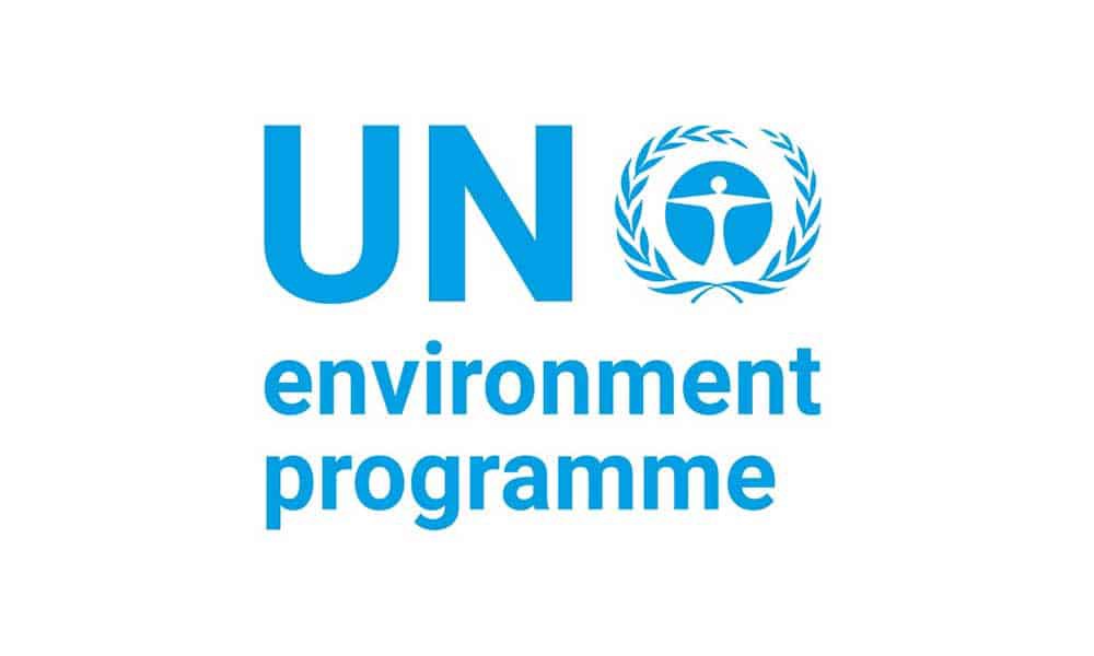
The United Nations Environment Programme (UNEP) was established in June 1972. It is a coordinating body for the United Nation?s environmental activities.
You may also like: 5 Tips to Get a Perfect Logo Design for Your Brand
The main objective of the organization is to recognize and examine global environmental problems, promote environmental science and information, and develop international and regional environmental programs and conventions.
Among all these, the most crucial mission is to help developing countries in executing environmentally sound policies and practices.
Coming to the logo, well, the organization has a circular shaped logo. Inside the circle, there is a human figure reaching the opposite part of the ring.
It communicates that the organization has an impact on every corner of the globe.
Similar to the UN logo, the UNEP logo also features the laurel leaves.
The designer has placed the name of the organization on the left side of the icon; where they have used the acronym of the United Nations (UN) and Environment Programme has been written below in lowercase.
7) The International Labor Organization Logo
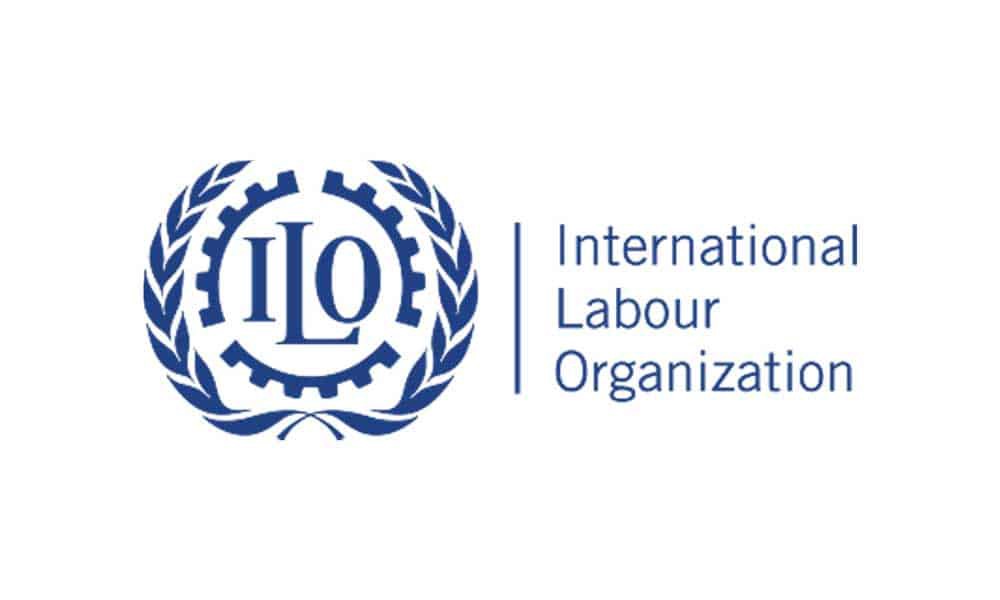
The International Labor Organization (ILO) was established in 1919. It grew out of the 19th-century labor and social movements, which ended in enormous demands for social justice and higher living standards for the world?s working people.
In 1946, ILO became the leading specialized agency linked with the United Nations.
In 1919, the original membership of 45 countries grew up to 121.
There are three crucial tasks of ILO. First is the adoption of international labor standards.
Second is the technical cooperation to help developing countries.
Third, is the standard-setting and technical cooperation bolstered by an extensive training, research education, and publications program.
The ILO logo features three pieces of machinery cogs.
The designer, by using the initials, has written the name of the organization inside the cogs. The designer has used machinery cogs in the design as they are the everyday things found in factories.
Again like other UN logos, this logo also features laurel leaves. The name of the organization has been placed adjacent to the design. The colour of the ISO logo is slightly darker than the UN logo.
8) The United Nations Children?s Fund (UNICEF) Logo
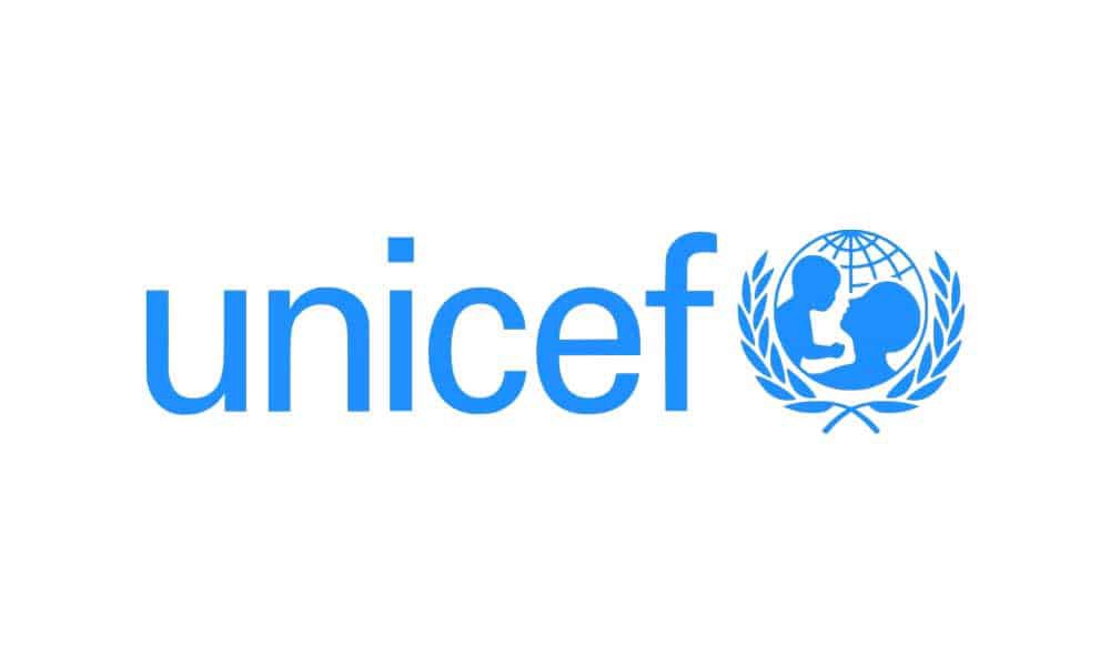
The United Nations Children?s Fund (UNICEF), previously called United Nations International Children?s Emergency Fund, is a special program of the United Nations that was created in 1946 to provide aid to children in countries destroyed by World War II.
After the medical and food crisis of the late 1940s stopped, UNICEF continued its role, and during the 1970s, the organization grew into a vocal supporter for the rights of children.
During the 1980s, UNICEF helped the UN Commission on Human Rights in drafting the Convention on children?s rights.
In 1989, the Convention became a popular and authorized human rights treaty in history, and UNICEF played a vital role in confirming its implementation.
Talking about the logo, well, UNICEF has a globe-shaped logo. Inside the globe, there is an image of a parent holding a child high in a loving manner.
The globe is surrounded by the familiar laurel leaves, leaving no lack of understanding to the sponsors of the organization.
The name of the organization has been written on the left side of the icon. The lettering of the organization?s name is in lowercase.
9) The United Nations Population Fund Logo
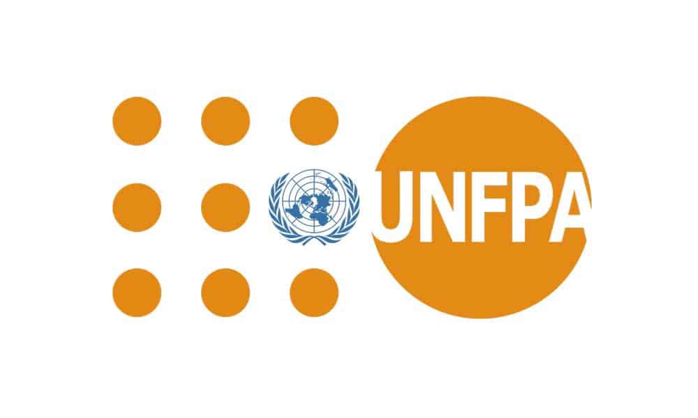
The United Nations Population Fund (UNFPA), previously called the United Nations Fund for Population Activities, is a program of United Nations that was established in 1969.
You may also like: Minimalism in Design
It is the most significant international source of assistance for population programs and the leading UN organization for the execution of the 1994 Programme of Action of the International Conference on Population and Development.
The main objective of the organization is to improve reproduction by improving health; creating national strategies and protocols, and birth control by providing supplies and services.
Recently they have been known for their universal campaign in the contradiction of child marriage, female genital mutilation, and obstetric fistula.
Compared to other UN logos, the United Nations Population Fund logo is quite unique.
The logo features an unbroken white circle, inside which the designer has written the initials of the organization.
On the left side of the circle, the designer has drawn white dots which are forming the shape of a square.
The logo also features the UN logo, which has been added in place of one of the dots in the design. The name of the organization is written adjacent to the icon.
10) International Maritime Organization Logo
International Maritime Organization, previously called Inter-governmental Maritime Consultative Organization, is a specialized agency of the United Nations that is in charge of improving the safety and security of worldwide shipping and to stop the marine pollution from ships.
In the middle of the 19th century, after the implementation of certain sea safety treaties, the requirement to create an international entity had aroused.
After the creation of the UN, the demand took shape, and in 1948, the ?Inter-governmental Maritime Consultative Organization? was established in Geneva.
In 1982, the name was changed to International Maritime Organization (IMO).
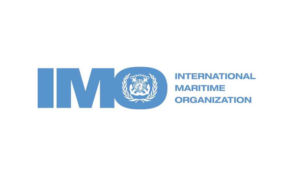
The organization has a wordmark logotype.
The designer has created a logo by using the initials of the organization?s name.
Inside the letter ?O?, the designer has featured the UN logo.
To relate with the objective of the organization, the designer has drawn two anchors, intersecting the UN logo.
The anchors are joined with a chain. The image is surrounded by laurel leaves, just like the other UN logos.
The full name of the organization has been written adjacent to its initials.
Conclusion
So, folks, these are the top 10 United Nations logos.
We hope that now you can differentiate between the logos of profit and non-profit organizations and get some insights on how to create one for your clients.
If you are still looking for logo inspirations, then, Designhill is your one-stop solution.
Author Bio: I am a graphic, web designer and blogger with over six years of experience and working as a Digital marketing strategist & Brand Consultant at Designhill. I am very passionate about anything related to design and spends copious amounts of time hidden behind a book or a screen and reading about design.
Originally published at https://inkbotdesign.com on January 28, 2020.
