Listen to this story
–:–
–:–
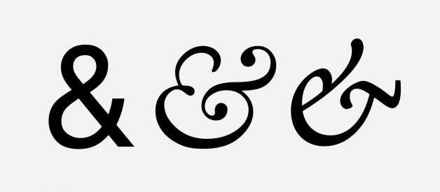
These days everybody knows about the ampersand. It?s one of typography?s most unique and interesting characters.
Its rise to hipster fame has catapulted the ampersand from the sketchbooks of type designers onto just about every printable surface you can imagine, the variations of which seem endless. From traditional representations all the way to hyper-stylised forms that bear little resemblance to the original mark.
The varied nature of its form allows type designers a little creative freedom, and is often seen as an opportunity to inject some extra personality into a typeface. Officially classified as punctuation by today?s unicode, it was in fact, once the 27th letter in the English alphabet existing as the graphical representation of the word ?and?.
Designers in all fields both love and hate the ampersand in equal measure, but very few know much about its history, or intended use, which is actually rather interesting.
A Brief History of The Glyph
As with a lot of aspects of typography, the history of the ampersand begins with our triumphant and progressive friends, the Ancient Romans.
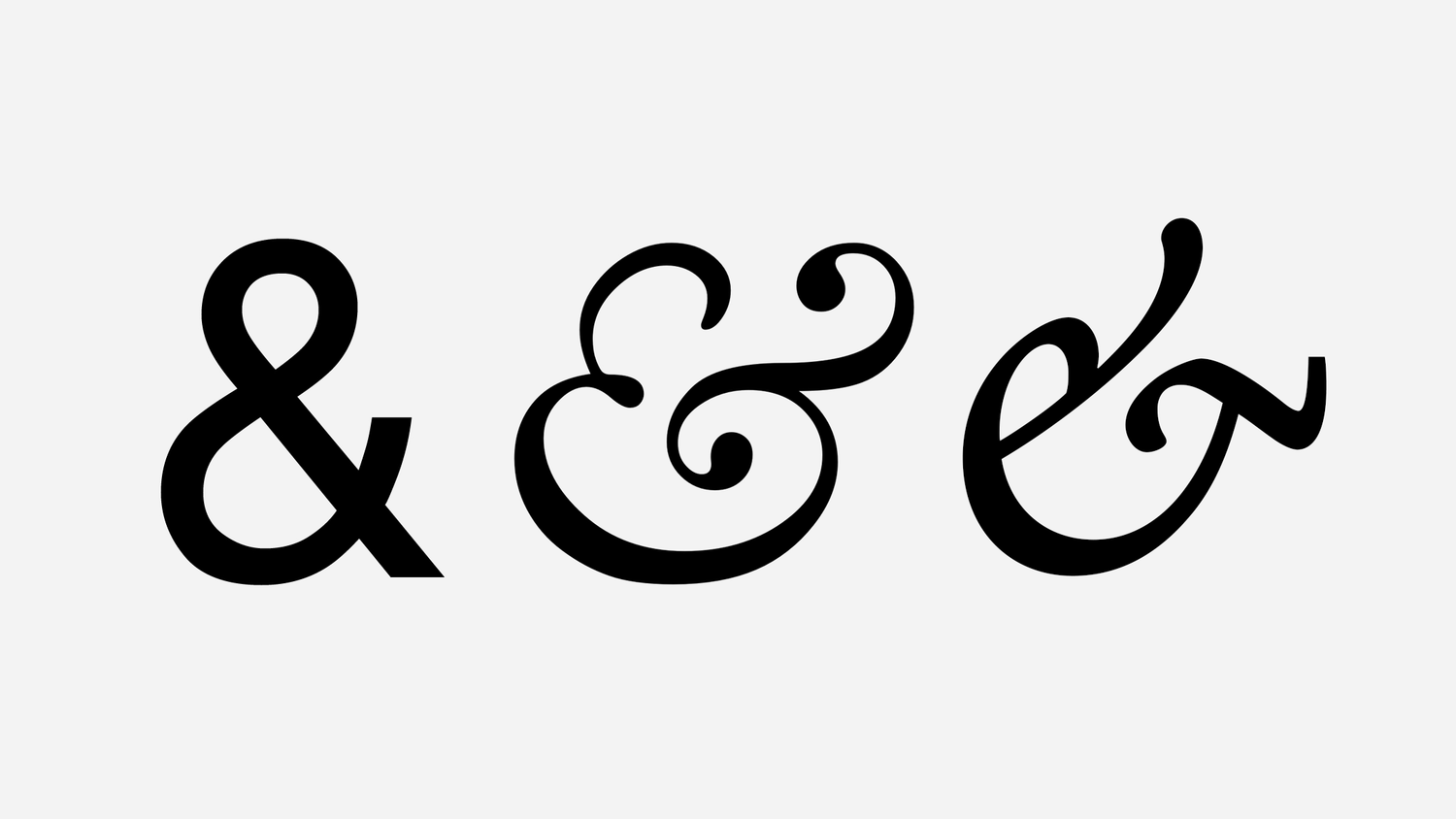
Roman scribes would write in cursive so as to increase the speed of their transcription, often combining letters into one form to save time while also increasing legibility, where certain characters overlap in a visually discordant manner ? this was the birth of the ligature. The ampersand is simply a ligature of the letters E and T (et being the latin word for and).
As the Romans expanded their empire across the globe, many languages just absorbed this ligature into their own alphabet. However as these languages evolved, the connection between the original ligature and the word it now represents diminished beyond comprehension. The outcome was a rise in overly stylised versions, much less representative of its original form.
In some of the traditional style typefaces of the modern age, the ampersand is more clearly representative of the original et ligature. Caslon is a great example of this, with many italic typeface variants also following suit.

While this helps explain why this character exists, and why it looks the way it does, it doesn?t really explain where it gets its name? Where on earth did the term ampersand actually come from?
The Etymology
Before deconstructing the word ampersand, you must first understand another latin legacy that made its way into our modern language.
By the early seventeen hundreds, schools throughout England had started to use the phrase per se (essentially meaning by itself) when spelling out words. This was specifically useful when encountering words that consist of only a single letter (A, I and originally O). As an example, in order to spell the phrase ?I invite you?, children would say:
?Per se i, i, n, v??
indicting that the initial i stood by itself, rather than a part of the proceeding word.
At the same time, and (the et-ligature &, now pronounced and) had become common place and was all but inducted into the English language as the 27th letter of the alphabet. It became so widely used that children in school, when reciting the alphabet, would include & after the letter Z. The result of this was that phonetically you would hear ?X, Y, Z and per se and? indicating that the & stood by itself at the end of the alphabet. The phrase ?and per se and? was inevitably slurred into one single term and by 1837, the term ampersand was well and truly immortalised in the English dictionary.
Interesting fact ? The ampersand was the only letter in the English alphabet that did not represent a speech sound.
Correct Usage
Over time, the ampersand would be de-classified within the English alphabet and its usage decreased as a result. While the & glyph still remains with its meaning unchanged, its use in modern english writing is somewhat frowned upon. It does however serve some interesting use cases adding a level of clarity where simply using and would not. For example:
Clarity within lists
An ampersand adds clarity when items within a list require and as part of its name, rather than as a separator (e.g. ?take your knife, pestle & mortar and ingredients?).
Accreditation
When giving credit to writers in the film, screenplay or story world, an & indicates collaboration of a closer nature than and. Writing ?McAndrew and Thorne? implies that Thorne was involved in re-writing some of McAndrews script. McAndrew & Thorne represents a dual effort where both writers collaborated to write the script together.
Referencing
Many educational institutions require the use of an & when citing sources of original work (e.g. ?Gibson & Fellwinter, 1986?)
So there you have it. The history of the worlds most famous character*.
You may find that, like me, you will never be able to look at an & in the same way again. This is both a blessing and a curse. However, as with all cycles of fashion and trend, we are beginning to see a resurgence of the original et-ligature, replacing the modern & form. As more type designers become aware of the history of this expressive little glyph, the desire to re-introduce it has grown. Keep your eyes peeled and spread your new found knowledge.
*obligatory outlandish claim
