One of the key goals of any designer is to create clear and understandable designs; pages that are well organized, balanced, with information that is easy to read and absorb will naturally result in a much better experience for your users. We have several tools at our disposal including grids, spacing rules, columns and gutters, to make this happen. In this article, however, we?re going to look at an often overlooked tool called the golden ratio. The golden ratio is a mathematical ratio, found in many things both natural and designed, that dictates the most pleasing proportions of a shape or structure.

The theory behind the Golden Ratio dates back historically to the time of Pi. The ratio has been used throughout history by philosophers, architects, and designers to create eye-catching, pleasing designs and structures. Some historical examples are the Parthenon in Greece, and the Pyramids in Egypt, where Architects leveraged this ratio to create balance between the structural elements. The reason for the golden ratio?s popularity is the belief that it is natural, and creates aesthetically pleasing balance for the viewer.
Much like in Architecture, we can leverage the golden ratio in digital design, whether we?re working on wireframes, brand development, or creating final production ready designs. Here?s how.
What is the golden ratio?
The ratio itself is defined as 1:1.618033987, and is represented by the Greek symbol Phi. This means that if length A is 100px, then length B would be 161.80px. This can apply to shapes or objects next to each other (comparing their widths or lengths), or for forming a single shape like a rectangle (i.e. length = 1.618x width).
The formula for calculating the ratio is A/B = (A+B)/A = 1.6180033987, though this number is often rounded in practical applications to be easier to work with. 1:1.618 or 1:1.62 may be used in these cases.
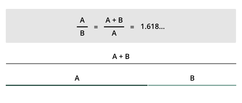 The golden ratio formula shows that length A is 1.618 times the length B. You can validate if two lengths follow the ratio by dividing their lengths.
Another term you will hear associated with the calculation of the Golden Ratio is the Fibonacci sequence, defined by the mathematician Fibonacci. This sequence states that each number in the sequence is the sum of the two values that came before it. For instance, 1+1 = 2, therefore the first three numbers in the sequence are 1, 1, 2, and the next would be 3 (1+2 = 3). This continues, creating the first 10 digits of 1,1,2,3,5,8,13,21,34,55.
The Fibonacci sequence is what creates the golden spiral, which is a logarithmic spiral that grows by a factor of the golden ratio. In most representations of the golden ratio, the golden spiral is shown, like below. This creates yet another guide when creating layouts, or designing logo assets, and helps to define balance.
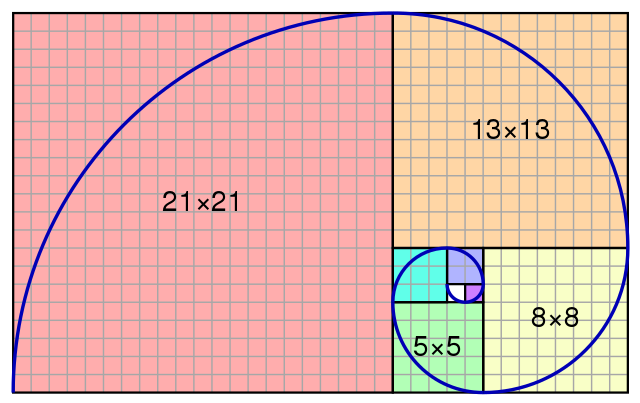 .An approximation of the golden spiral created by drawing circular arcs connecting the opposite corners of squares in the Fibonacci tiling.
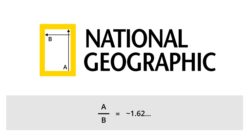
Though you may be thinking this is just a fancy formula mathematicians developed, it is commonly occurring in nature, primarily the spiral. It can be seen in plants, the shell of the Nautilus, and even the cloud formations in hurricanes. When you dig into it, the golden ratio is all around us, both man made and natural. Take a look at the National Geographic logo ? it?s a proportional rectangle that follows the Golden Ratio.
How to use the golden ratio in UX design
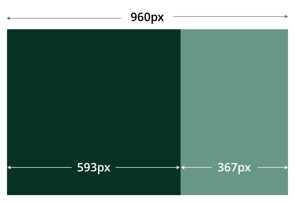
Using the golden ratio in your design work is simpler than it may seem. Since it?s all about the ratio, you can leverage the formula to generate columns and proportional layouts. For instance, if you want to create a layout with a sidebar and a main content area in a width of 960px, you would calculate the width of the main column to be 960px / 1.618. This will generate a width of 593px. You would do the same to the main column width to get the sidebar width (593px / 1.618) to get 367 px. Of course this isn?t factoring in margin or padding, and you may want to round these measurements to be even numbers, or fit a multiple based on your system. However, this provides guidance on the most pleasing balance between these columns.
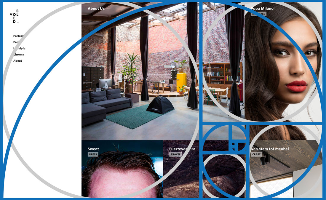 More examples of the golden ratio at work in website design. Image credit design shack.
In this scenario, you?ll likely want these columns to be scrolling, and not fixed to a certain height. If you have content blocks or sidebar widgets, you can leverage the formula to determine the best height for these blocks based off of their width (either multiply or divide by the 1.618 value to get an arrangement that fits for your application).
Though it is great to leverage this ration in your design, applying it across the whole page or layout can be difficult, as many designs are dynamic, and respond to changing viewport or layout sizes. If you focus your ratio use on components within the design, and leverage a grid based on the ratio to align those components, you?ll be able to reap the benefit with less stress.
A great, simple way to get started is by leveraging templates and wireframe examples that make use of the ratio for creating their layouts and placing elements. This is a great baseline to use when starting your design, as you can see how it works in practice. There are also many calculators for plugging in measurements and calculating appropriate dimensions based on the ratio. If you?re using applications like Adobe XD for your design work, you can download templates like this Golden Grid from Jon Vargas. Whatever you?re creating, hopefully this will equip you to design stunning, balanced layouts.
Visit XD Ideas for more unique insights and authentic points of view on the practice, business and impact of design.
Join a free Daily Creative Challenge to sharpen you UI/UX design skills
Learn about Adobe XD, the powerful platform where teams collaborate to create designs for websites, mobile apps, voice interfaces and more.
Originally published at https://xd.adobe.com.


