I don?t care about the Miss Universe pageant.
However, something that a group of people worked very hard for, and that many other people place significance on, was tainted with heartbreak, disappointment, and awkwardness.
It?s a terrible situation for everyone involved.
Miss Colombia experienced a moment of thinking she had achieved her dream, only to have it ripped away. Miss Philippines had to graciously accept the crown, despite this, and all the while Steve Harvey was riddled with guilt for his blunder.
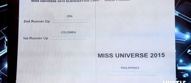
The culprit? Many people are blaming the design of the announcement card:

This announcement card is horridly ugly. It?s shockingly informal. It seems, many people think, that its haphazard starkness doesn?t serve the dignity of the occasion, and, additionally, it?s just too confusing.
As someone who writes about design I?ve been bumped a couple of times to comment on it. So, here it goes.
This announcement card is fine. In all of its ugliness and informality, it?s fine. Here?s why.
This is the way pageants work
The most confusing thing about this card, is the ?runner up? system. I, personally, have always been confused by the ?runner up? system.
Any pageant-type-thing I have ever seen works like this:
- There are three contestants on-stage.
- The emcee announces the ?second runner-up? (which I always figured should just be called ?third place?)
- Two contestants remain, clutching each other?s hands, waiting to see who will be the winner.
- The emcee announces the ?first runner-up? (which I always figured should just be called ?second place?)
- The remaining contestant is the winner.
(I could be wrong about this, because ? as stated before ? pageants don?t interest me, so I?ve rarely seen them.)
If you look again at the card design, you can see that, conceptually, the design makes sense. The two contestants who you, the emcee, should announce are right where you would look first: the top-left.
The one who remains is in a totally different column, separated by a dividing line. By process of elimination, you will announce that one.
Conceptually, it makes sense. Visually, it?s imperfect. It would have been better to just have them in a list.
If I were to redesign the card, it would look like this:

That?s it. The fonts ? though poor choices ? don?t need to be changed. We don?t need fancy background patterns, or icons of stars and such. Those things could make it better, but they aren?t necessary.
The card doesn?t need to be any prettier
Others are shocked to see how visually ugly the card is. How could something that carried so much weight be given so little consideration?
Welcome to the world of making things.
The card wasn?t to appear on camera, and there were plenty of other things ? audience facing things ? for the design team to design.
So, someone else probably designed the card.
The card is a terrible piece of design:
- It mixes Arial and Trebuchet (both sans-serif typefaces, both better-suited for the screen)
- It has those silly little underlines where the contestants? name-stickers were to be stuck later. They?re unnecessary.
- The reading flow is messed up a bit by putting the information in different columns.
I can?t help but notice the sweet irony of people being surprised that something ?behind-the-scenes? of a beauty pageant is so recklessly put together. That could be a whole article right there.
But, the card is still fine.
Steve Harvey is a professional
Yes, this card is fine. It was to be handed to ONE professional ? preferably one who had rehearsed, who was going to use the card to announce the winner.
This wasn?t a voting card that was going to be distributed to millions of people of varying cultural backgrounds and abilities to decide the country?s next leader.
This was one card, that was to be handed to someone who knew what they were doing. Should someone from the design team log a few more hours to make it perfect?
Mmmayyyybe. But they don?t need to. The card is fine.
Sometimes, people make mistakes. Steve Harvey didn?t try to hide behind a somewhat-a-little-bit-confusingly-designed announcement card. He claimed responsibility for not doing his job as he should have. Good for him.
Sometimes poor designs cause errors. This especially happens with things that many different untrained people are going to use, like highway exits, voter ballots, or that app you?re trying to coerce people to use.
This isn?t one of those cases.
Yes, the design of this card could have been better. But it wasn?t.
It was fine. To blame the design of this card for Mr. Harvey?s mistake is to ?cry wolf? in the name of design. Save it for when it really matters.
