
Theme your Angular Material apps like a PRO, examples included ?
 For what is the web if not to express our ideas?
Check out new live coding video tutorial & video from meetup.
Theming support in an application can be pretty useful. From nice to have feature like letting user to chose from available color schemes to get personalized experience to more mission critical branding capabilities like building multi-tenant SaaS product where every client wants to use their own domain, logo and colors to offer branded services to their end customers.
Lately I have been working on Angular ngRx Material Starter project and surprisingly, one of the best features of new Angular Material component library proved to be its theming capabilities. It enables us to implement beautiful themes with only a little effort on our side!
Google Developer Expert approved! ?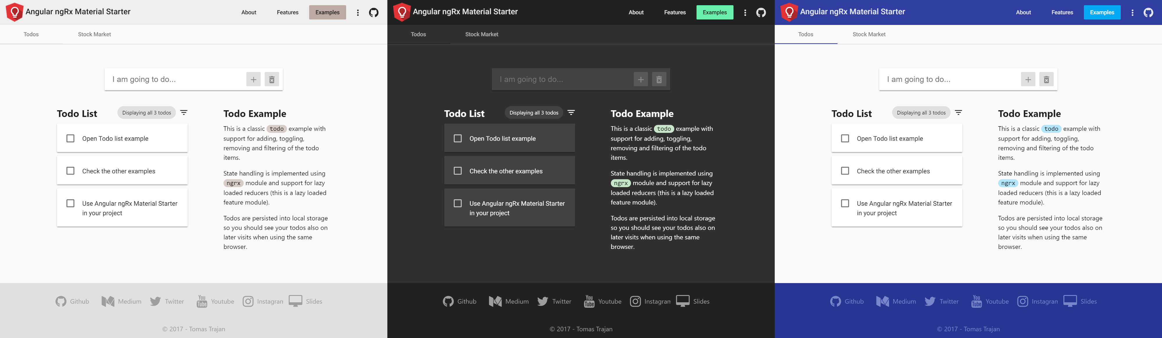 Angular Material theming capabilities in practice (light, dark and default themes of our example project)
Unfortunately, as of June 2017, the official theming documentation seems to be a bit lackluster and it takes a while to figure out how the whole thing actually works and how to get access to the needed colors defined as a part of the theme.
Anatomy of a theme
Defining a theme in Angular Material is extremely simple, all we need to do is to create a theme file, select three color palettes for the main theme colors ? primary, accent and warn ? and we are all set!
Feel free to explore all the palettes that are available out of the box.
Angular Material theme definition file
The numbers behind the palette variable name select particular shades of chosen color for default, lighter and darker variants. If no numbers are provided Angular Material selects sensible defaults $default: 500, $lighter: 100, $darker: 700.
Yeah cool, variable names and numbers, but what does it mean in practice?!
No worries I got your back ?
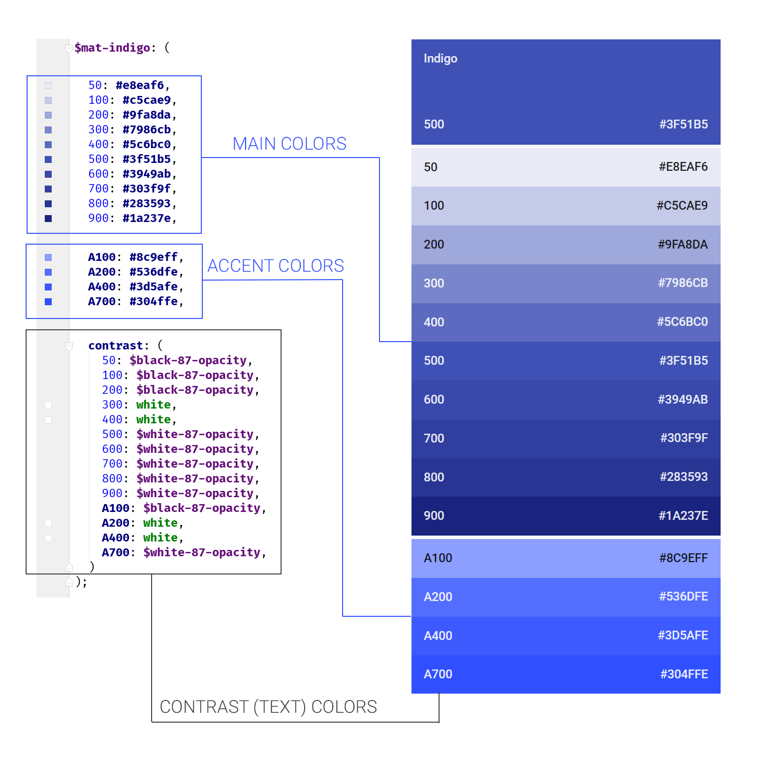 Anatomy of a Angular Material Palette
Even though every palette contains accent shades (eg: A100), we don?t necessarily need to use them as the accent color of our theme, we may simply choose different palette instead.
In example above, theme variable $my-theme-accent is set to$mat-light-blue palette instead of accent shades of $mat-indigo palette which is used for $my-theme-primary variable?
Check out all the out of the box available Material Colors.
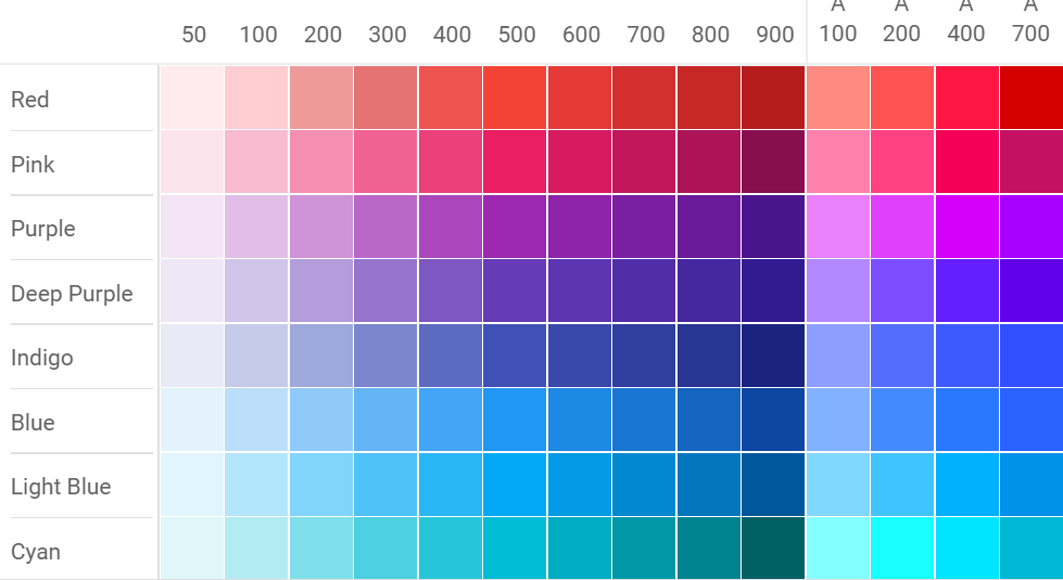 Example of some of the available Material colors
In the code example above we created our theme using mat-light-theme function. This means that all the other ?neutral? colors of our theme will be various shades of black and white with mostly white (or very light grey) backgrounds and mostly dark elements like text, dividers, shadows ?
Angular Material provides also mat-dark-theme function which does exactly the opposite ? dark backgrounds and light elements. We will get into more details of these two later?
Do you wan?t to stay up to date with releases of Angular Material? Follow Release Butler, a Twitter bot I created that tweets beautiful changelogs of popular frontend libraries!
Release Butler tweets changelogs of popular frontend frameworks and libraries
Using our custom themes
Great, we defined our custom theme but that doesn?t do anything by itself. Next step is to include our custom theme in main style file of our application (usually styles.scss).
Using custom theme in our application
Using specific css class for single theme is not necessary per se but it will help us when adding additional themes
Adding multiple custom themes
To use multiple themes we simply need to import additional themes and create respective css classes for each theme.
Use multiple custom themes
Theme class and overlay handling
Depending on our particular use case we might need to implement some dynamic css class switching (with [class]) to enable user to switch themes using application preferences during runtime or use parametrized build (eg: define variable in webpack) to build our application using desired theme by adding correct css class to the <body> tag during build.
Angular Material contains components like dropdown or dialog which create overlay over the application’s default layout, to theme these elements we have to set theme class also on the overlayContainer.
Setting theme on the overlayContainer of Angular Material during runtime
Cool our application now supports use of potentially unlimited number of different themes??. This is useful in itself but these themes will only style components provided by the Angular Material library itself. While there are quite some components available (and even more are waiting in the pipeline for the future releases) almost no application can do without implementing some custom components.
Follow me on Twitter to get notified about the newest blog posts and interesting frontend stuff
Theming our custom components
Let?s say we are going to implement our own custom ?big input? component in shared module. Using @angular/cli we will execute command which will look something like ng generate component shared/big-input –module shared.module. This will generate component, template and style files. We will put our general layout and styling to the big-input.component.scss but we will also create new file big-input.component.scss-theme.scss where we will use style rules which have anything to do with color.
While <component-name>.component.scss-theme.scss is not official naming convention, I found it very helpful because IDE will put original styles file and theme file next to each other based on default alphabetical ordering.
The custom component theme file then will look something like this?
Styling custom component using theme variables
In our mixin, we retrieved all the available theme variables to demonstrate what is possible but in real project we should only retrieve what is necessary?
These variables then contain many sub-values based on the variable type. $primary, $accent and $warn variables contain reference to the whole palette as we defined in our custom theme definition in the beginning of article.
Retrieving color
We can retrieve particular colors using mat-color function. We can select default, lighter and darker shades (eg: mat-color($primary, lighter)) as defined by our theme or even any available color of the palette when necessary (mat-color($primary, A200)).
Contrast colors
It can be useful to retrieve appropriate contrast color when using main color as a background for some component which also contains text. In that case we can retrieve corresponding contrast color, eg: mat-color($primary, lighter-contrast) for backgrounds which mat-color($primary, lighter).
Foreground and background color sub-values
While $primary, $accent and $warn variables contain same sub-values because they are created in a same way using mat-palette function, $foreground and $background are a bit different. We don?t define them by hand but Angular Material sets their colors based on the function we use to create our custom theme. There are two available functions ? mat-light-theme & mat-dark-theme and available sub-values are?
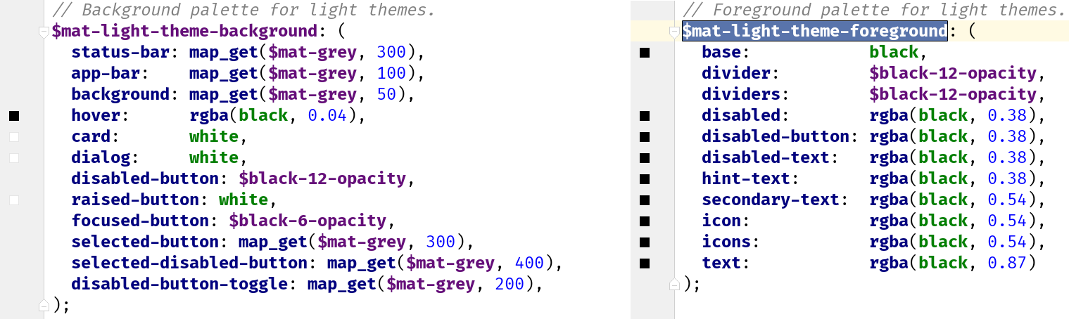 Background and foreground Angular Material variables
Using custom component themes
To use our custom component theme we have to include it in main styles.scss file.
It is a good practice to create separate custom-components-theme mixin where we can collect all of our custom components so that we don’t have to repeat all of them for every custom theme class
Including custom component themes in main style.scss file
? Psst! Do you think that NgRx or Redux are overkill for your needs? Looking for something simpler? Check out @angular-extensions/model library!
 Try out @angular-extensions/model library! Check out docs & Github
Defining custom palette
Angular material provides quite some palettes out of the box and many times it will be enough but sometimes we will need to use colors defined in company?s design manual to achieve consistent branding of the product.
In that case we can simply create custom-palettes.scss file and create our own palette variables (eg: $my-company-blue) with all the sub-values which are contained in standard Angular Material palettes like 100, 200, contrast, ?
Then we simply import this file in the custom theme definition file so that we can use the provided values.
That?s it!
We learned how to theme our Angular Material applications! Check out the example website, github repo and please support this article with sharing and your ? ? ? to spread it to a wider audience!
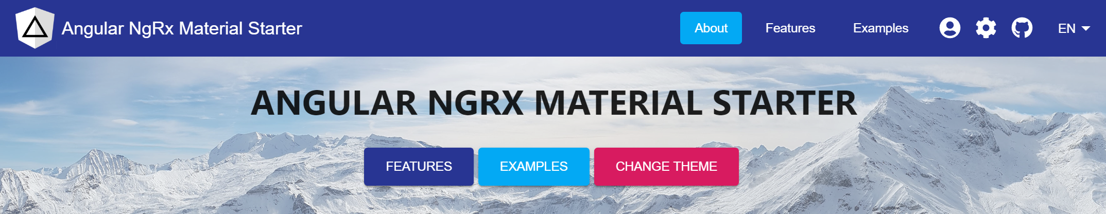
Starting an Angular project? Check out Angular NgRx Material Starter!
 Follow me on Twitter to get notified about the newest blog posts and interesting frontend stuff
Also, feel free to check out other interesting front-end related posts like?
Total Guide To Angular 6+ Dependency Injection ? providedIn vs providers:[ ] ?
Let?s learn when and how to use new better Angular 6+ dependency injection mechanism with new providedIn syntax to make?
medium.com
How To Stay Up To Date With Releases Of Popular Frameworks
Introducing Release Butler ? A Twitter Bot That Helps You To Stay Up To Date With Releases Of Popular Frontend?
medium.com
Medium Hates Him! See How He Improved the Stats Page With This One Simple Trick
Yeah, the title, I know? but I had to try it at least once in my life ??
medium.freecodecamp.org
?? How To Create Your First Custom Angular Schematics With Ease??
Learn how to create, publish and use your own custom Angular Schematics to increase your productivity and enhance?
medium.com
And never forget, future is bright
 Obviously the bright future

