Much like CSS Grid (my other Medium tutorial) Flex Box is quite complex because it consists of not one but two element types: The container & items.
My Coding Books
JavaScript Grammar contains the entire language walk-through from the stand point of a complete beginner gradual?
medium.com
To get a good idea of how flex works try flex layout editor on this page.
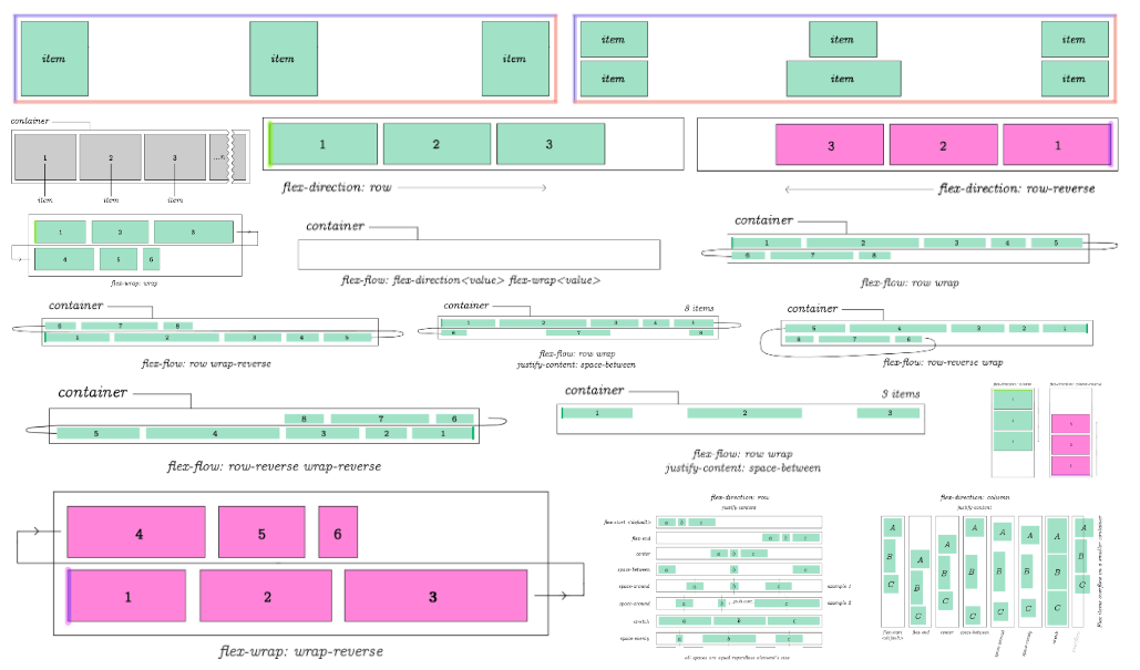
When I started to learn Flex, I wanted to see everything it was capable of. But, I wasn?t able to find a thorough tutorial showing examples of all Flex properties. So, I created these diagrams with Flex from the bird?s ? eye view.

That?s everything Flex is capable of. But? let?s go over each diagram individually with comments. By the end of this Flex tutorial you should be up to speed with pretty much the complete picture of what it can do.
Flex
Flex is a set of rules for automatically stretching multiple columns and rowsof content across parent container.
display:flex
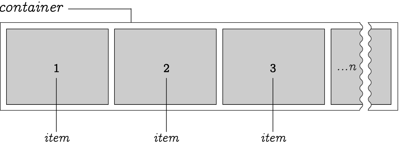
Unlike many other CSS properties, in Flex you have a main container anditems nested within it. Some CSS flex properties are used only on the parent. Others only on the items.
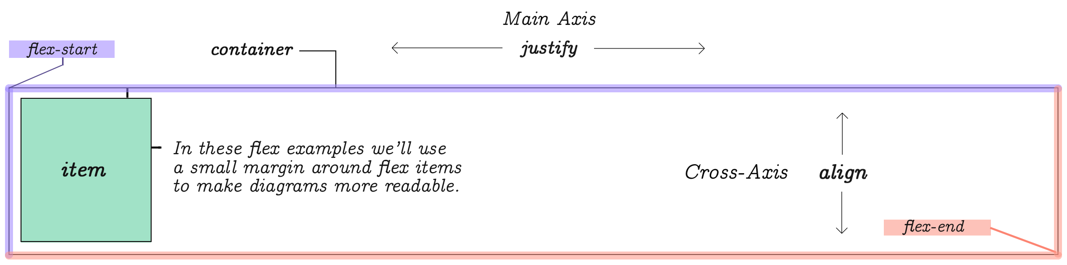
You can think of a flex element as a parent container with display:flex. Elements placed inside this container are called items. Each container has a flex-start and flex-end points as shown on this diagram.
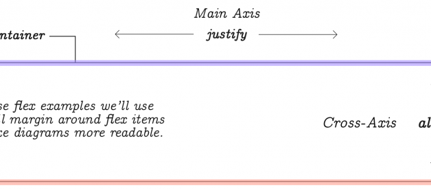
Main-axis and Cross-axis
While the list of items is provided in a linear way, Flex requires you to bemindful of rows and columns. For this reason, it has two coordinate axis. Thehorizontal axis is referred to as Main-Axis and the vertical is the Cross-Axis.
To control the behavior of content?s width and gaps between that stretchhorizontally across the Main-Axis you will use justify properties. To controlvertical behavior of items you will use align properties.
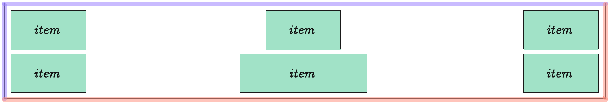
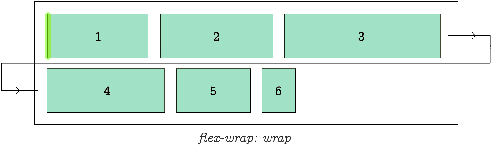
If you have 3 columns and 6 items, a second row will be automatically createdby Flex to accommodate for the remaining items.
If you have more than 6 items listed, even more rows will be created.
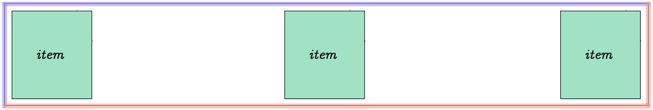
Flex items equally distributed on the Main-Axis. We?ll take a look at the properties and values to accomplish this in just a moment.You can determine the number of columns.
How the rows and columns are distributed inside the parent element is determined by CSS Flex properties flex-direction, flex-wrap and a few others that will be demonstrated throughout the rest of this flex tutorial.
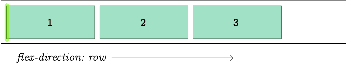
Here we have an arbitrary n-number of items positioned within a container. By default, items stretch from left to right. However, the origin point can be reversed.
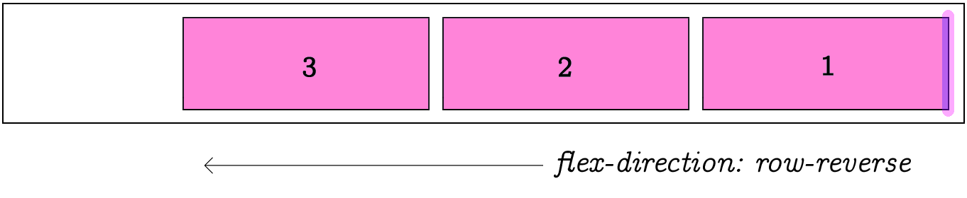
Direction
It?s possible to set direction of the item?s flow by reversing it.
flex-direction:row-reverse changes direction of the item list flow. The default is row, which means flowing from left to right, as you would expect!
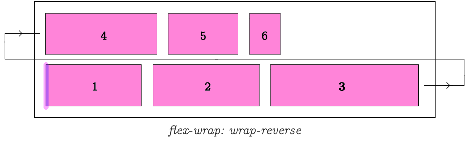
Wrap
flex-wrap:wrap determines how items are wrapped when parent container runs out of space.
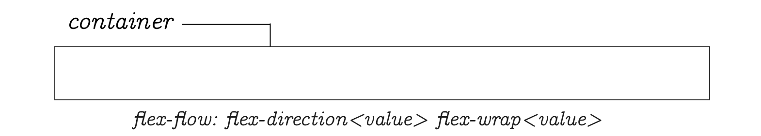
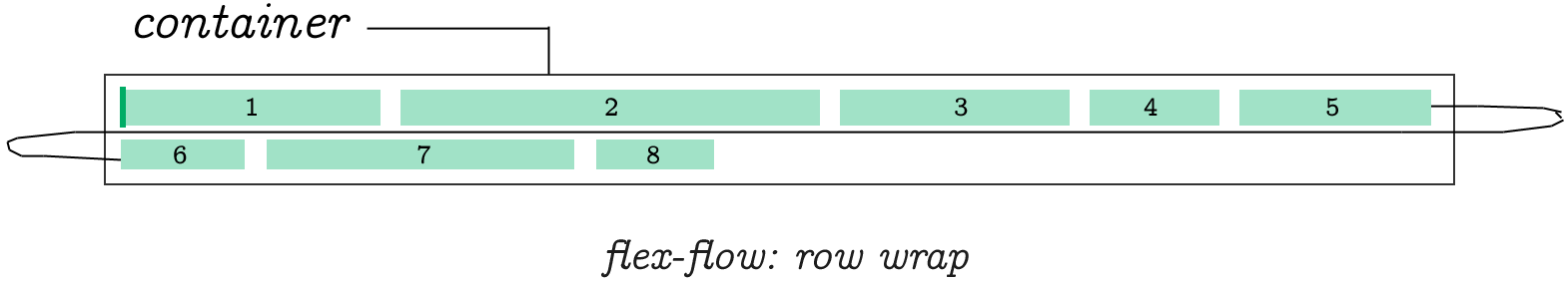
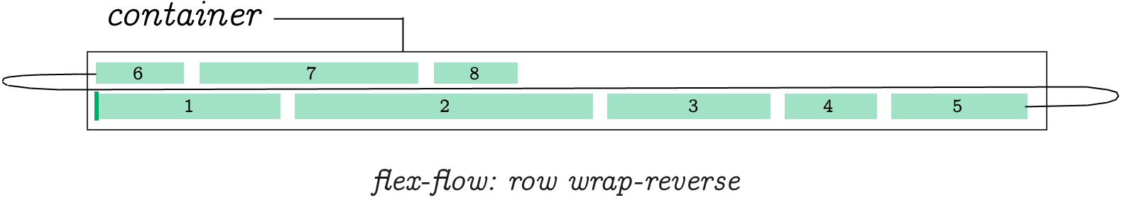
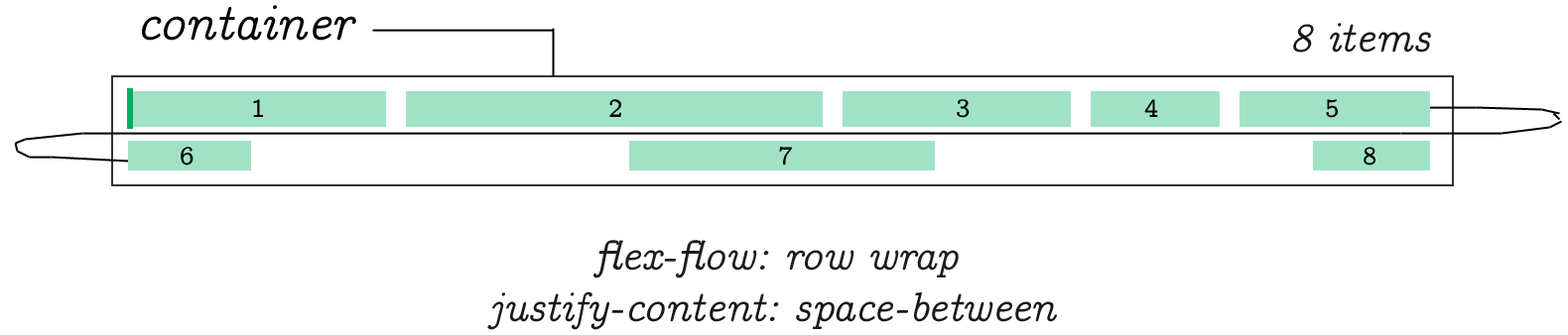
Flow
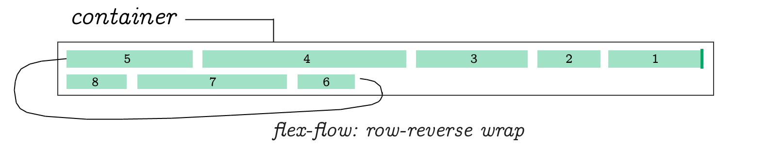
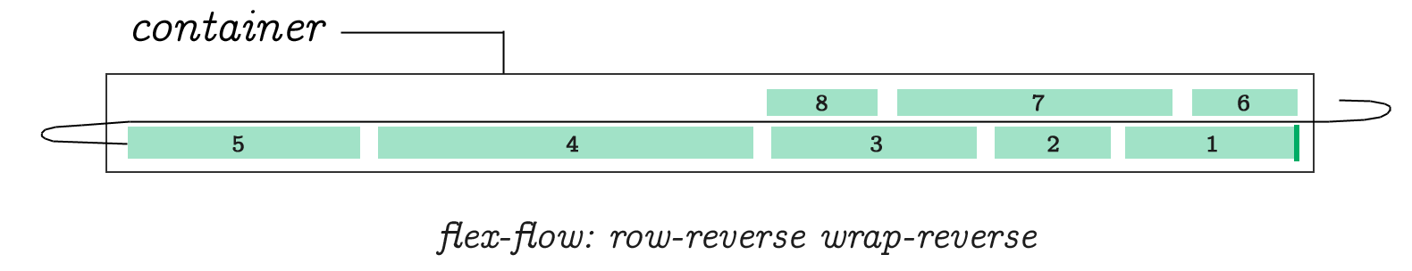
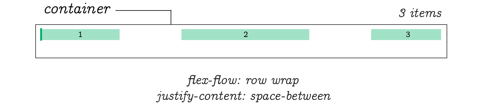
flex-flow is a short hand for flex-direction and flex-wrapallowing you to specify both of them using just one property name.flex-flow:row wrap determines flex-direction to be row andflex-wrap to be wrap.flex-flow:row wrap-reverse;flex-flow:row wrap; justify-content: space-between;flex-flow:row-reverse wrap;flex-flow:row-reverse wrap-reverse;flex-flow:row wrap; justify-content: space-between;The direction can be changed to make the Cross-Axis primary.
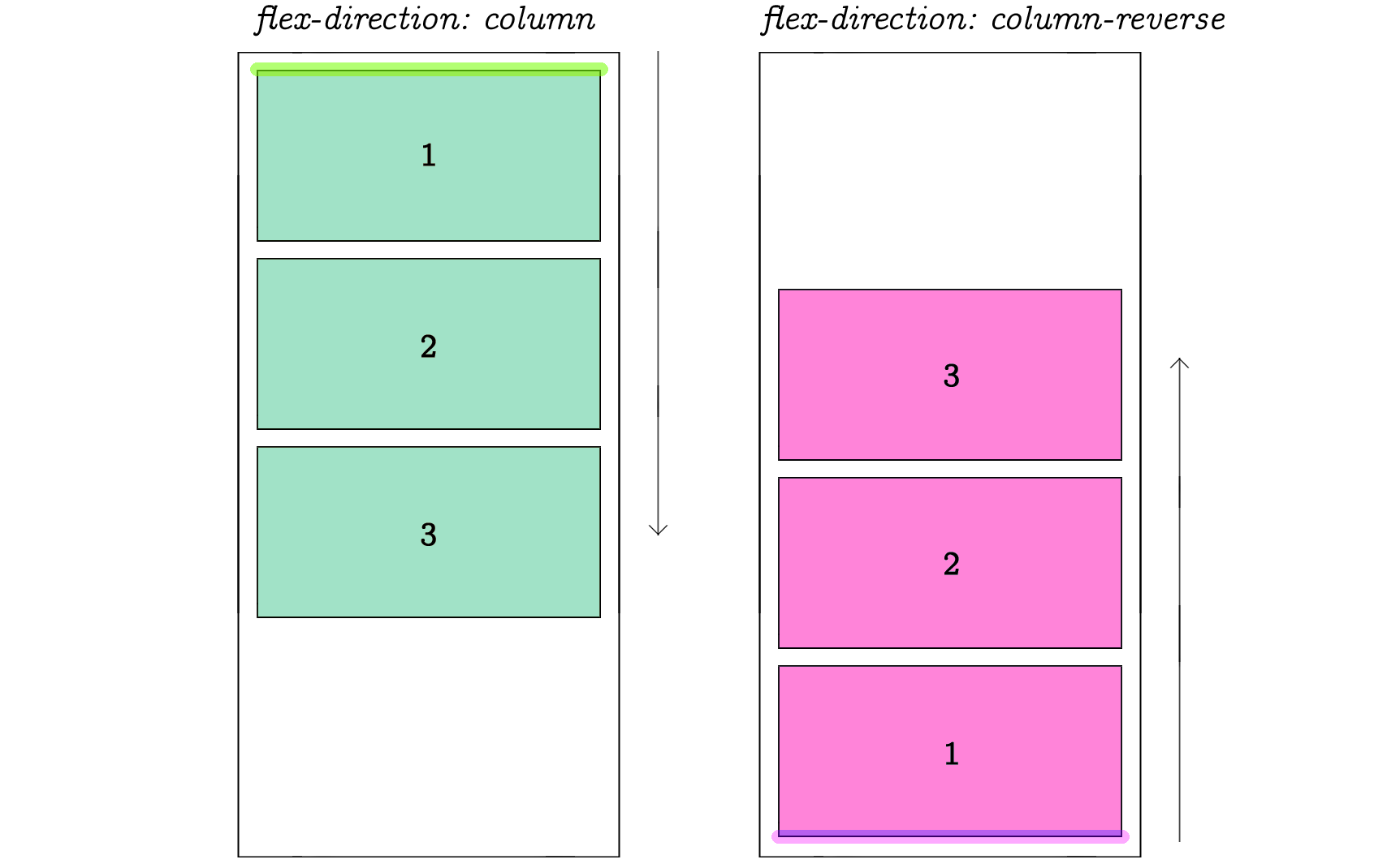
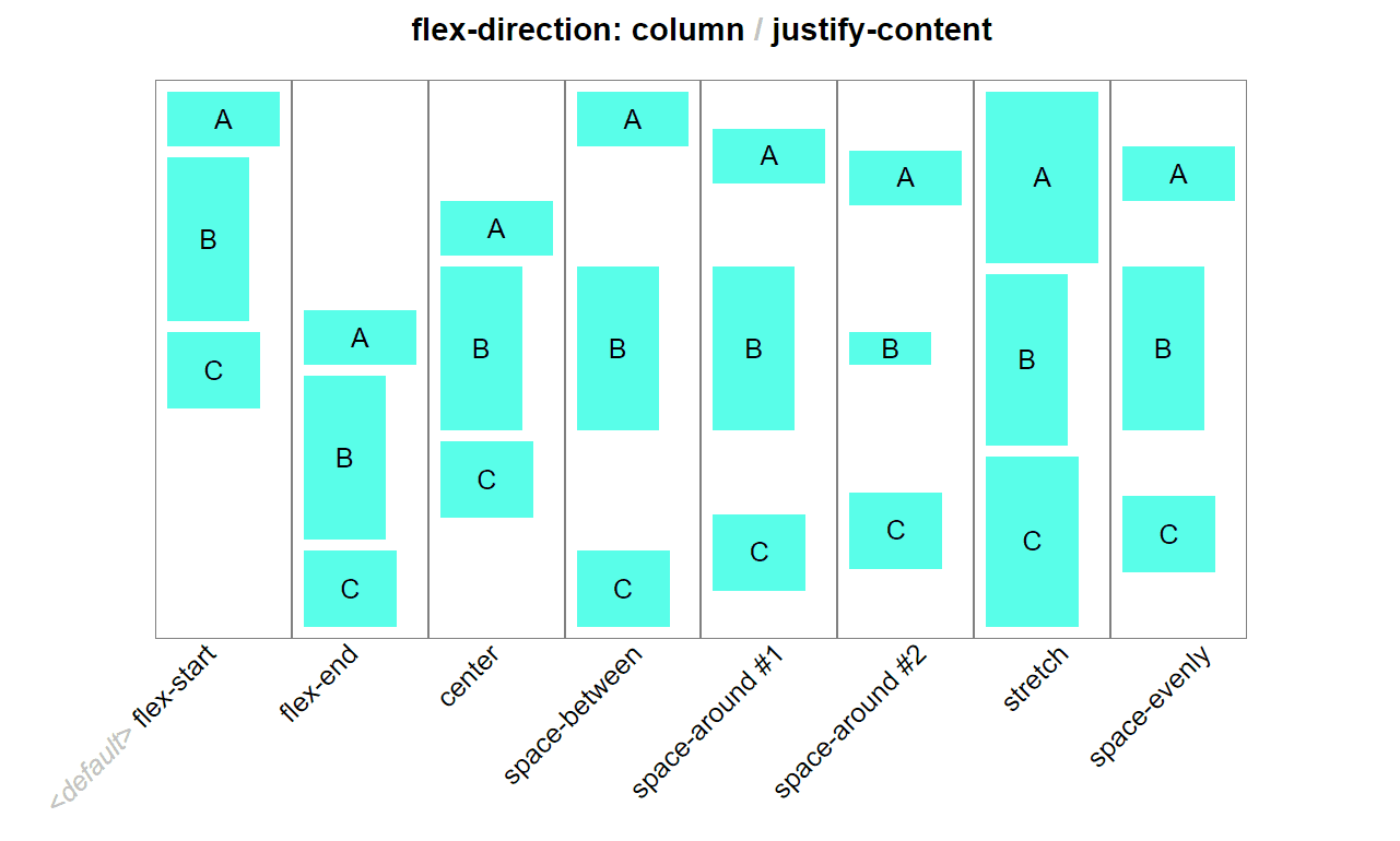
When we change flex direction to column, the flex-flow property behaves inexactly the same way as in previous examples. Except this time, they followthe vertical direction of a column.
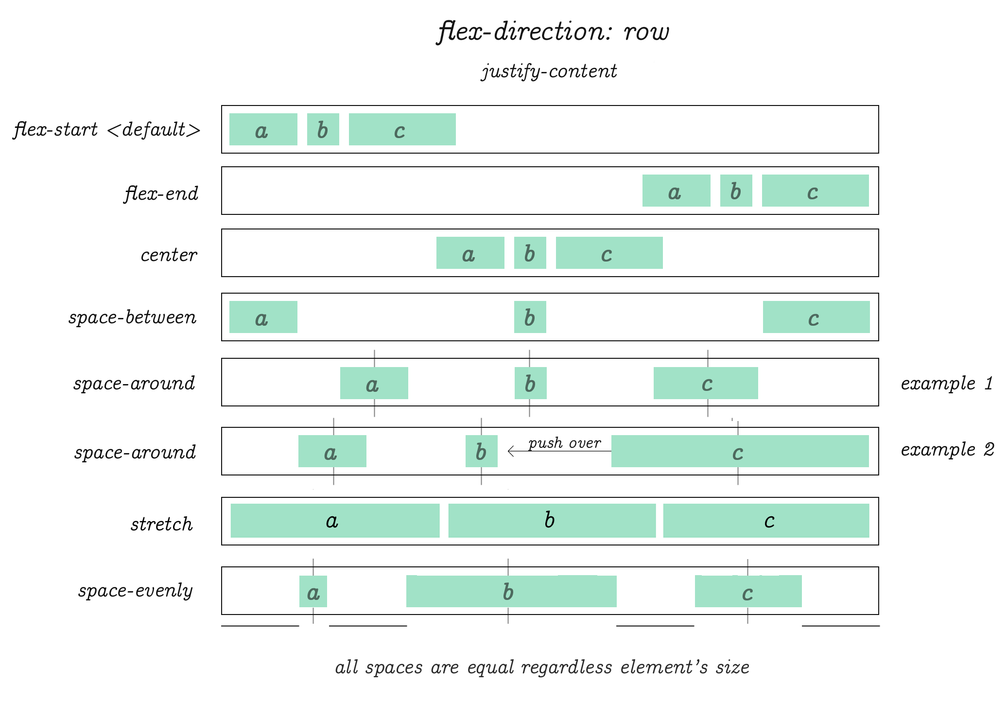
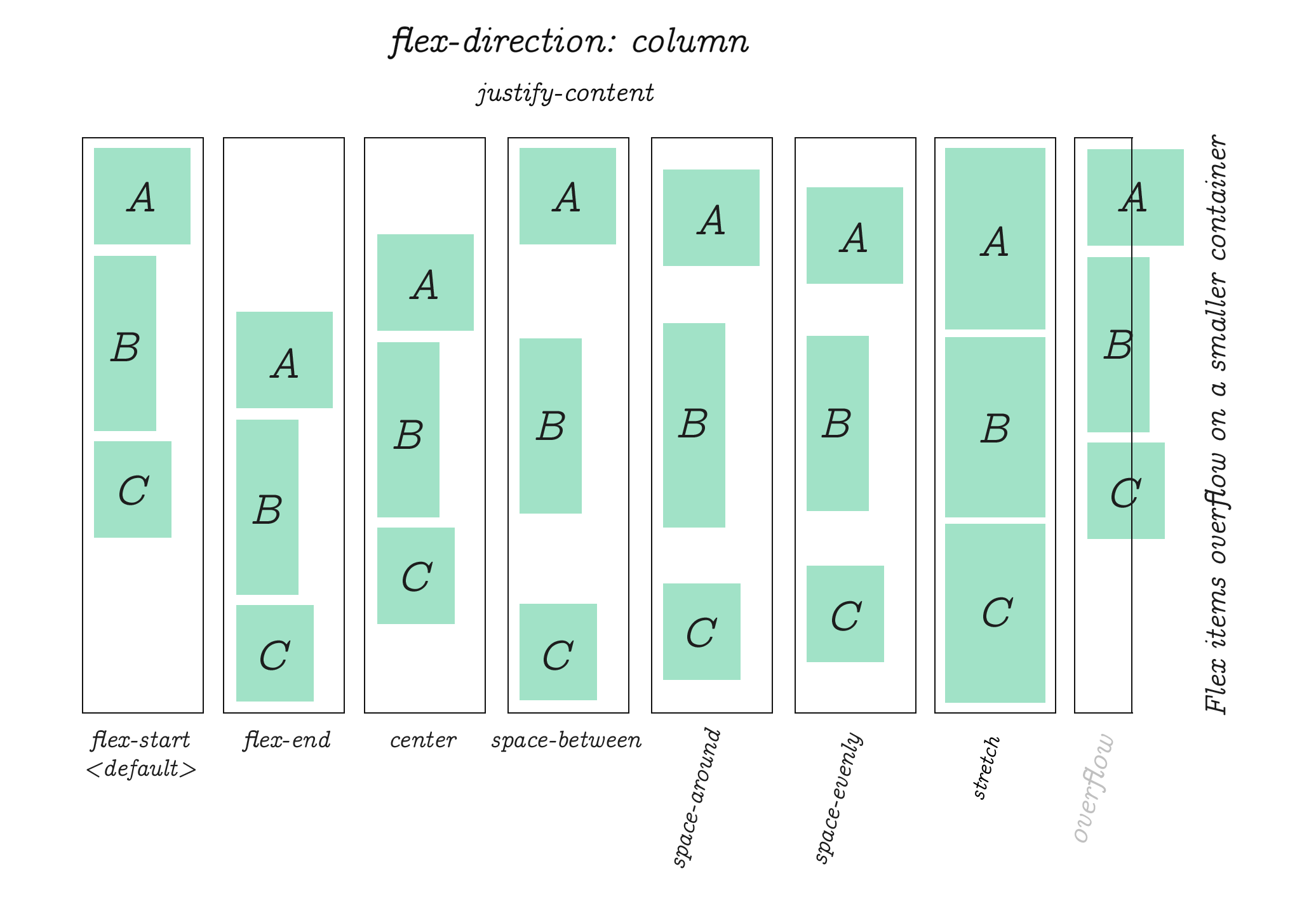
justify-content
I received a lot of requests to clarify the example above. So I created this animation. The original piece from which the diagram was crafted:
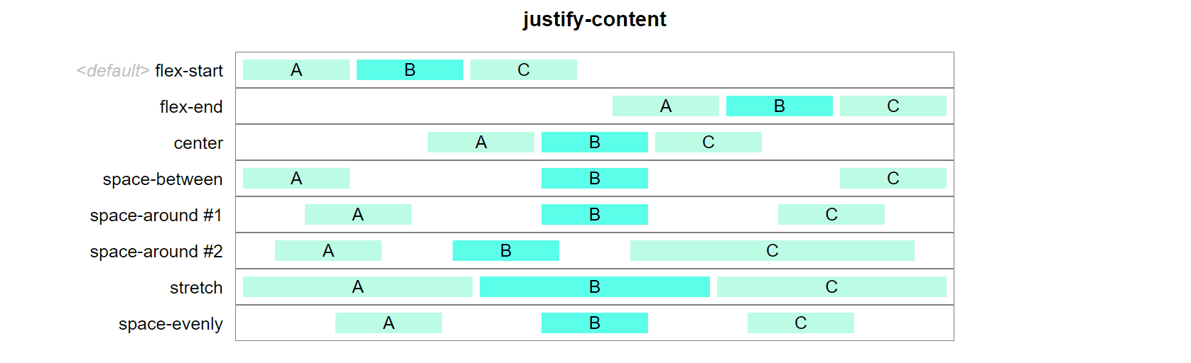 Animated justify-content.
Hope this clears the fog a bit.
flex-direction:row; justify-content: flex-start |flex-end |center|space-between |space-around |stretch |space-evenly. In this example we?re using only 3 items per row.
There is no limit on the number of items you wish to use in flex. These diagrams only demonstrate the behavior of items when one of the listed values is applied to justify-content property.
The same justify-content property is used to align items when flex-direction is column.
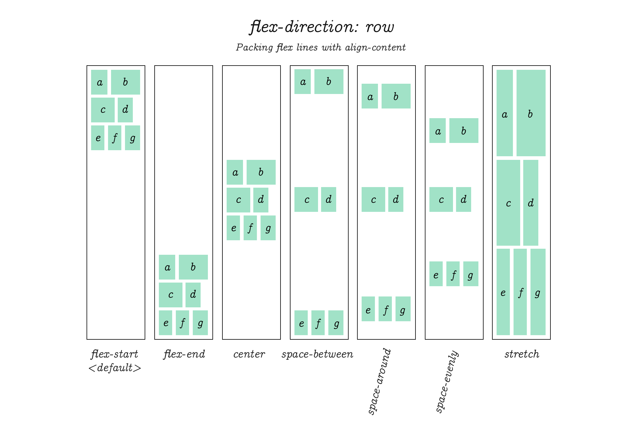
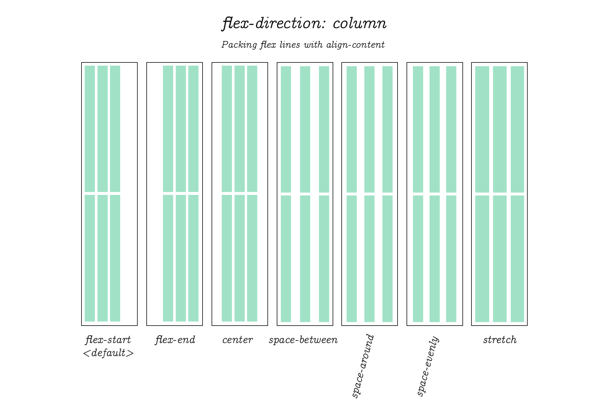
Packing Flex Lines (according to Flex specification)
Flex specification refers to this as ?packing flex lines.? Basically, it works just like the examples we?ve seen on the previous few pages. Except this time, note that the spacing is between whole sets of items. This is useful when you want to crate gaps around a batch of several items.
Packing Flex Lines (continued.) But now with flex-direction set to column.
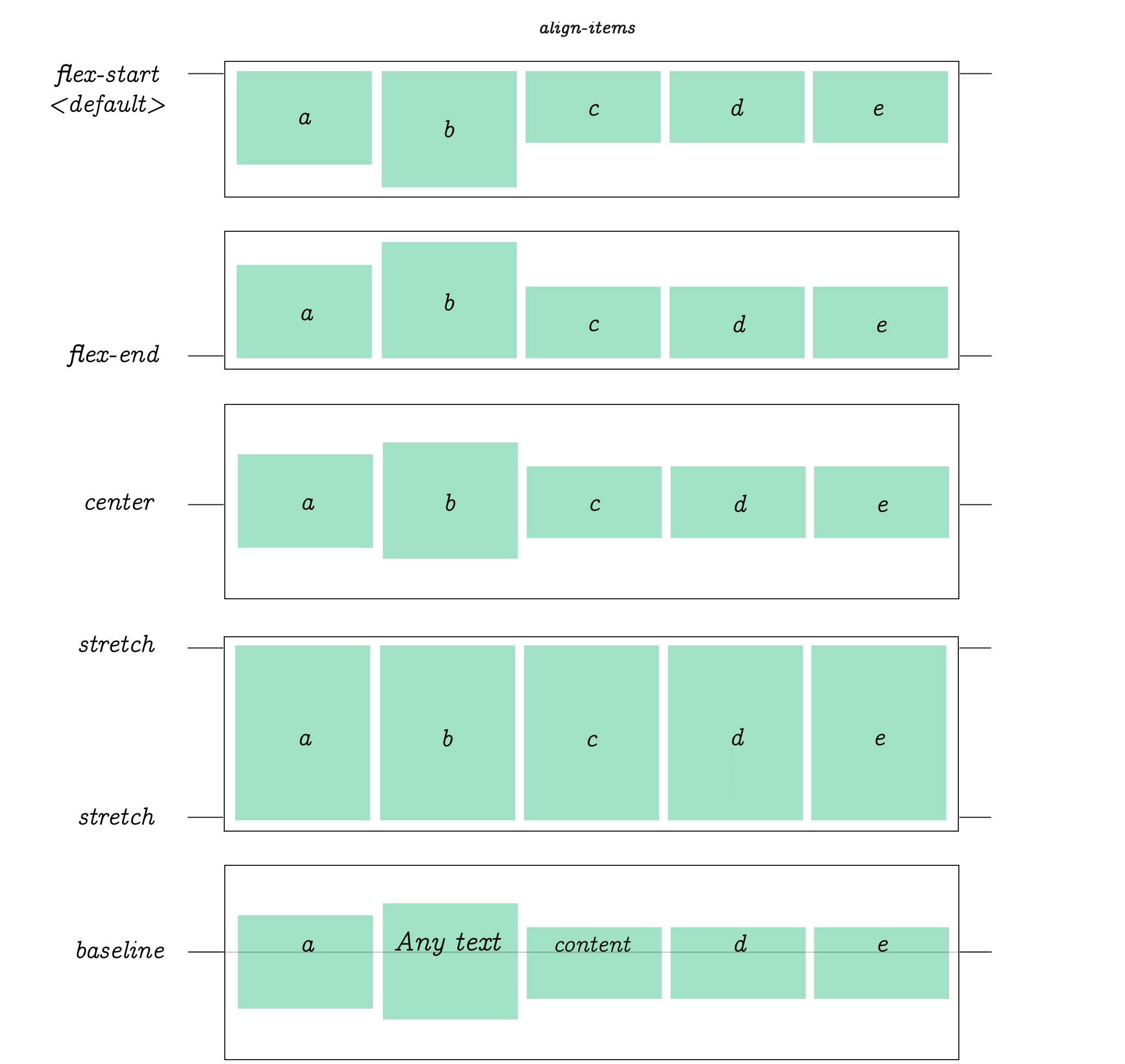
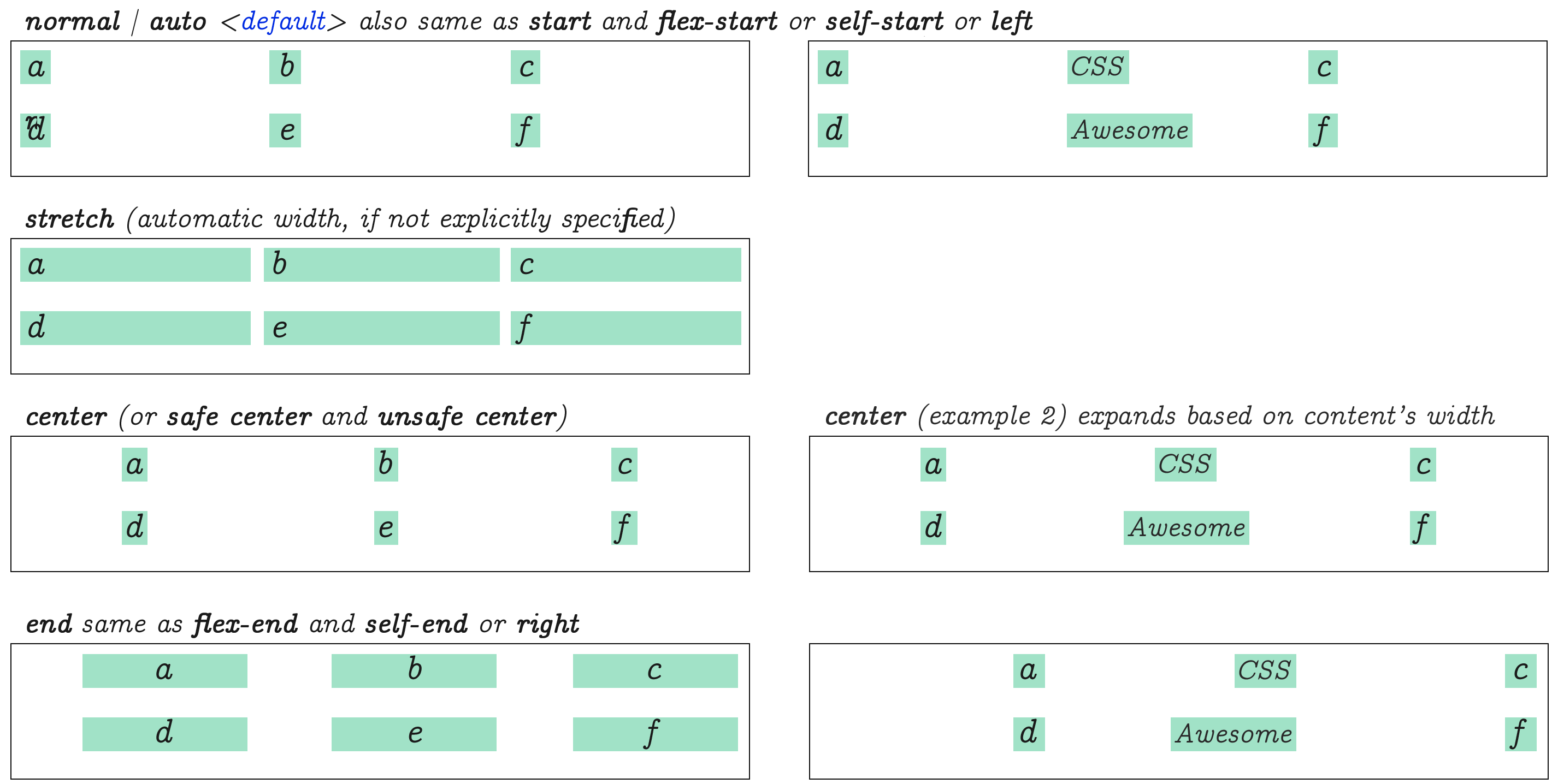
align-items
align-items controls the align of items horizontally, relative to the parent container.
flex-basis
flex-basis works similar to another CSS property: min-width outside of flex. It will expand item?s size based on inner content. If not, the default basis value will be used.
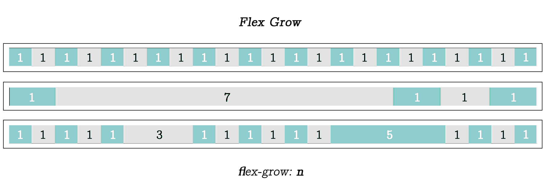
flex-grow
flex-grow, when applied to an item will scale it relative to the sum of the size of all other items on the same row, which are automatically adjusted according the the value that was specified. In each example here the item?s flex-grow value was set to 1, 7 and (3 and 5) in the last example.
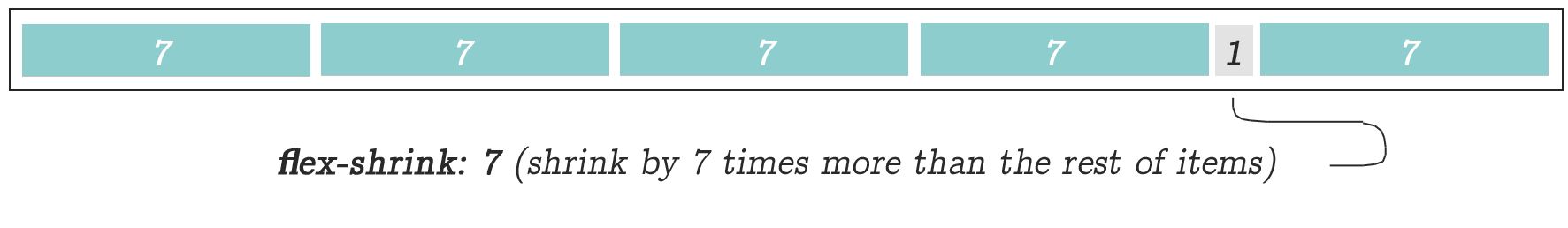
flex-shrink
flex-shrink is the opposite of flex-grow. In this example value of 7 was used to ?shrink? the selected item in the amount of time equal to 1/7th times the size of its surrounding items ? which it will be also automatically adjusted.
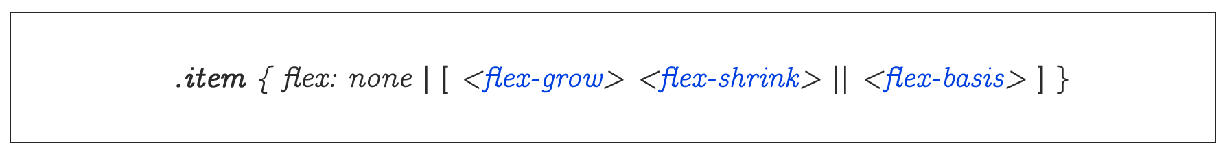
When dealing with individual items, you can use the propertyflex as a shortcut for flex-grow, flex-shrink and flex-basis using onlyone property name.
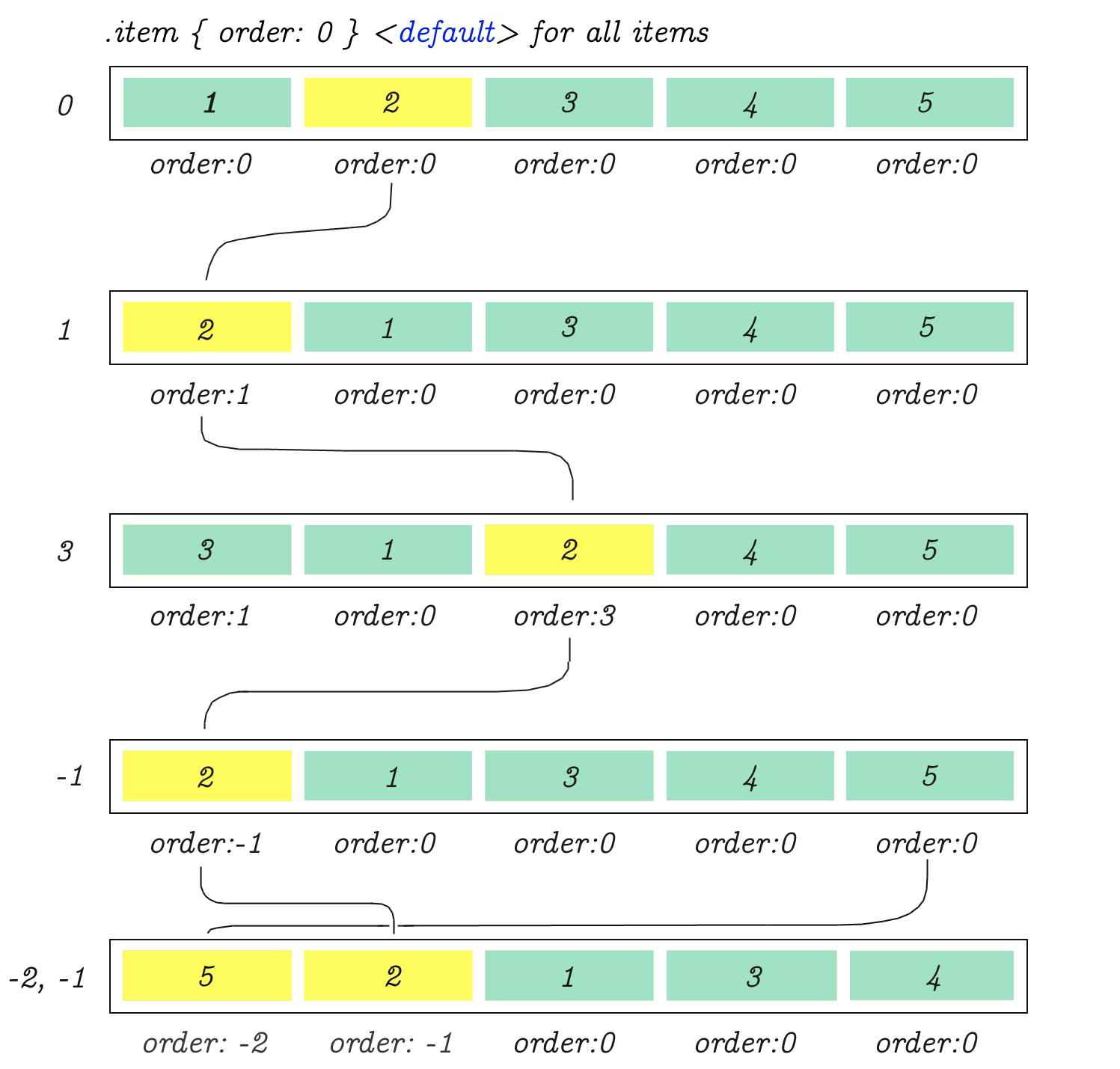
order
Using order property it?s possible to re-arrange the natural order of items.
justify-items
One last thing for those who are looking to use CSS Grid together with Flex Box? CSS grid?s justify-items is similar to Flex?s justify-content. (The properties described in the above diagram will not work in Flex, but it?s pretty much the grid?s equivalent for aligning cell content.)
Follow Me For Weekly Freemium On Social Networks
You can, on Twitter for weekend PDF giveaways.
My Coding Books
CSS Visual Dictionary contains visual diagrams for every single CSS property in common use. JavaScript Grammar contains?
medium.com
Follow me on Instagram for a quick hit of JavaScript.
You can follow me on Facebook for free coding stuff.
See my other comprehensive CSS Grid tutorial right here on Medium.
