Seth argues that the Mets, yes, those Mets, have the best uniforms in New York.
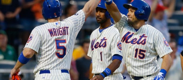
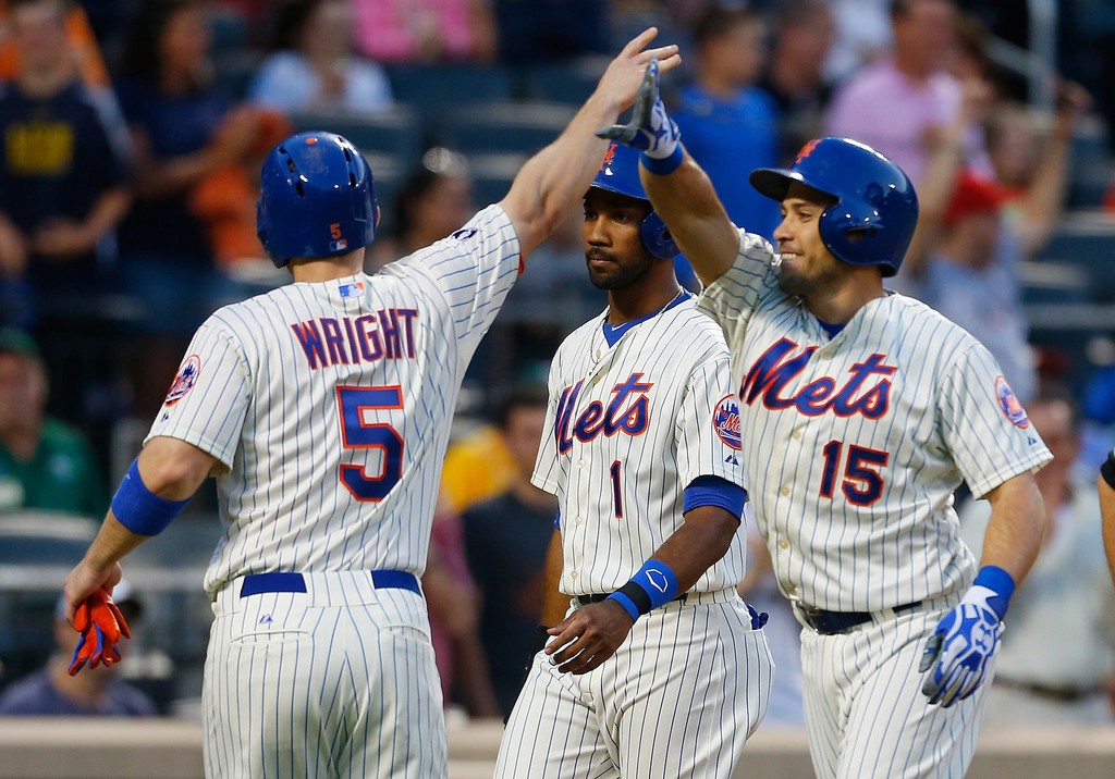 Photo Credit: Mike Stobe / Getty Images
As we await for baseball to return, all this free time to think about baseball has really opened the floodgates to baseball fans/writers/players throwing out plenty of polls. With Nike now taking over the manufacturing of MLB uniforms, it allowed fans to opine (or in some cases complain) about the changes other teams put into place with their on field look.
While the New York Mets did not alter their attire, beyond the addition of a ?swoosh?, it left me happy to see the team maintain their classic aesthetic. It should also be noted that Nike did not make the changes to the uniforms. Those designs were in place with Major League Baseball from when it was originally supposed to be Under Armour becoming the new outfitter.
I for one, a non-Mets fan, love the look of the New York Mets. In today?s age where teams, of all sports, try to design their uniforms to have an edge or dark dominant colors, the Mets have reverted to having their classic color scheme. Albeit a desire to have throwbacks to their late ?90s look of black softball tops has come up recently.
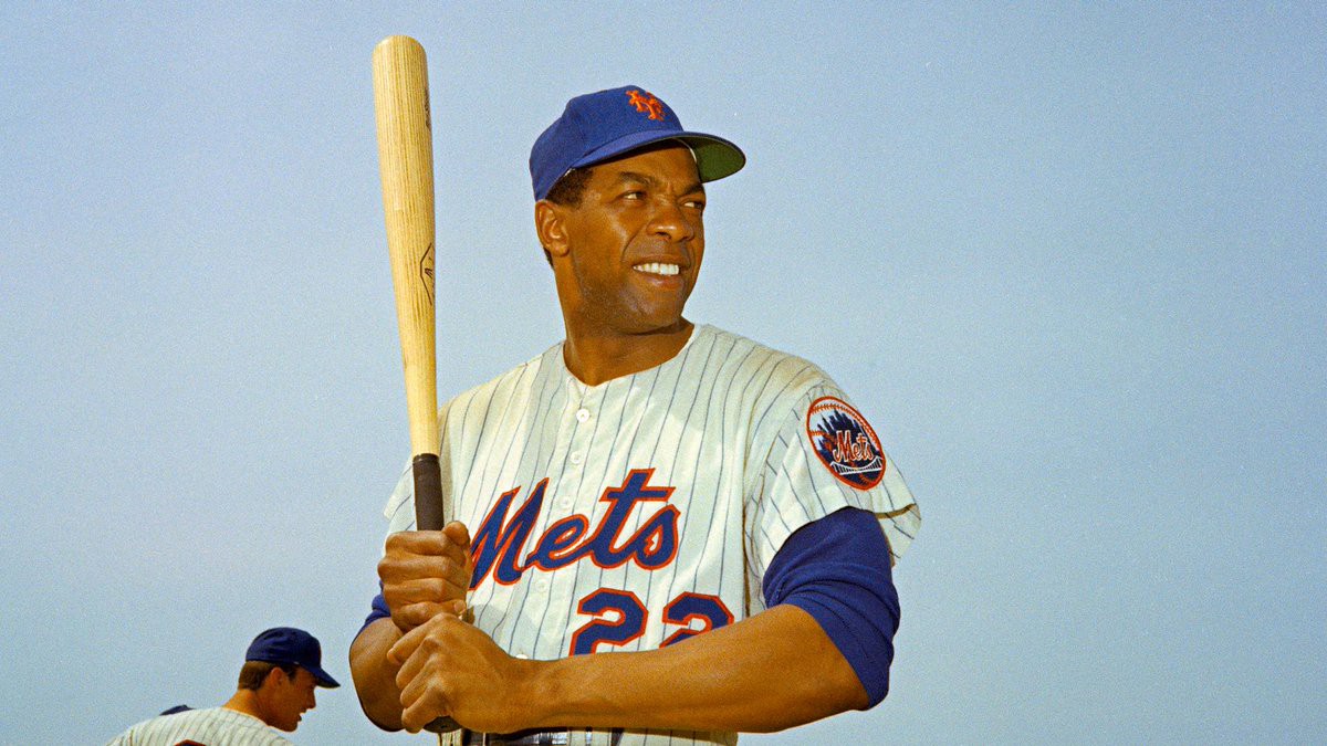 Photo Credit: AP
I love that when the New York Mets joined the league, their colors were chosen to honor the two NL franchises that left the city to expand Major League Baseball to the west ? the New York Giants and the Brooklyn Dodgers. With the Mets occupying the Giants former home, the Polo Grounds, it gave fans one direct connection to the past. The team felt that incorporating the Dodgers royal blue (we cannot call it ?Dodger Blue? in this case) as the main color and taking the orange that accented the Giants colors, it allowed the new club to pay homage. Taking it one step further, the interlocking ?NY? that Giants fans became accustomed to returned as the Mets cap emblem.
For the most of the Mets history, the team has constantly had the ?Mets? script on their home uniforms, and a stylized ?New York? mark on their road uniforms. From their initial existence, have those two styled uniforms was fairly commonplace in the league. As the flannel uniforms gave way to the double knit craze of the 1970?s, the road uniforms adopted a ?Mets? script when the team went to two-button Henley tops.
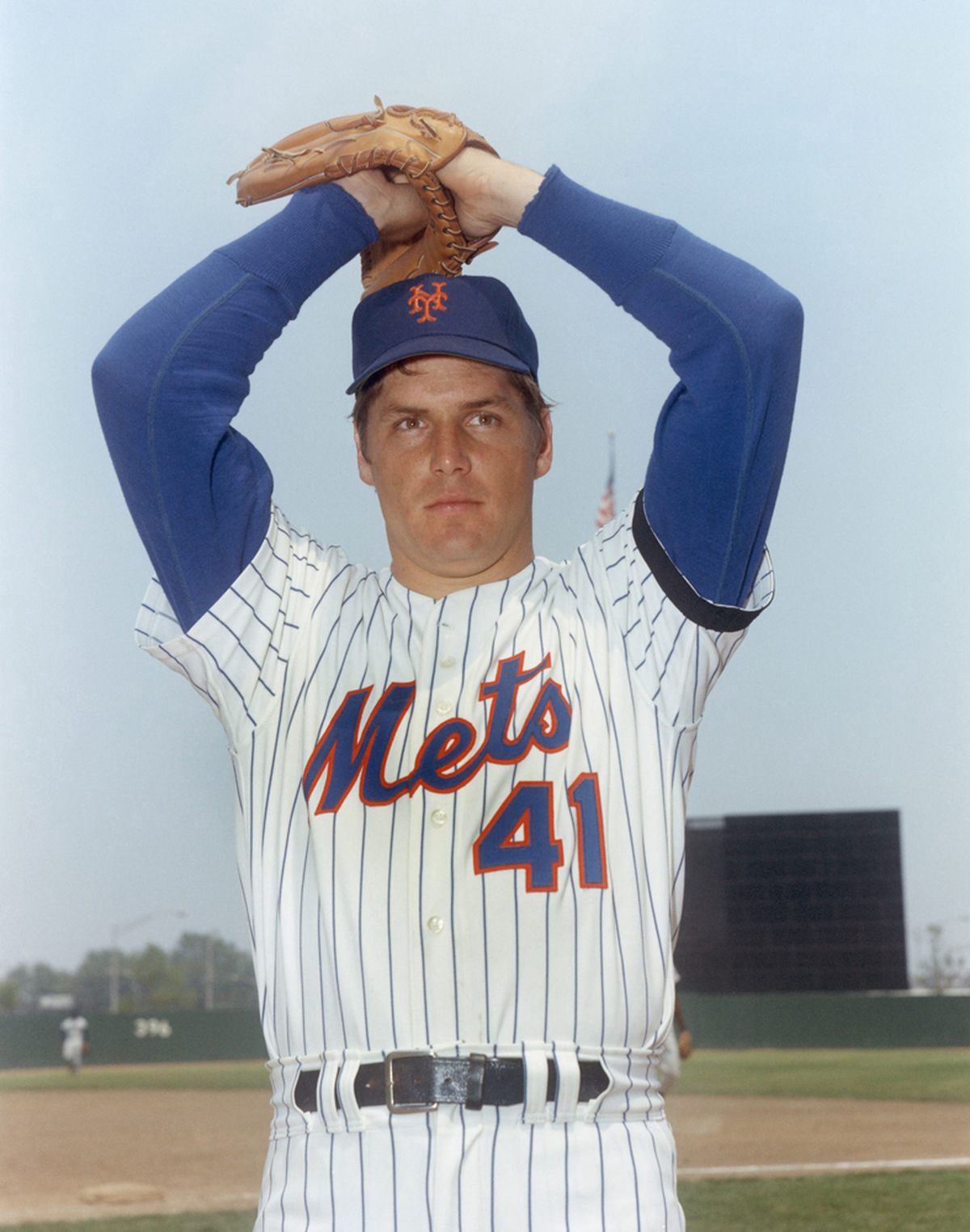 Photo Credit: Louis Requena / MLB Photos / Getty Images
Sticking to the Mets tried and true home uniform, it?s one of my personal favorite looks. Frankly, I feel it?s under appreciated. The royal blue pinstripes takes a traditional baseball look but does not make it seem too business like. That?s been one of my complaints with the Yankees pinstripes. The midnight blue with the chest logo likens it to the blue pinstripe suits you see guys walking around Wall Street in. The Mets pinstripes gives off a more casual feel. Maybe it?s just me, but seeing photos of baseball uniforms prior to end of the flannel uniforms in the early ?70s (like the Tom Seaver photo above) make these classic Mets uniforms look so amazing.
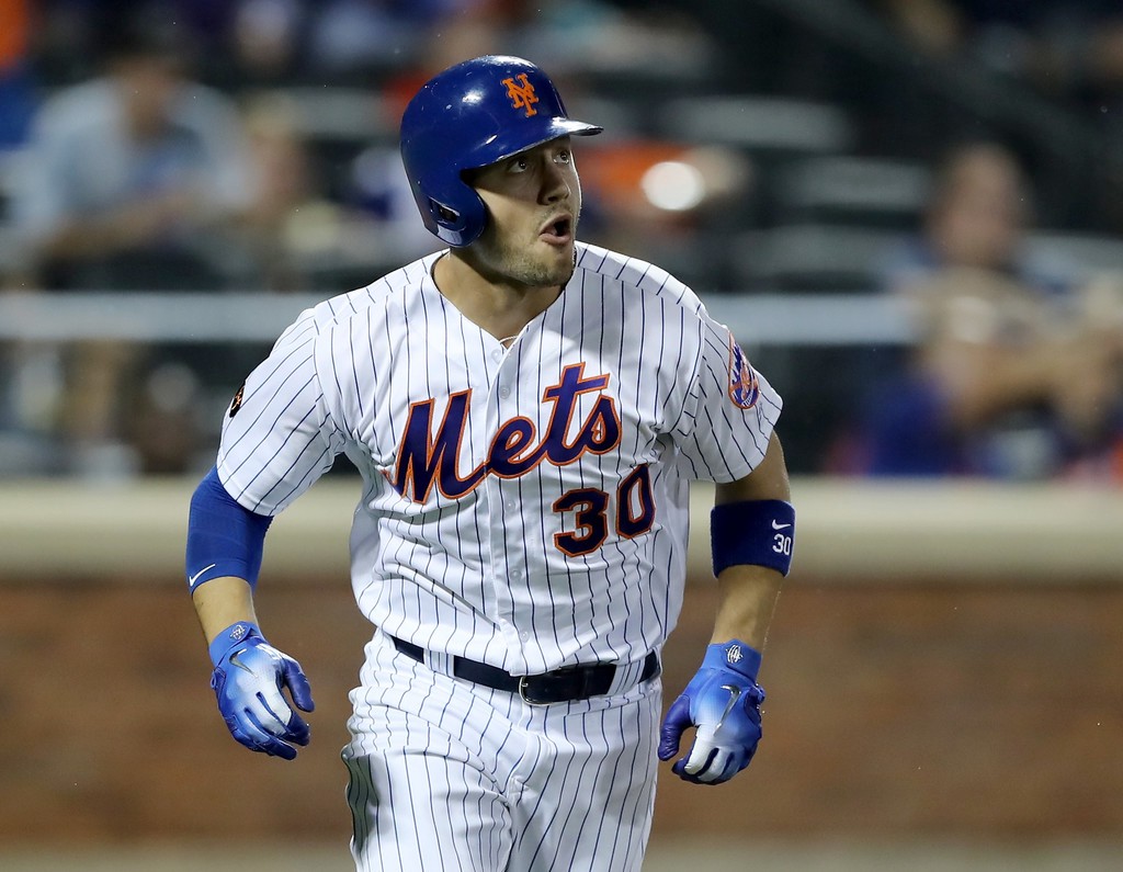 Photo Credit: Getty Images
Even with today?s styling of the classic Mets home uniform, it takes you on a trip down memory lane. While the last several seasons have seen the home white pinstripes uniform as a pure white color, there was a time in the 2010?s when the team showcased that look in an off white color. Though not as off white to be a cream like what the San Francisco Giants did with their home uniforms.
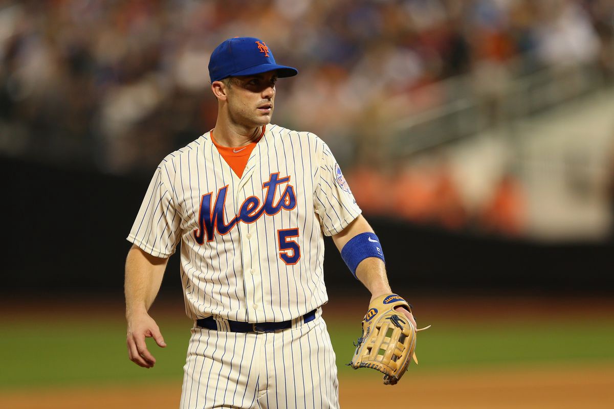 Photo Credit: Getty Images
The off white color accents the look. It gives fans the sentimental feel for those early Mets uniforms, even though through rose-colored glasses, there was not a lot of success associated with those early New York Mets teams.
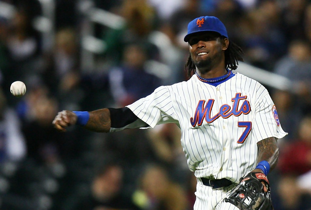 Photo Credit: Andrew Burton / Getty Images
Even during the Mets ?black for the sake of black? era, they wore pinstripe uniforms with a black drop shadow. As much as I loathe the team incorporating black into their uniforms, the pinstripe uniforms were a marked improvement over their solid white uni?s during that era.
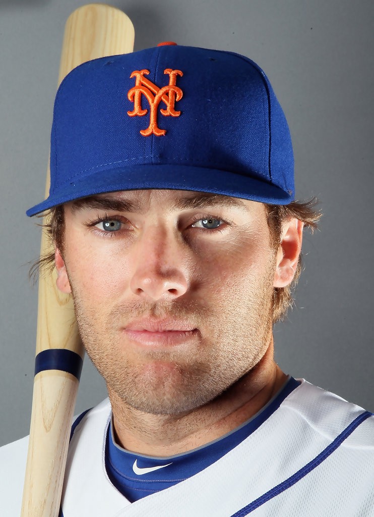 Photo Credit: Elsa / Getty Images
As mentioned earlier, the Mets hat borrows the orange ?NY? emblem that the New York Giants used to wear. With the home, solid blue caps, it completes a great looking uniform. Orange is not a great color to use as a main color, but as an accent, it adds pop to a uniform. In the Mets hat?s case, it really stands out.
In the need to keep adding more items for fans to buy, the blue alternate hat with the silver outline around the ?NY? or the blue with orange bill cap leave much to be desired in my opinion. The all blue hat is the best. It?s simple, it?s timeless, it just works.
The Mets have been in the league for nearly 70 years and it?s refreshing to see that the team currently wears a uniform that?s not far removed from their inaugural look. I?m not bashing the other popular looks that you see Mets fans wear ? the ?80s ?racing stripes? or the black alternates that were introduced in 1998 ? but the home white pinstripes uniforms with the all blue cap is the team?s best look.
With the Mets taking a chance and trying new looks over the years, it should help fans appreciate the original uniforms for how clean and simple they look. Most teams are not like the Yankees where they?ve essentially worn the same thing for the last several decades. The Mets have altered their look to be en vogue. In today?s sports culture where there?s an appreciation for a classic style, it?s nice to see the Mets cherish their roots. That?s despite their rocky start in the National League before becoming the underdog story of 1969.
I love those M-E-T-S, Mets home uniforms and I hope some of you guys love them too.