Google is a company that has seen immense success in just a few years, and their colourful Google logo is a rich experience for the variety of online users.
The Google logo also has a great history starting from its introduction.
The Google logo appears in various settings so that it can promote itself as a search engine.
The company has also relied on various kinds of logos since it has been renamed.
However, the Google logo that is now in fashion is one of the most famous logos on the internet today.
The Google company also comprises of various kinds of modifications and humour, like cartoon modifications for holidays, the birthday of celebrities and famous people and important events.
These unique designs have been done in part by Dennis Hwang and are known as Google Doodles.
The Google logo design is one of the most colourful and innovative, ever-changing logos that is known to be adapted on a regular basis, and this logo has also gone through some significant alterations in the last two decades.
Google has been known to decide on its logo rapidly, but this design has been redesigned several times.
Here?s a sneak preview of the different kinds of Google Logos from the very beginning of their initiation.
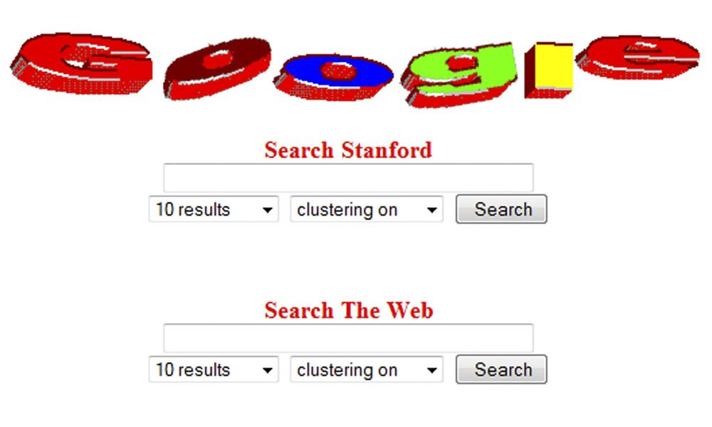
The story begins in 1996 when a research project which was known as BackRub which was founded by Larry page, gradually was renamed Google ? a misspelt version of Googol.
The initial goal was to signify, that Google had an enormous potential to handle a significant amount of data compared to other search engines.
In 1997 Google?s first branding embodiment was finally launched on Stanford?s servers.
Page and Brin were PhD students at Stanford University, and they decided to download the complete web into their computer and develop a search program for the same.
Google was first released internally in Stanford and from the very beginning; it has maintained a clean and straightforward homepage which is free from flashy and flowery animations.
It was an instant hit in the Stanford network.
The first logo of Google that was designed by the company was a straightforward one that never won any awards or accolades.
The logo was designed with the help of Microsoft word, and people could not describe it as attractive or enticing.
The Google logo slowly gained its stand when Larry Page and Sergey Brin from Stanford University decided to launch Google officially in 1998.
Once Google was determined to be started for good, the duo came up with a better design with the help of the well known open source image editing package called GIMP.
Related Post: 10 Tips for Designing a Logo that Works for your Business
They chose the Baskerville Bold font and a green ?G.?
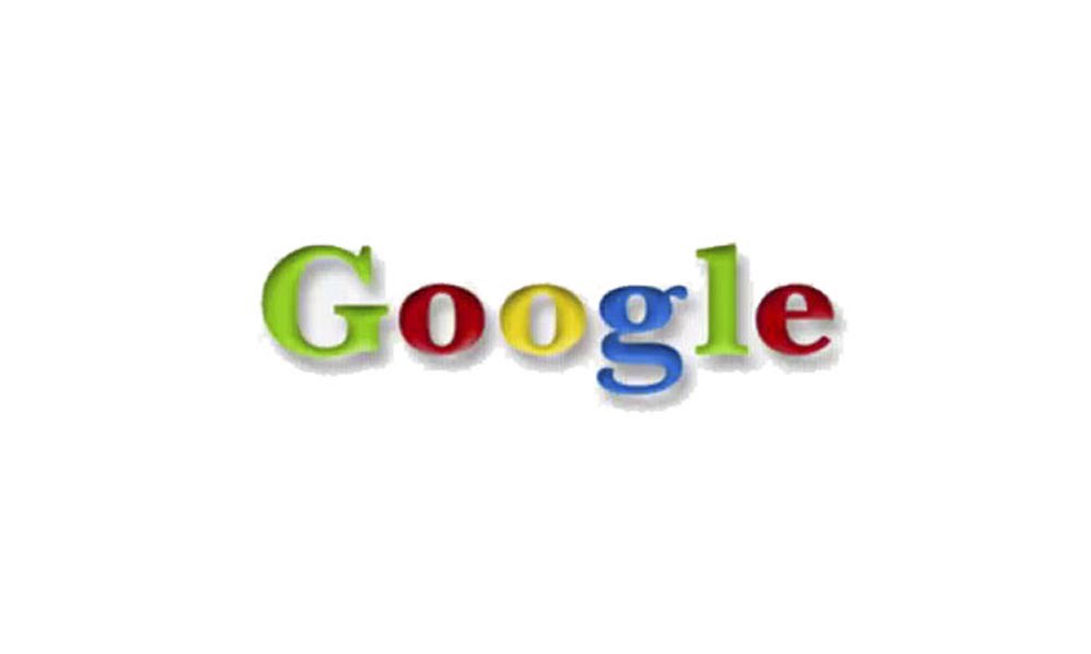
The logo was however very much short lived and was changed very soon.
By the year 1999, the same logo was updated with Baskerville Bold typefaces like its predecessor, switching around of colours, and an exclamation.
Google had a brand new facelift with better and bolder icons, better colour schemes, and a 3D print that added some shadows and an exclamation mark, created by graphic designer Ruth Kedar.
The first attempt was made with Adobe Garamond as the typeface.
Intelligent Logo Design
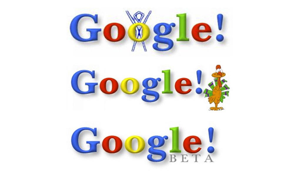
There were a variety of different colour iterations, and Kedar ended up with primary colours.
Instead of that original order, a secondary colour was also put on the letter L that was green, which brought the idea that Google did not follow a typical trend.
This Logo was inspired by the Yahoo logo at that time.
Though some may feel that the colours are placed haphazardly, the real truth is that the Google logo is a well thought and well-planned one with primary colours on the colour wheel.
Kedar felt that Brin and Page liked this because it looked somewhat like a Chinese finger trap.
Kedar decided to focus on the O?s of the logo by adding an infinite pattern and a target aspect to one O to hit the homepage.
The Logo from 1999 onwards
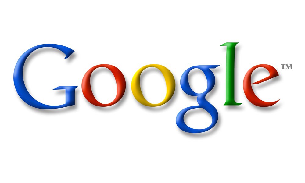
By the year 1999, Google was already a well-known Search Engine which was robust and comprised of various information as well.
It was already trying to position itself among the top 5 in the world.
The Google logo design went through some changes including concept logos in the year 1999.
This included the logo that was designed in the Catull typeface, which featured a stylised target as well as the logo that features the interlocked O?s with an axis across them.
Kedar decided on the ITC Leawood and overlapping circles that symbolised target bonding to establish the intertwined and globally targeted nature of the business, but this logo was a little close to the Olympics logo.
Google then decided that the more straightforward form was better.
They decided to change the interlocked O?s to more straightforward O?s that was user-friendly and colourful which also resembles the Google logo of today.
This new logo was a significant facelift, and this logo prevailed in the company till the year 2010 as the company felt that adding too much of design and flair would be a little restrictive.
Kedar finally created the simple design which kept readability and professionalism intact.
There are various colour iterations.
The shading and the texture of the letters were done in a bland way making sure that it is in lifting it from the page while giving it both weight and lightness.
Though the fonts were solid, it had a delicate quality as well.
2010?2013 onwards ? Google Logo Design
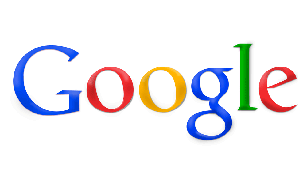
After a long prevailed seat in the industry, Google decided to do away with the delicate shading logo and also change the typeface into bolder and brightened colours for a bright and funky look.
Related Post: 5 Branding Trends to Prepare For in 2018
2013 Google Logo
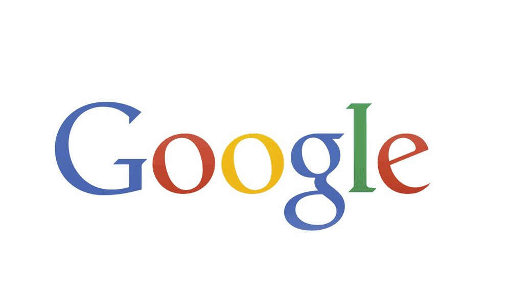
In the year 2013, Google decided to alter its logo by changing the fonts into a flat-shaped design with softer edges and a layout that was user-friendly and readable ? especially on the mobile screen.
However, then, not many people liked this idea in their logo hence, later on, they tried to move towards a new one with the upcoming year.
Google Logo 2014
On 24th May 2014, The Google logo once again received an alteration that was hard to notice with the help of a naked eye.
The second ?g? was moved one pixel to the right, while the ?l? was moved a pixel down first and then they tried it with one pixel to the right.
Google Logo 2015
The Google logo got a significant transformation in the year 2015.
Google deserted the Catull typeface and started using a tailor-made sans-serif font, called Product Sans.
This logo had softer colours, and also has an animation look and this logo was probably here to stay for a long time.
Google?s Logo today
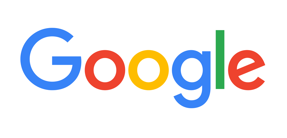
The new Google Logo design that prevails today is more straightforward with a standalone G that is stylish and iconic.
It signifies a smart set of fonts which are user-friendly and perceptive than all the other previous logos.
The font is a modified typeface called the Product Sans.
This makes the logo look smart, modern and playful as well.
This newly designed logo bears a resemblance to the logo for Google?s new parent company Alphabet which has a similar look that signifies style with simplicity.
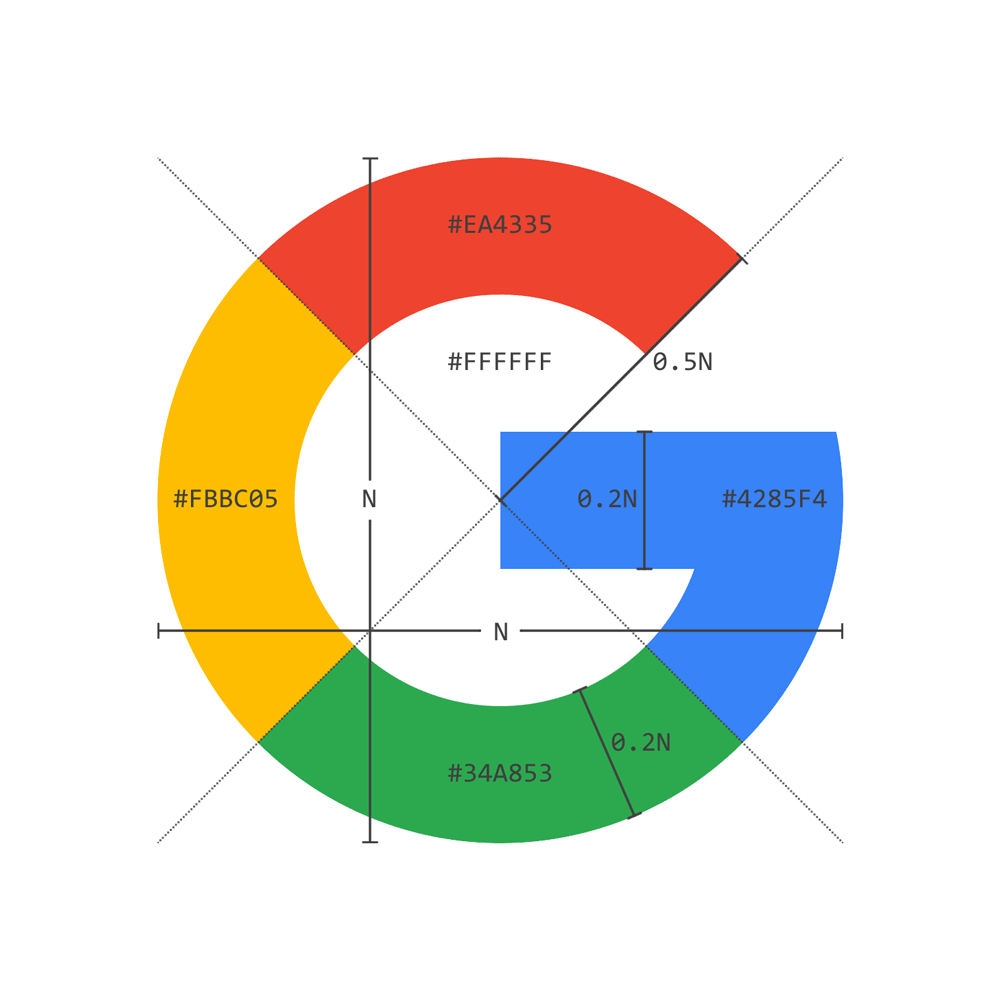
Google has also been seen to be changing the tiny G Logo that is seen in the browser tabs and would now be showcasing an Uppercase G with stripes in all four Google?s colours.
The new design can also be seen on the Google home with a pretty animation that lures onlookers.
Why did Google decide to make a change to the logo?
Why did Google decide to change the existing logo?
The main reason behind the same is the ever-changing technology that has changed the way we interact with people and the internet.
The new logo has been created to reflect the realities of life where we use more than just desktops and laptops.
The new Google logo has been aptly designed for an extensive collection of applications, PC?s, chrome books, as well as a variety of smartphones.
Google has been trying to make the logo look good on small screens with new and more straightforward letterings that make the letters easier to read and more distinct.
The new logo also helps Google display a lower bandwidth connection.
The new logo version has only 305 bytes, while the existing logo comprises of 14,000 bytes.
How the Google logo is yet to create a miracle in the industry.
Related Post: 5 Tips for Building a Strong Visual Brand Identity
The new Google logo design which is in use has a different colour pattern which has been amended time, and again.
The Google logo has changed almost more than a dozen times since the time of its inception, but the company still seems to be trying to improve itself as far as branding is concerned, and it has never gone, off-brand till now.
Ever since the year 1999, the Google logo has featured similar colours, the basic layout and the same kind of preference that is simple.
Though the Google logo and the company itself is an ever-evolving brand, Google is ruling the world of the internet.
Google has been continuously trying to rebrand and rebuild the company, and as the years pass by, we are still expecting that the Google logo design will go through new and innovative iterations which would surpass the previous logos as well!
The Google Doodle
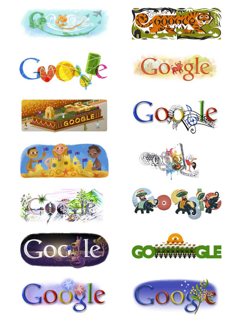
The first Google Doodle was made in honour of the Burning Man festival in 1998.
The doodle was designed by Larry Page and Sergey Brim to notify the users in case of their absence in case of servers crashed.
Google Doodle was developed by a contractor until Larry and Sergey asked Dennis Hwang to create a logo for Bastille Day in 2000, and hence they have been designing a logo.
Colourless Logo
A colourless version of the Google logo design is used on the local homepage.
This design was first used on the Google Poland homepage.
This logo was later, also used in China and Hong Kong to pay respects to the victims of the Qinghai earthquake.
In the year 2010, the doodle changed to a grey coloured Google logo that was lighted up with standard Google colours.
These are the different phases as to how the Google logo design slowly and gradually came into being one of the best logos on the internet.
So what is next for the new Google logo branding?
Time will tell the same as we have already seen the changes in the last 20 years.
Google is always trying to find out new and innovative things that may help to improve the image and reputation of the company.
Author Bio: Maria Jones is a freelance writer and blogger. Who?s planning to take up computer science to enhance her knowledge and passion when it comes to blogging, and his appreciation about our technology. For More information, Please visit ItsMyOwnWay.
If you wish to discuss how we can develop your brand or provide graphic design for your product or business, email us: [email protected]
Inkbot Design is a Creative Branding Agency that is passionate about effective Graphic Design, Brand Identity, Logos and Web Design.
T: @inkbotdesign F: /inkbotdesign
Originally published at inkbotdesign.com on April 11, 2018.

