Have you had a project where the assets and images were not consistent with the design layout? Were you on the verge of pulling out your hair when attempting to fit different sized images into a set container or grid? Did you come up with some diabolical scheme on assassinating the designer who set you on mission: impossible?
Today I reveal to you 3 simple solutions on how to fit images without cropping (because our purpose is to write code & not worry about pictures).
1. Hold the designer hostage until they agree to resize the images to pixel perfect
Eliminate the source at the problem. Easy. As. That.
I?m just kidding ? you can always contact them and politely ask that they make your life a little less miserable by sizing the images to fit their respective containers.
2. Using the background-image property instead of <img>
By using the background-image property directly into your container, this will allow you to position and scale your images easily with CSS!
CSS<style> .img { width: 500px; height: 500px; background-position: 50% 50%; background-repeat: no-repeat; background-size: cover; } </style>MARKUP<div class=”grid”> <div class=”img” style=”background-image: url(‘https://unsplash.it/400/500’)”></div> <div class=”img” style=”background-image: url(‘https://unsplash.it/500/400’)”></div></div>
In the example I provided, I created two divs and nested a background-image in each. Next, I styled it by setting the dimensions of my choosing ? I chose a square here, but you can use whatever dimensions and adjust the positioning to your liking. You can find more information on how to use background-position here.
3. Overflow:Hidden; and 2D Positioning
CSS<style> .square { position: relative; width: 300px; height: 300px; overflow: hidden; } img { position: absolute; max-width: 100%; width: 100%; height: auto; top: 50%; left: 50%; transform: translate( -50%, -50%); } img.landscape { height: 100%; width: auto;}</style>MARKUP<div class=”square”> <img src=”https://unsplash.it/400/500″ alt=”Image” /> </div><div class=”square”> <img src=”https://unsplash.it/500/400″ class=”landscape” alt=”Image” /> </div>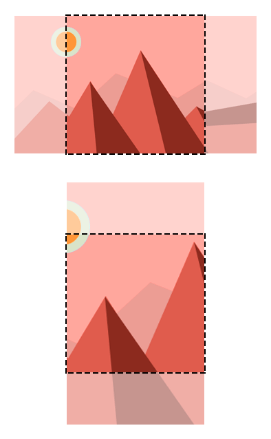 http://jonathannicol.com/cms/wp-content/uploads/2014/06/cropped-thumbnails.png
How this works is we are positioning the image first by making the top left corner the center of its container. Then with 2D positioning, we slide the image up and left by half of its dimensions.
For the landscape image, we can add a class of ?landscape? and style it accordingly to fit its respective container.
It is important to note that the percentage values used in the translate method are relative to the element itself and not the container. You can find more interesting ways to use 2D transformations here.
And there we have it.

