Sans Serif vs Serif Font ? Which Should You Use & When
Every designer knows that choosing a font makes a huge impact. Fonts have an essential role in our designs, so we should always choose them with care.
You always have to decide which font is the right font for your website or any other piece of written content, digital product or graphic design.
If you are an experienced graphic designer, then you must be familiar with the sensitivity of choosing a perfect font ? as we all know that an ideal font increases the readability of a design. So before selecting any font, always have a clear vision of design in your mind.
Before you can pick a particular text style, you have to comprehend the various classifications of textual forms.
While there is a massive amount of different ratings, for example, display, Gothic, script and many others, but the most popular are serif and sans serif.
Today we are going to cover that what is a sans serif vs serif. What defines them and what are the main differences between them.
After we complete these explanations, we will move forward. We?ll give you some information on the proper usage of these two types of font families.
So, you will be able to know which of them is the best fit for specific situations.
The Difference Between Sans Serif vs Serif Font?
First of all, let?s have a look at the appearance of both font families.
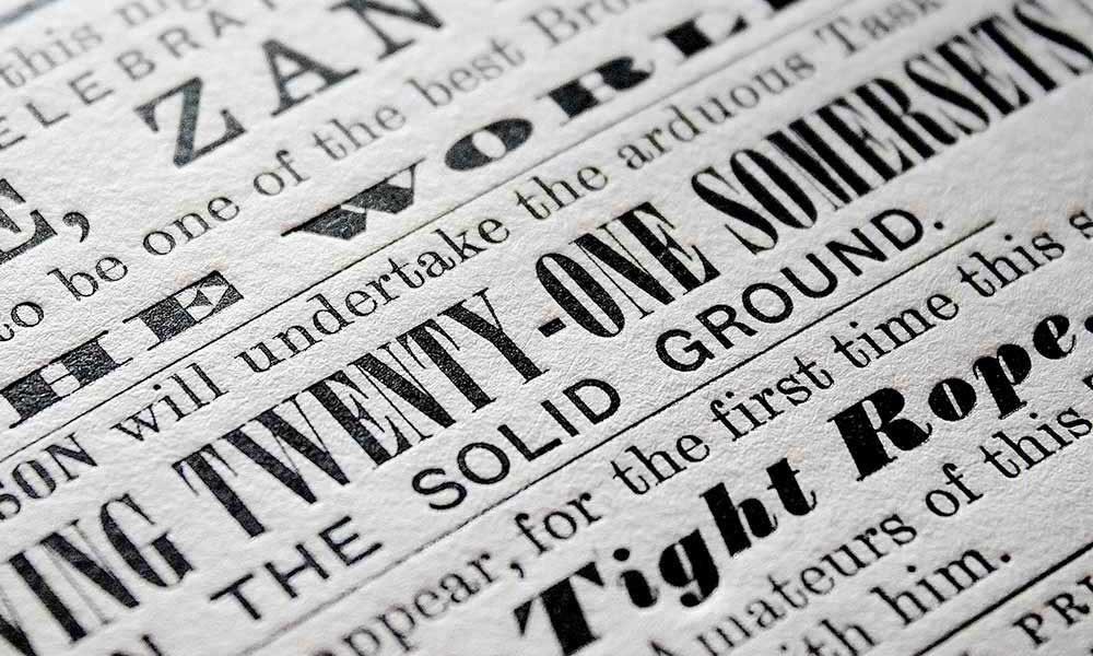
What is a Serif Font?
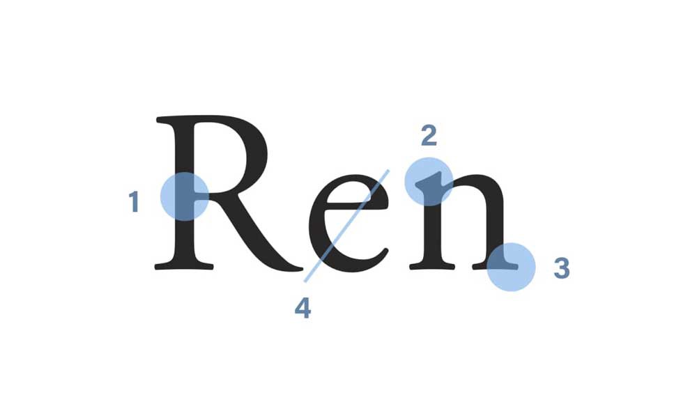
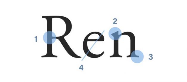
To define what a serif font is, we need to know what a Serif is. A Serif is the little decorative stroke that continues after the end of the stems of letters.
This means that serif fonts will look more professional with a bit more flair than their counterparts. It?s one of the most popular font families of all time.
Serif Font comprises four subgroups incorporating old style, transitional, Didone and slab serif. Always remember that without serif, you will need to have more type and energy to identify the letters.
What Does a Serif Font Communicate to a Reader?
Serif fonts are more traditional. They send a message of trustworthiness and elegance.
You may also like: 6 Creative Stages of Branding Design ? A Step-by-Step Guide
This is the case because serif has a great history. We can trace them back to the 18th century, so their history is extensive.
We have all seen them everywhere. But you may not have noticed that they are always connected with a message of this type.
There is a potential drawback with serif fonts. If you are not dealing with a high-resolution display, you may have trouble showing them.
This is a concern nowadays that we have so many different screens where we show our content and designs.
You need to keep this detail in mind and test your font choice before making up your mind. It will make a big difference, so be careful about it.
You will not have this kind of problem with printed media, so no need to worry about it in those cases.
Serif Font and Its Uses
- Serif Fonts are very easy to read because of the large block of text. So it increases the readability of the design.
- Different newspapers and magazines use Serif fonts for their main headlines.
- These fonts increase the vision and goddess of design, so they prefer to use this font.
- Because of the Sharp angles, serif fonts are better suits for all kinds of digital displays. This makes them an ideal choice for web designers.
- Serif fonts look more beautiful when used in bold format with bigger font sizes.
The Most Popular Serif Fonts
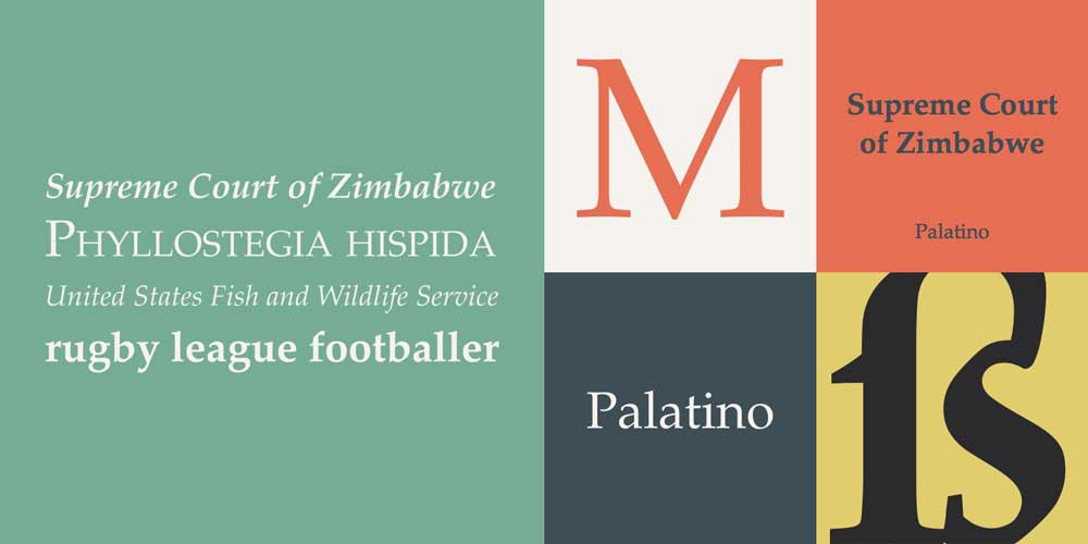
Are you familiar with the Palatino Font? Of course, you must be if you are a designer. It is one of the most popular serif?s fonts that is elegant and comprises of a large number of font weights.
This font design comes from Herman Zapf in 1986 with thin letterforms.
Bookman Old Style is another name in the list of Serif Fonts that has fantastic finishes and lovely bends. It will give an appealing book impact for your works of art.
The design of this font comes from two designers, namely Ong Chong Wah and Morris Fuller Benton.
Georgia is another Serif type that fulfils the need of that font that looks clear even at small resolutions. It is one of the most famous fonts in history that not only make our designs beautiful but completely give them a unique look.
The standard Font style ?Times? is also in this category that is used for newspapers or other paper related business. It is also said to be one of the most used Fonts, and even I personally used it in different designs.
What is a Sans Serif Font?
?Sans? means without. So not much of a mystery here. A Sans Serif font is one without these decorative strokes. It will look cleaner and more professional.
You may also like: 5 Website Design Trends in 2017 Every Designer Should Follow
They came into being in the 18th century, yet their popularity and usage increase until the 19th century.
We will go deeper into their uses and implications now. Of course, we cannot state that one is better than the other.
They serve different purposes, and it will be up to you to use them well. Making the right choice in this regard will aid you in sending the right message.
Sans Serif and It?s uses
- They are primarily known for their attractive and unique look. Many web designers prefer to use this font family over Serif Font.
- In the print of design, Sans serif font looks cleaner than the serif font. As they are lightweight can be easily used on brochures, mockups and business cards.
- There is one another big reason for using sans serif fonts over serif fonts. This is a font family that comes with the most popular fonts in history that we are going to discuss ahead.
The Most Popular Sans Serif Font
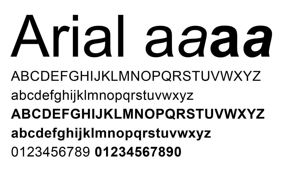
If you are a designer, then you must know about the Arial font, which is a sans-serif typeface.
Arial is extremely popular, and it has been this way for a very long time. It is one of the clean and almost neutral fonts in history.
Helvetica was a trendy choice at the time when Arial font was created. Arial was made to fit precisely with Helvetica design. So that a document made with Helvetica could be printed using Arial.
Because of its long history, Arial is very widely spread. This means that you can trust that anything designed with it will look as you produce it on any digital medium.
This is not the case with many fonts, particularly on the web.
Courier Font is also in the list of Sans Serif that was designed by Howard ?Bud? Kettler for IBM?s typewriter. It has been adjusted to use as a PC textual style.
Sans Serif vs Serif Font? Which One Is Better?
When choosing a font, you should make sure that they are looking good with the message
that you are trying to send.
But also ensure that you don?t go crazy with too many different fonts.
You may also like: 6 Essential Elements Of Modern Website Design
You can mix it up a little bit, but it is not recommended to use too many different font types together.
You would usually go with two or three different kinds of fonts for your whole project unless you are in very exceptional circumstances.
Another thing to consider is that all the things that we discussed earlier are general considerations.
These are the best practices that we use a lot in our industry to produce creative designs.
Some designers consider Sans Serif fonts are easy to read than serif fonts.
That means that readability is not such a big problem on screens with sans serif fonts. This also depends on the particular font that you choose.
To make it clear, let?s discuss the drawbacks of both fonts.
The Drawback of Serif Font
- It doesn?t have a much bright vibe, so it is less suitable for web designers who keep their text small.
- If you will use this font in a small size than these small serifs can be astray or lost, so it is only suitable for significant size characters.
- It is less attention-grabbing as compared to Sans Serif fonts.
The Drawback of Sans Serif Font
- The utilisation of a sans serif typeface alone doesn?t pass on a message of familiarity.
- According to a study, sans serif fonts, readability is less than Serif font as Serif font tends to be easier to read and understand than Sans Serif.
- Everything relies upon the utilisation, mind-set, and individual task. The best answer is regularly the least clear.
There are many designers around the world, and each of them has their own choice.
Most of the designers use the two styles. It helps them to make their designs stand out in the market.
Serifs and sans serifs fonts can work in any number of uses. The key is to utilise the typefaces carefully on the designs that you are going to get ready for your clients.
Conclusion
Choosing the right font for your project is very important.
Because it is the only thing that can make a big difference in your design appearance.
Knowing the family of the font will give you an excellent idea about its appearance on your different type of designs.
It is also essential to keep other spacing and readability considerations in mind. In the end, you should let your judgment guide you in your decisions and trust that you will find the right fit for each situation.
Originally published at https://inkbotdesign.com on November 15, 2019.

