![Pure CSS Parallax — 3 simple CSS tricks to add 🔥 to any website [Pt. 2]](https://911weknow.com/wp-content/uploads/2020/09/pure-css-parallax-3-simple-css-tricks-to-add-f09f94a5-to-any-website-pt-2-1-628x275.gif)
In this article I want to take a dive into what has recently become one of my favourite CSS effects, pure CSS parallax. I wasn?t much of a fan of parallax on the web as it is often tacky and laggy. That was until I discovered this blog post by Google showcasing how to achieve performant parallax with CSS.
Since applying this technique I have been been loving the layer of polish it adds. Implemented with subtlety I think it can take your website to the next level and make it stand out from the crowd.
Pure CSS parallax is also easier to implement than JS, and is often more performant, win win!
Without further ado, let?s see what we will be implementing today!

? What we?ll be building
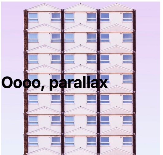
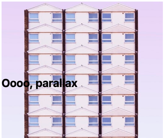
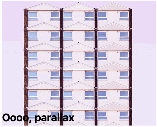
Firstly, let?s look at a relatively simple parallax effect. We can see this on our own website https://daily-fire.com. Notice the graphics in the background move slightly slower than the content in the foreground. The effect is subtle but is a great way to add give a webpage depth.
 Parallax on https://daily-fire.com
The next implementation is applying the parallax effect to an element on a page, rather than the whole page itself. This is typically where people might turn to a JS implementation, but we will be covering how to achieve this with CSS. The website https://www.whispir.com uses a CSS parallax effect to add to the illusion of depth on their illustrations:
 Parallax on https://whispir.com
Here the illustrations are brought to life by having the floating elements move at different speeds as you scroll. This creates a really nice depth effect, complimenting the illustration nicely.
? Understanding the approach
Both of the examples we will be implementing today use the same technique but vary slightly in implementation.
This approach relies on the CSS3 transform and perspective properties. Conceptually, we will be creating a 3D space in which we place different layers at different points on the z-axis.
If the notion of a Z axis is unfamiliar to you, you can think of it like this:
- X axis is left and right
- Y axis is up and down
- Z axis is forward and backward
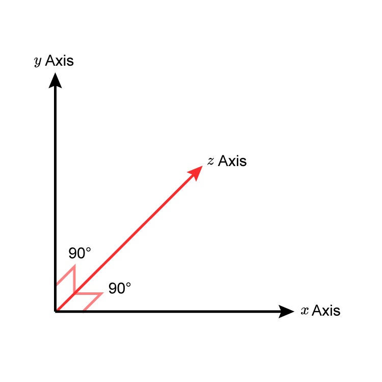
Before getting started on the parallax let?s understand this 3D space visually. We?ll start with some code:
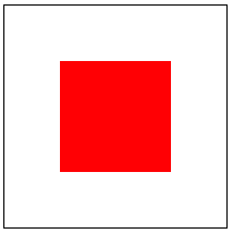
Which gives us:
Pretty exciting stuff! ?
What?s important about this is the use of the perspective property on line 9. You can think of that as assigning 8px of ?depth? to the container. Let?s take a look at what happens when we start to play with the position of the .element along the Z axis.
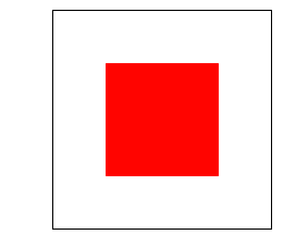
There we go! By animating the position along the Z axis it appears that the box is getting bigger. If you don?t quite get what is happening here, the following GIF includes some guides to help you see how it is moving, as if it were in a cube:
This is the basis for how our CSS parallax will work. We place the different layers at different positions along the z-axis
? Implementing parallax
With the knowledge of the previous example we can move onto more practical applications of the perspective property.
First let?s setup our parallax container which will wrap our ?layers?
Here we set a few additional properties that ensure that the scrolling happens within our .parallax-container element. If the scroll happens within the container we can rely on CSS to handle the ?parallaxing?.
Let?s see the markup:
And the styles:
This results in:
Getting somewhere now!
However, upon closer inspection something isn?t quite right. Our text is a lot bigger than it should be. This is because we are translating the .foreground towards us 3px, and just like in real life, if you bring an object closer to your eyes, it gets bigger!
To counteract this we need to apply a scale to the layer to make it render at the correct size. The Google article gives us a handy formula to determine what the scale value should be. The formula is:
(perspective ? distance) / perspective = scaleFactor
For our example, our perspective is 8px and we have moved our layer a distance of 3px. Let?s plug that into the formula and see what we get:
(8 ? 3) / 8 = 0.625
Finally, let?s apply this as a scale:
That looks better! You can confirm that you have done it correctly by setting transform: translateZ(0) scale(1); on the .foreground and seeing no difference in size (you can do this in the Codepen below).
Bonus: if you are using Sass or a similar CSS preprocessor we can create a function to calculate this for us. Here it is in SCSS:
With just that little bit of CSS we have created a parallax effect! Here is the result:
Check it out on Codepen too:
? Expanding
Let?s expand on this example a little and apply a parallax effect to an image on the page, rather than the whole background of the page.
First, take a look at the markup we will be using:
And the styles:
Note: Here we are using SCSS and the helper function we described above to calculate the scale factor of our layer
Now when we scroll we can see that the different layers move at different speeds!
Layers further along the Z axis (greater translateZ value) will appear to move faster.
Have a play with code and try tweaking the variables to see how the effect changes!
And that?s it! We have just implemented performant, multi-layer parallax with around 20 lines of CSS ?
? Gotcha?s
This effect does have one slight quirk on iOS Safari. This effect seems to disable inertia scrolling (that nice scroll effect you?re used to on your phone, where the screen keeps scrolling after you ?flick?). Luckily there is an easy fix, simply add this CSS property to your parallax container:
This should fix the scrolling issue on iOS Safari!
The Performant Parallaxing article goes into more depth on this topic.
? Wrapping Up
I hope to have shown that this effect can be really cool. Paired with the fact that it?s super easy to implement, I?m hoping you are tempted to go ahead and use this in your own projects.
Parallax can be an awesome effect, great for adding depth or that little bit of ?wow? to your website. But use it wisely! It is an effect that can quickly go from cool to tacky. That being said, I hope this article has shown you how easy it is to implement on your website, with no external libraries, no scroll jacking, just simple, performant CSS 3D transforms.

Peace, Love & ?

